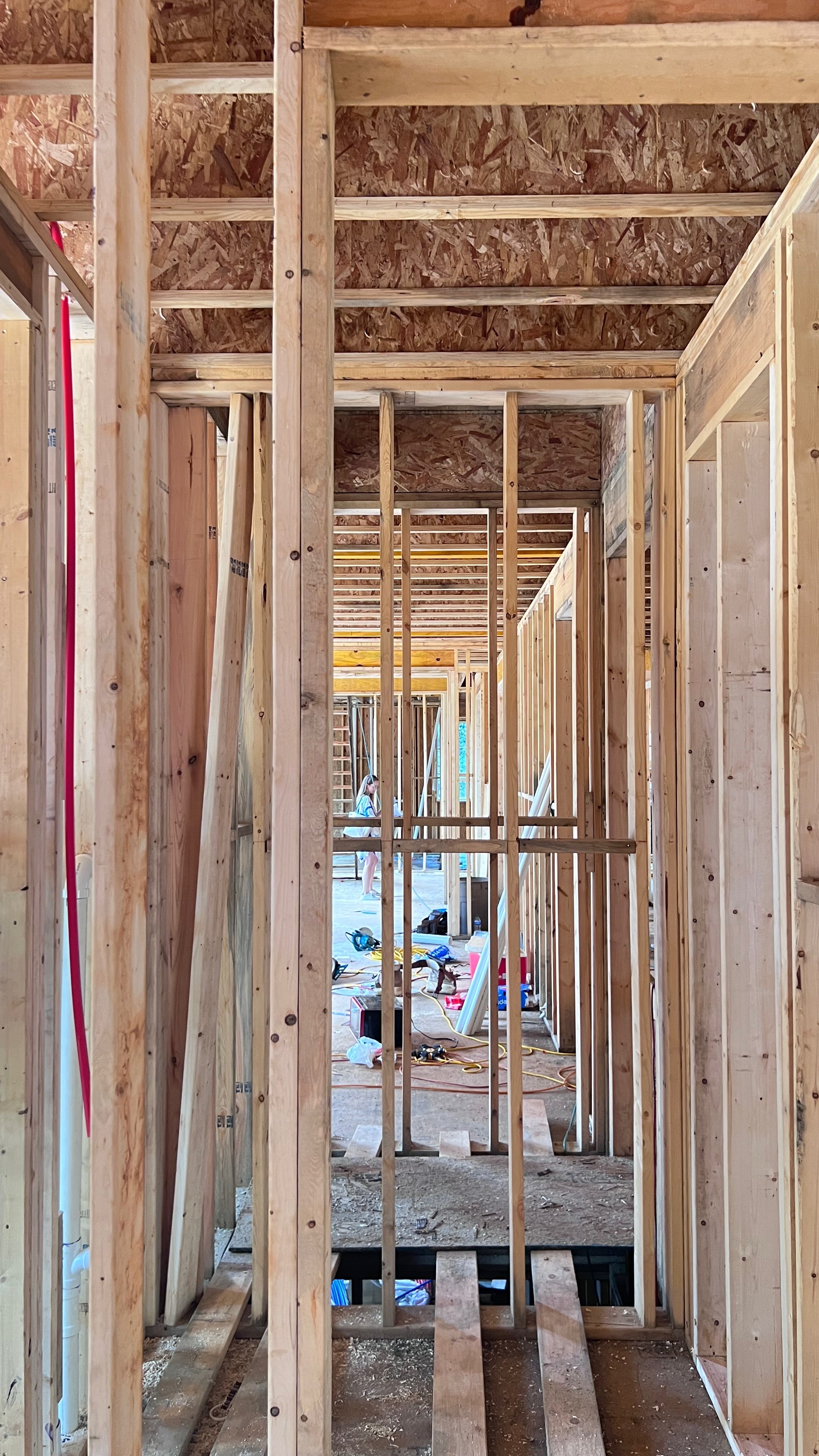
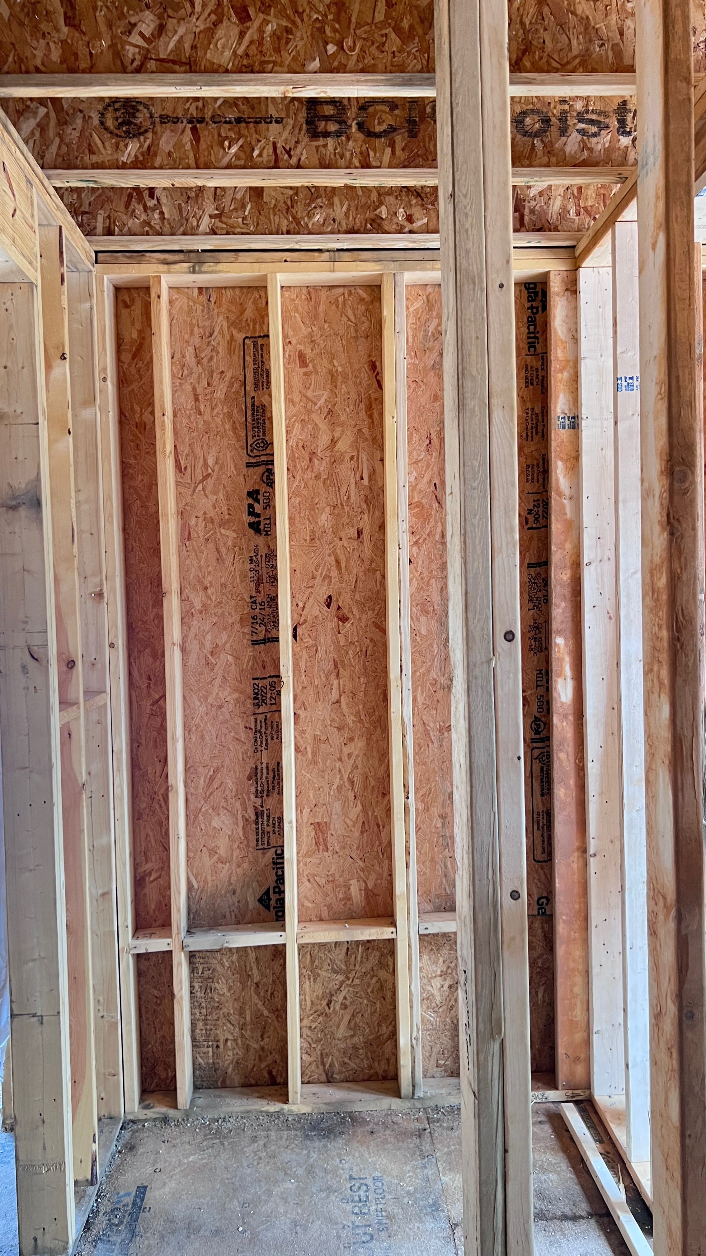
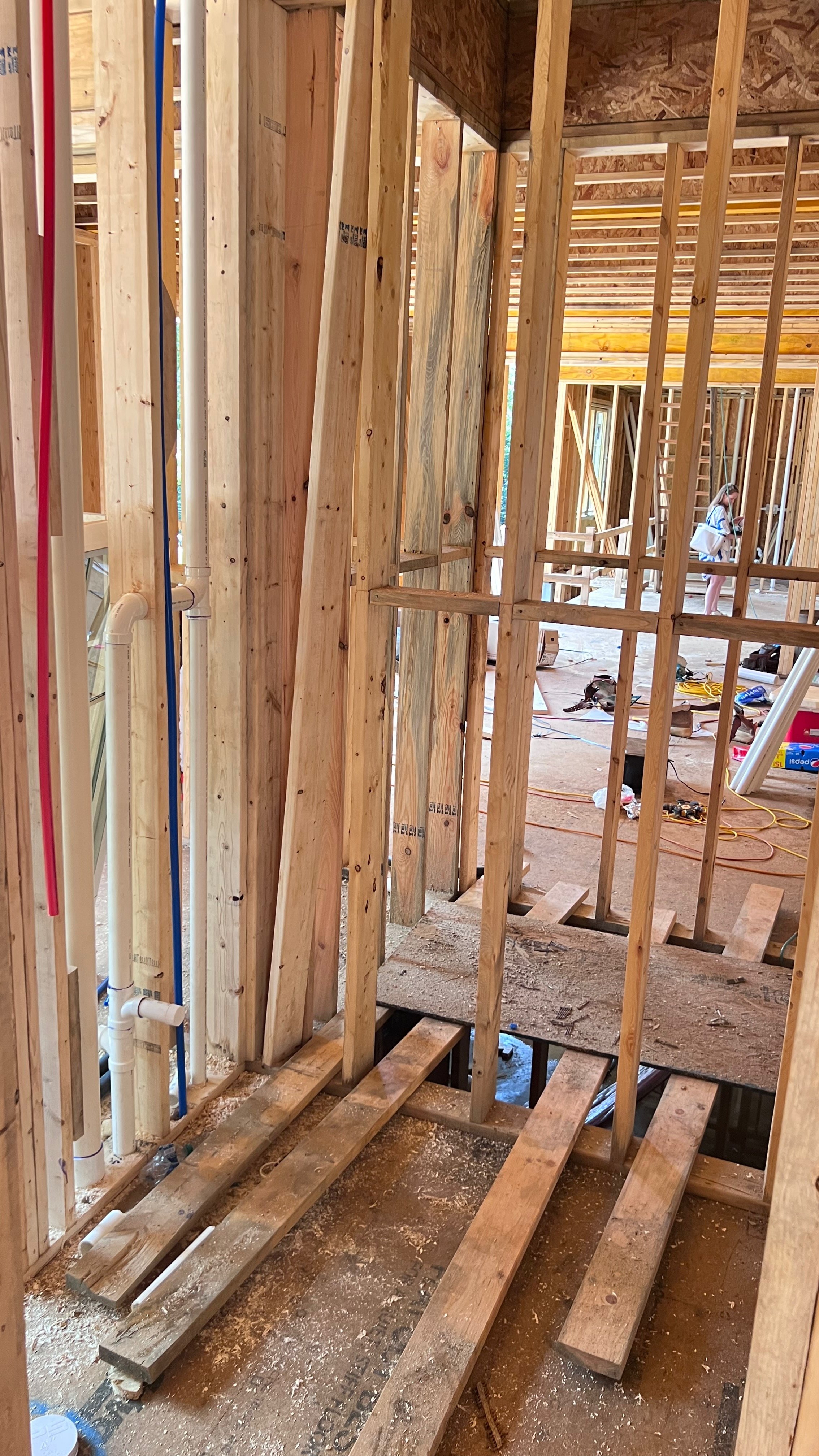
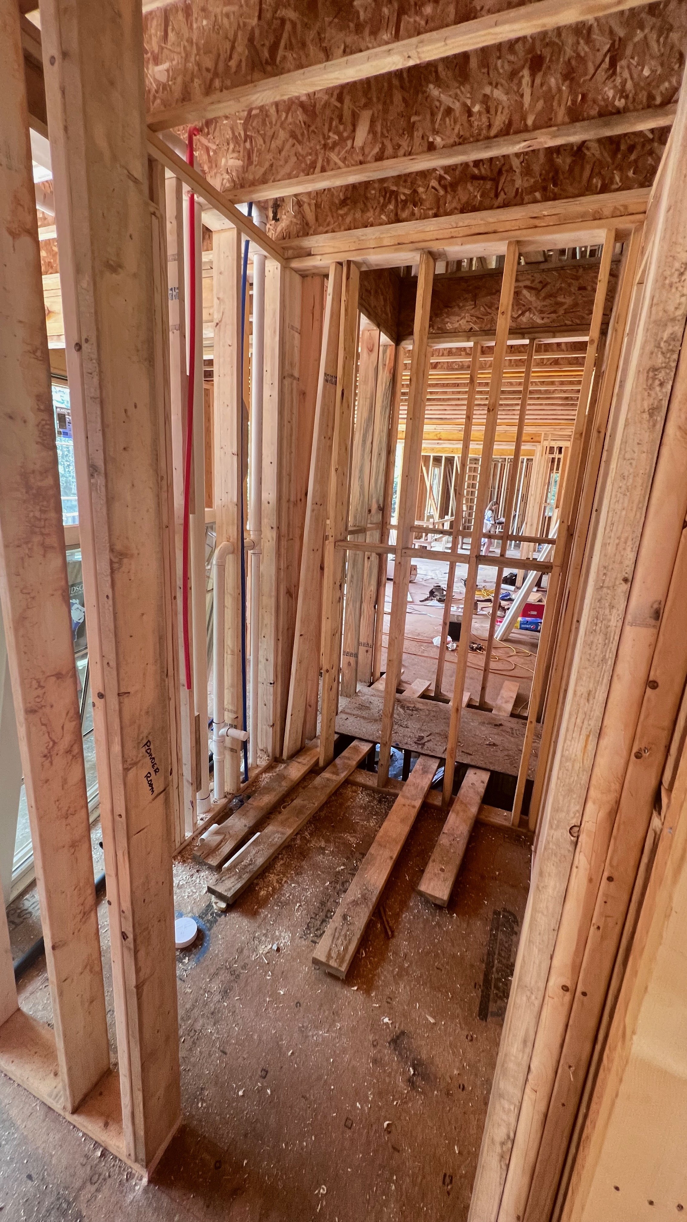
Last summer, I received an invitation that was not on my 2022 Bingo card. I was asked to be of 18 interior designers selected to participate in the 2022 Atlanta Home & Lifestyles’ Home for the Holidays Designer Showhouse and Marketplace! I was thrilled, but terrified at the same time!
A showhouse is an opportunity for an interior designer to show off their skills, expertise, and style by designing and decorating an assigned space in a home. Whether the home is under contract, has an existing owner, or is a spec design built by a developer (like this one), being asked is kind of a big deal. I’d be one of 18 interior designers from around Atlanta and the Southeast participating and likely with the least amount of experience and press coming in. I hadn’t participated in a showhouse before, nor did I expect to ever be asked. It wasn’t exactly on my interior designer bucket list as it would be for many, but it was such an honor to be recognized and requested, it was an opportunity I couldn’t possibly pass up. After speaking with a few mentors and designers I admired, I decided to take the leap. I was so excited!
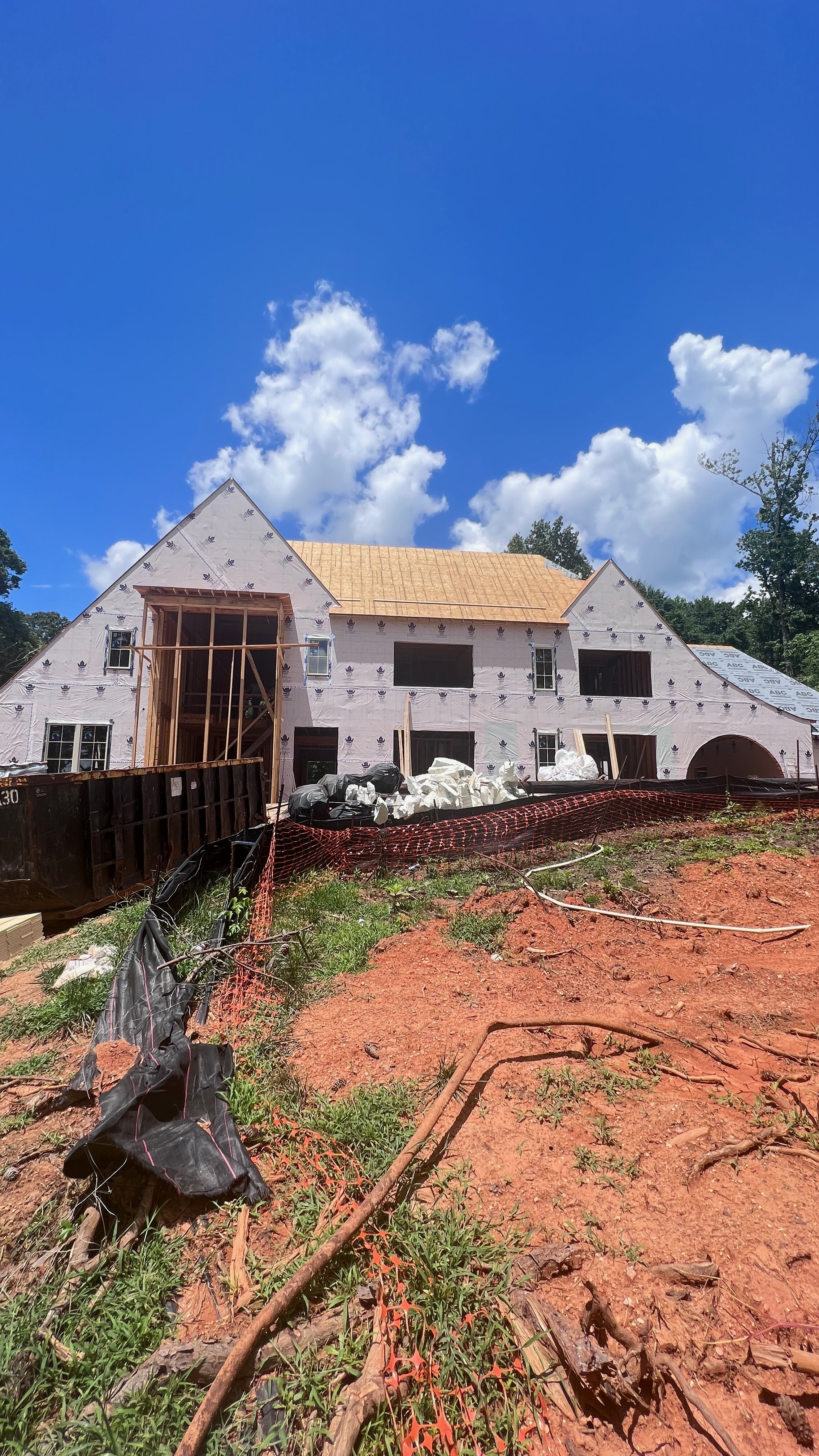
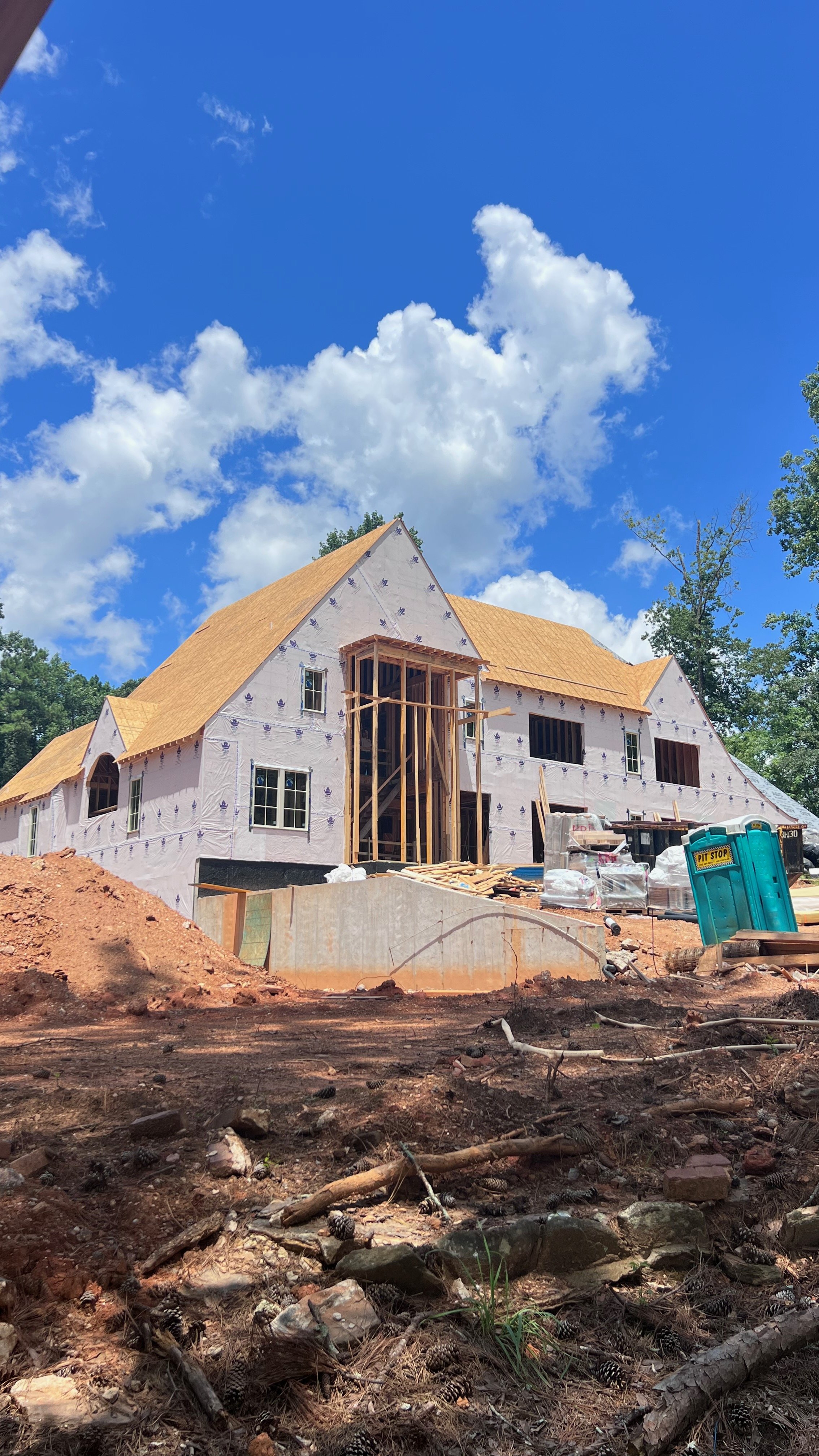
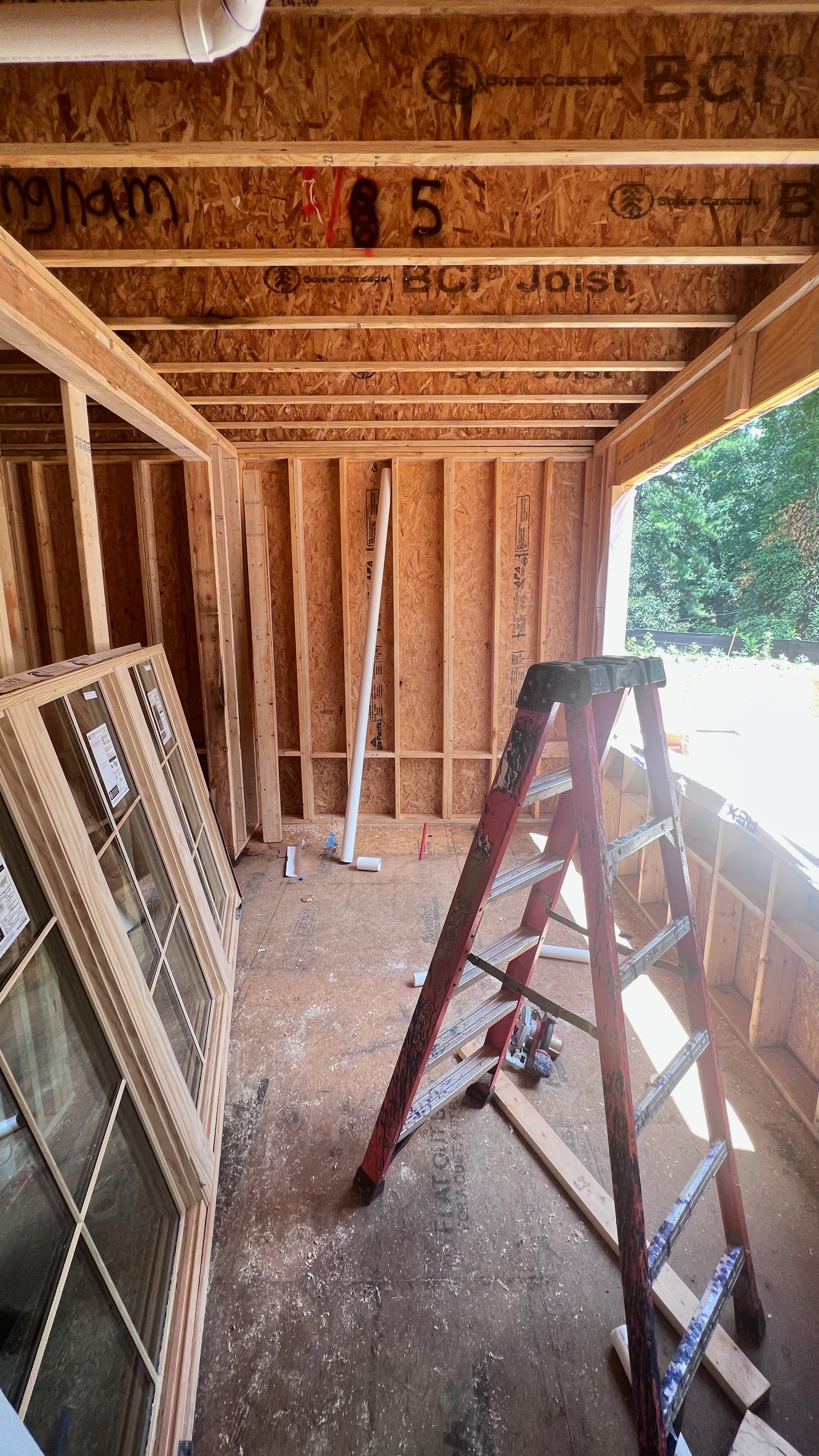
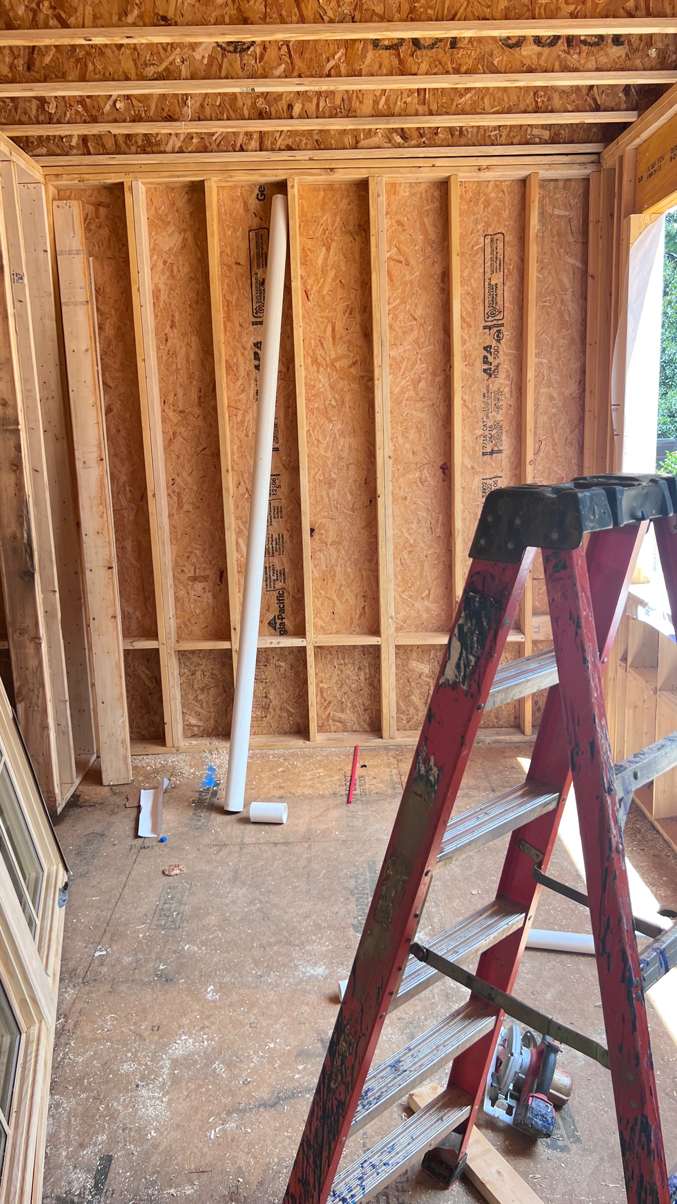
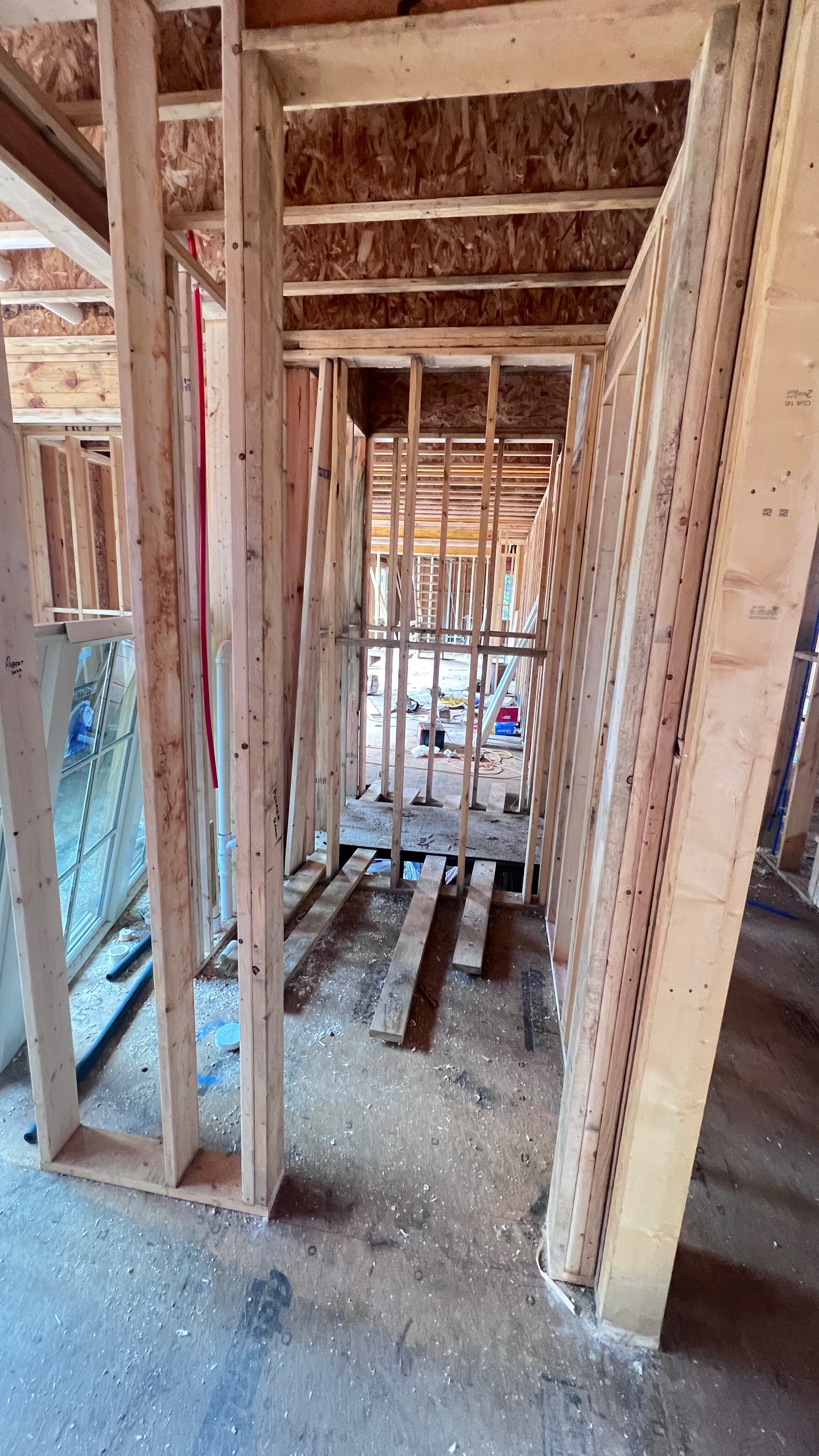
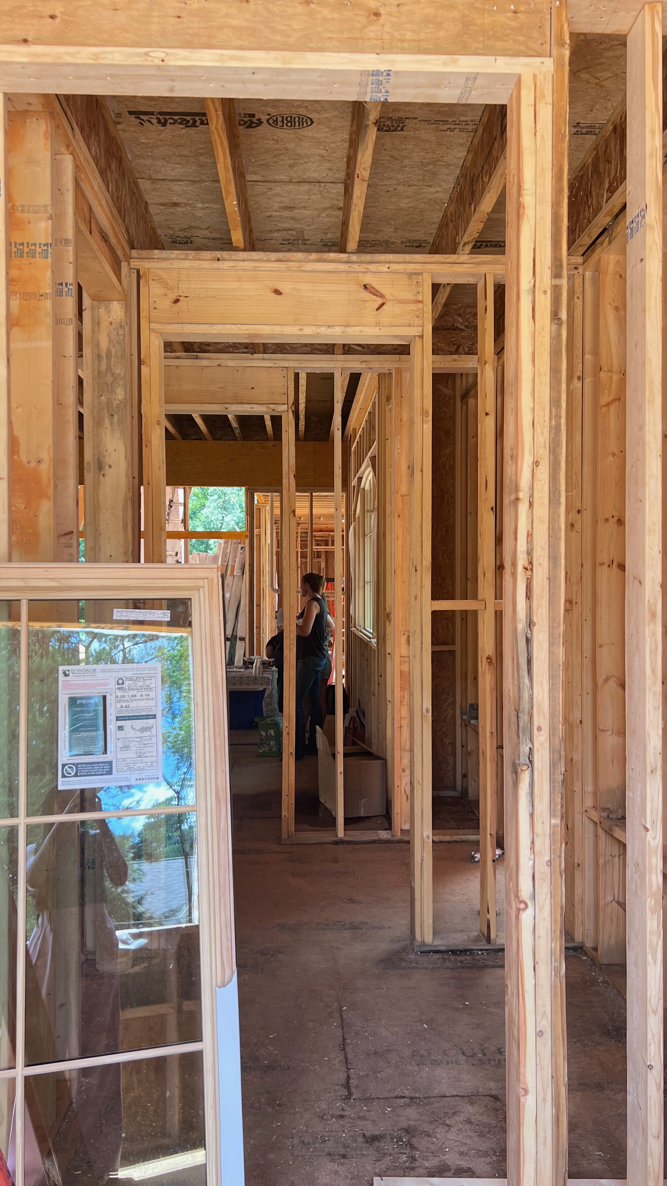
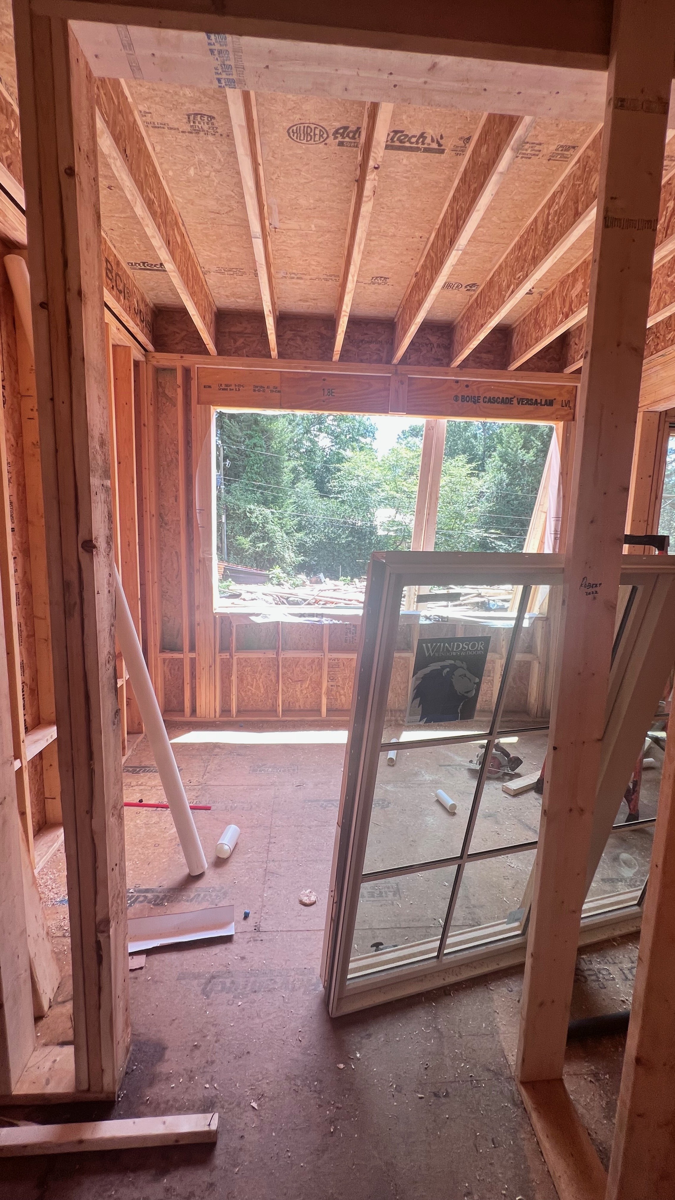
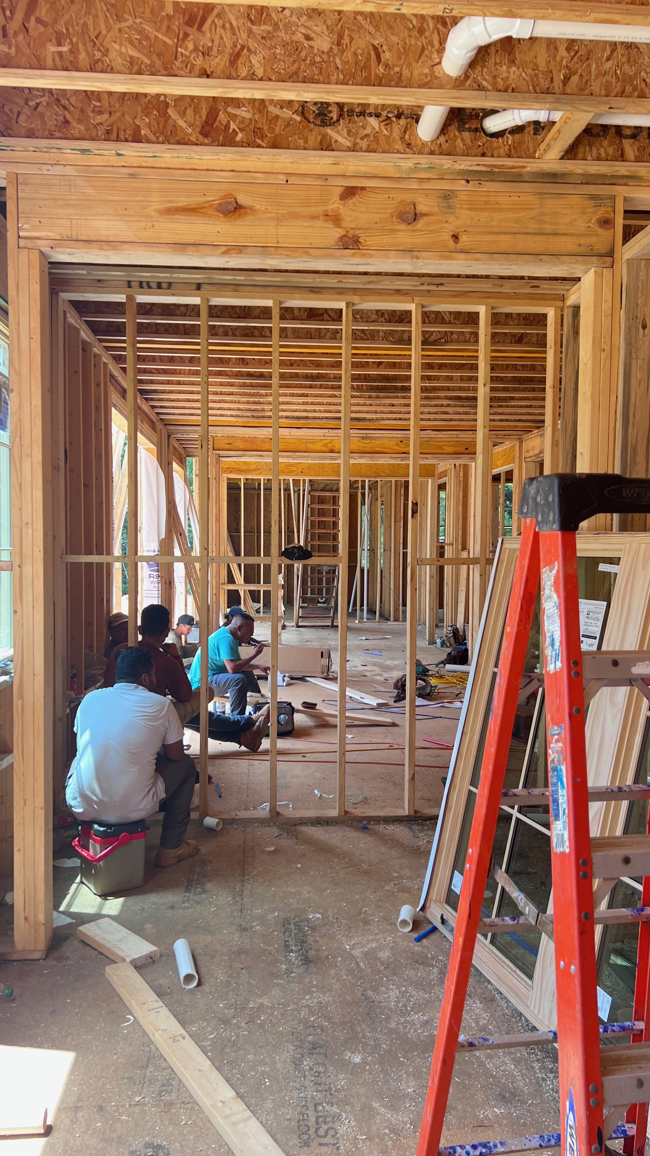
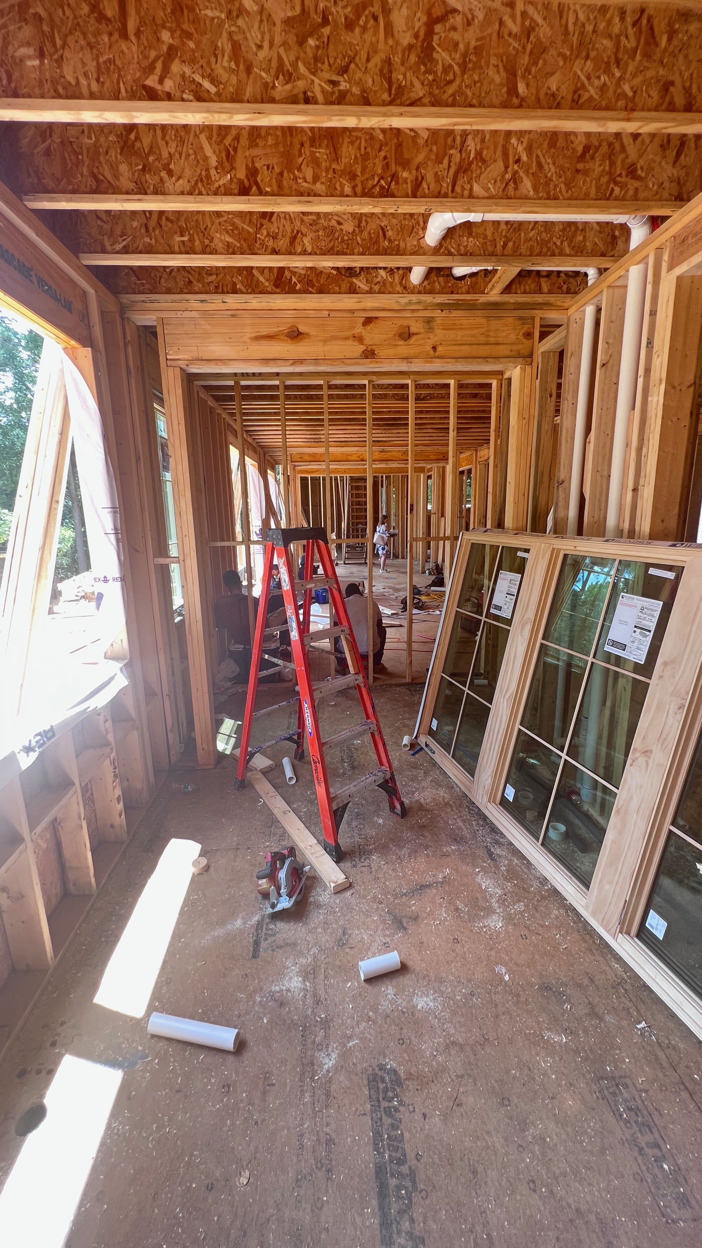
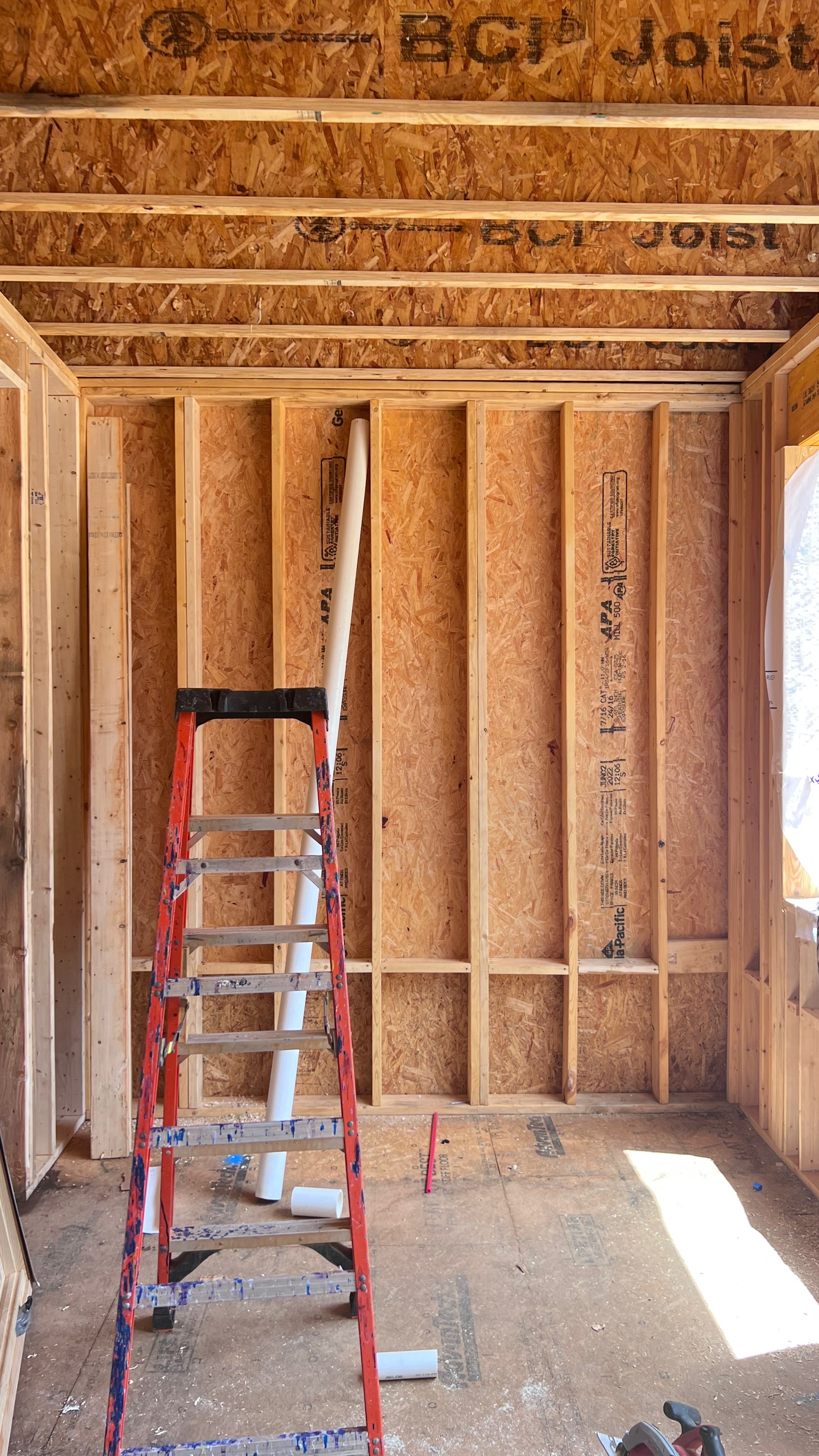
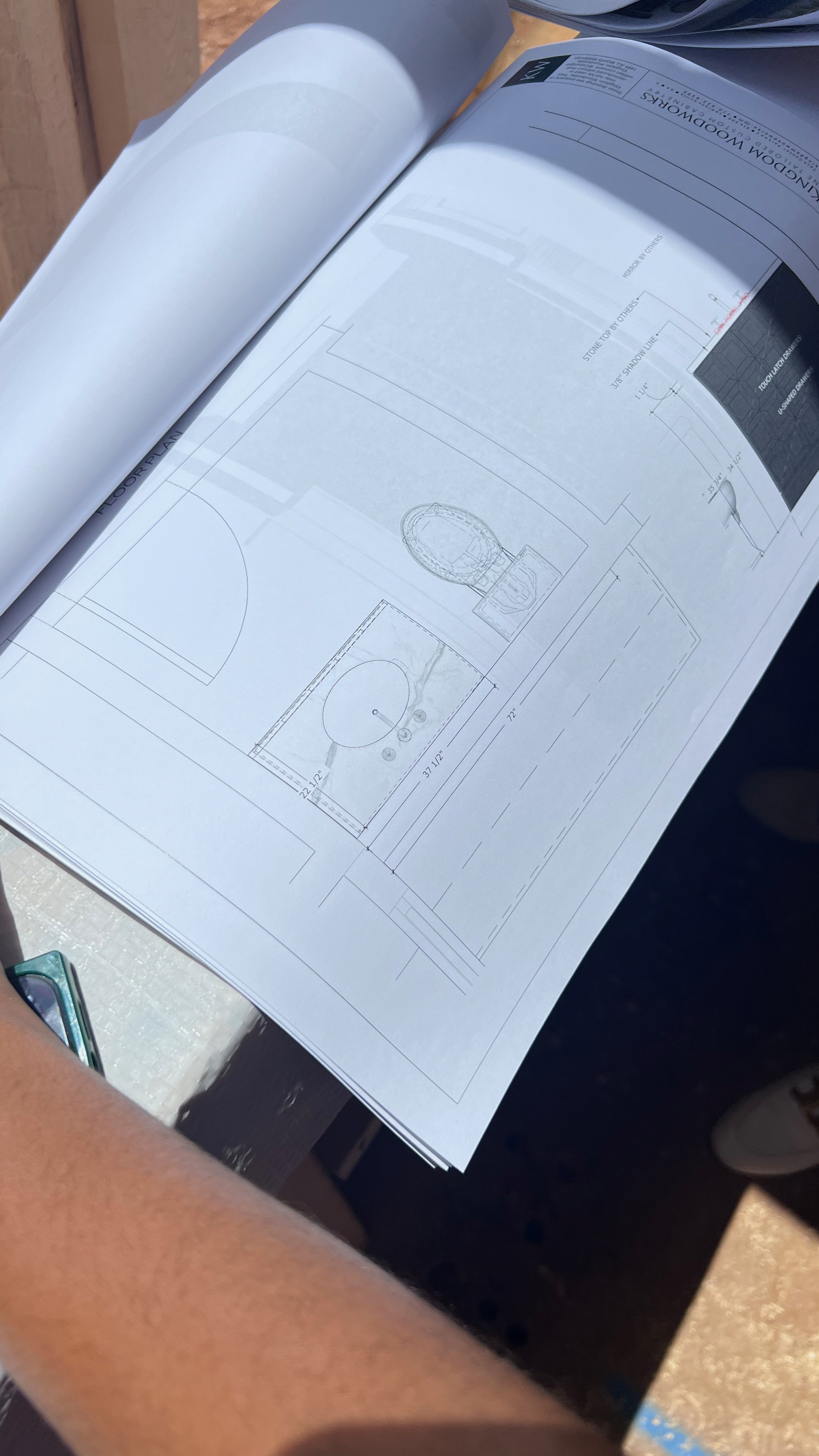
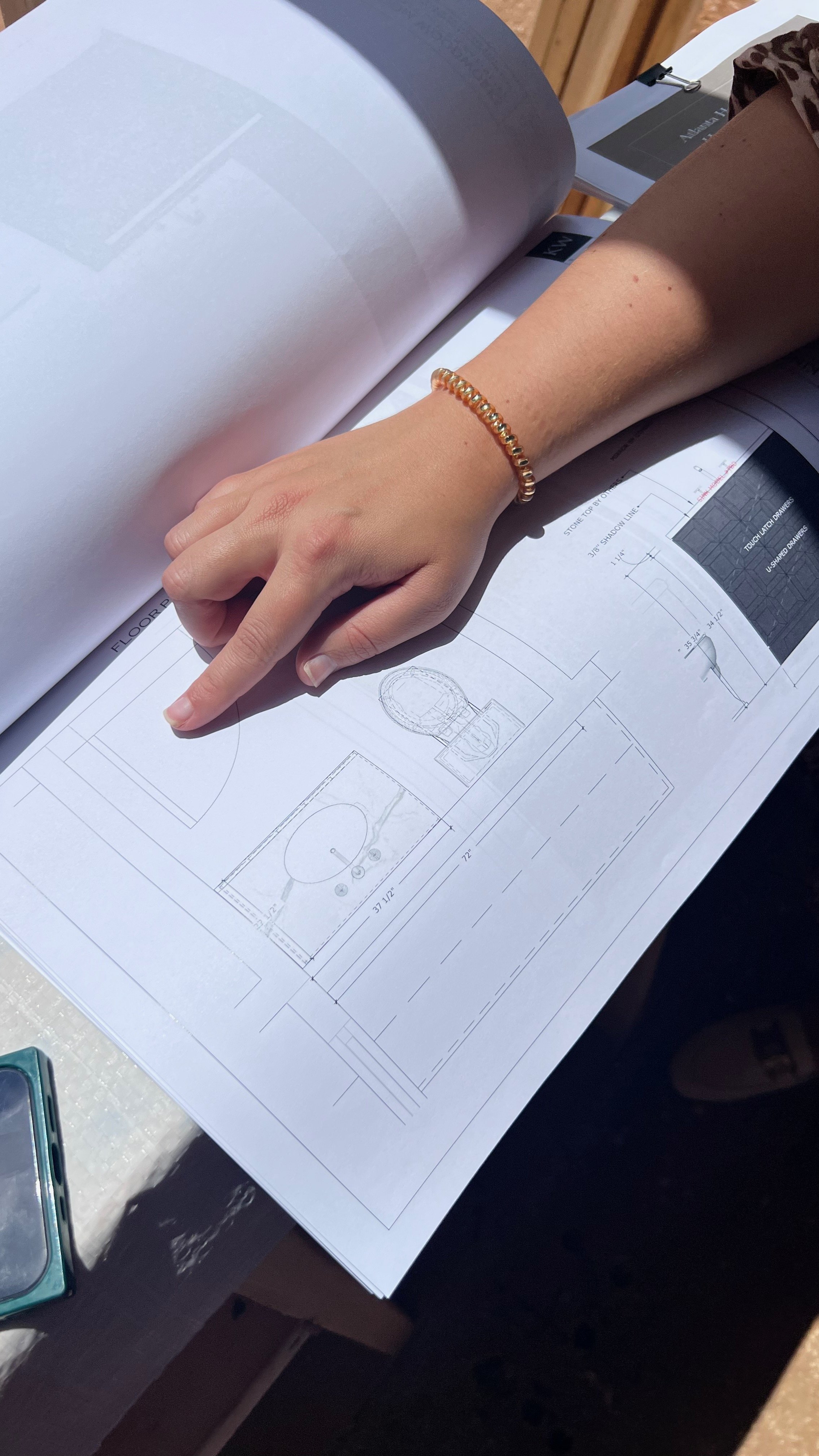
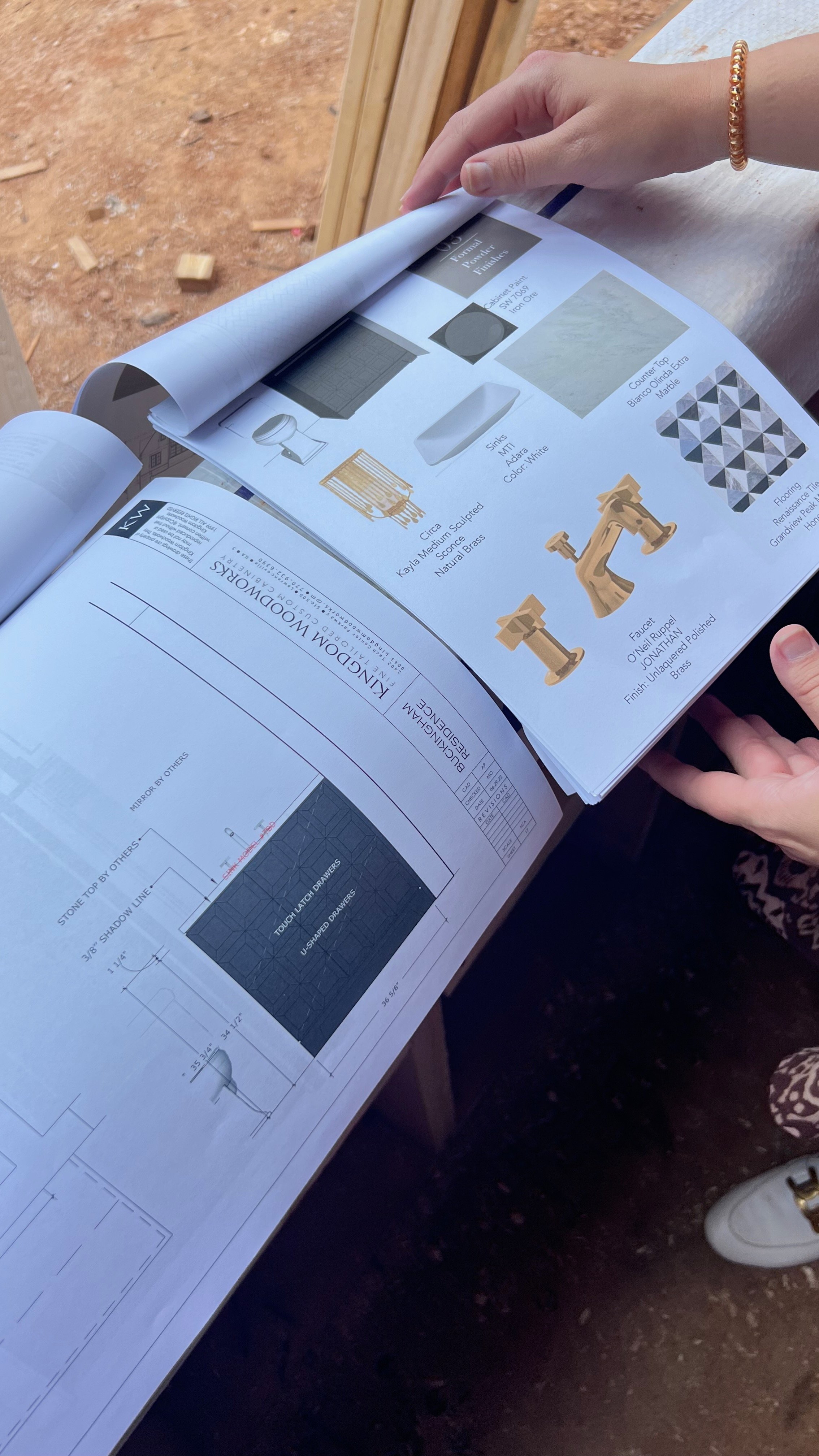
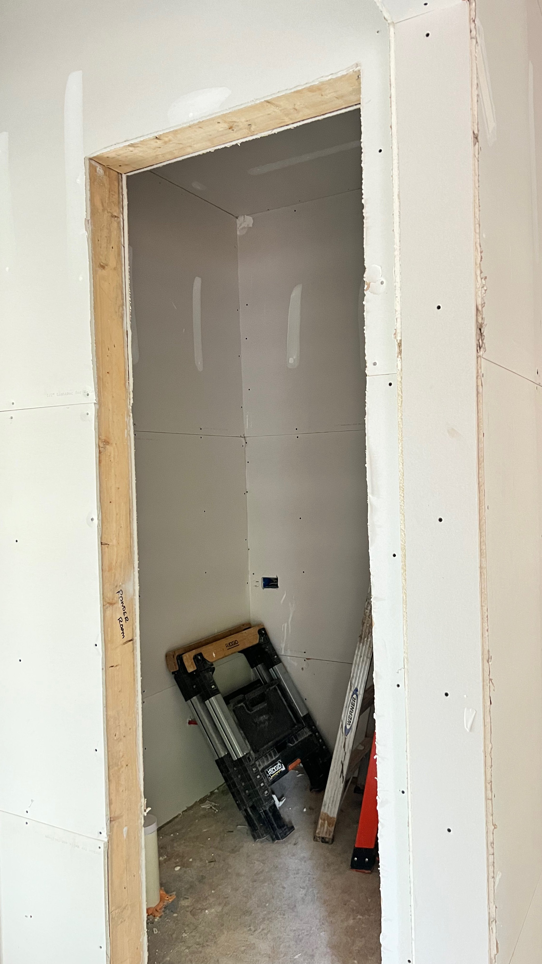
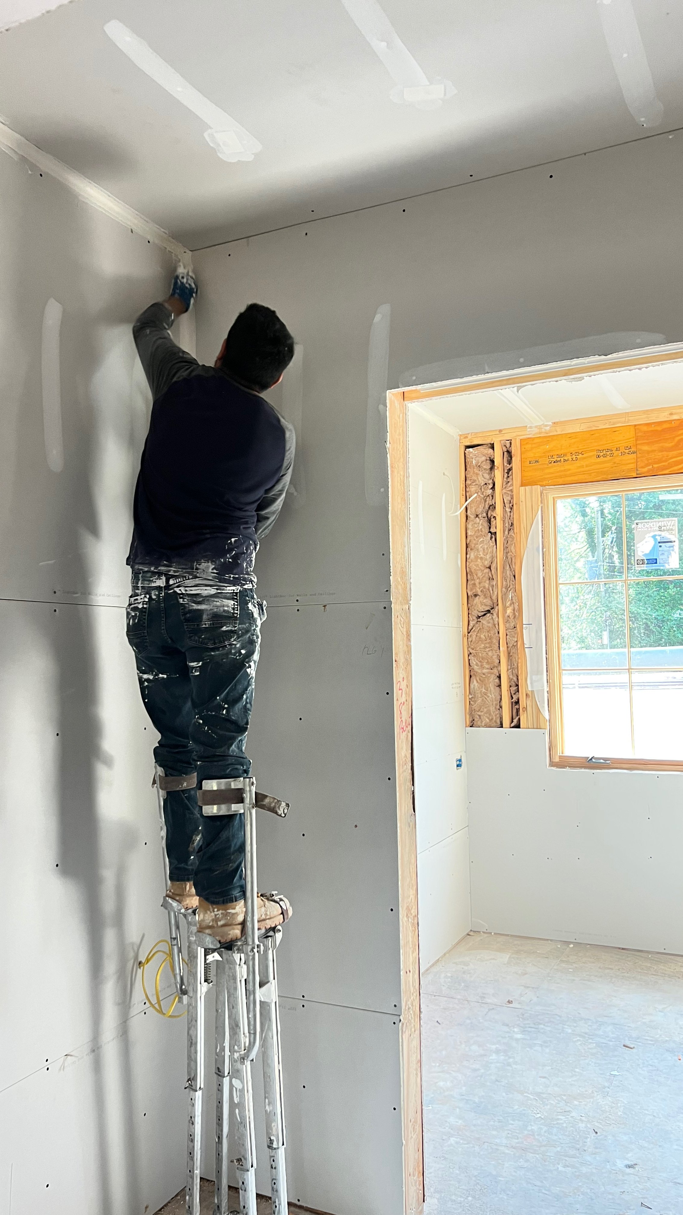
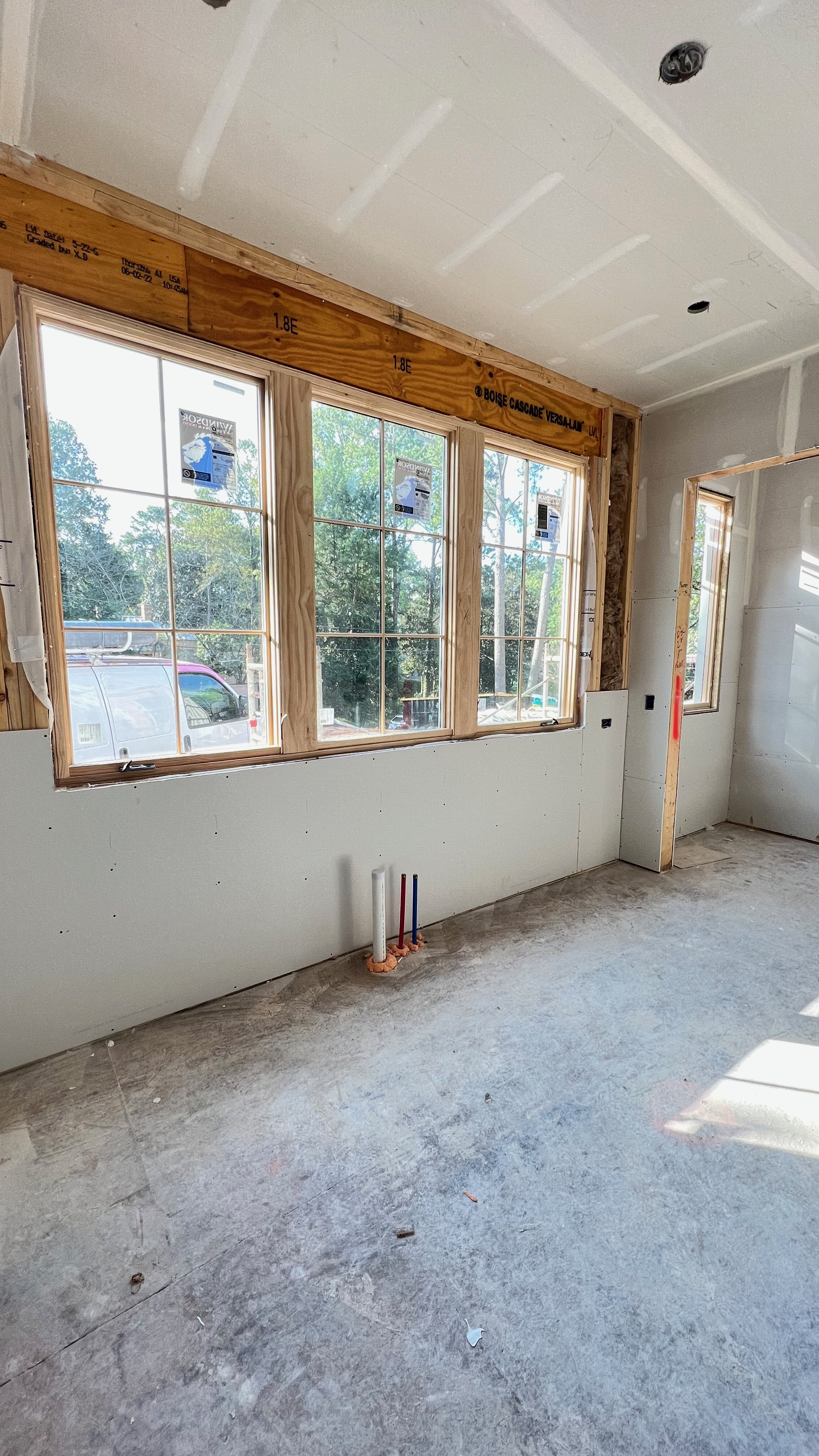
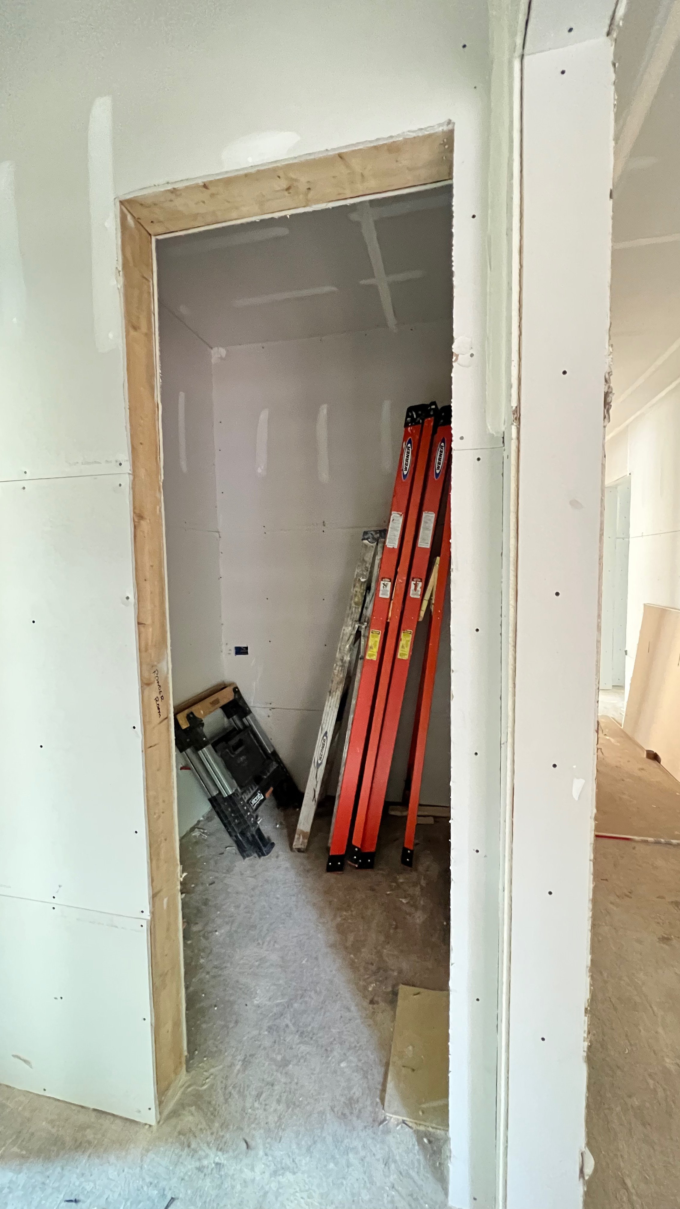
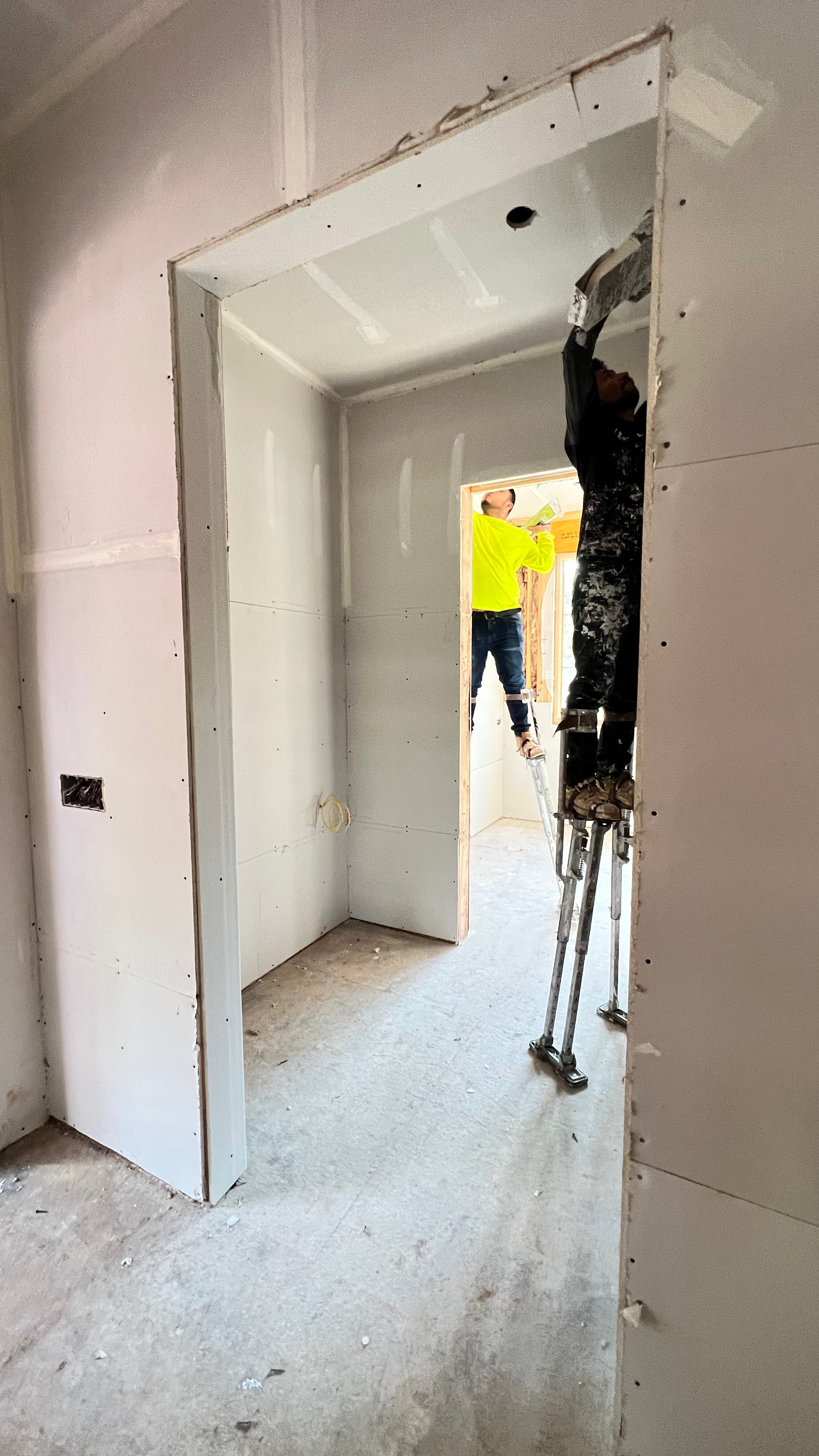
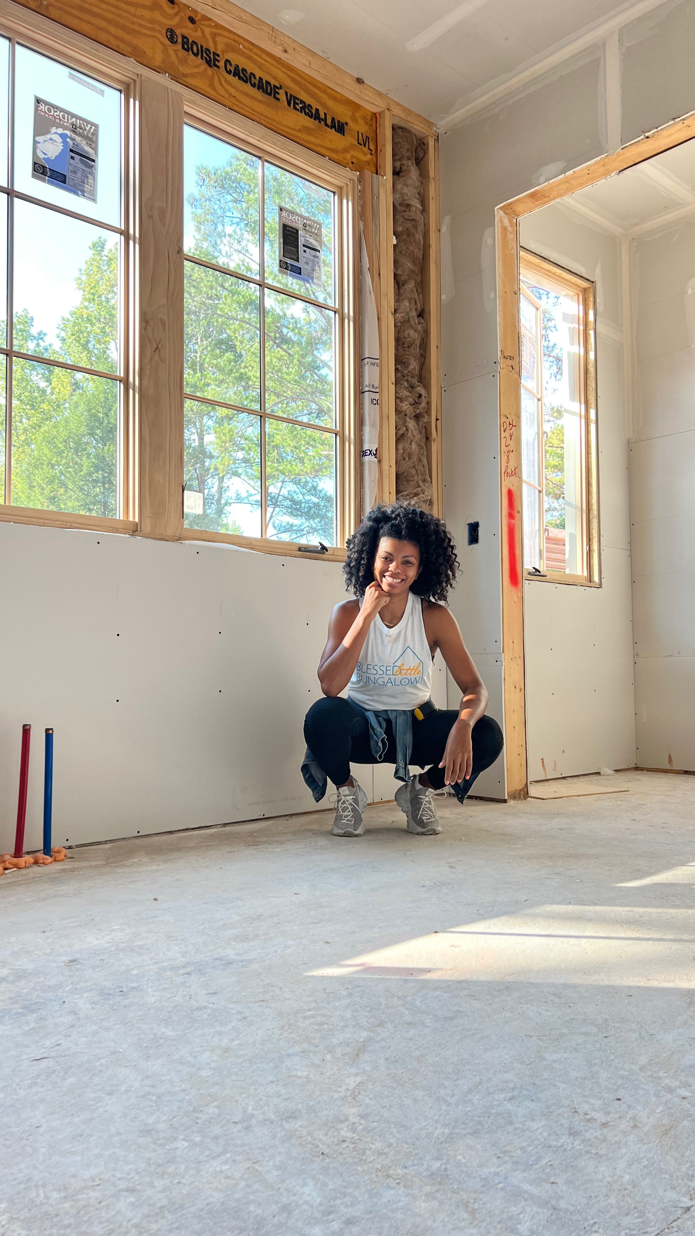
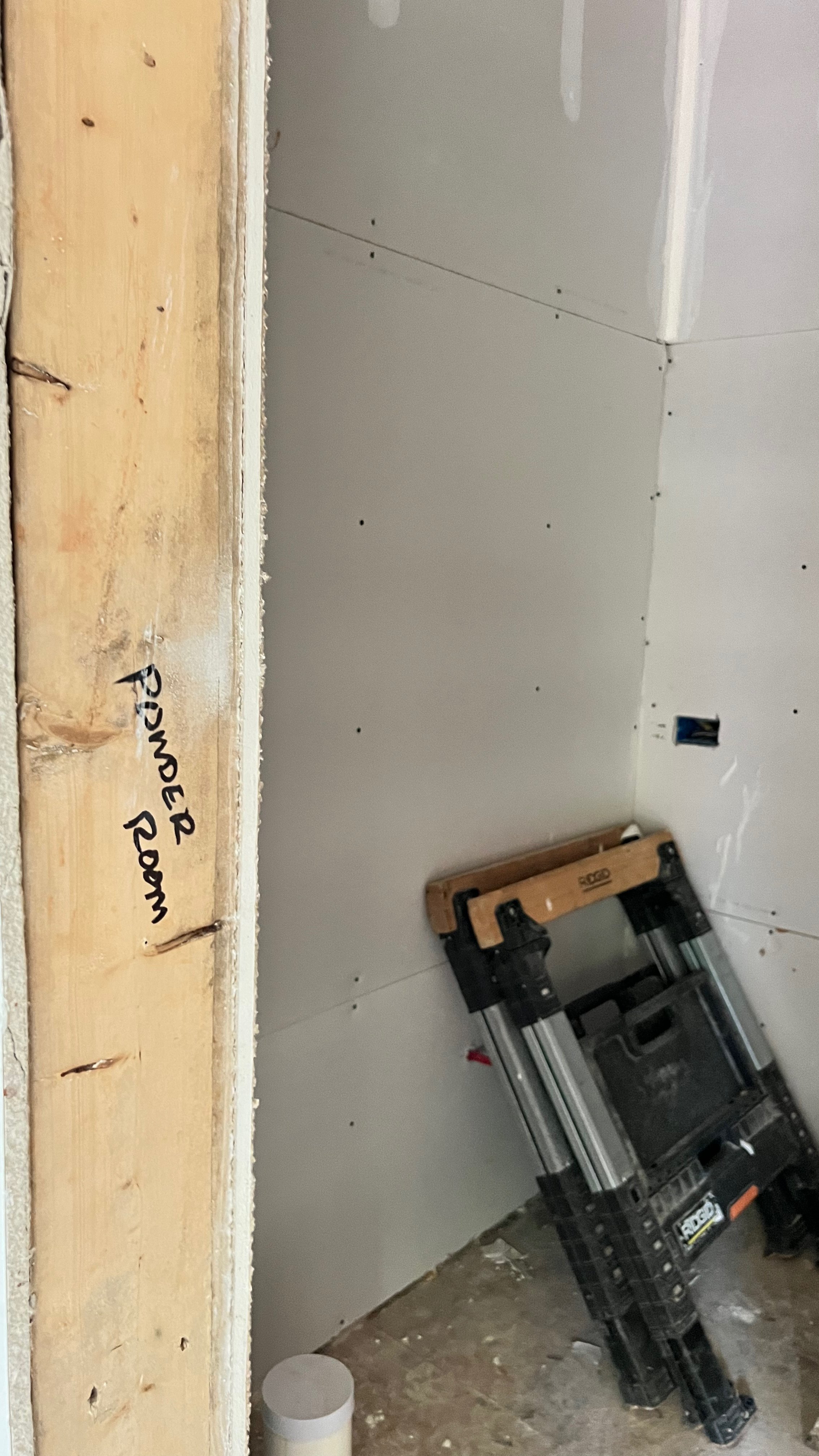
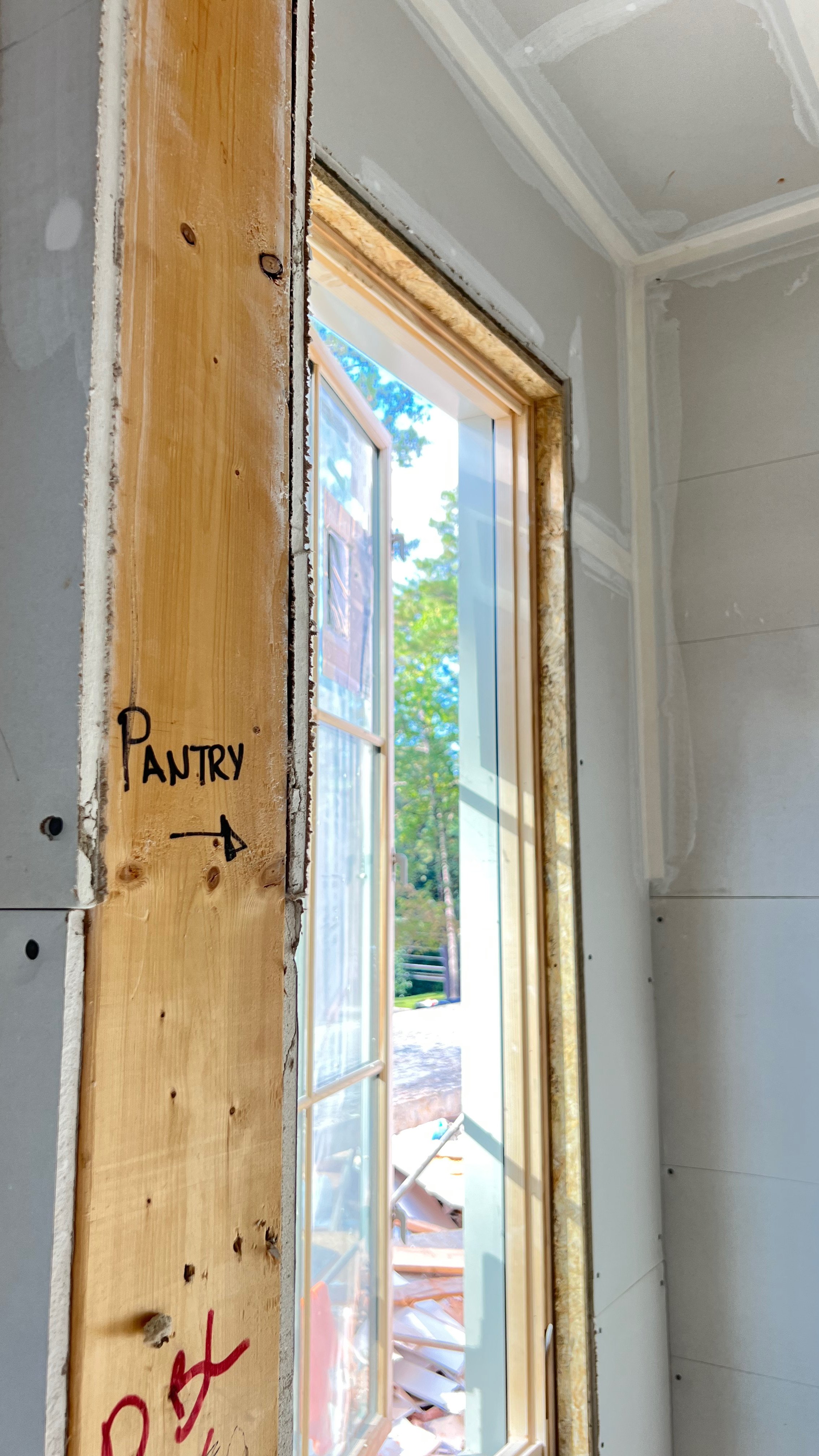
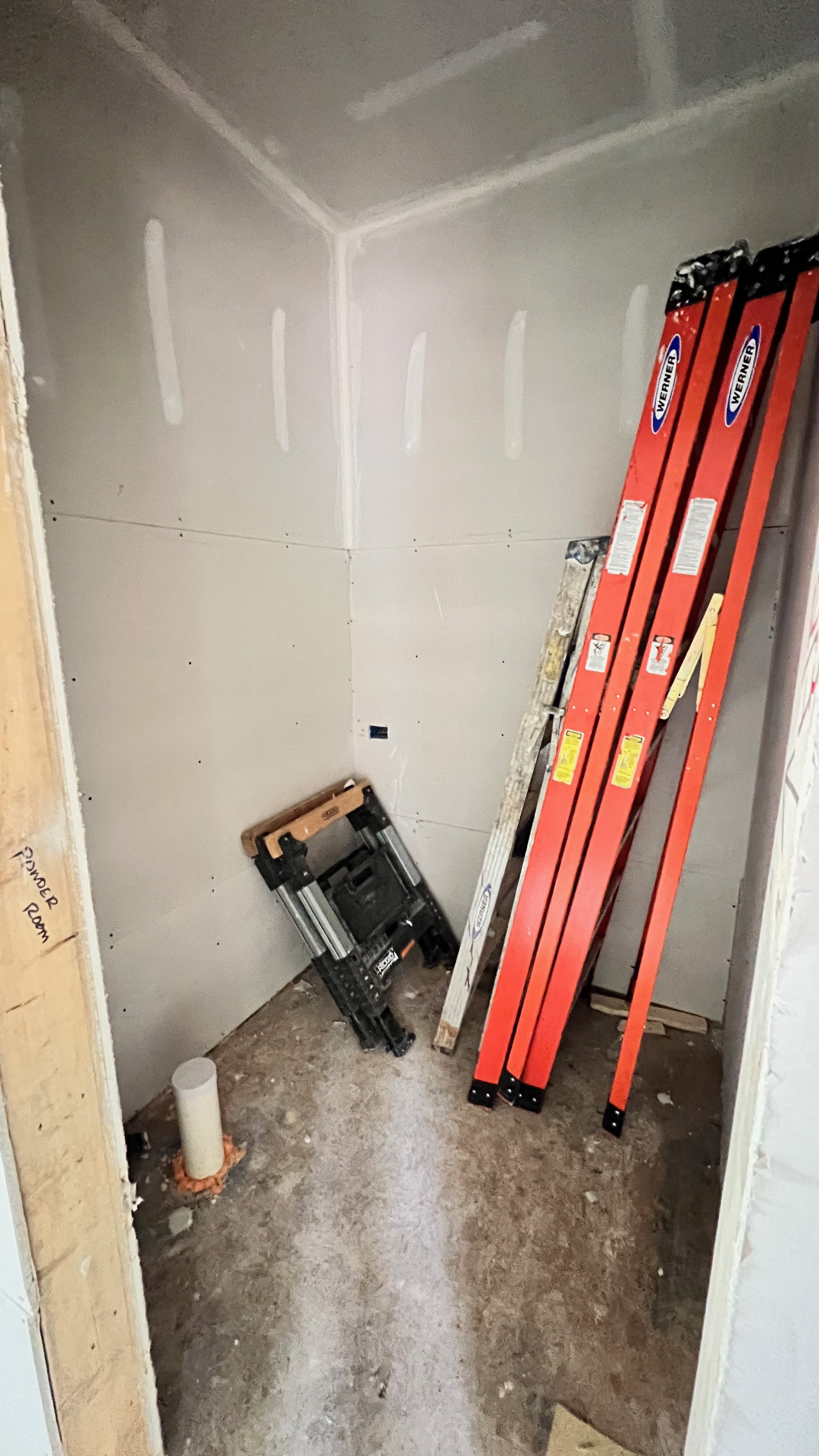
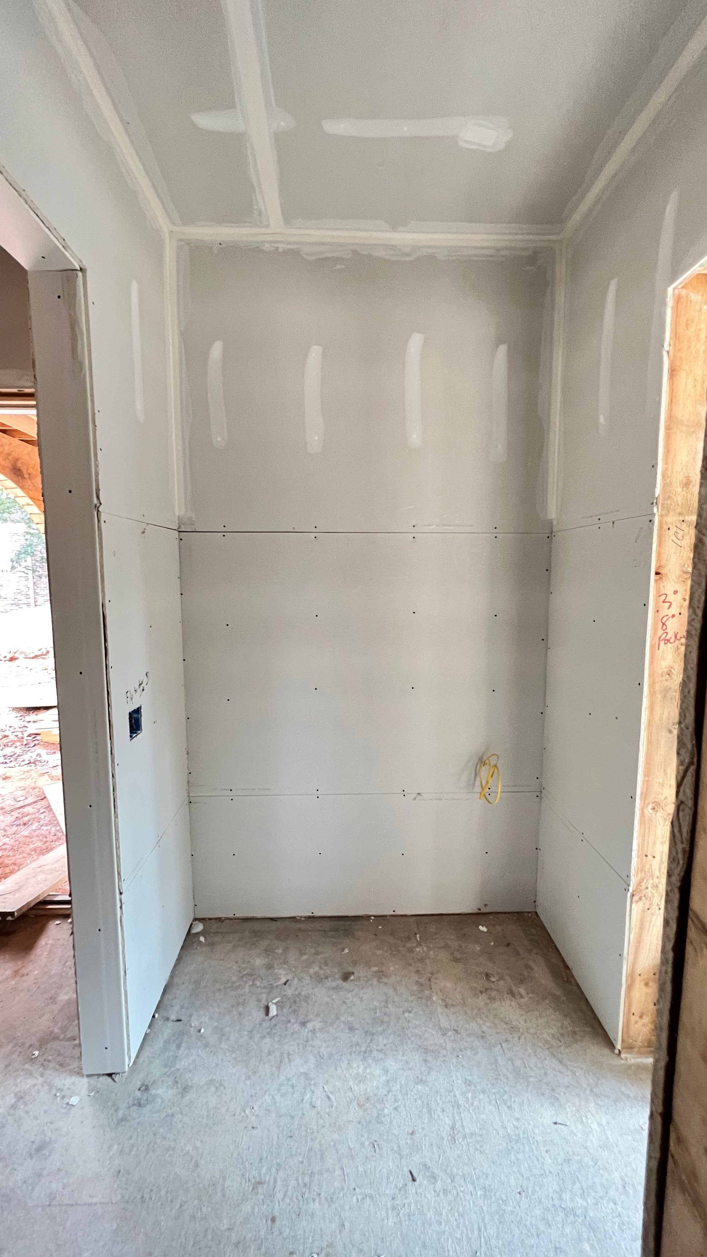
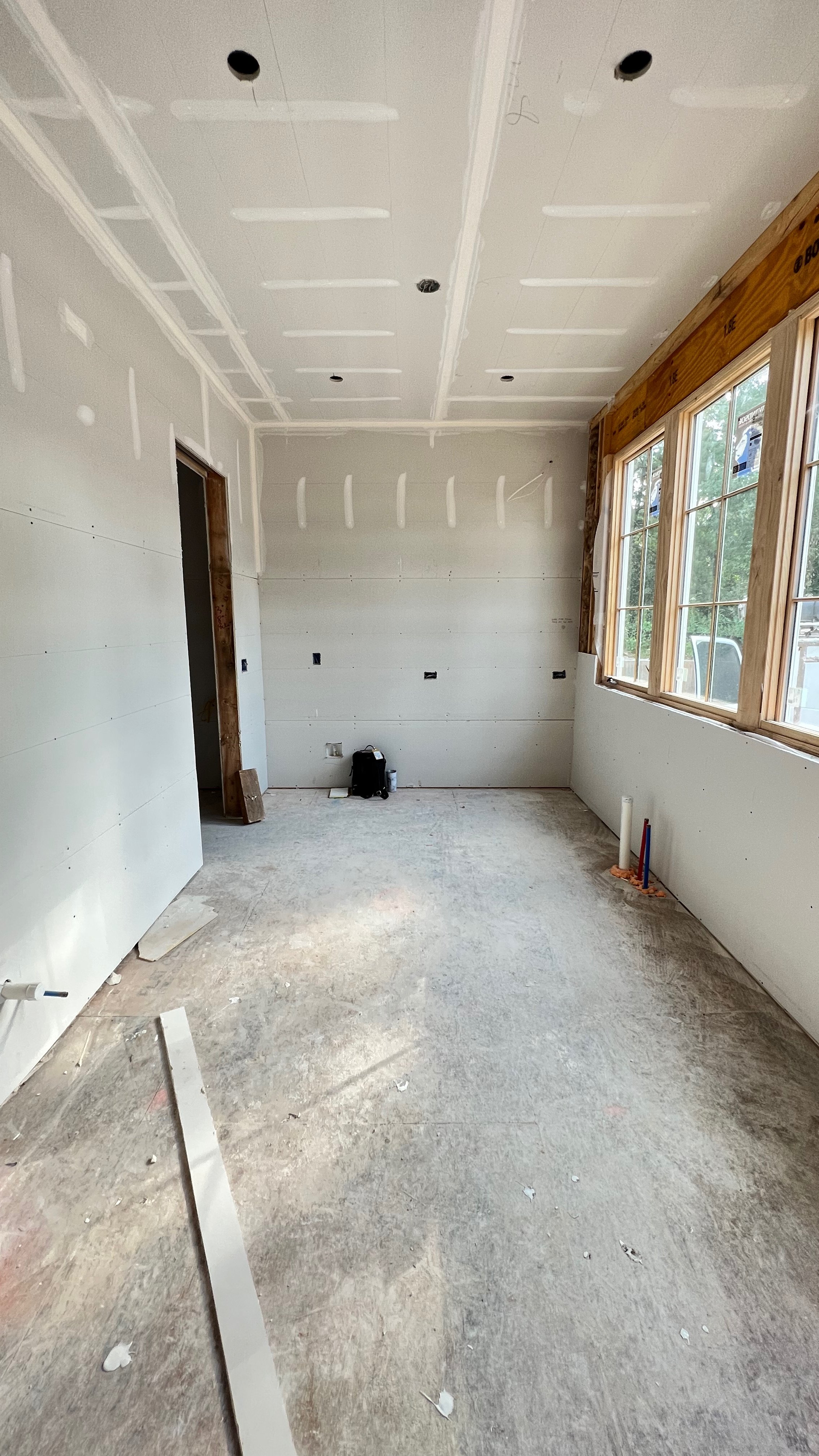
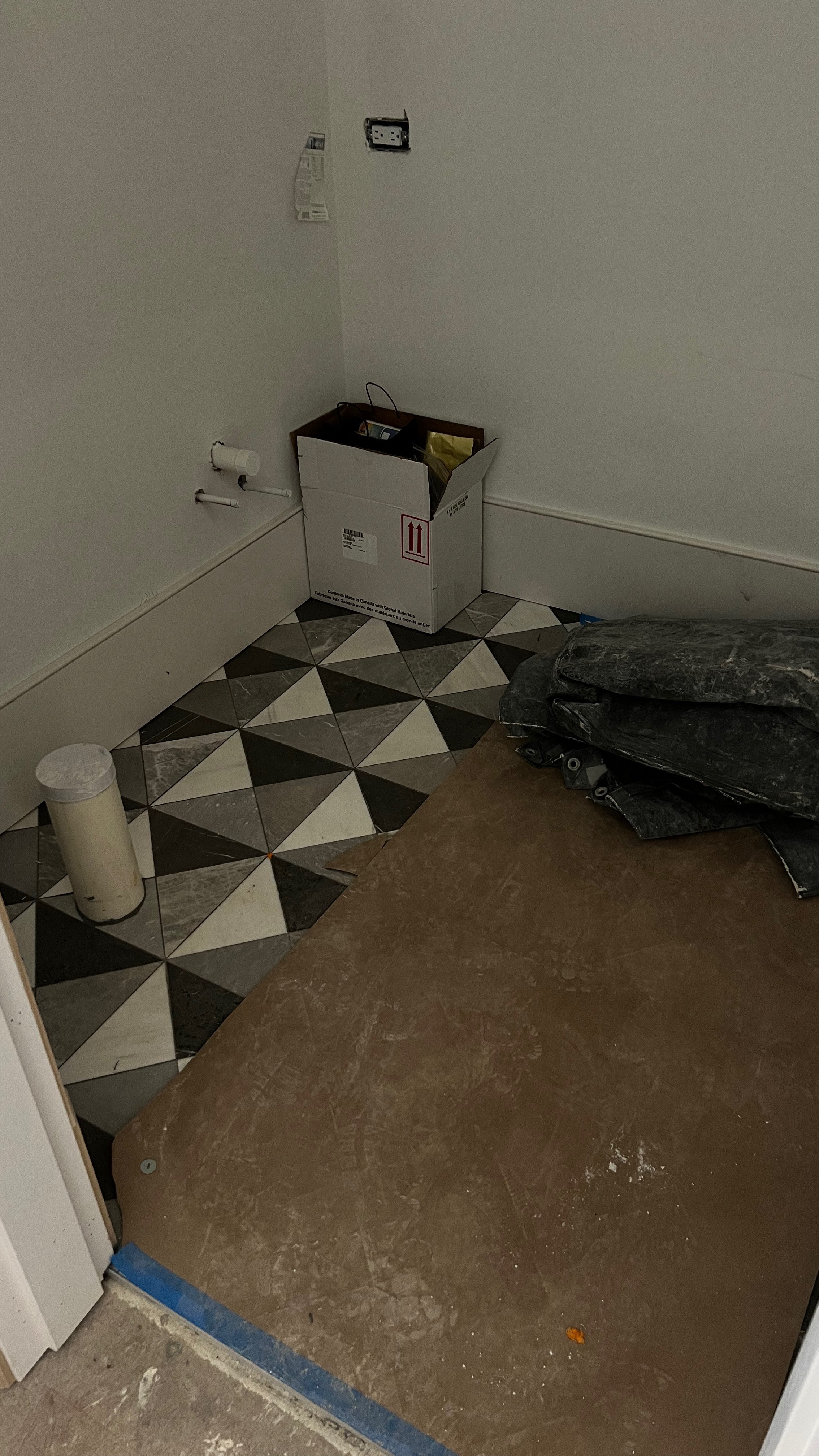
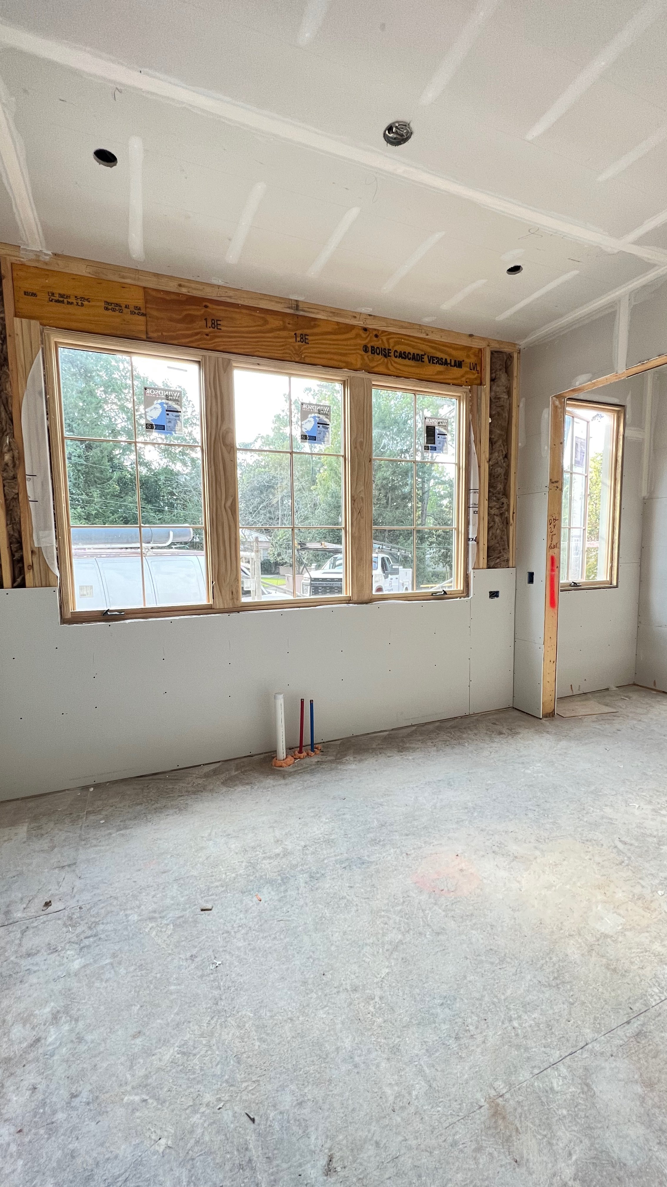
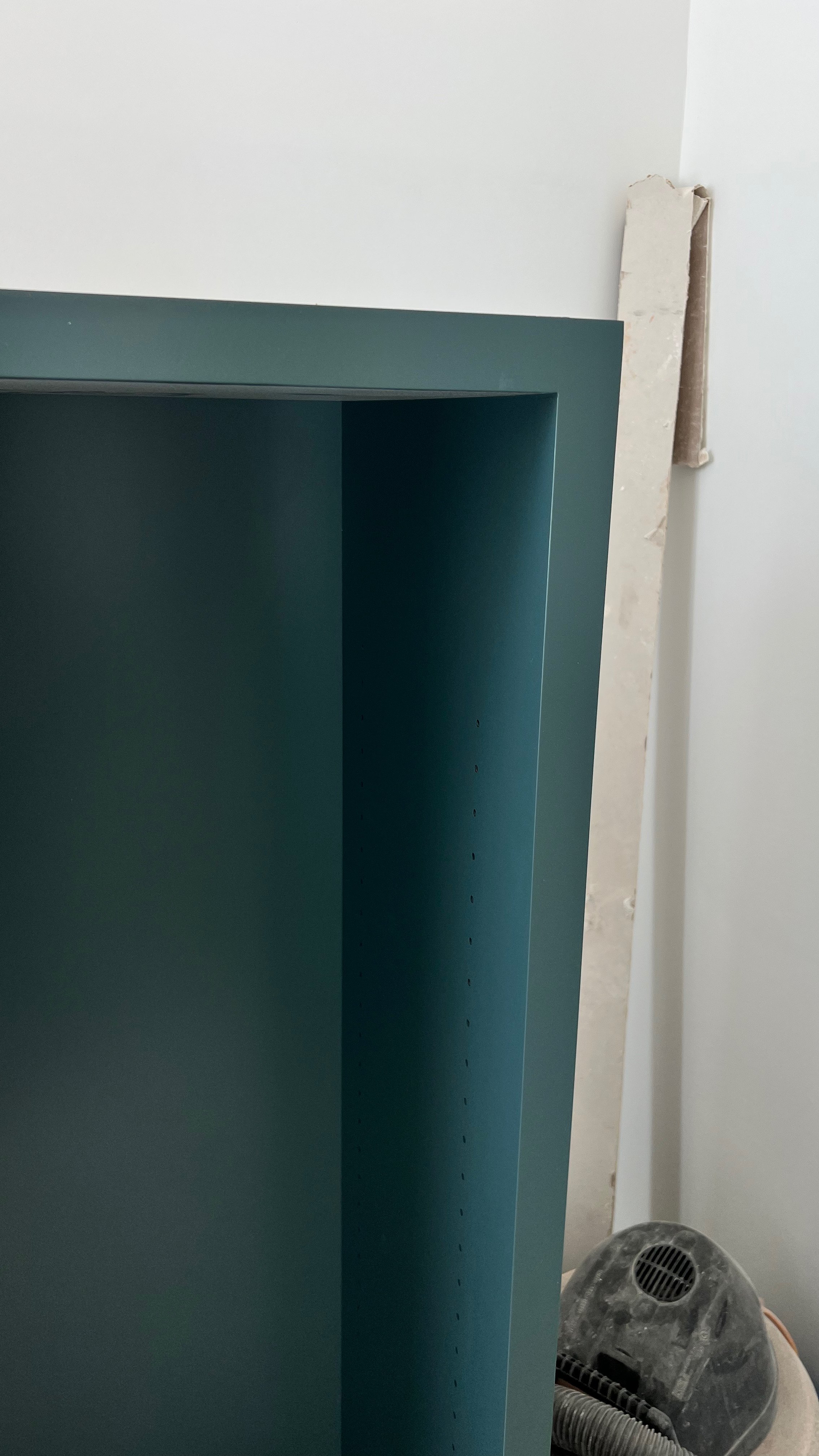
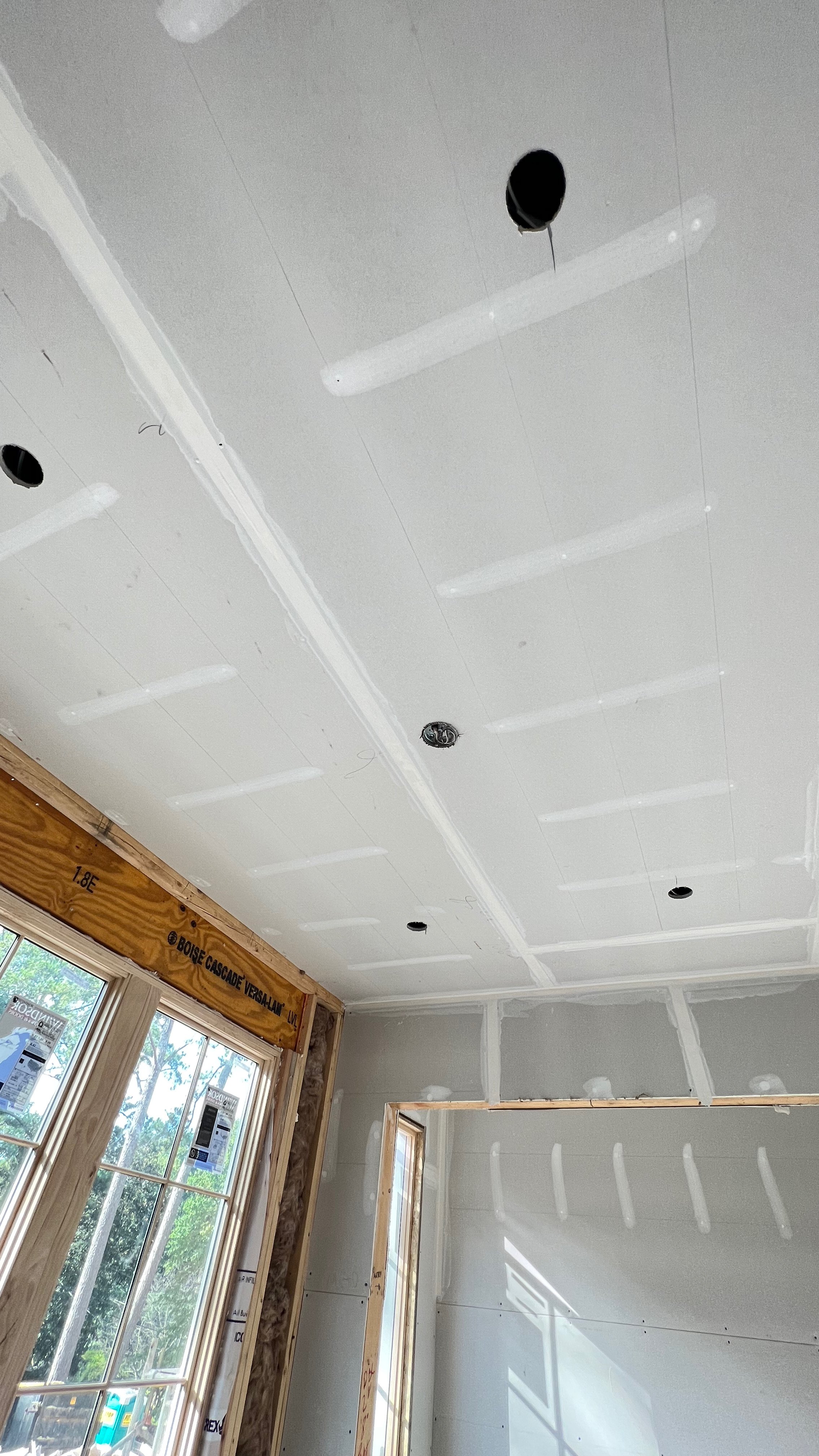
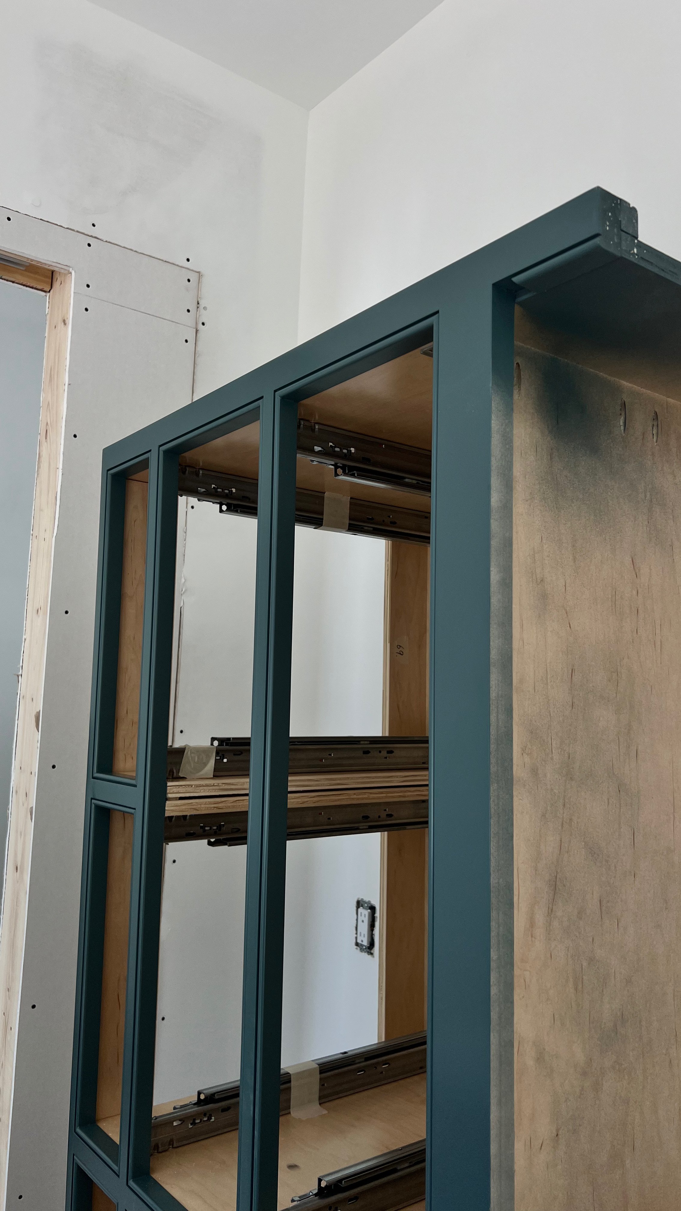
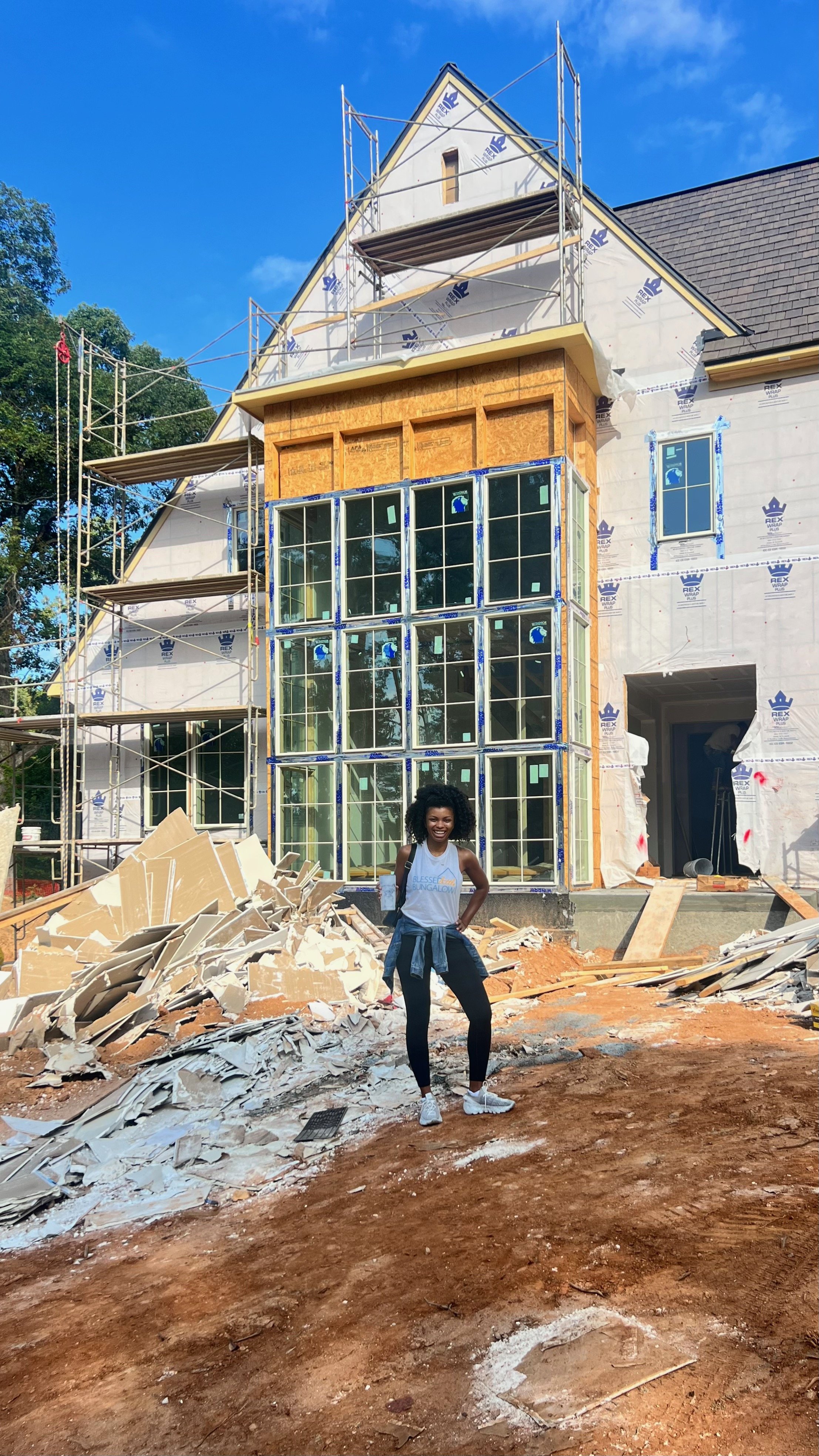
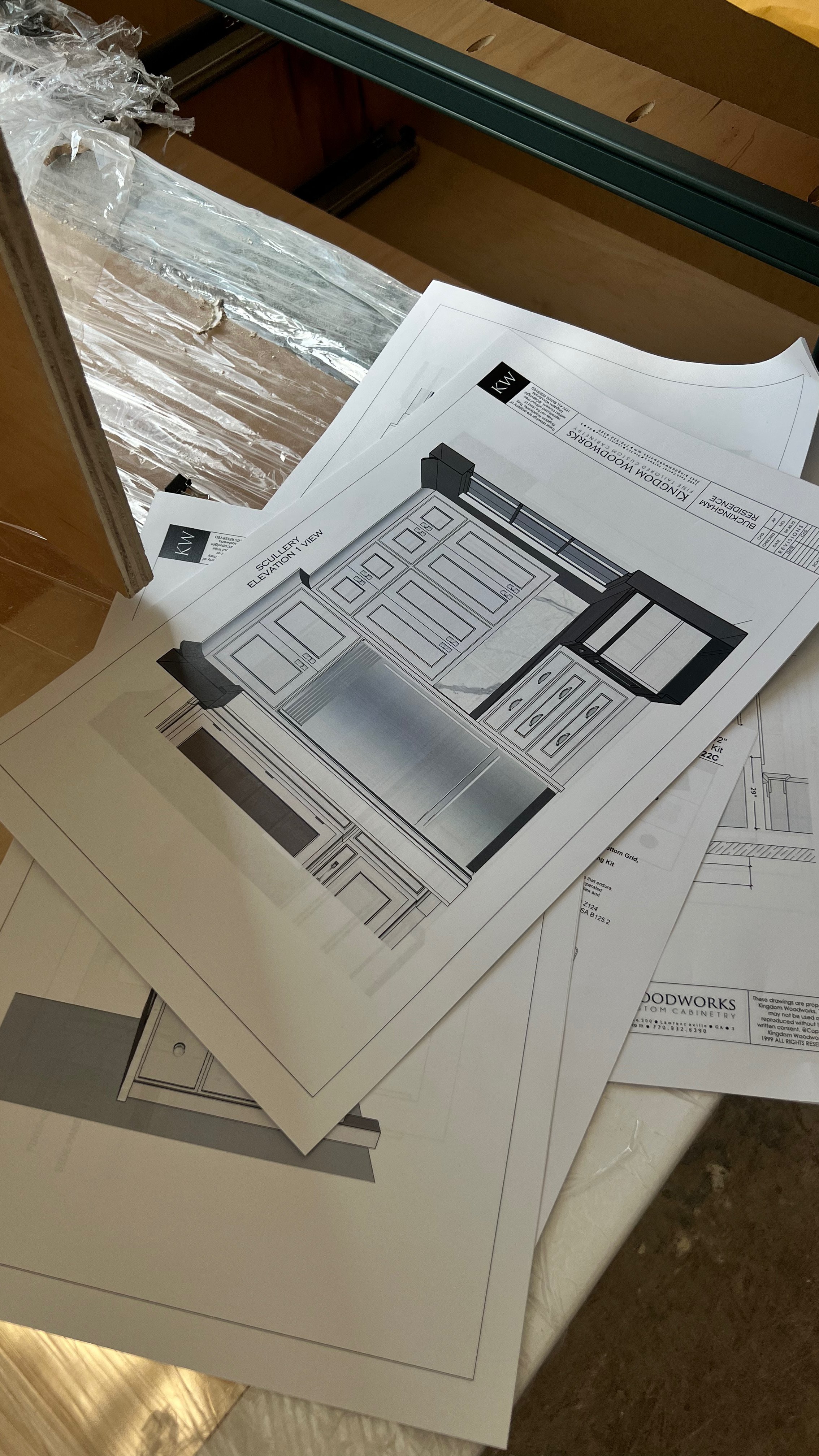
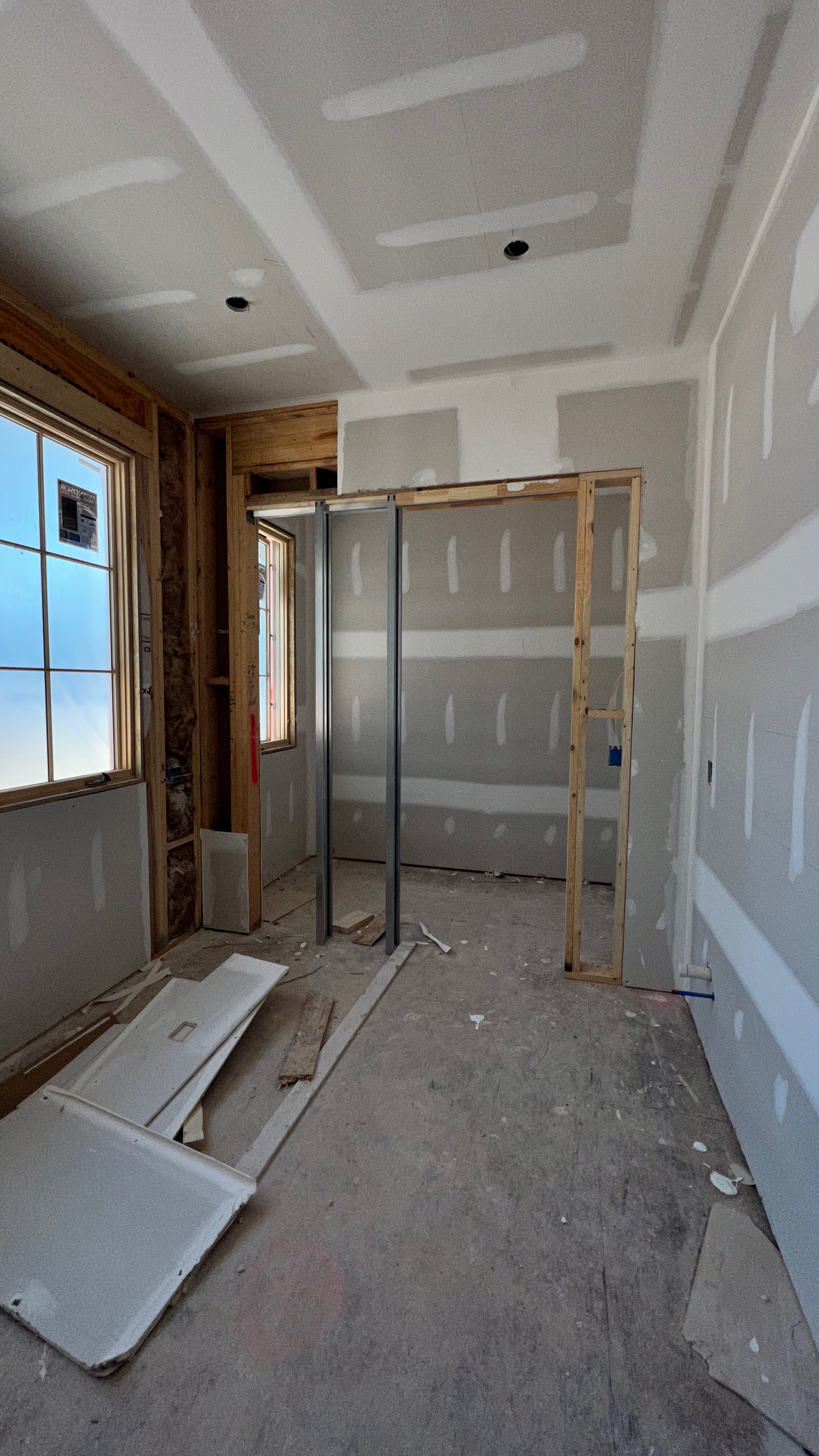
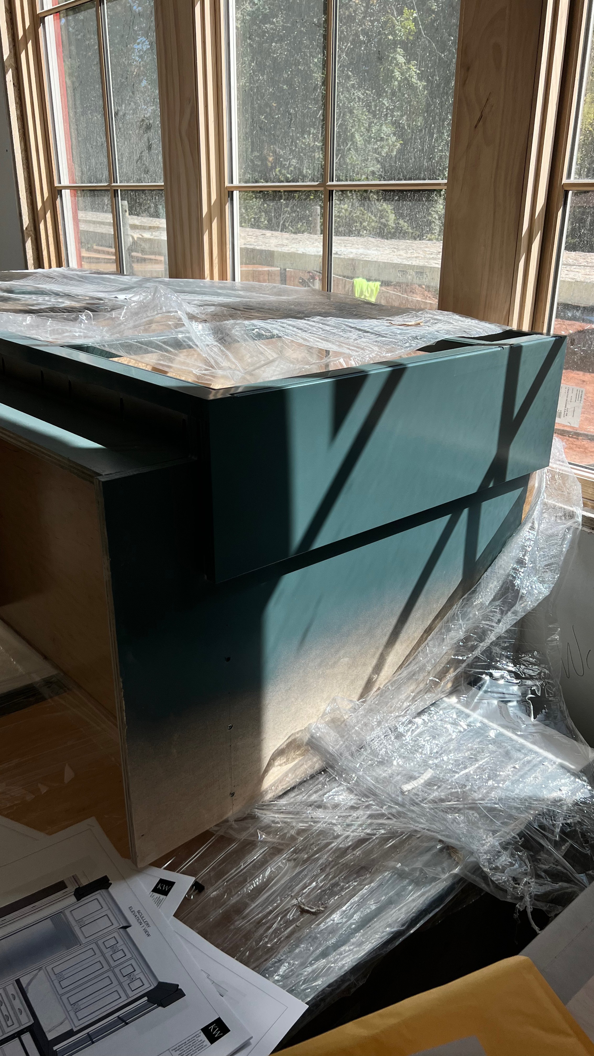
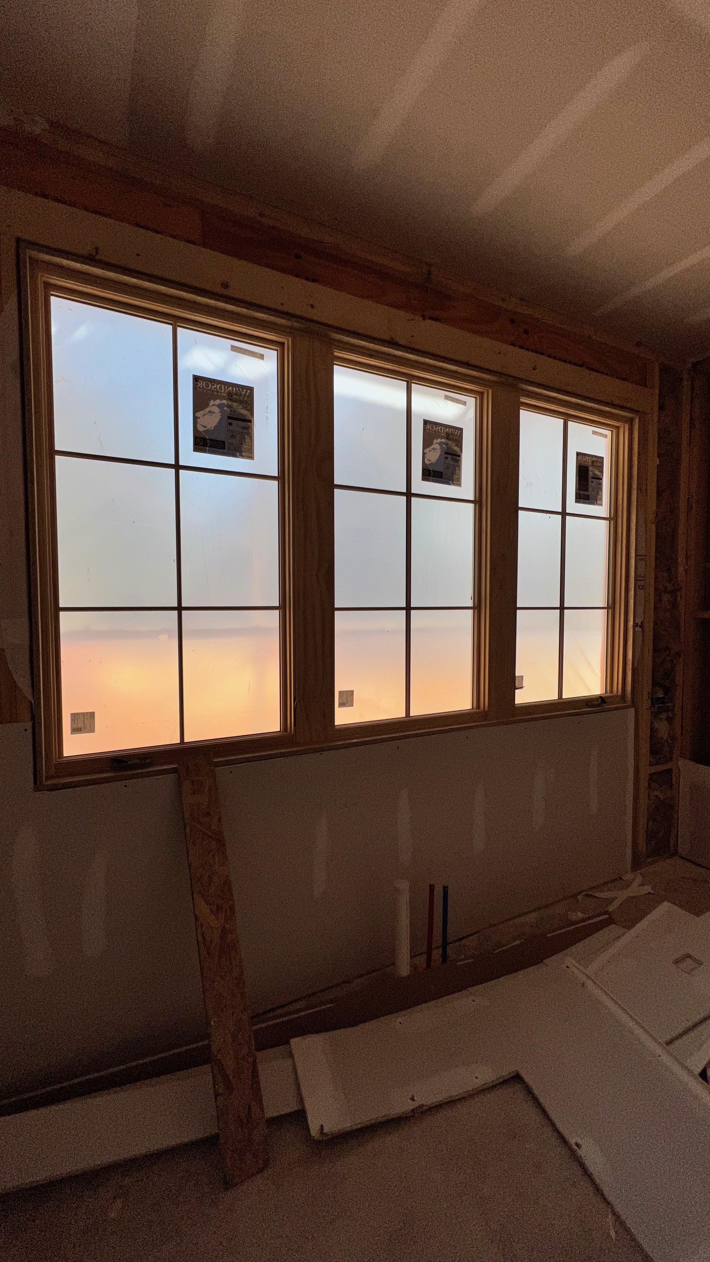
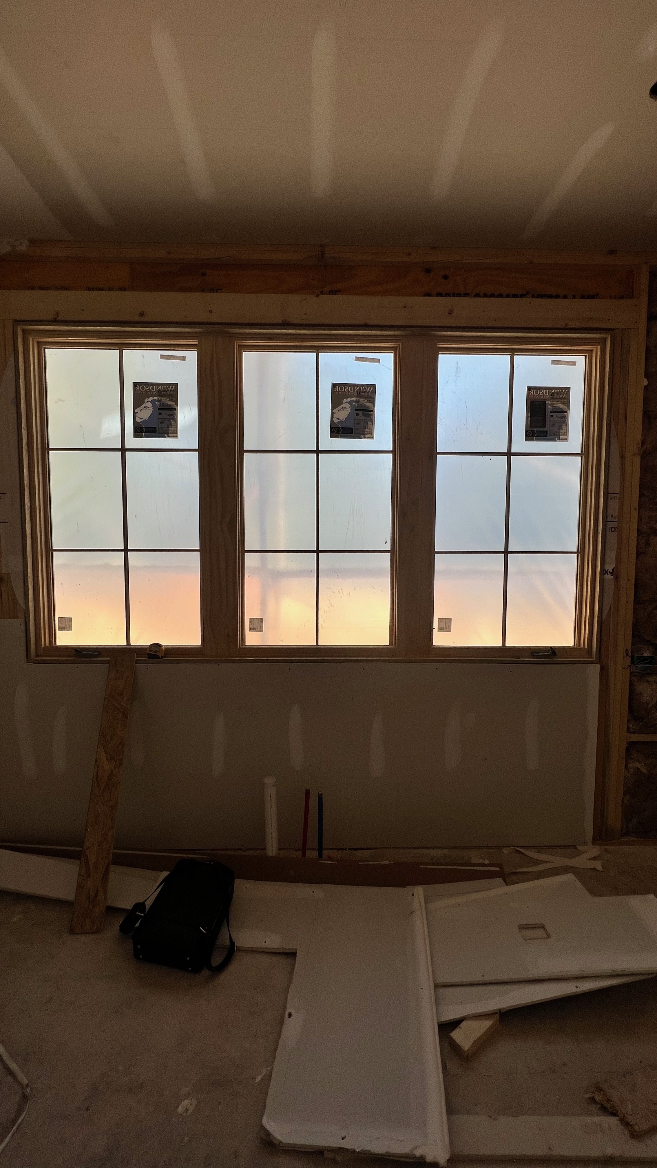
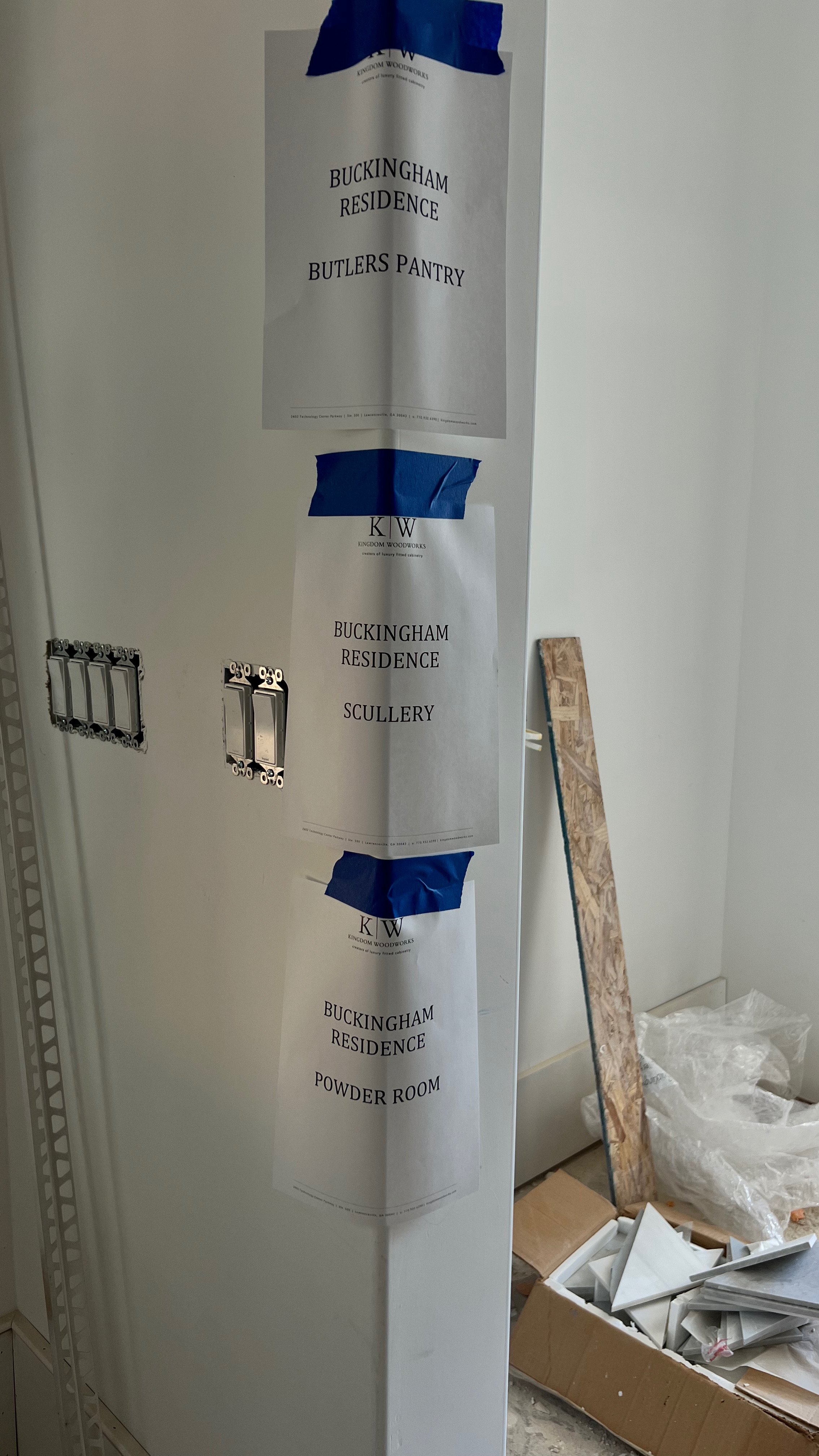
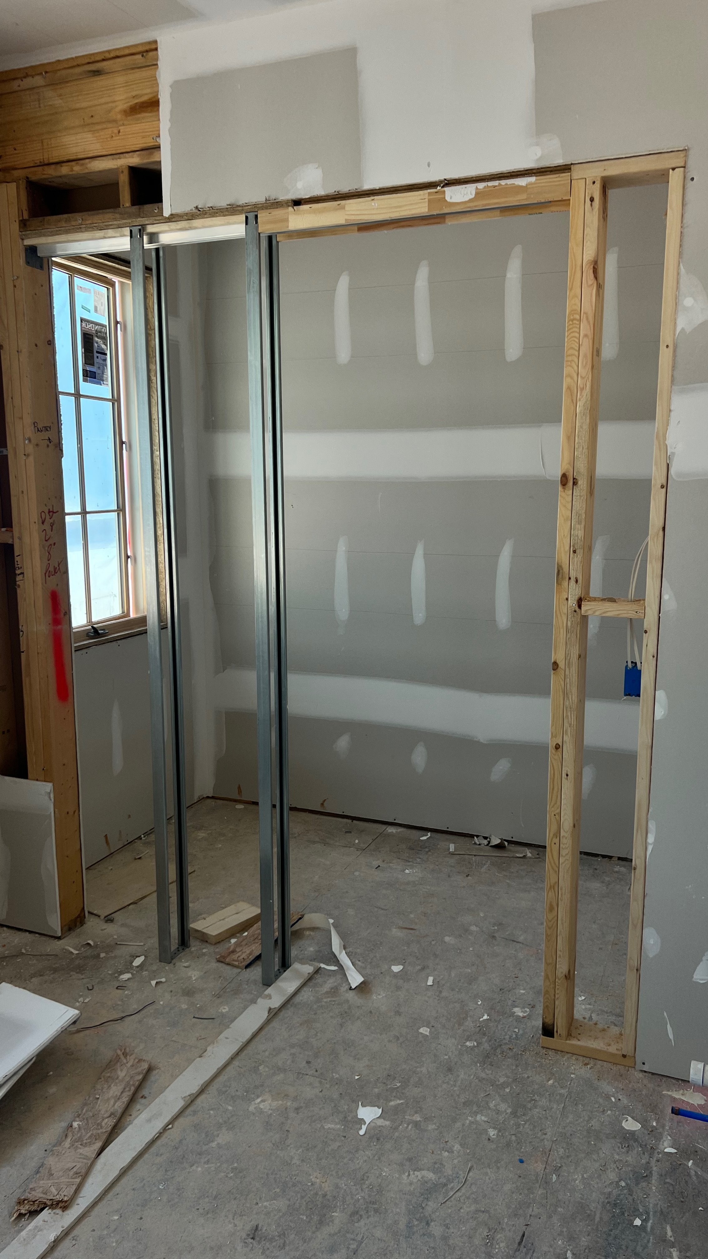
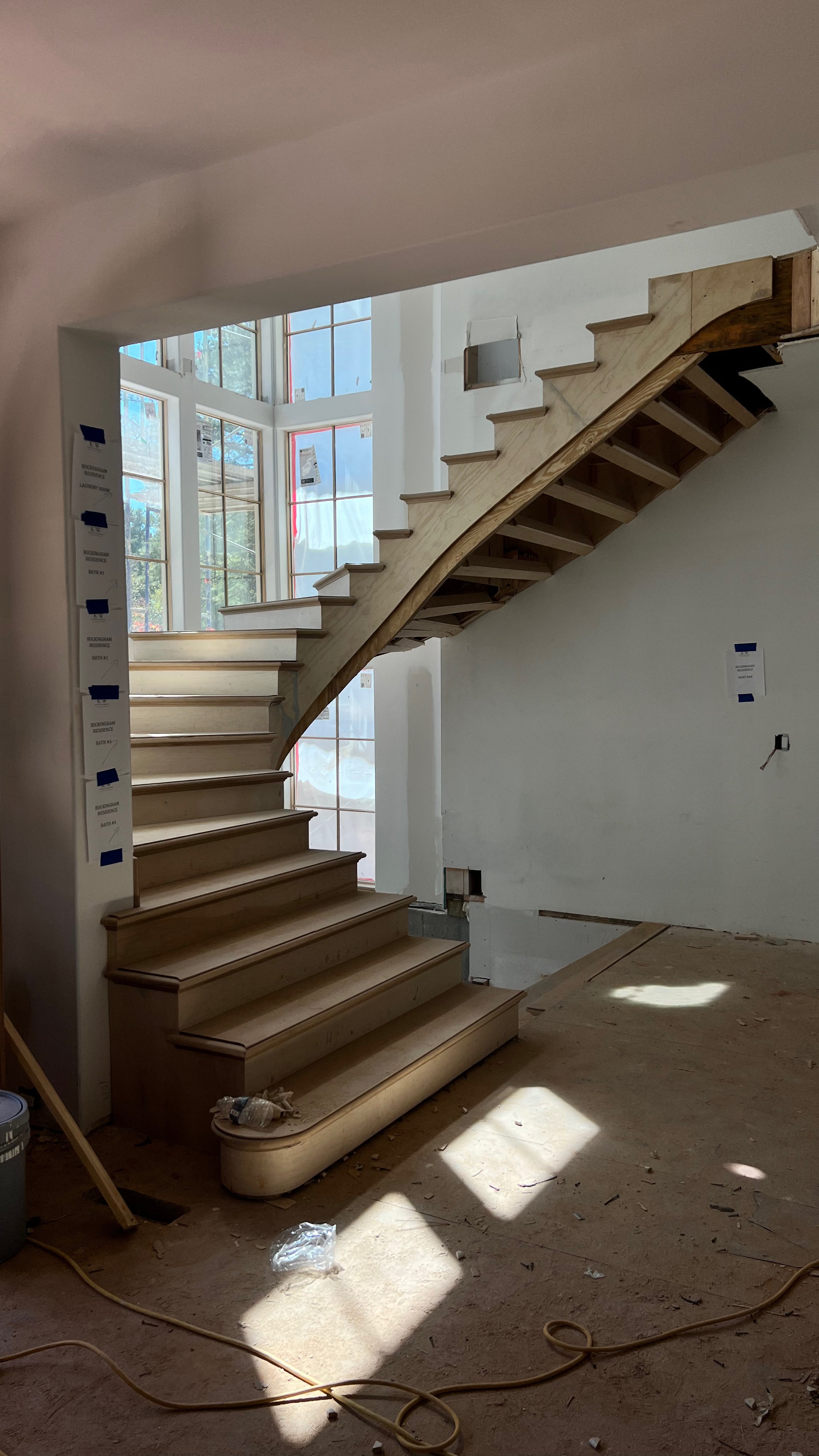
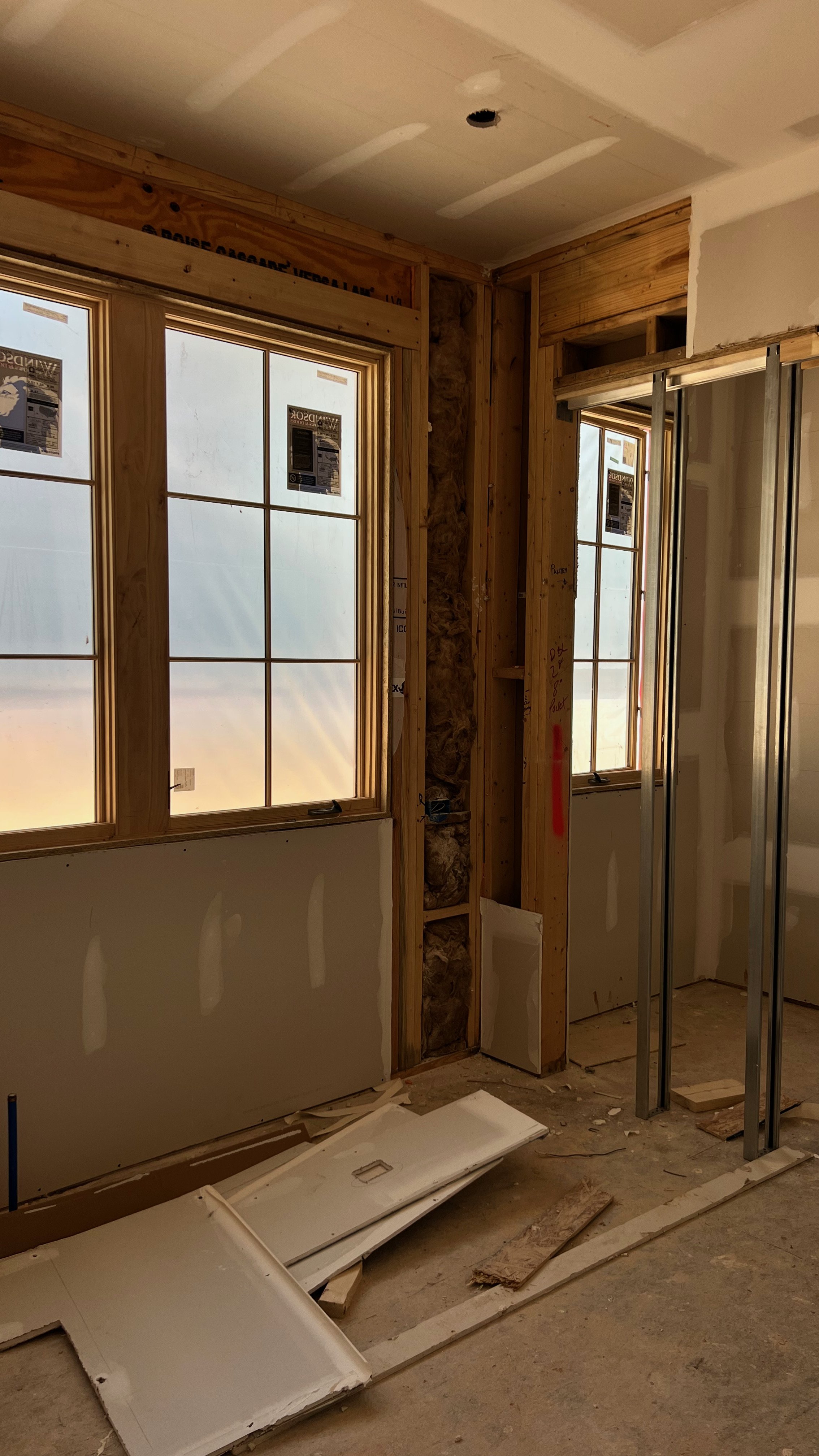
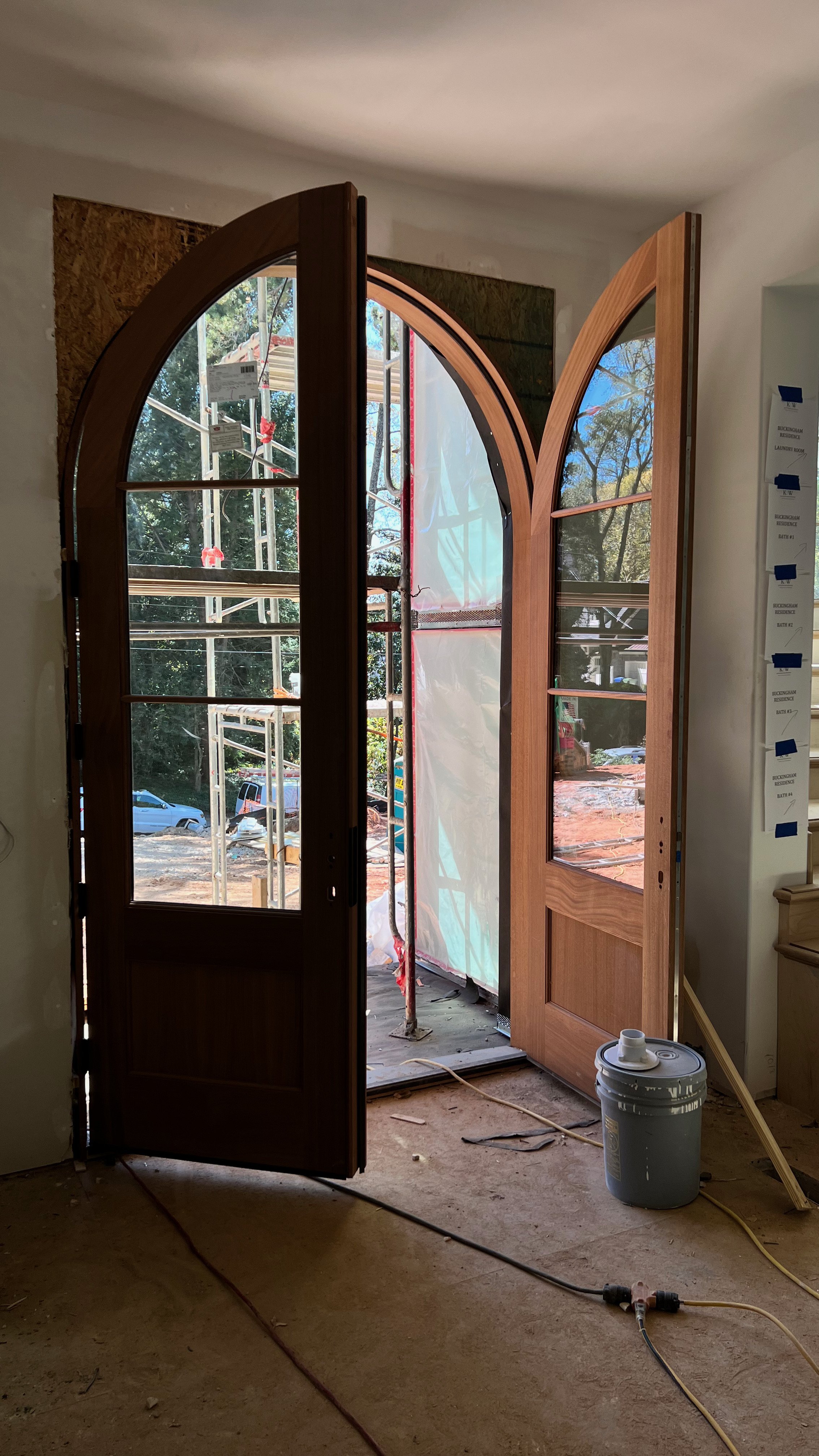
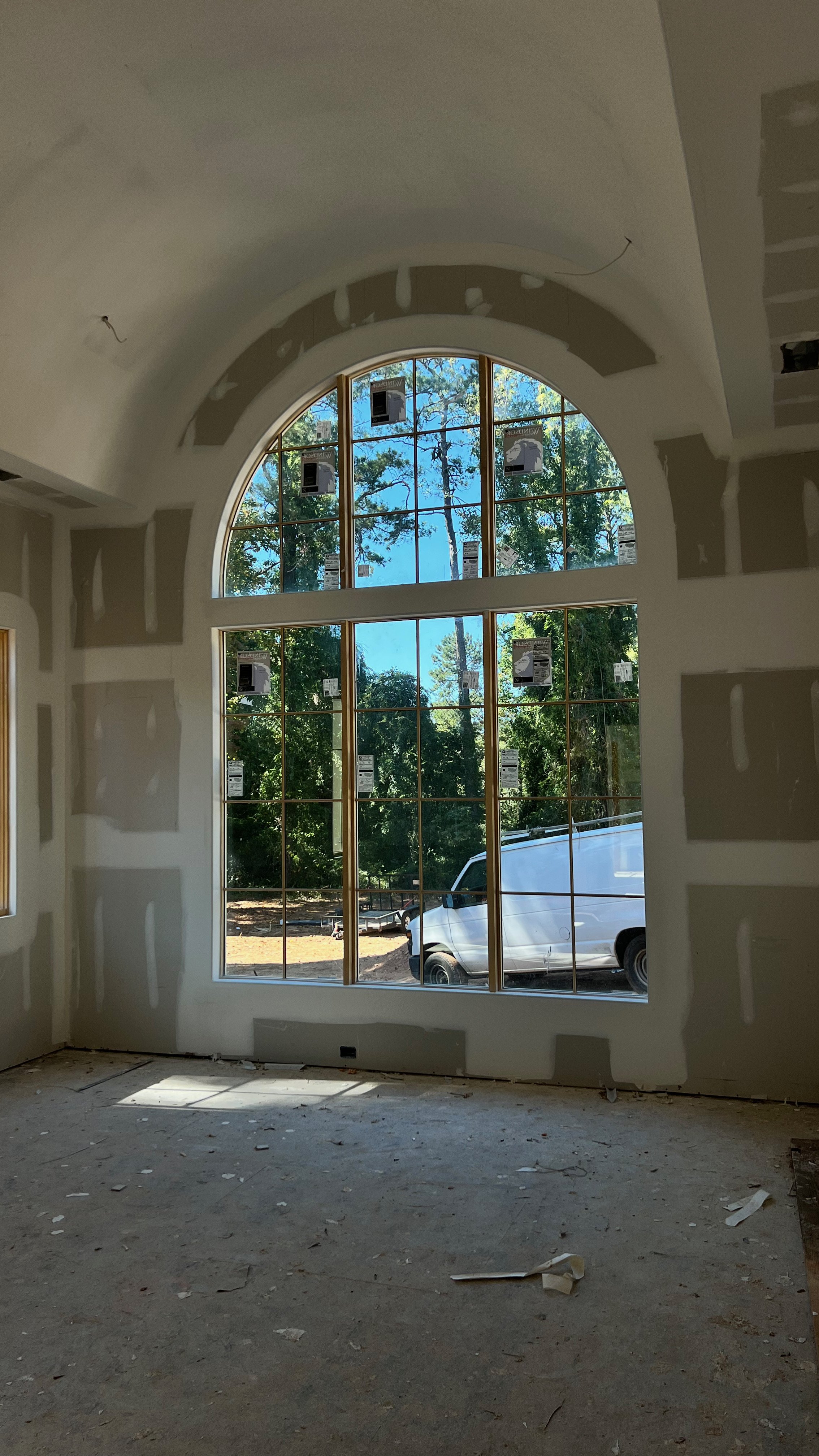
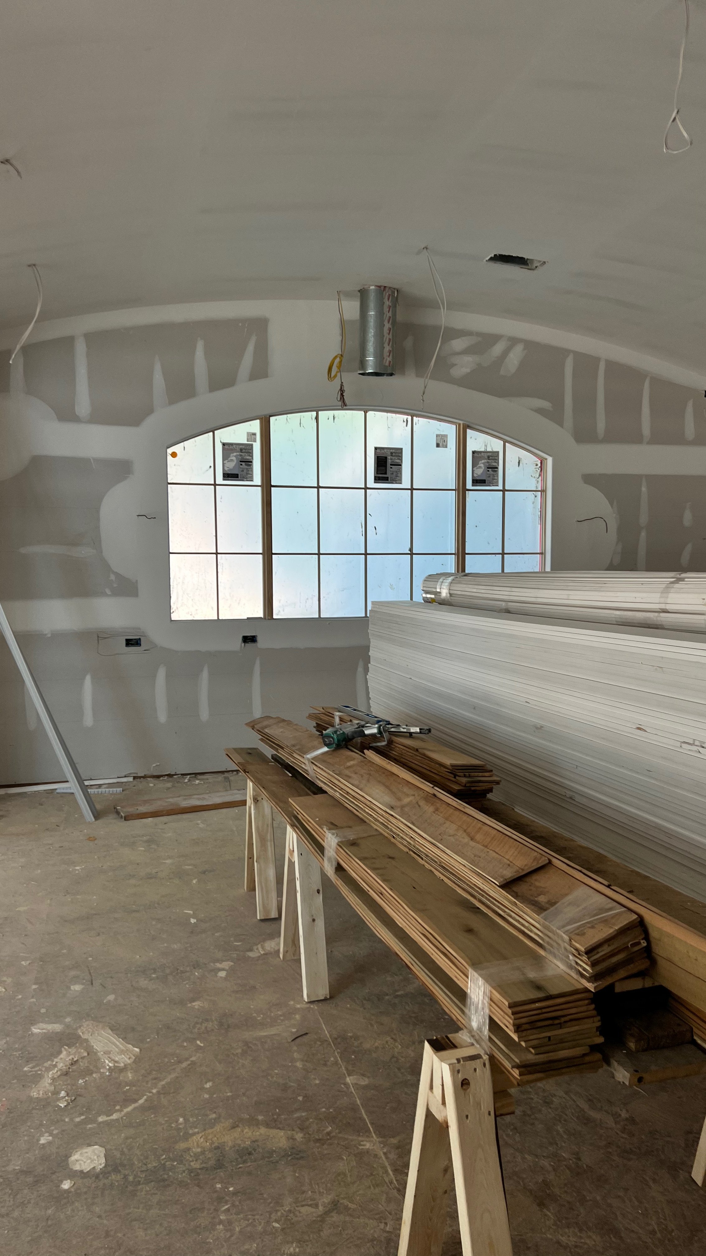
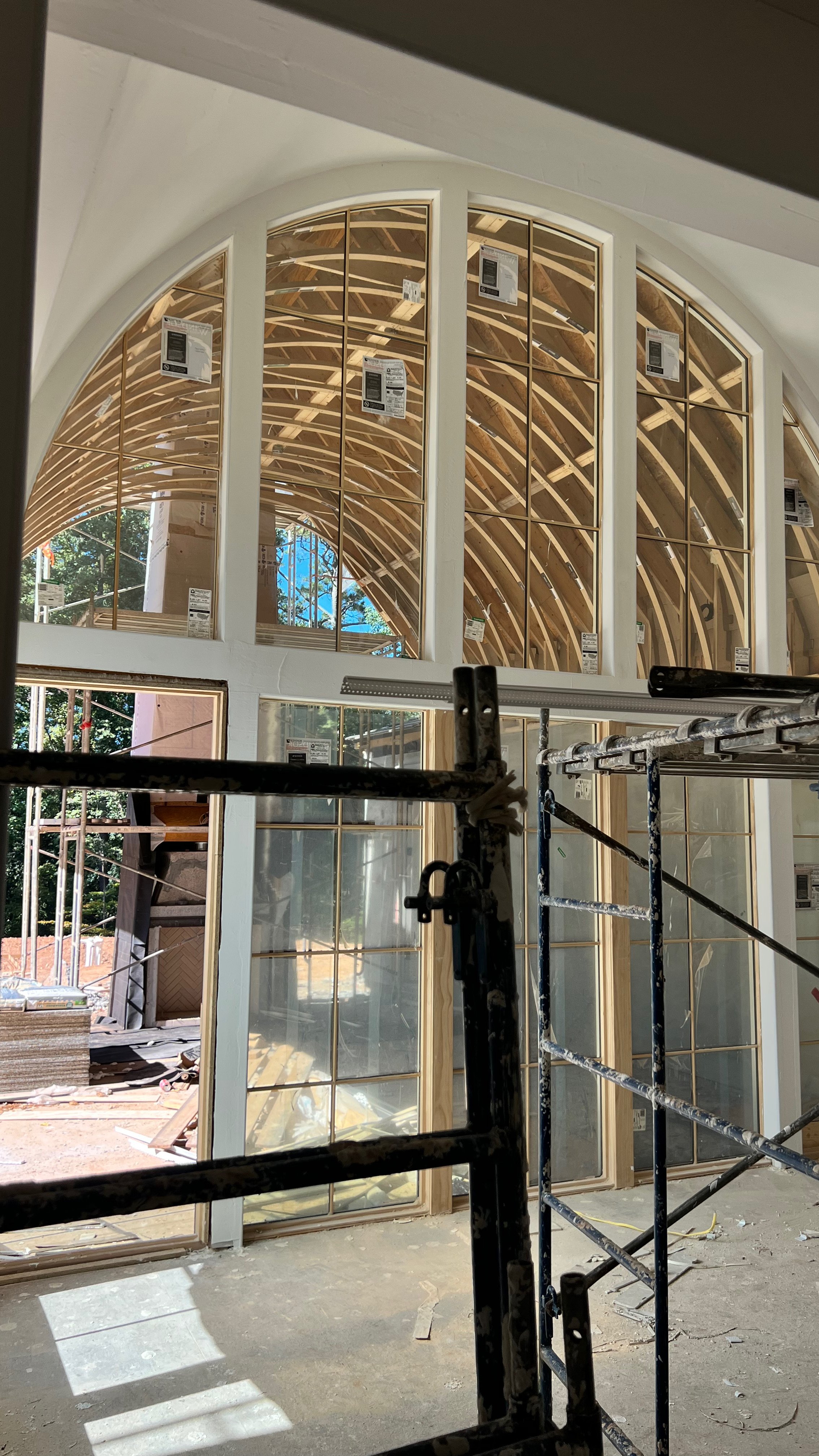
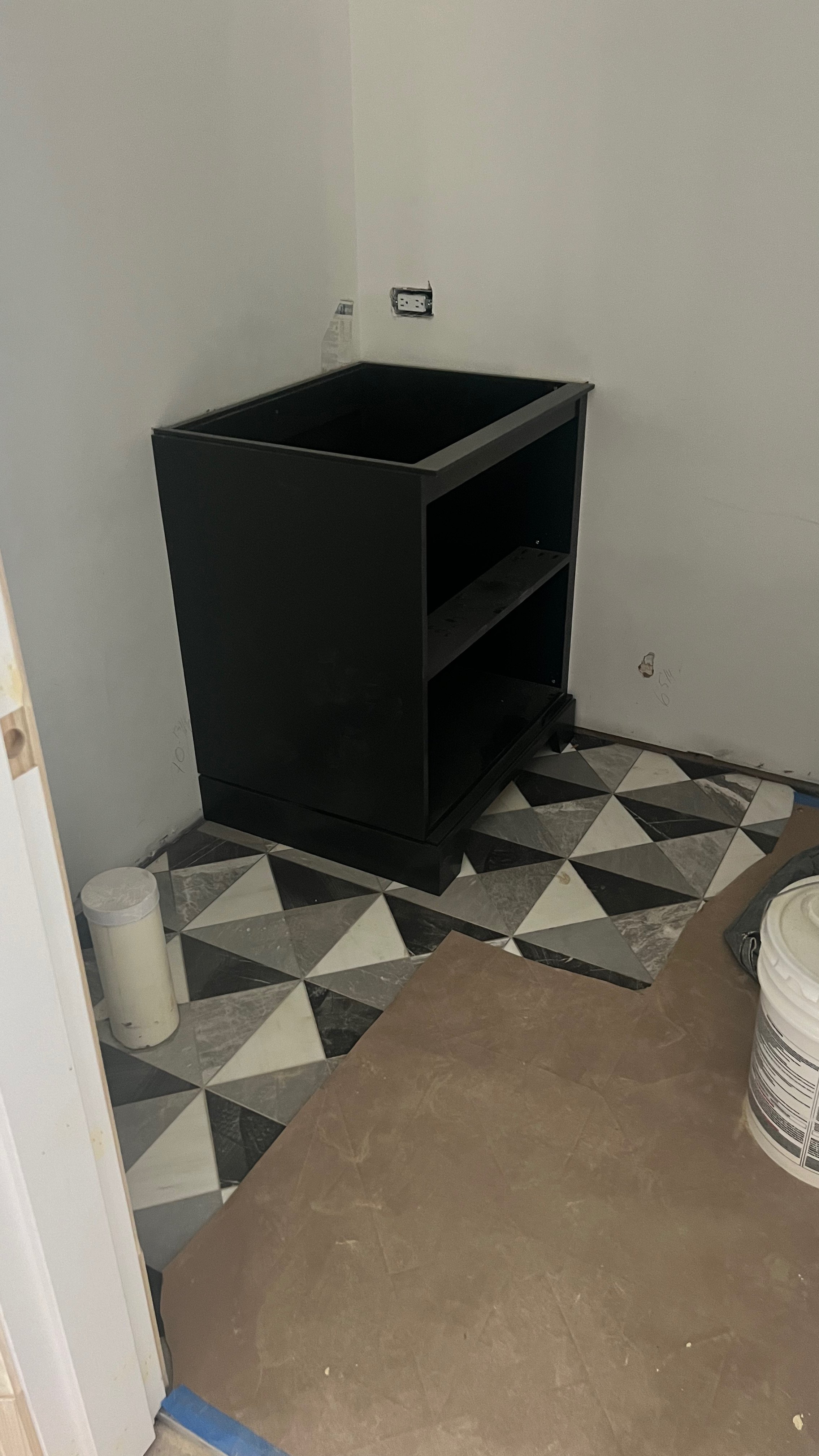
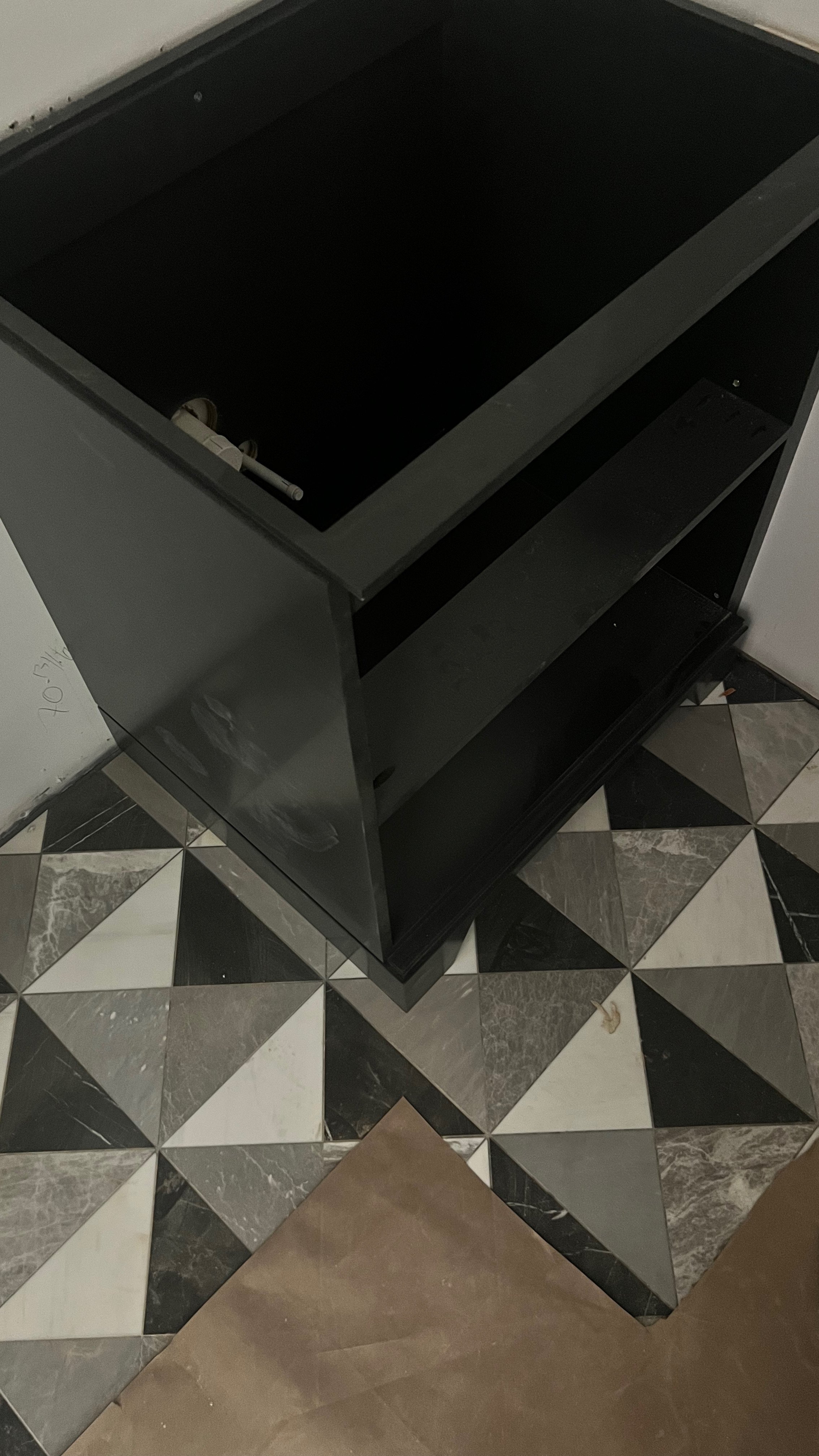
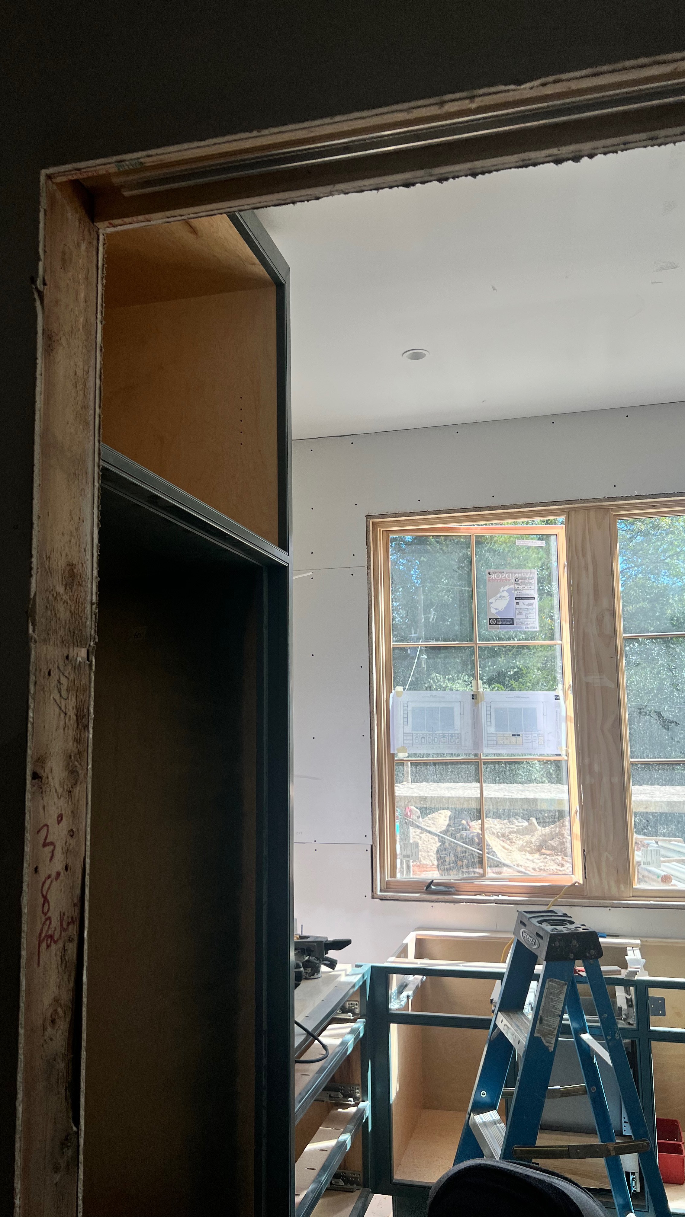
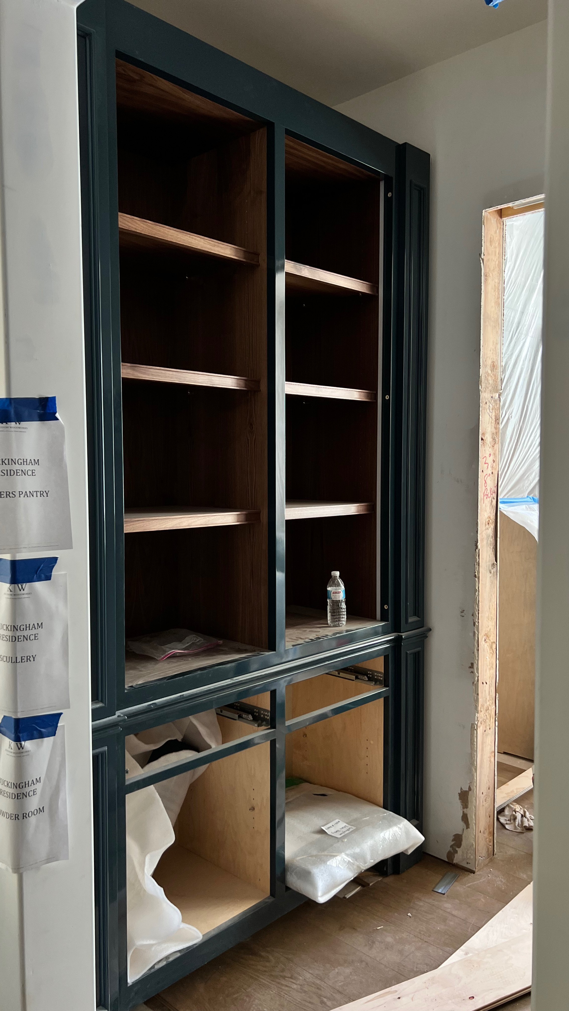
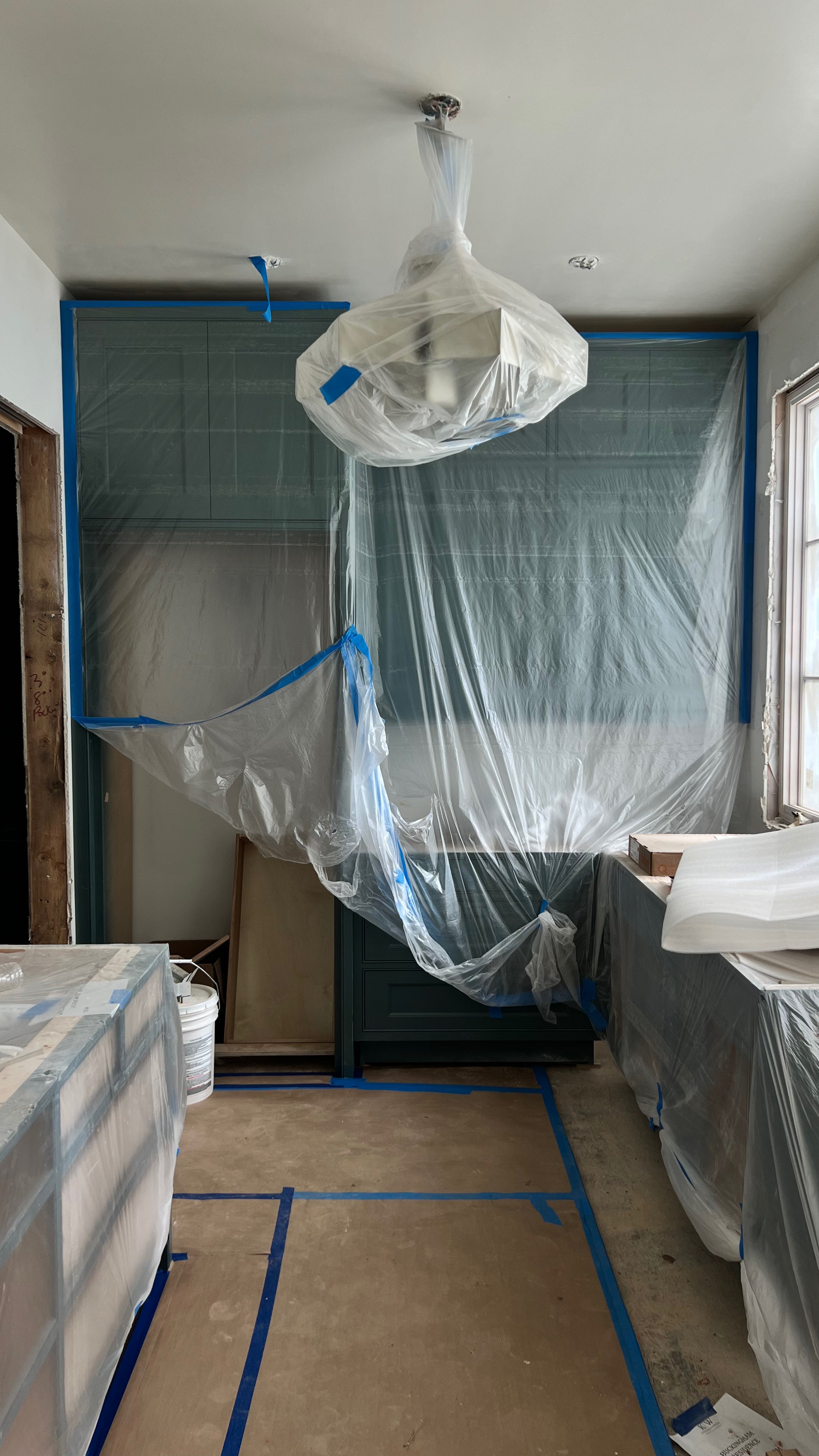
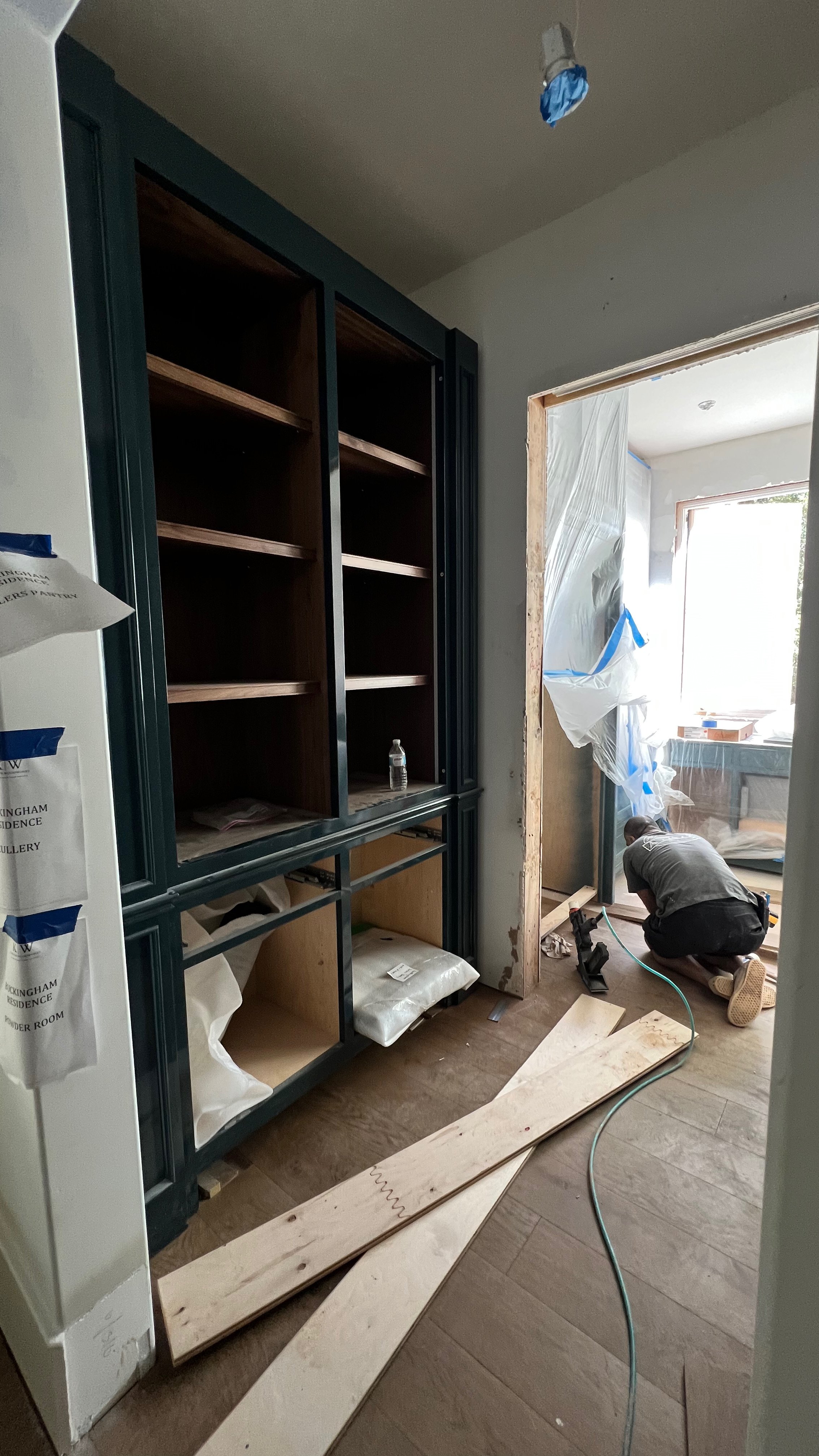
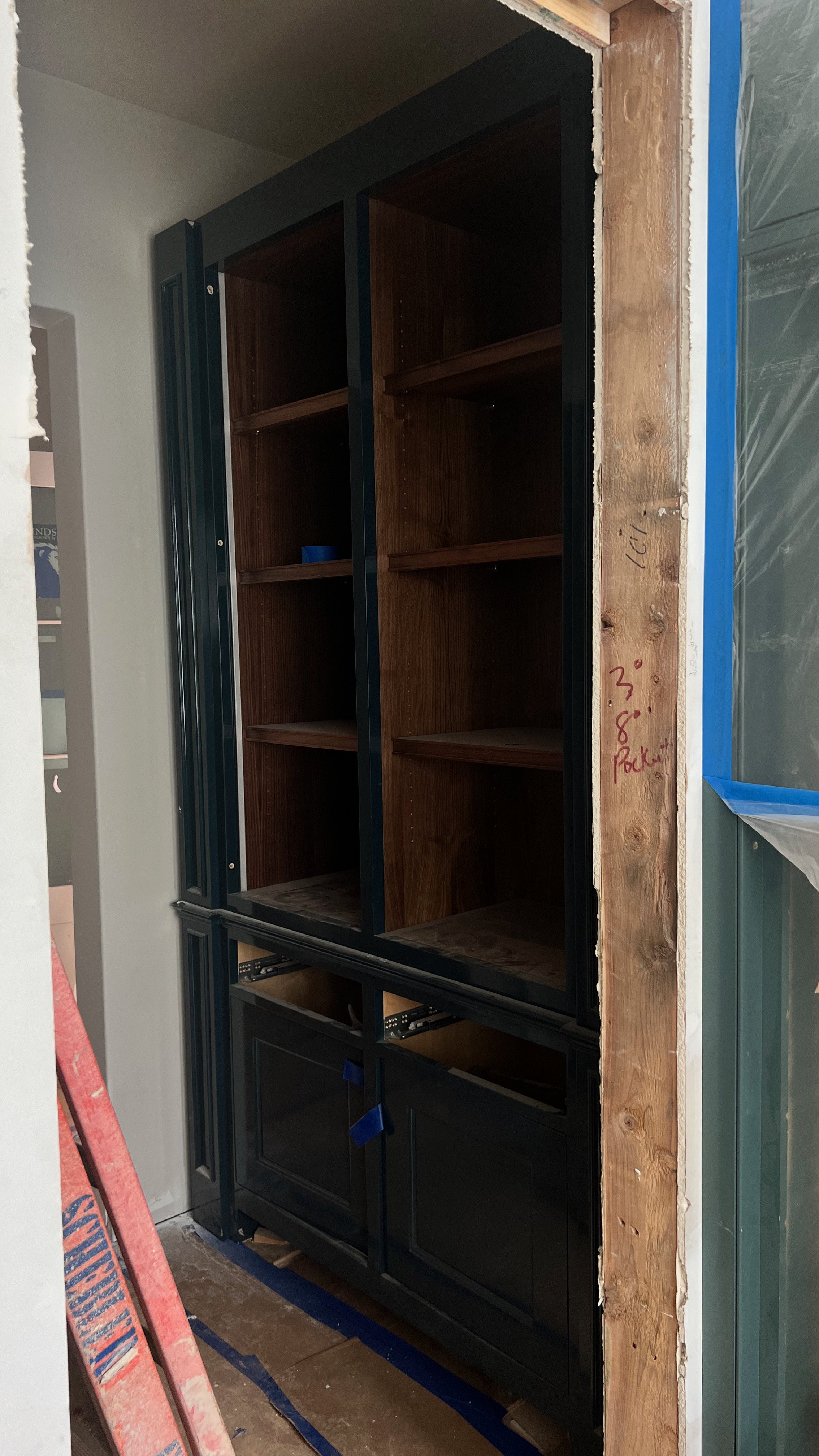
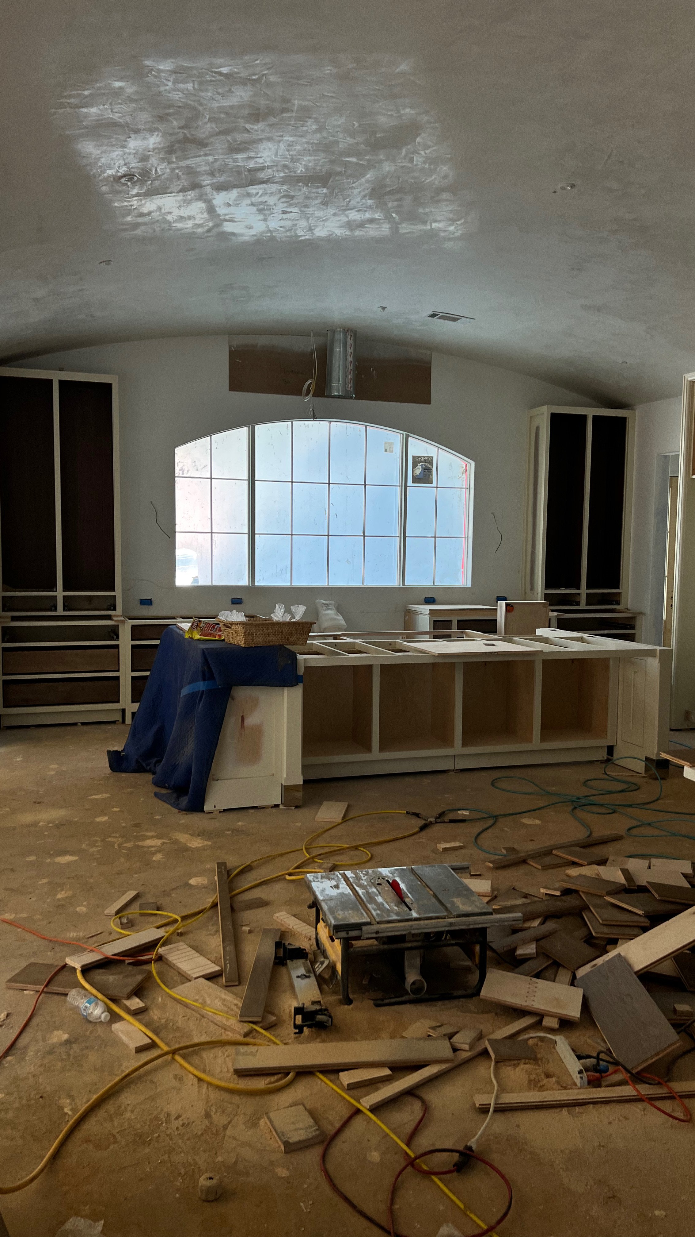
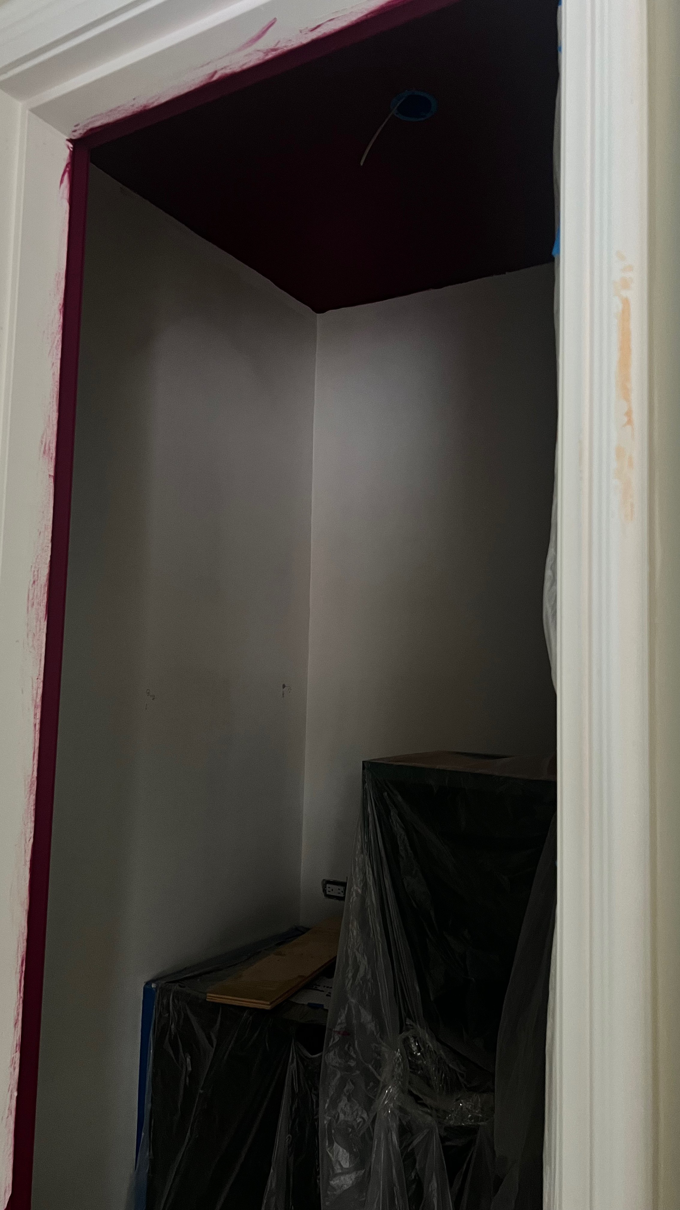
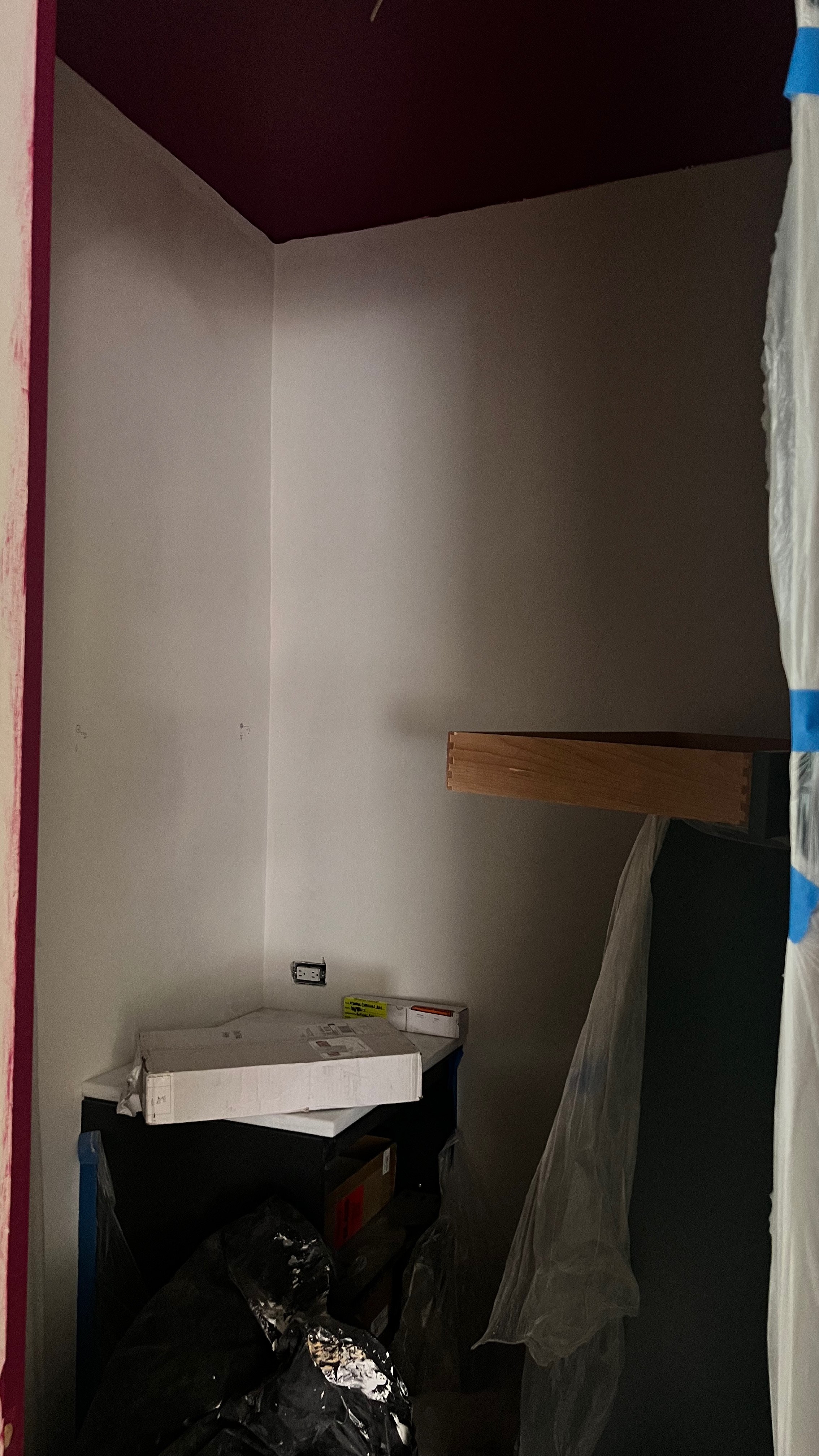
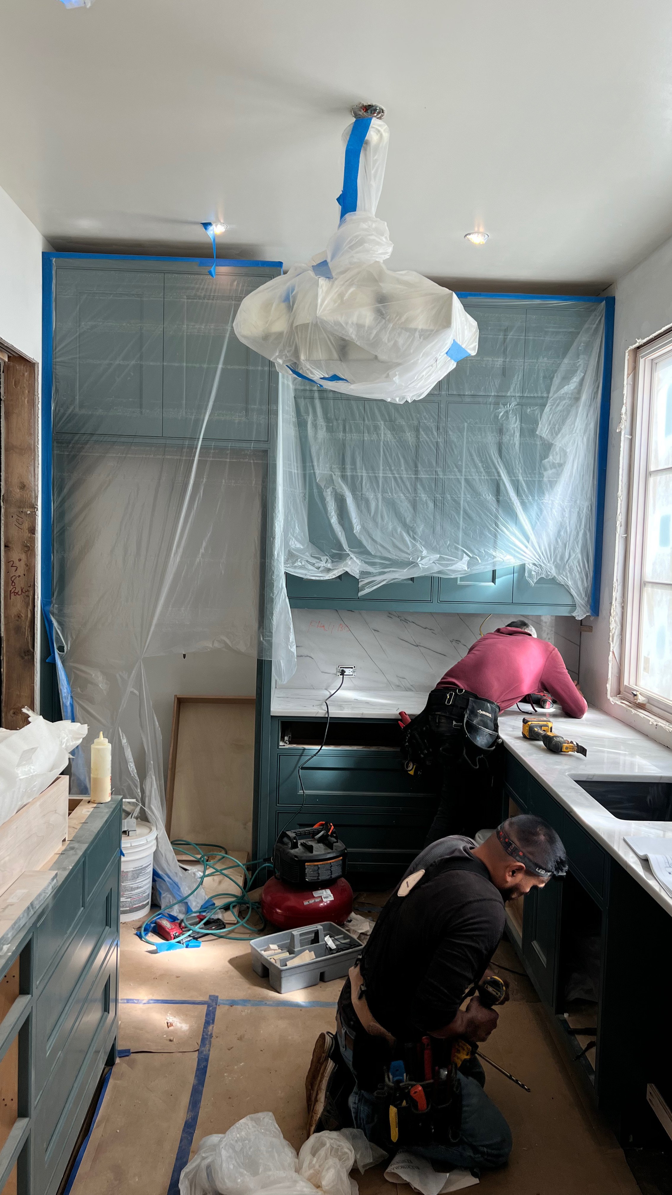
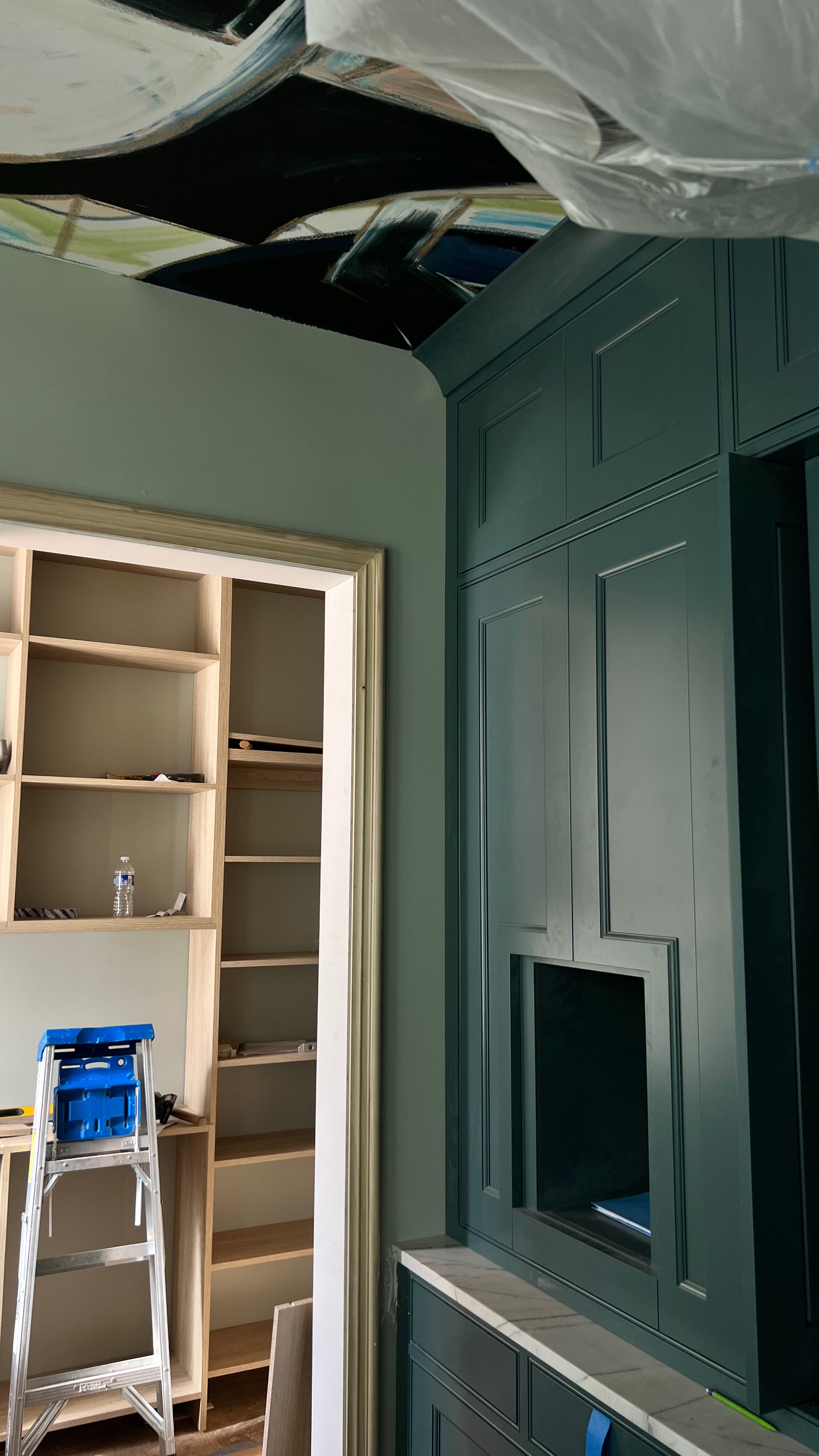
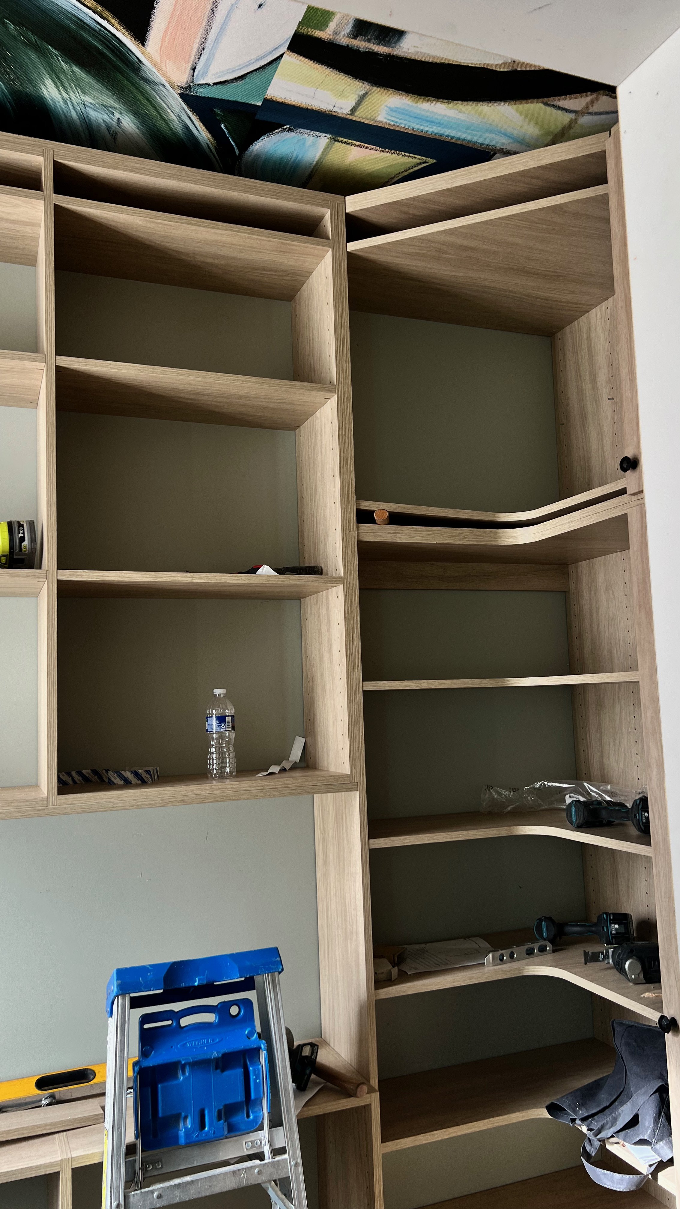
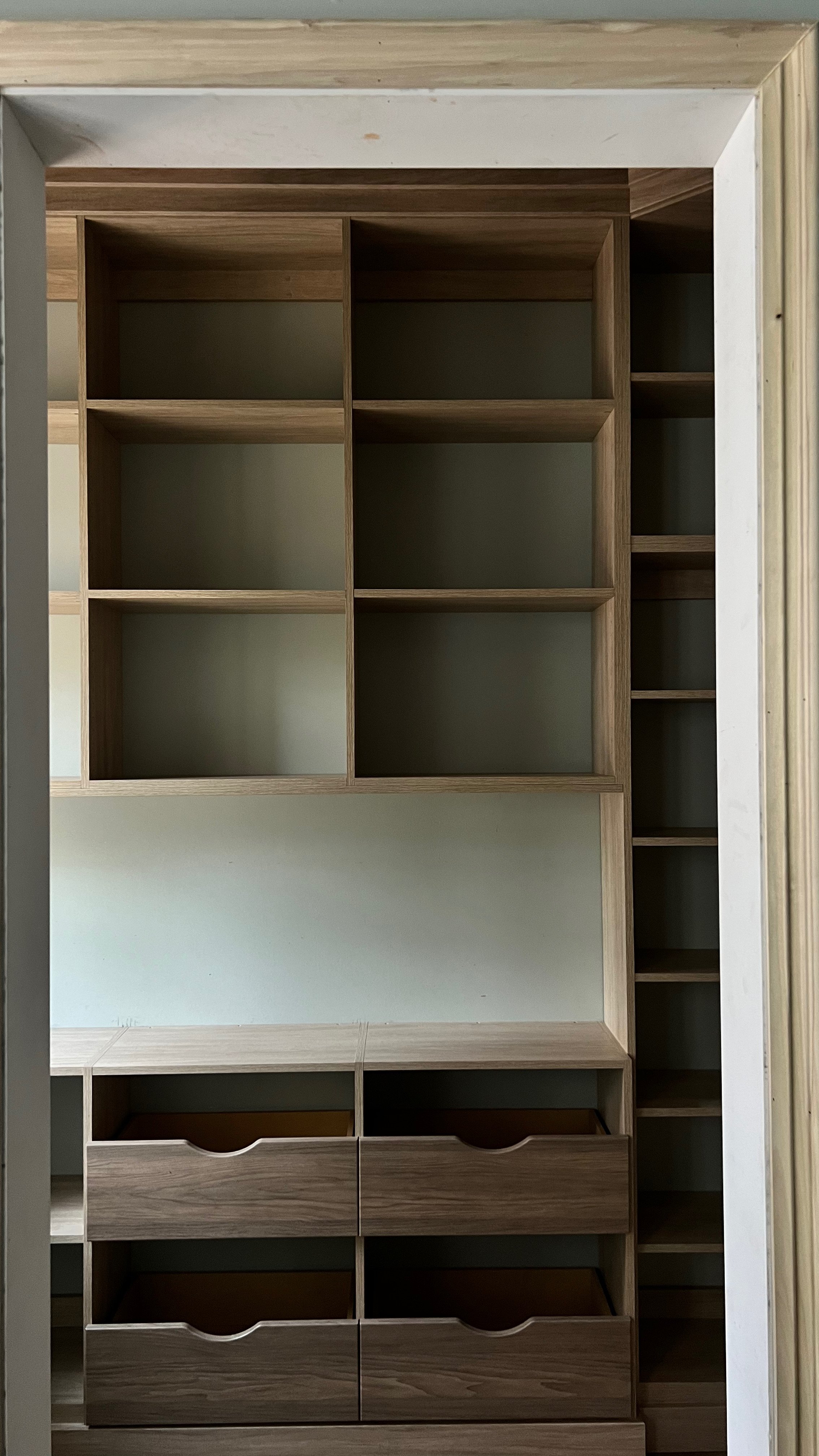
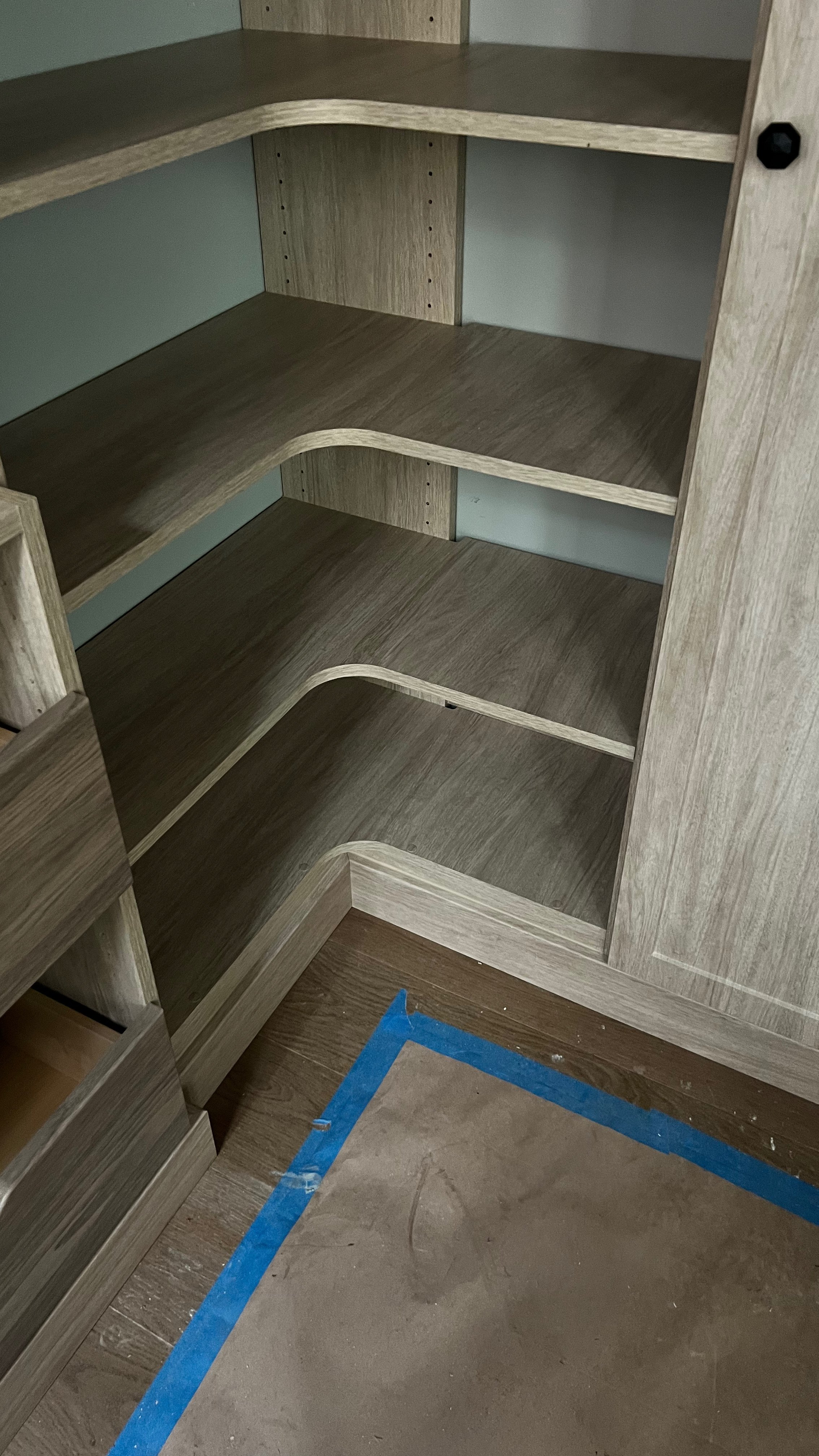
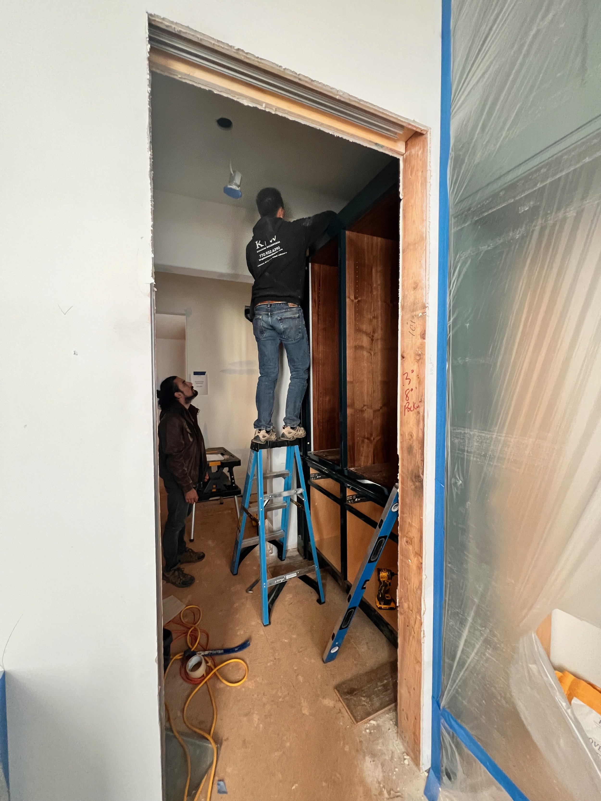
Once all the paperwork and participation requirements were completed, here’s where things began:
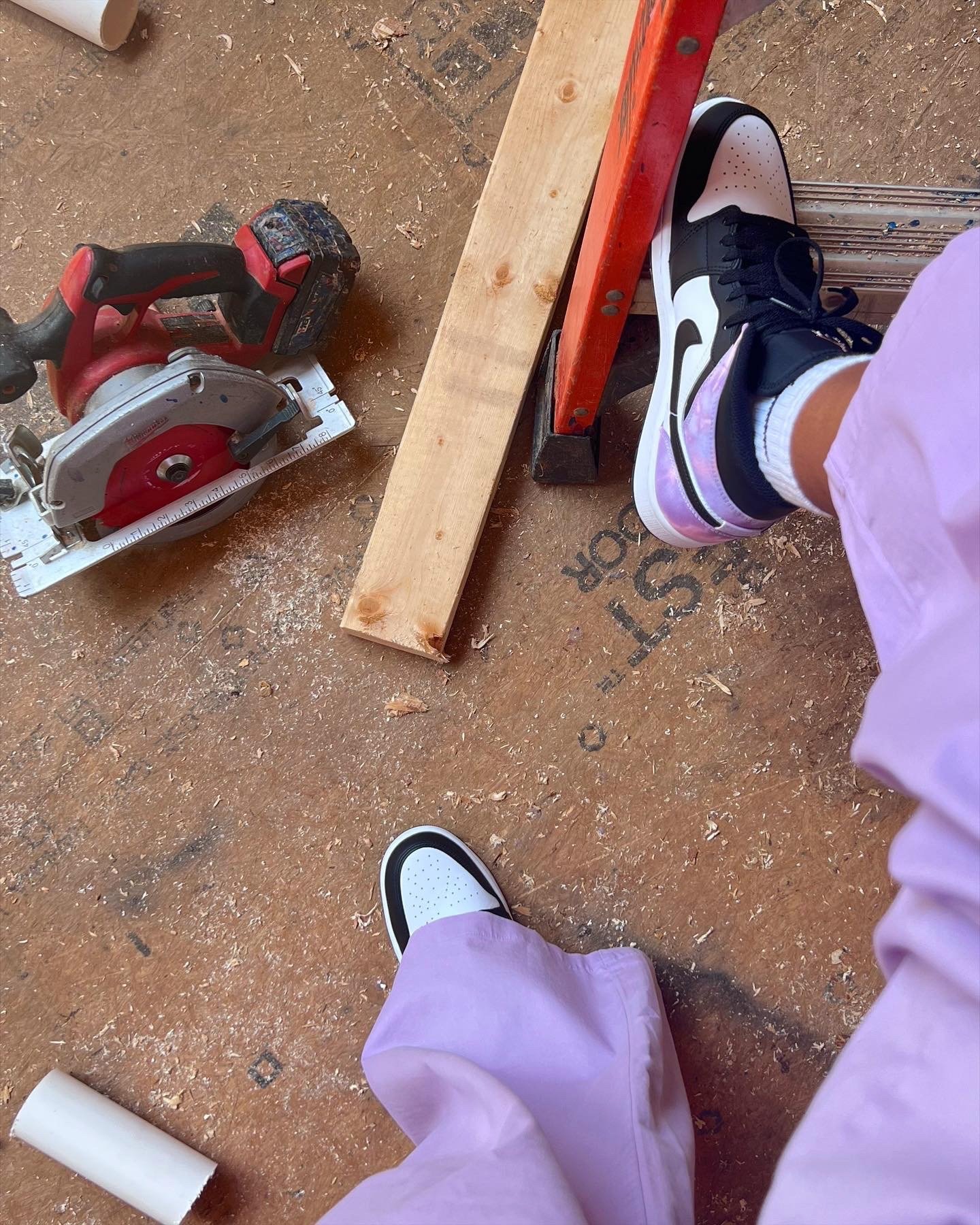
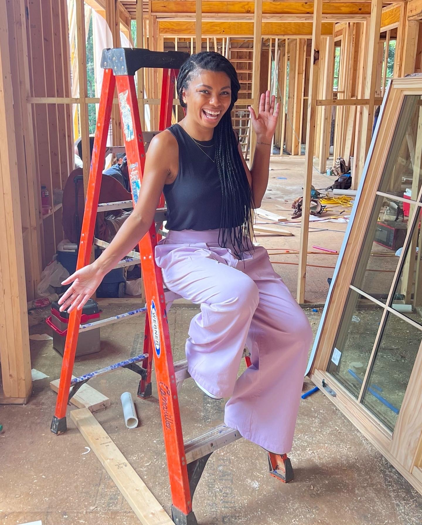
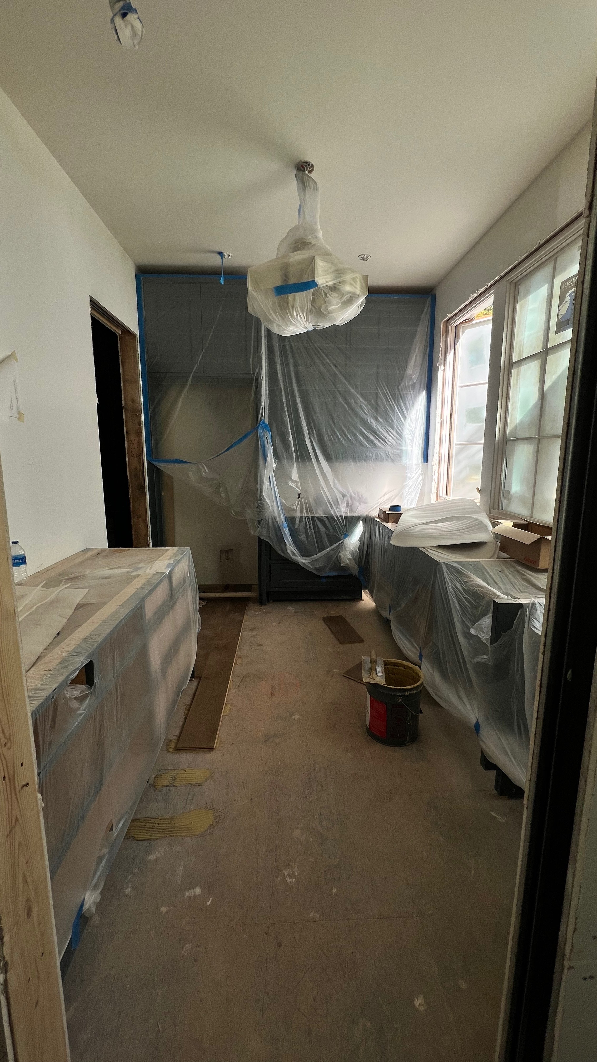
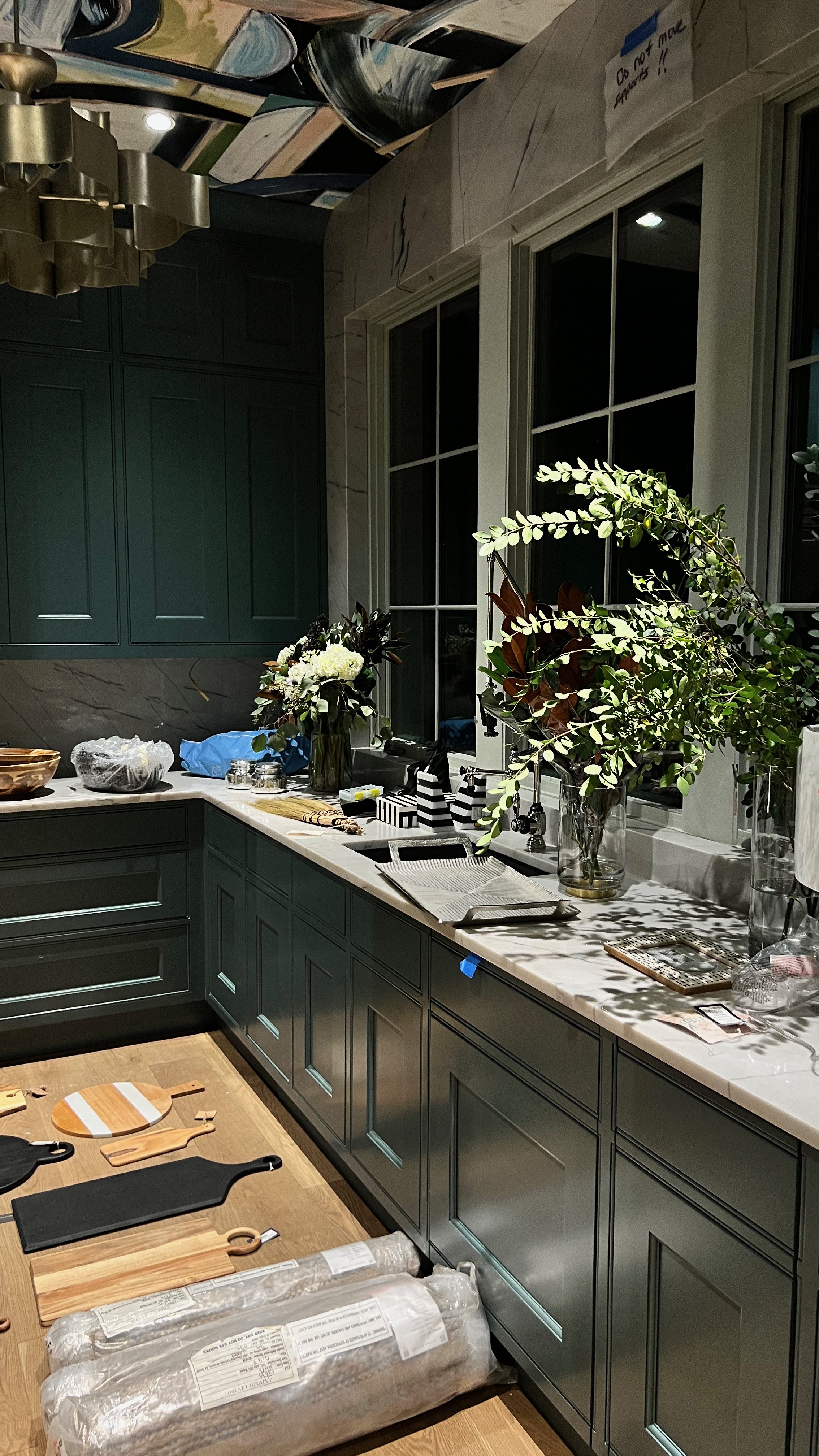
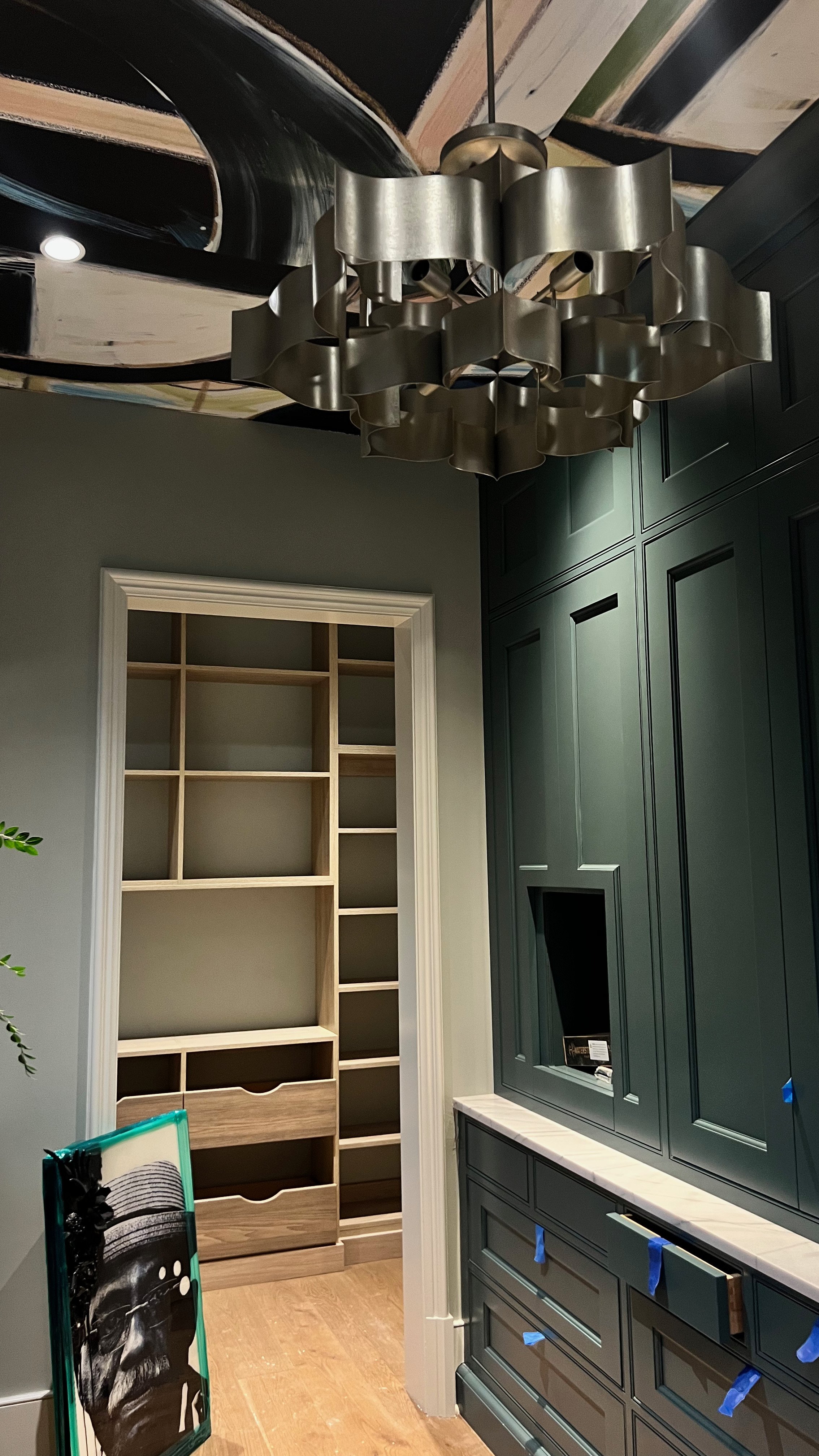
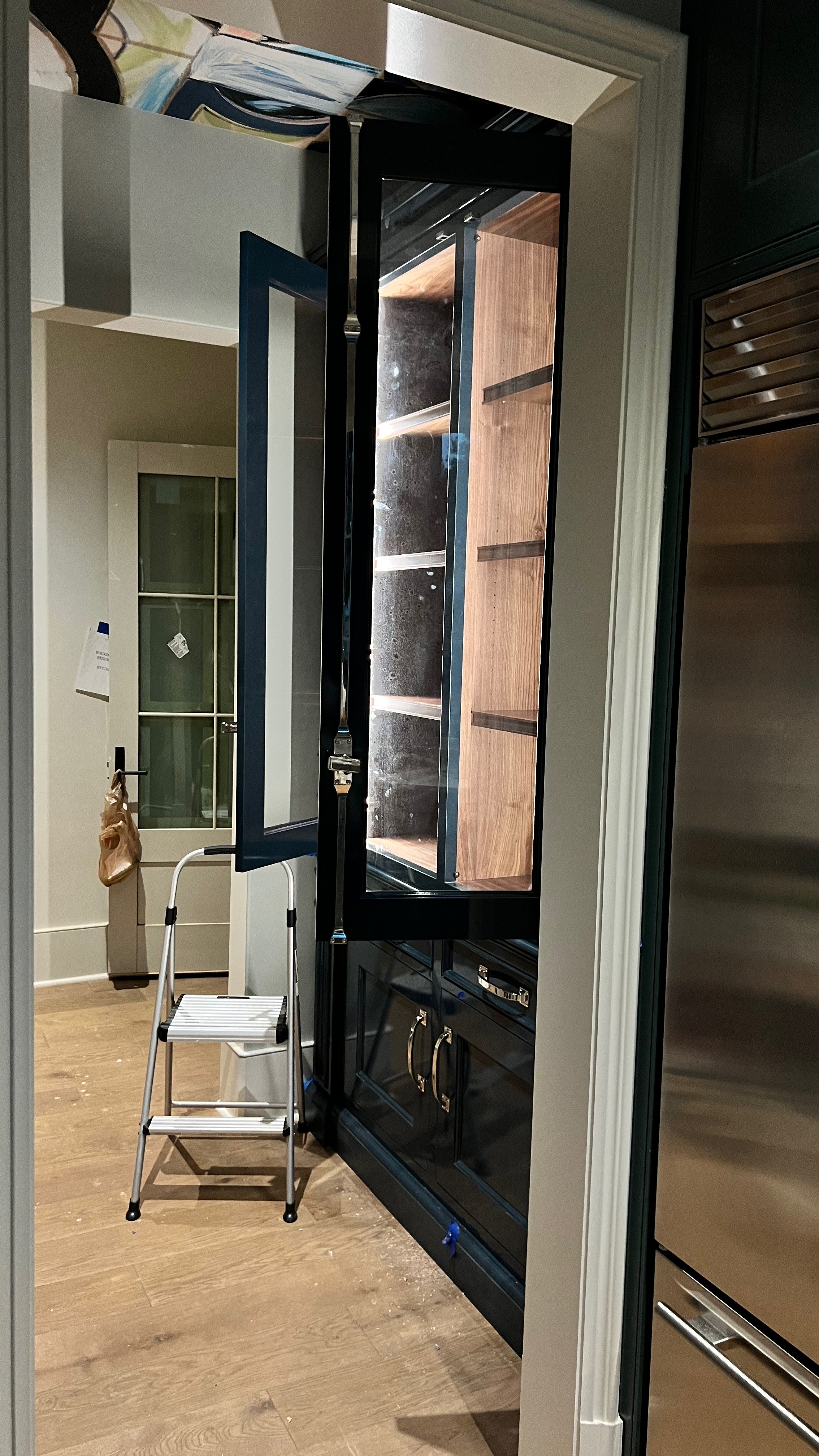
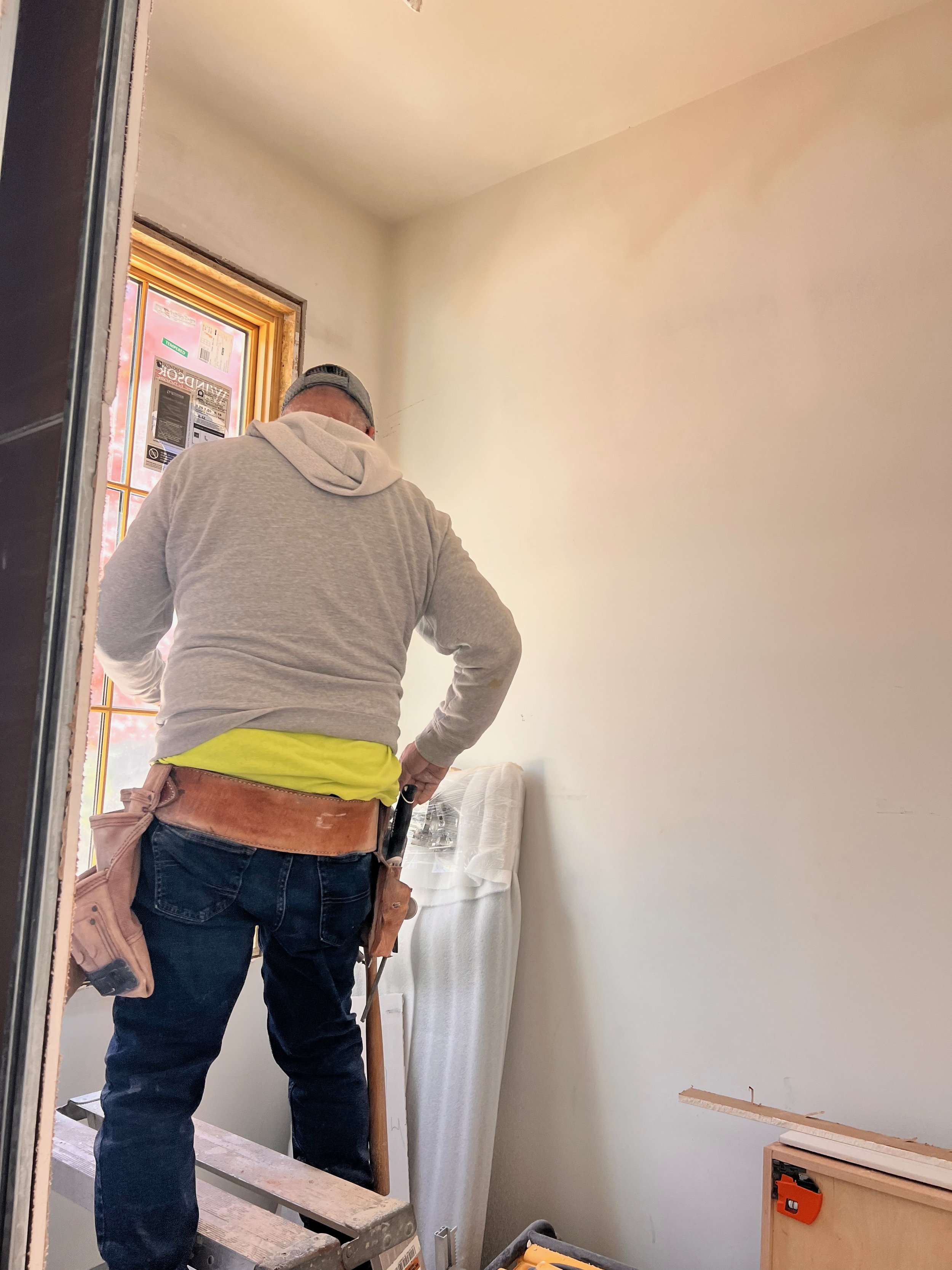
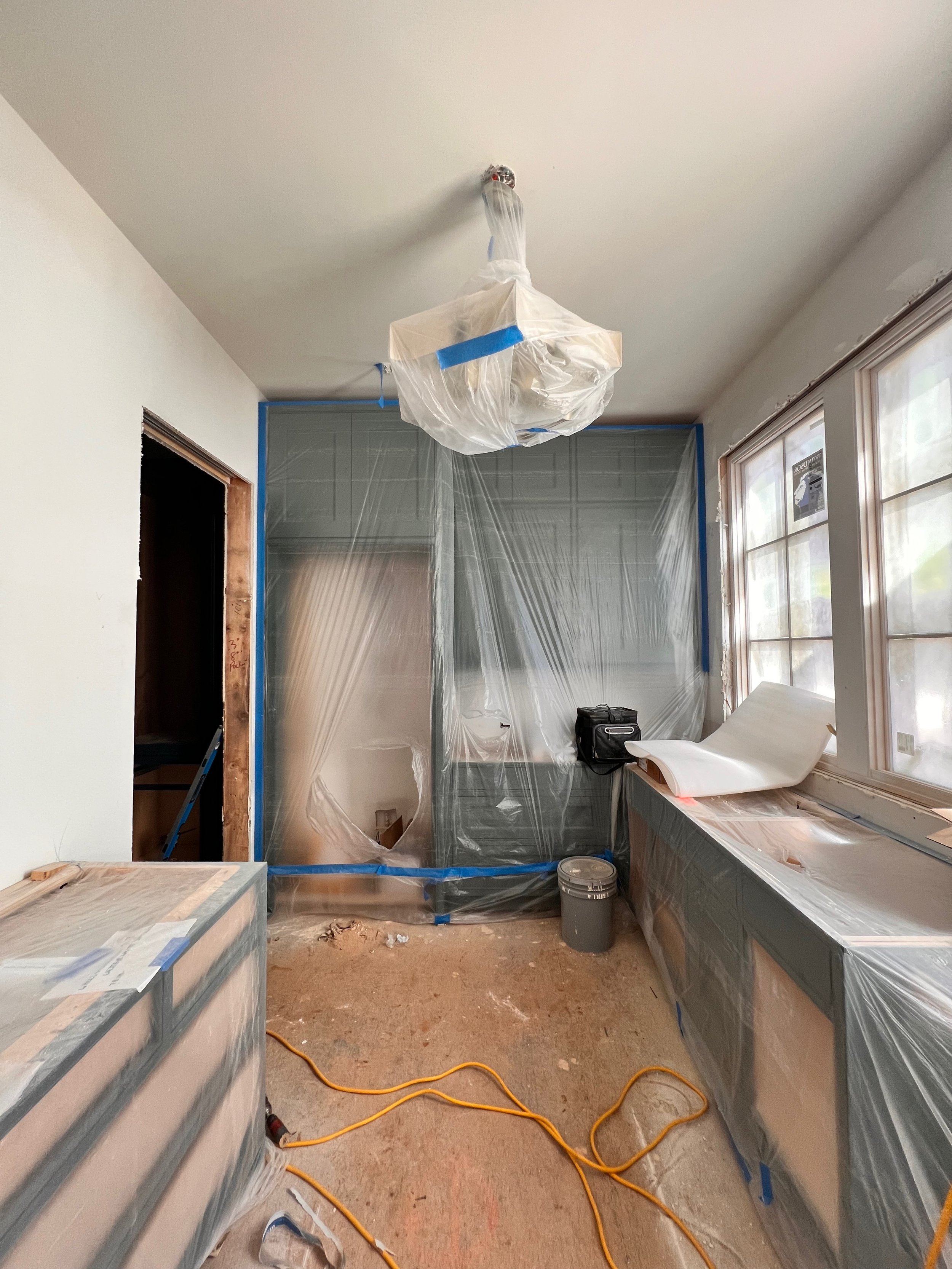
I was assigned the main floor powder room, scullery (or second kitchen), pantry and butler’s pantry. Being given multiple spaces in the home as a first-timer was scary, but once I visited the site, I was relieved that they were all located in my own personal corner of the home. The one cool thing about a showhouse is that there is no client to appease. No guard rails. No limits. It’s a fun way to show off your skills and design style without having anyone to answer to (except the builder of course LOL). Now if you select paint colors outside of the spec designer and builder’s palette, you may have to repaint, remove wallpaper, and design choices once the showhouse is over, but I didn’t allow that to make me play it safe. I wanted to “go big” and make sure everyone that entered my spaces knew that this Southern girl that loved pattern and color left her mark in the square footage she was given.
On that note, here’s how I designed my spaces:
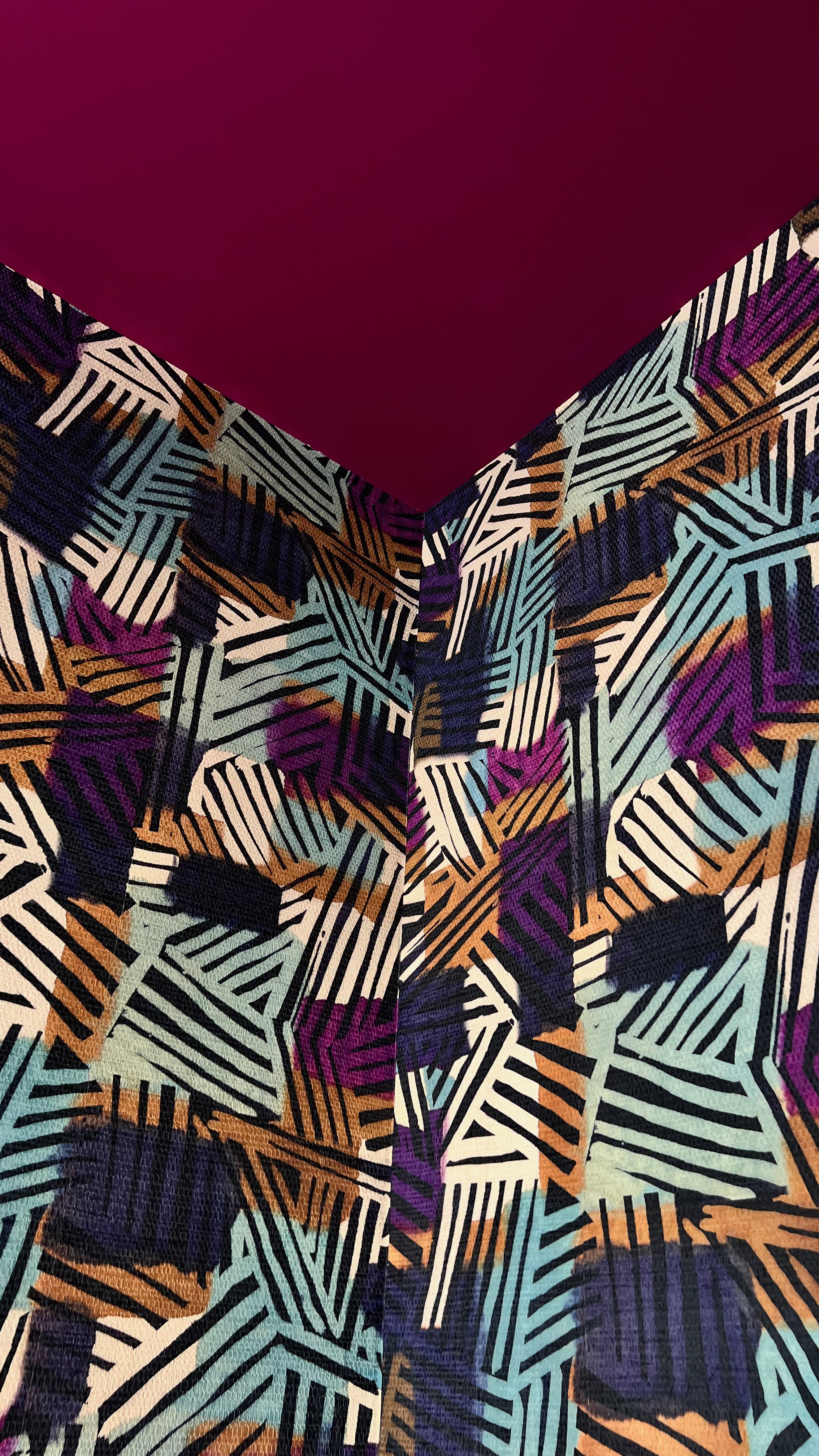
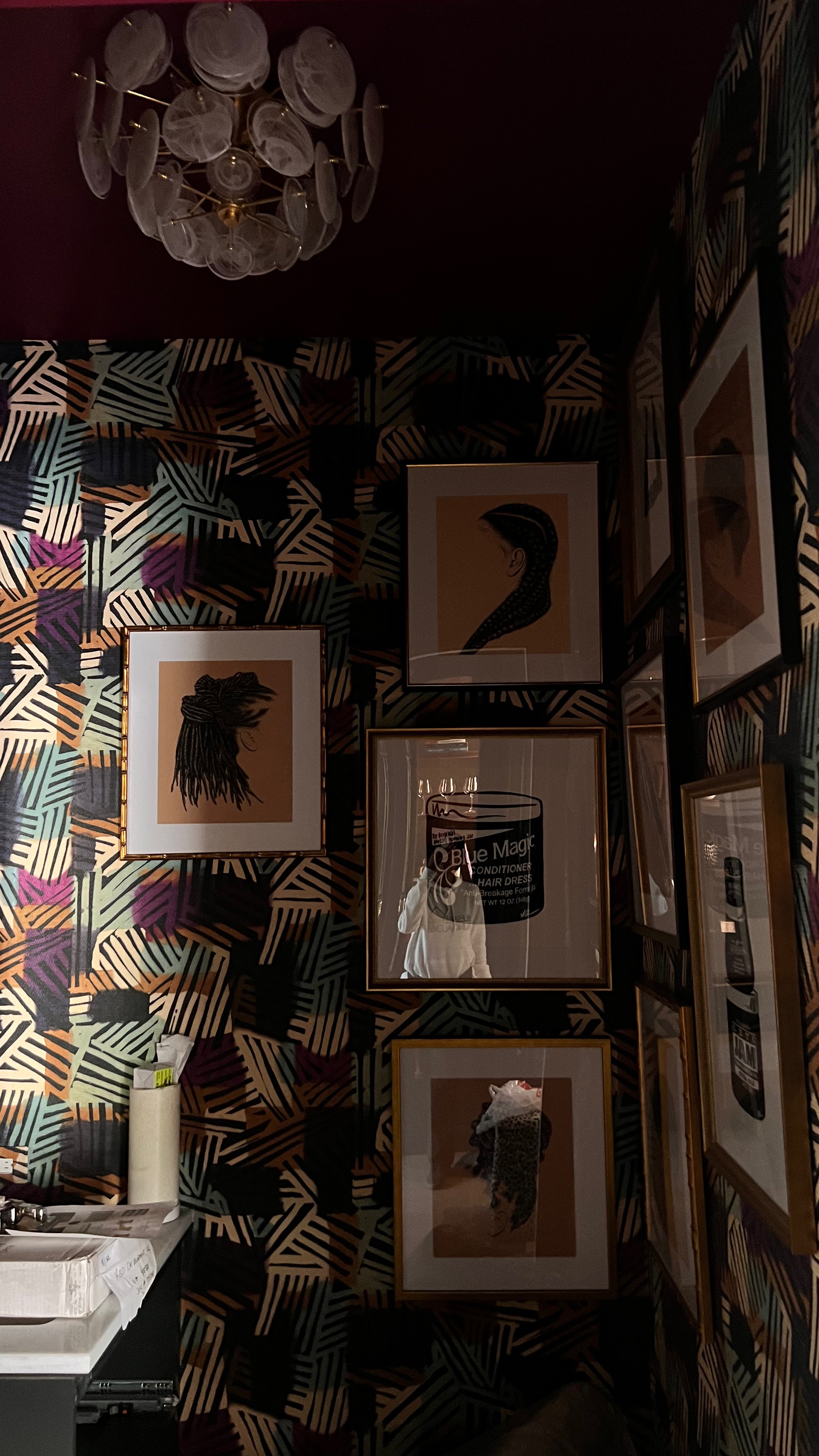
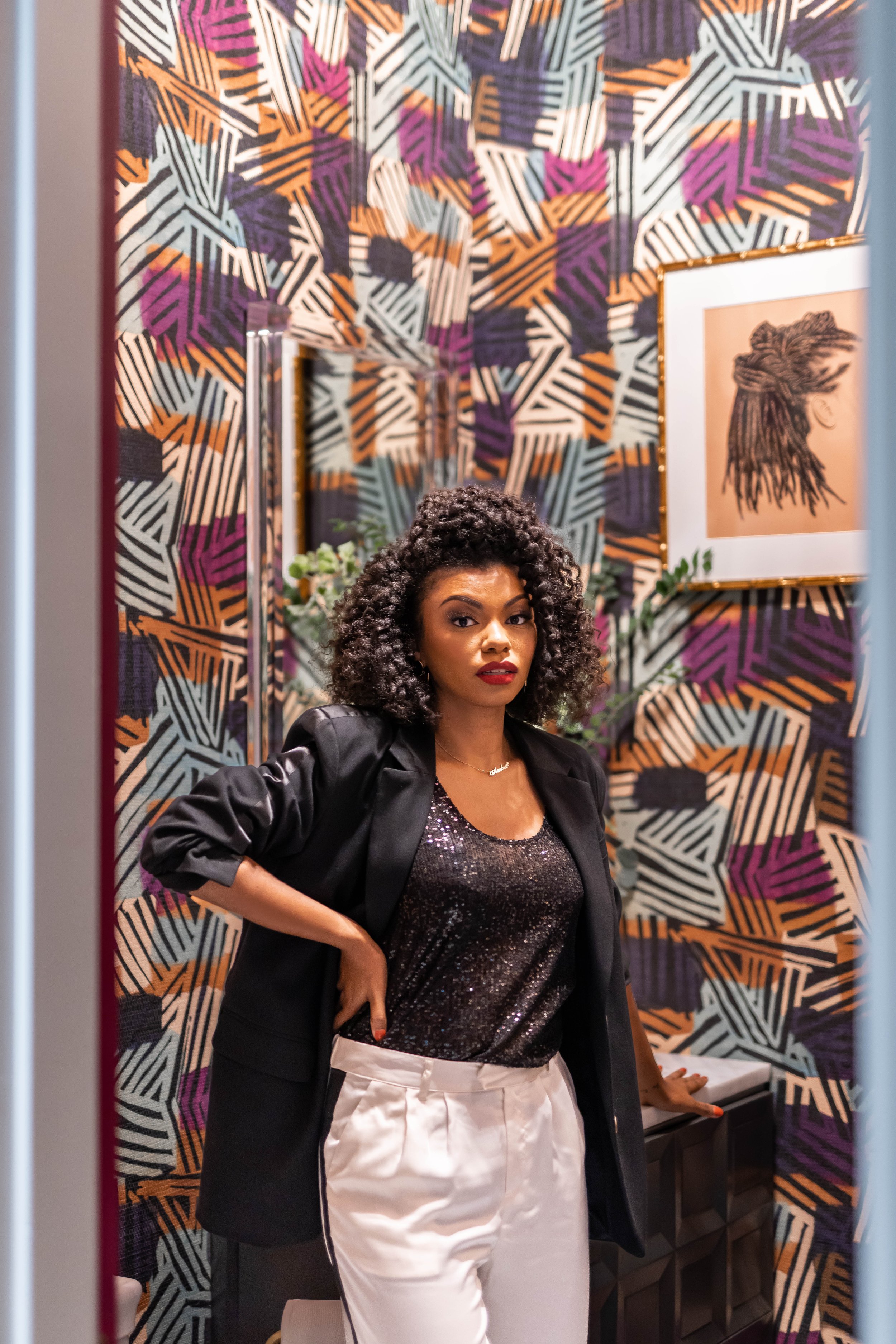
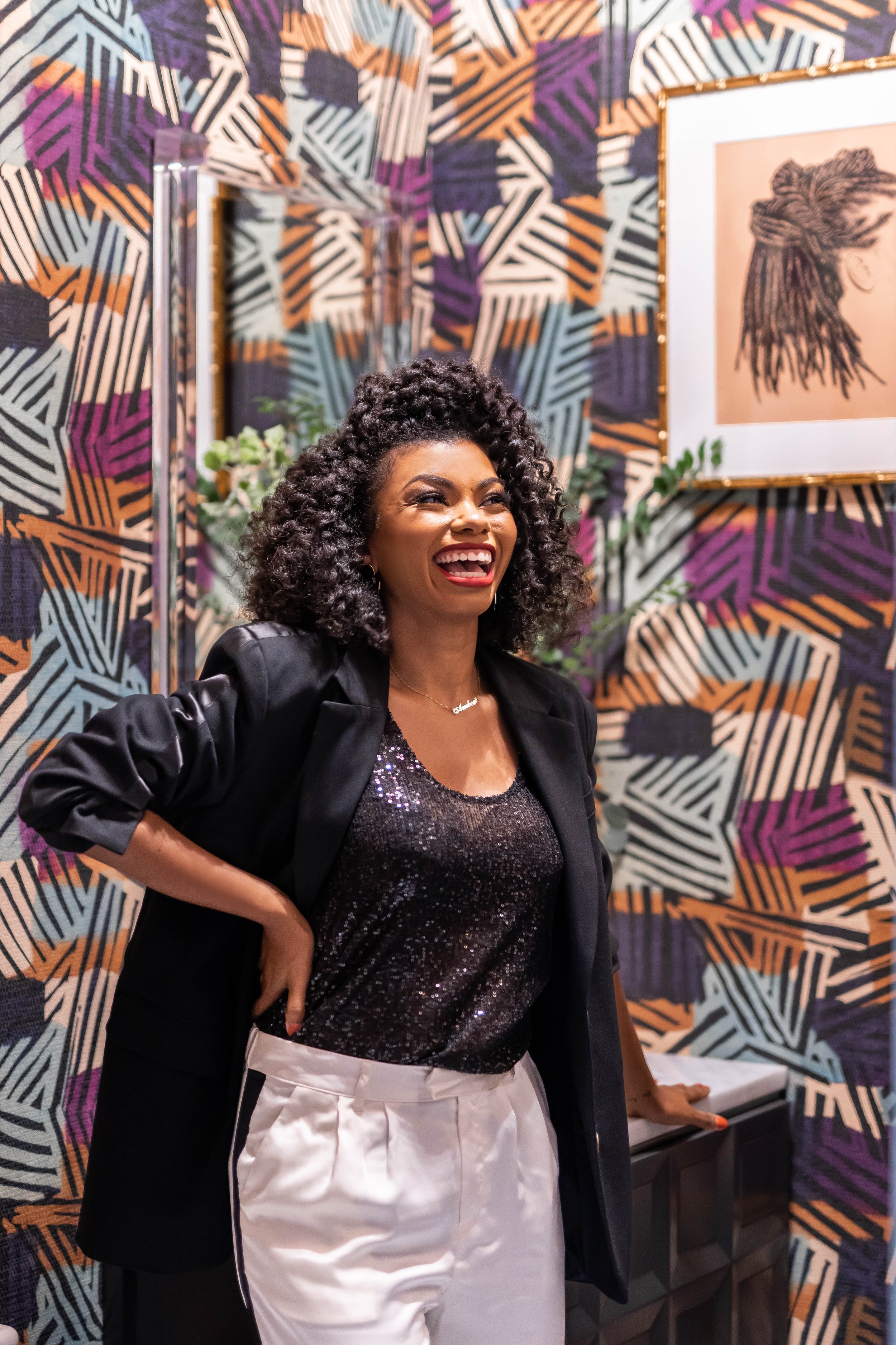
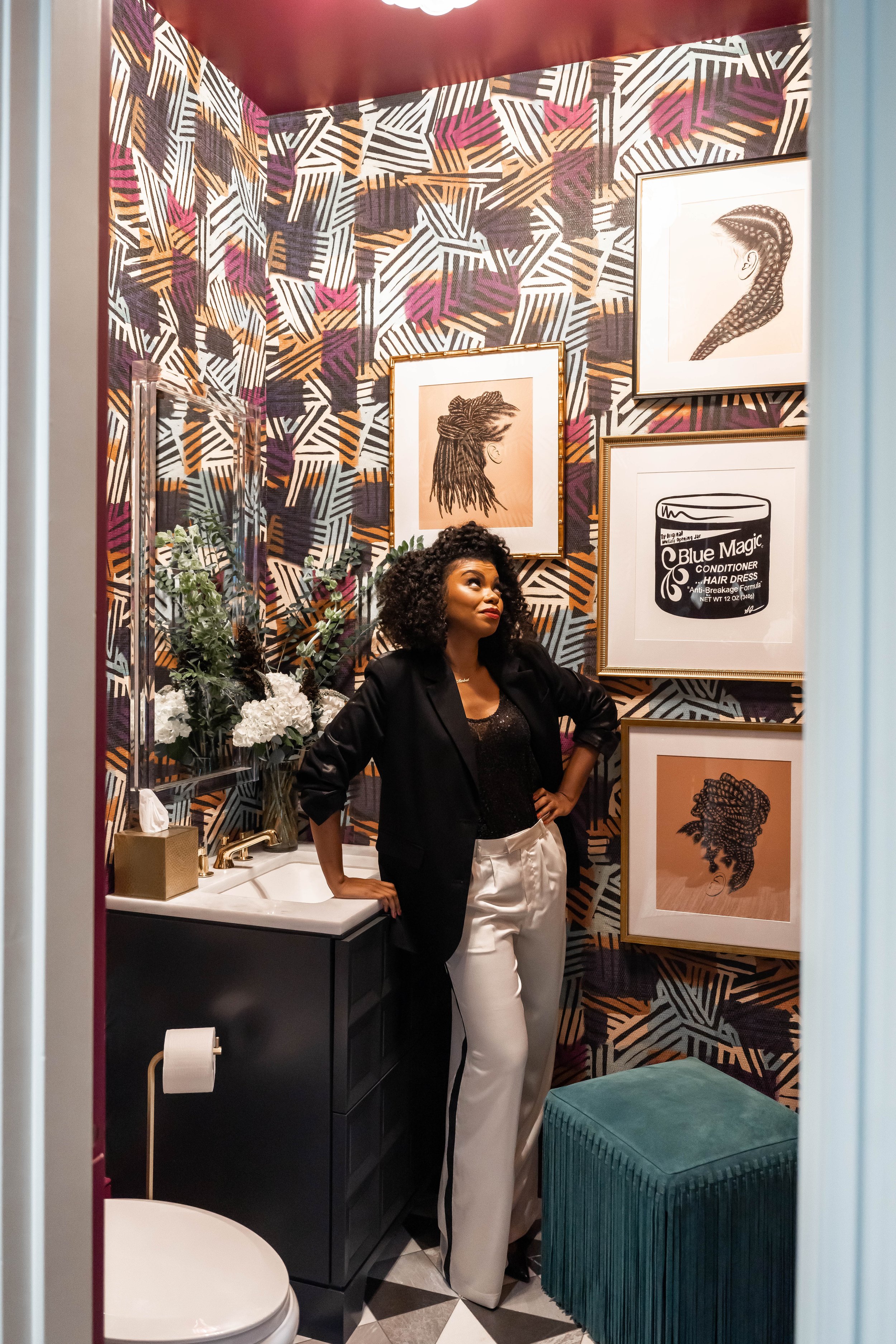
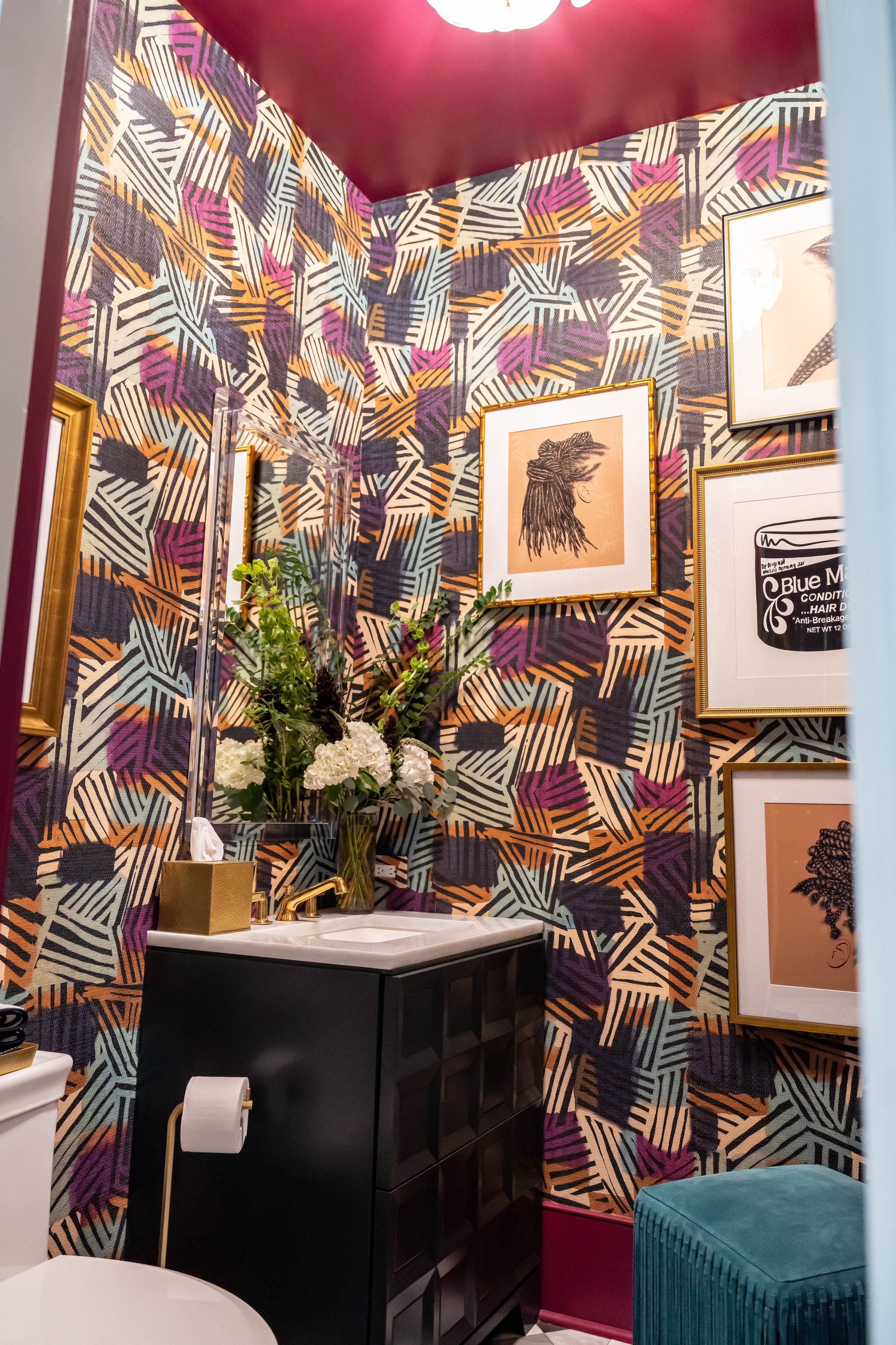
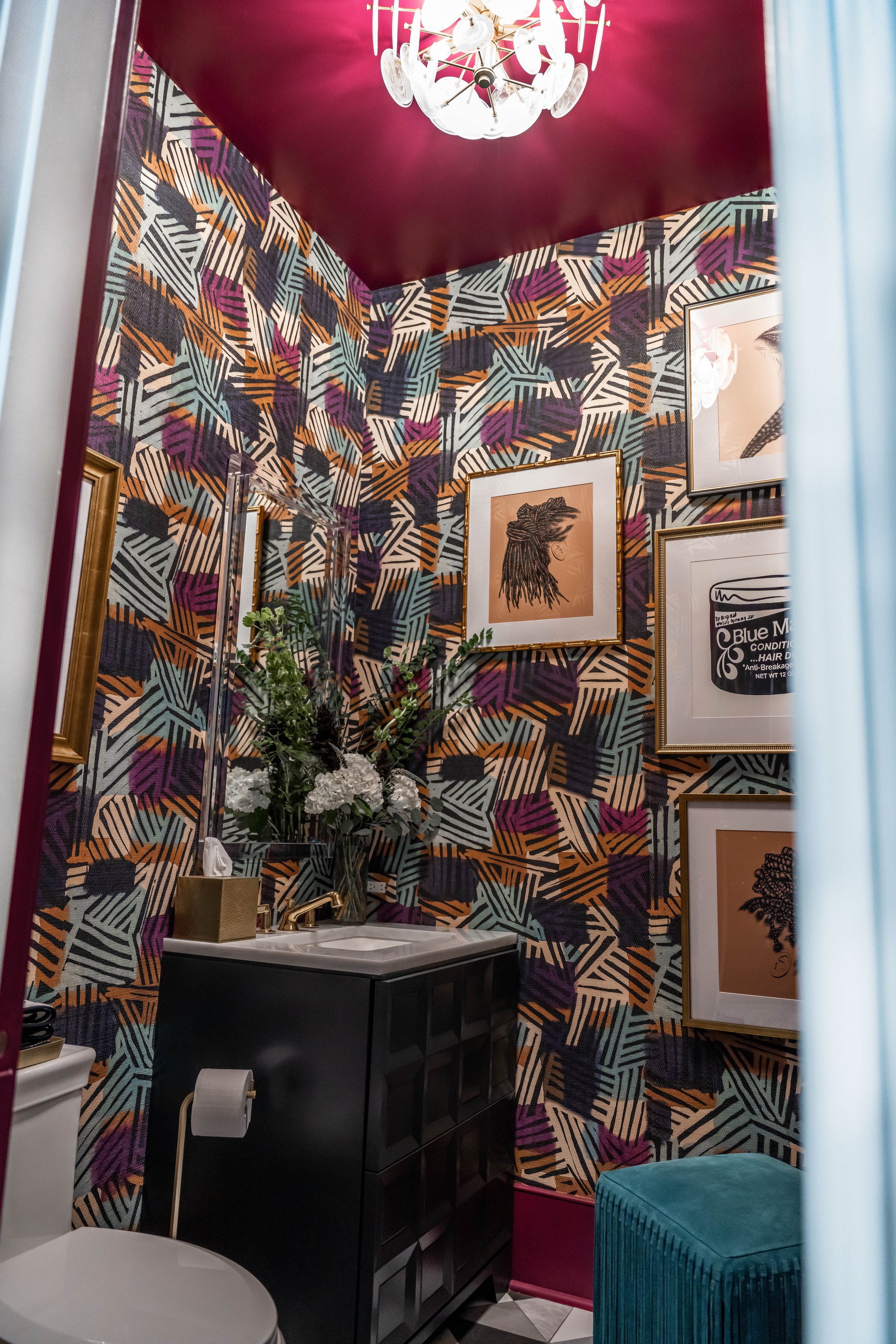
For the powder room, I wanted to go BOLD! The tile and vanity color selected by the spec designer, Lauren Davenport Imber of Davenport Designs, were black and white. The tile immediately made me think of my favorite rooftop lounge in San Francisco, Charmaine’s atop the San Francisco Proper Hotel. With the foundation of black and white tile and fabrics, there was a ton of pattern, color, texture and art layered on top. Living on the west coast was wonderful, but cut short by the pandemic, so I wanted to make this powder room my love letter to the Bay Area, its unapologetic, vibrant culture, bougainvillea-lined streets, colorful Queen Anne Victorian and Italianate row houses, and the absolute unexpected at every corner.
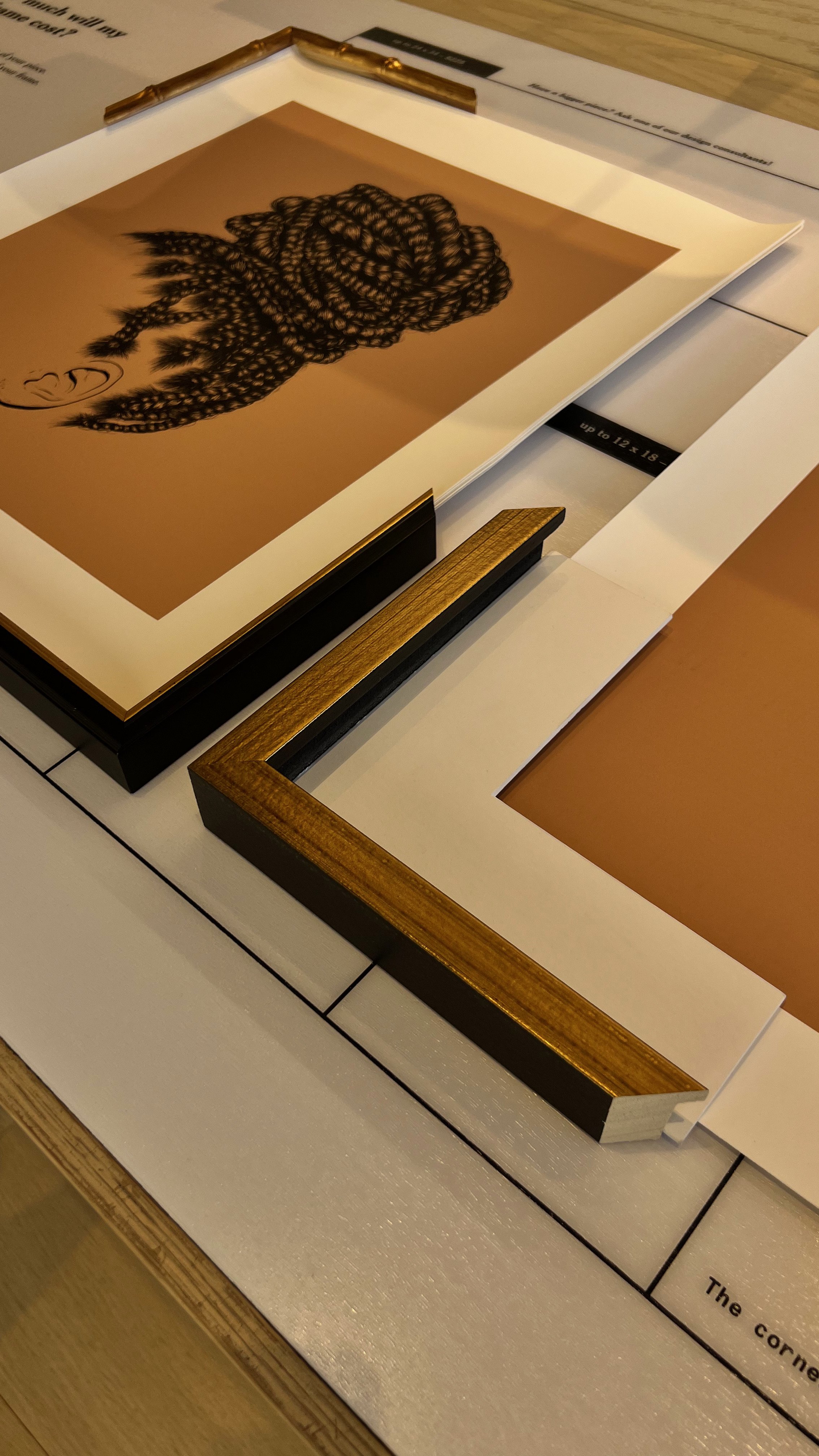
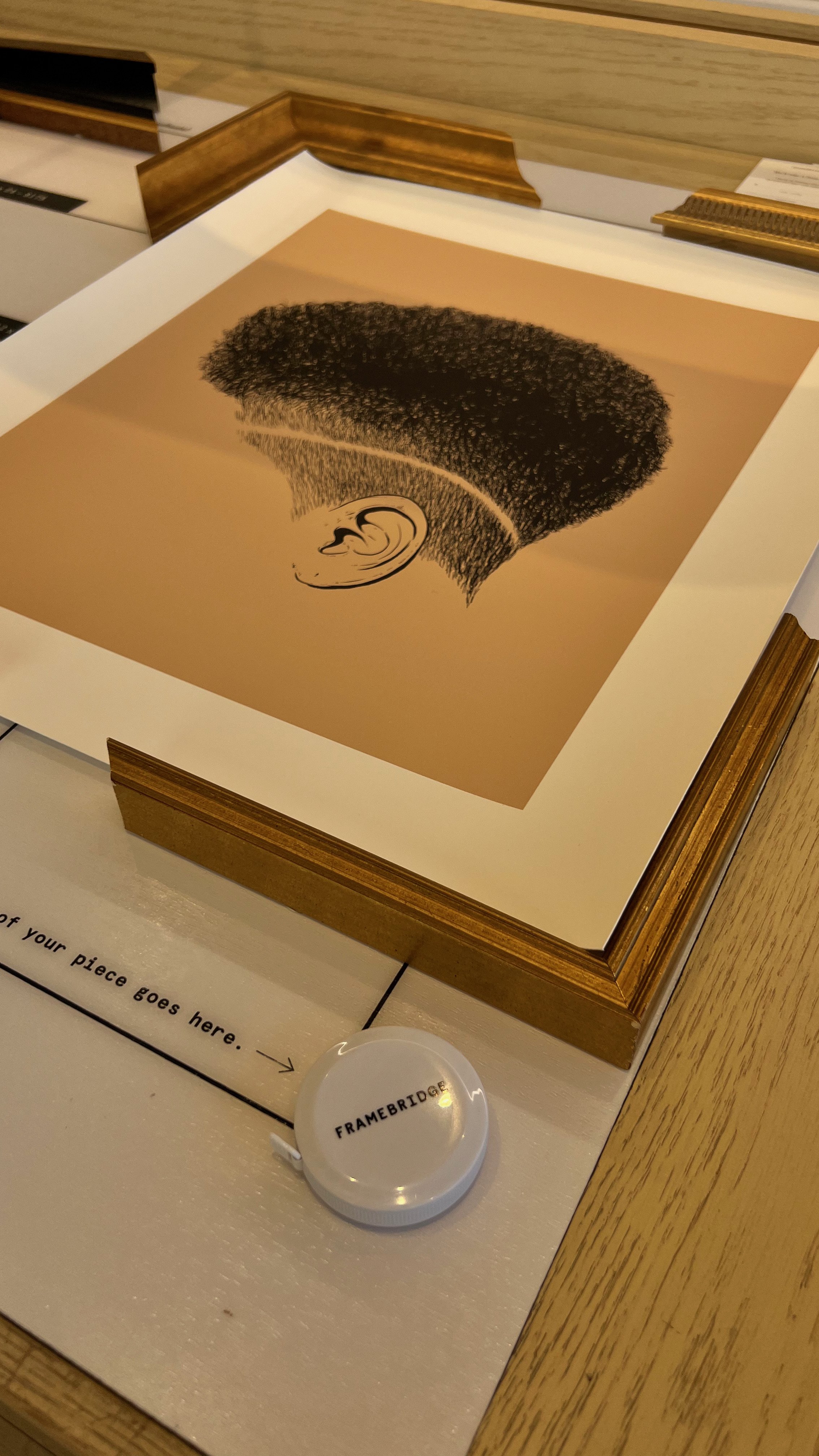
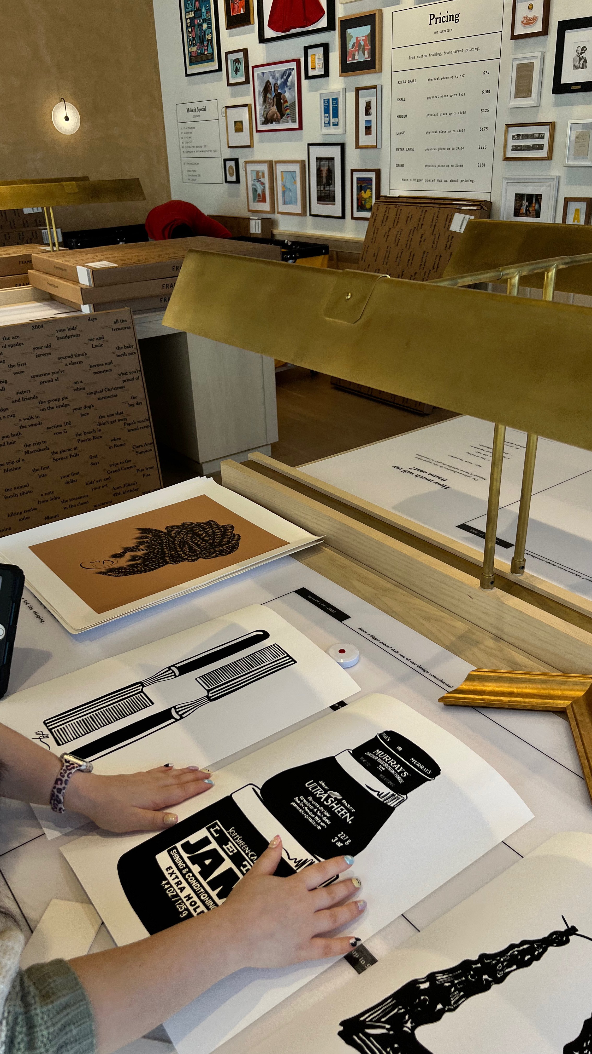
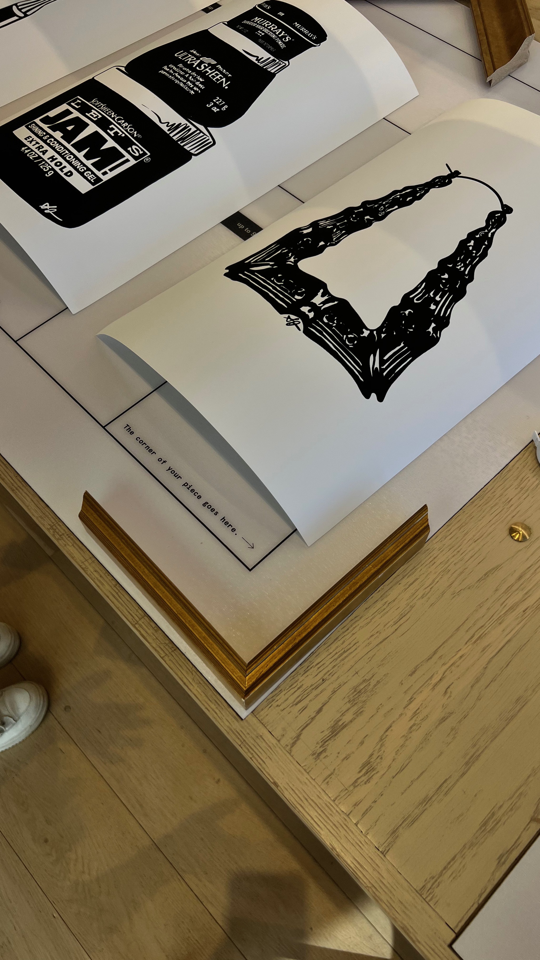
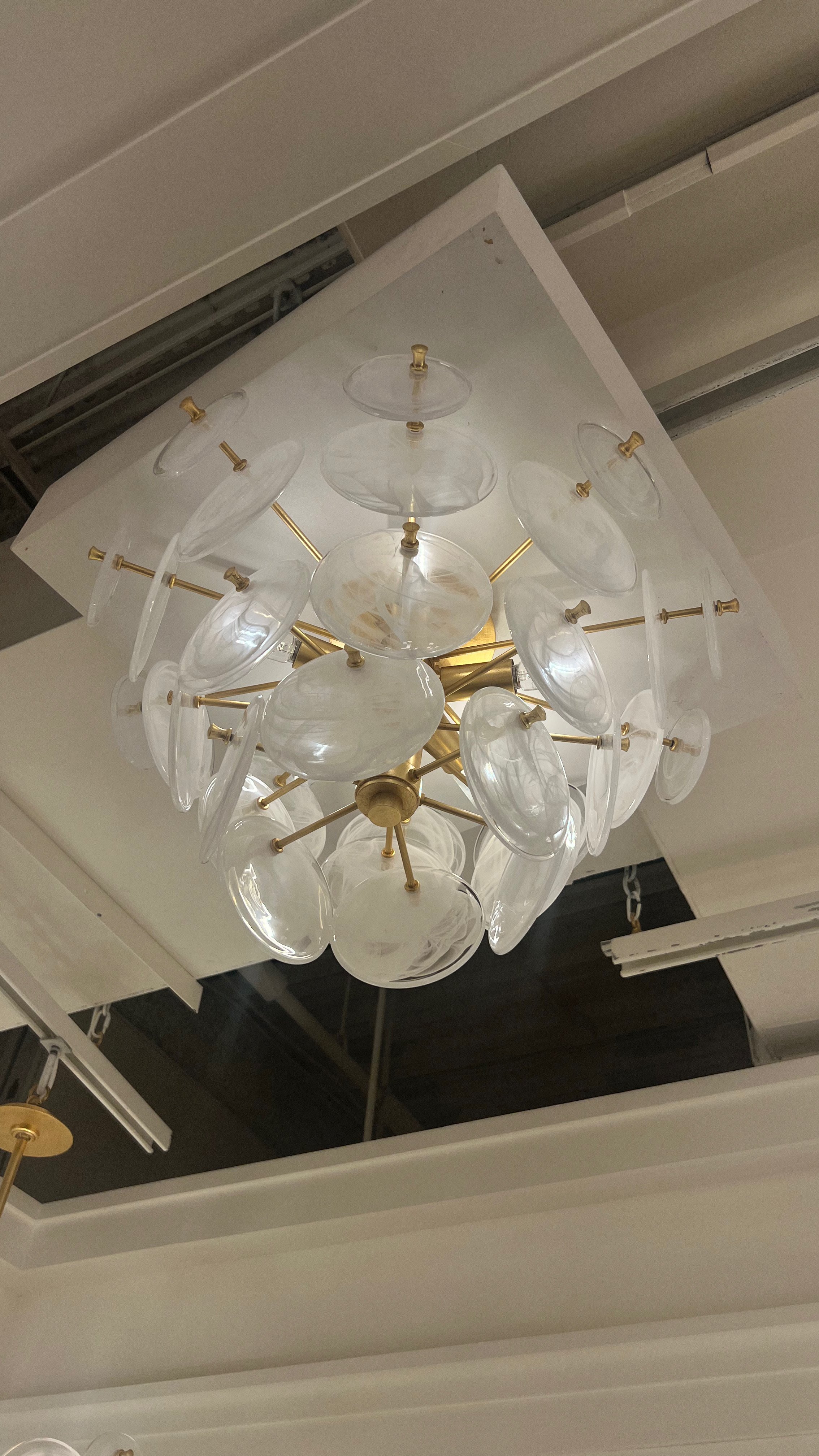
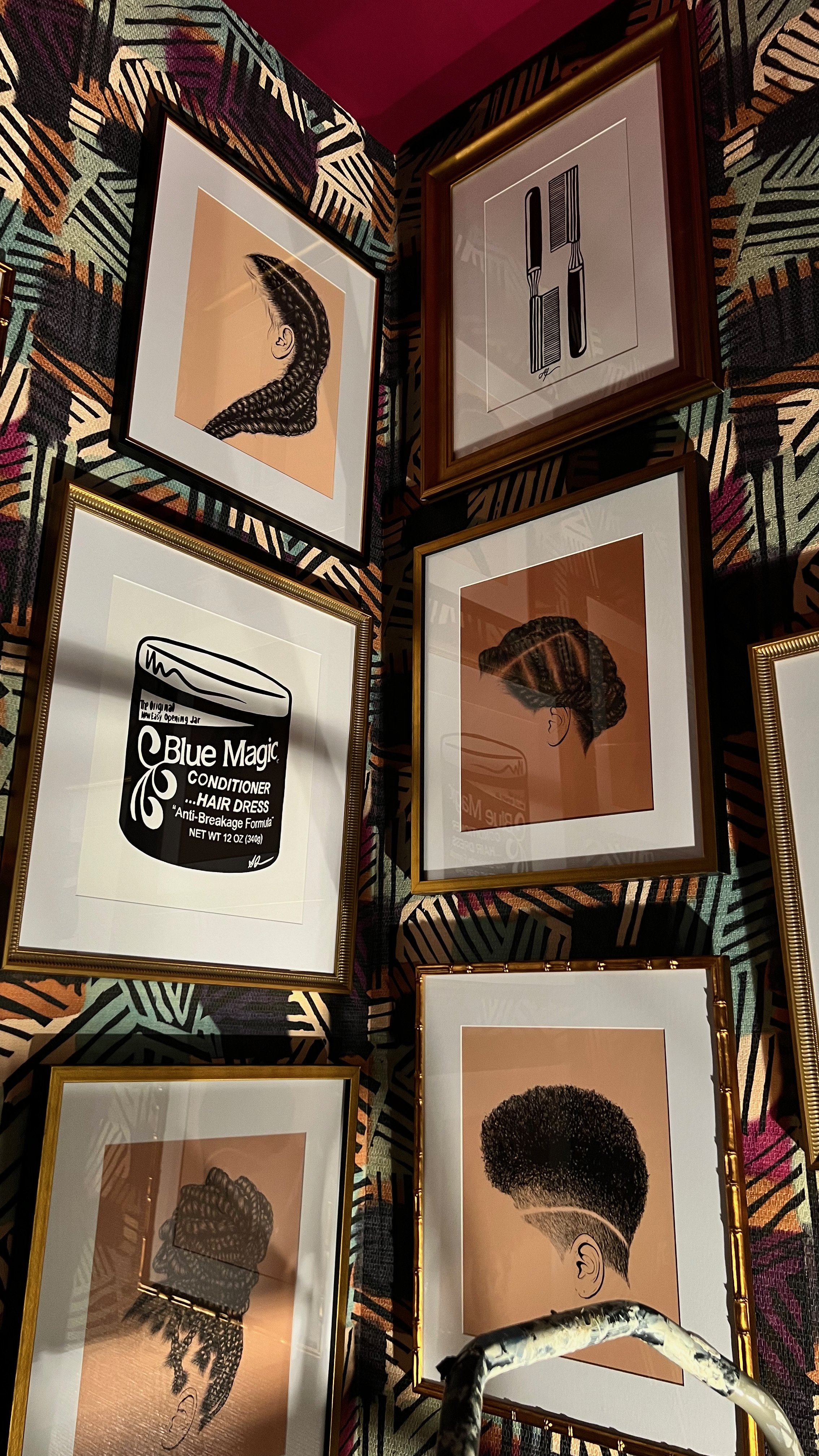
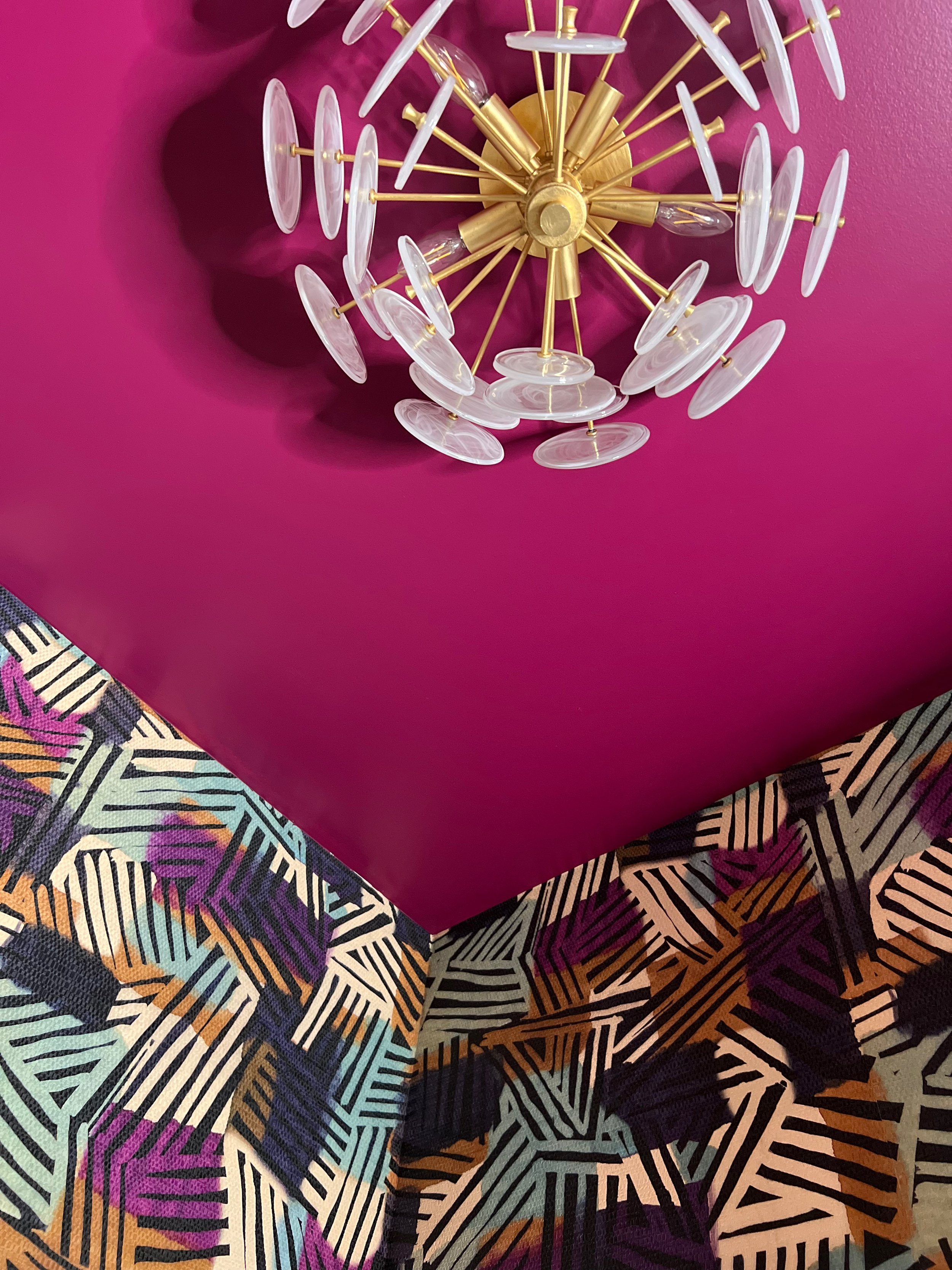
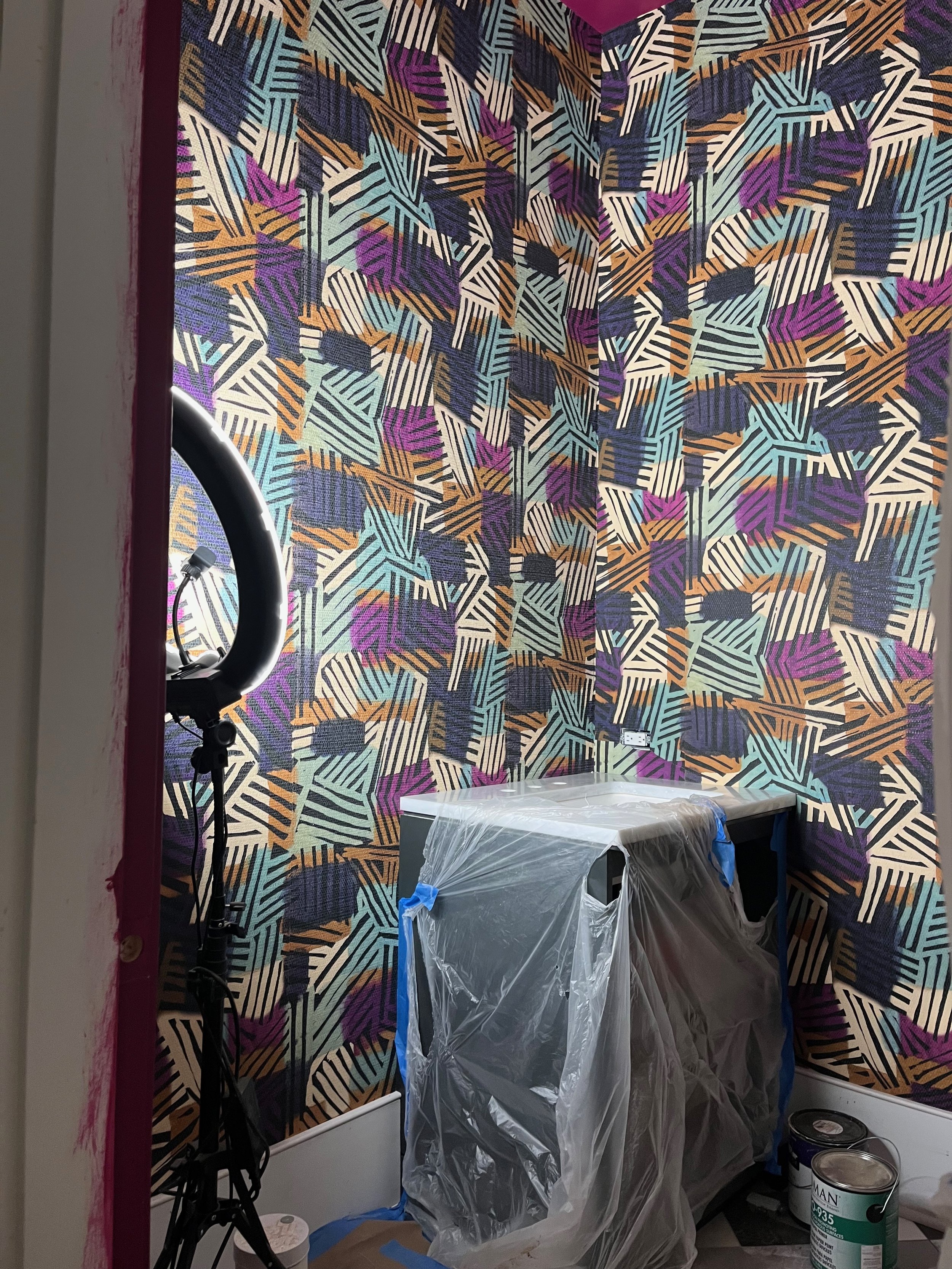
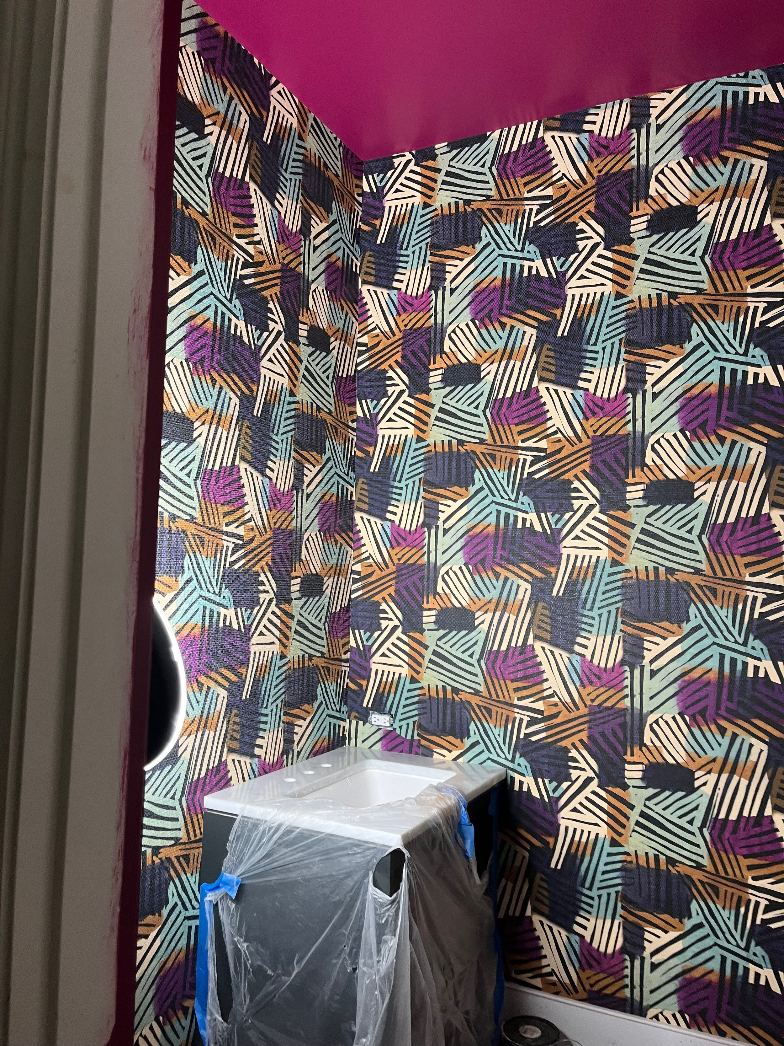
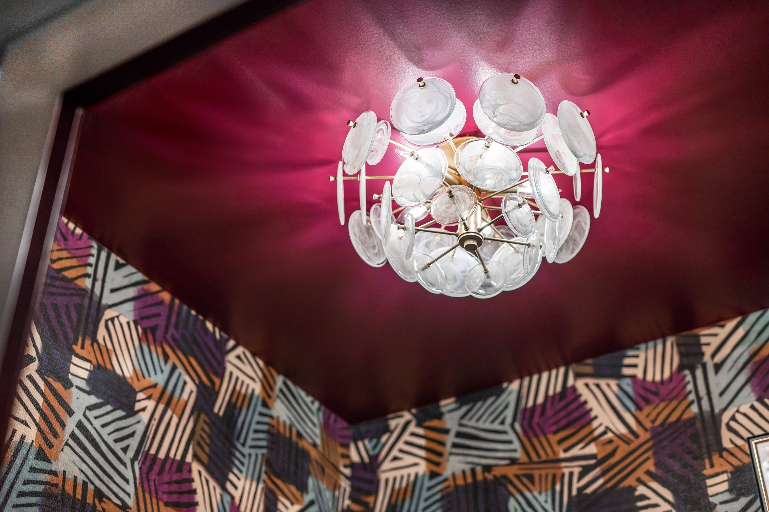
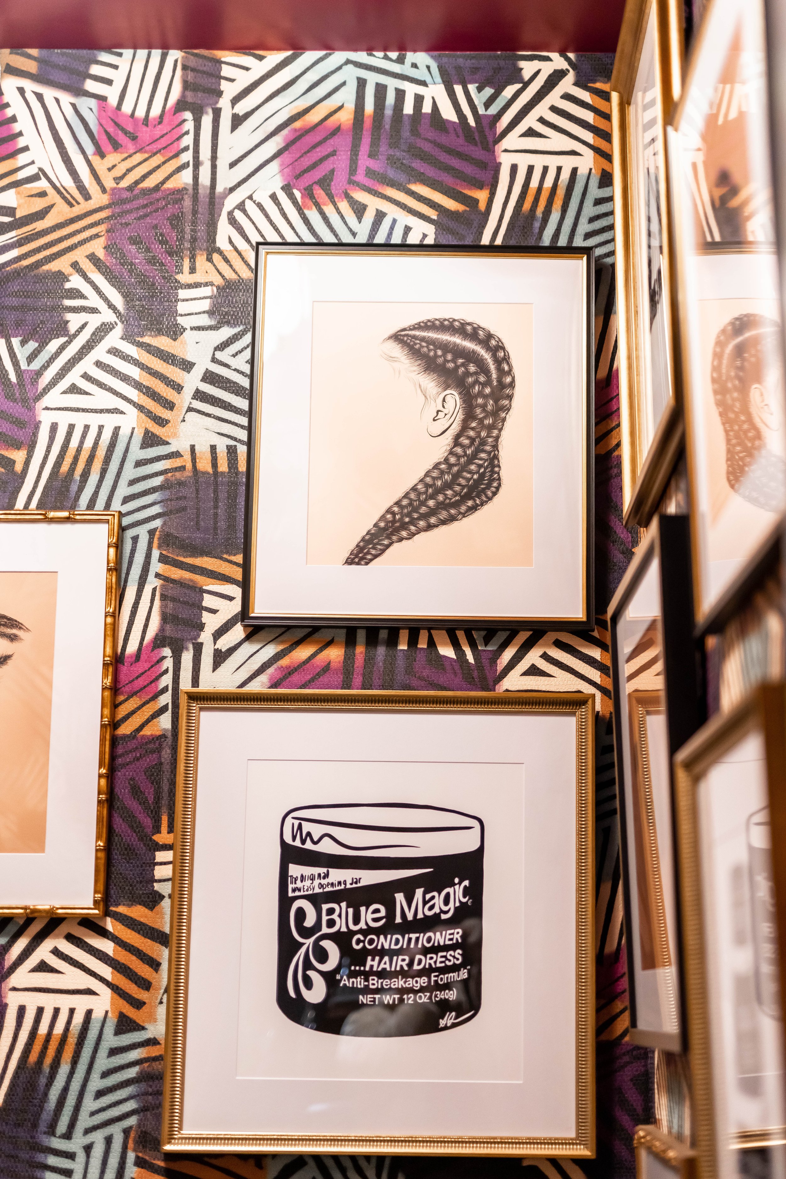
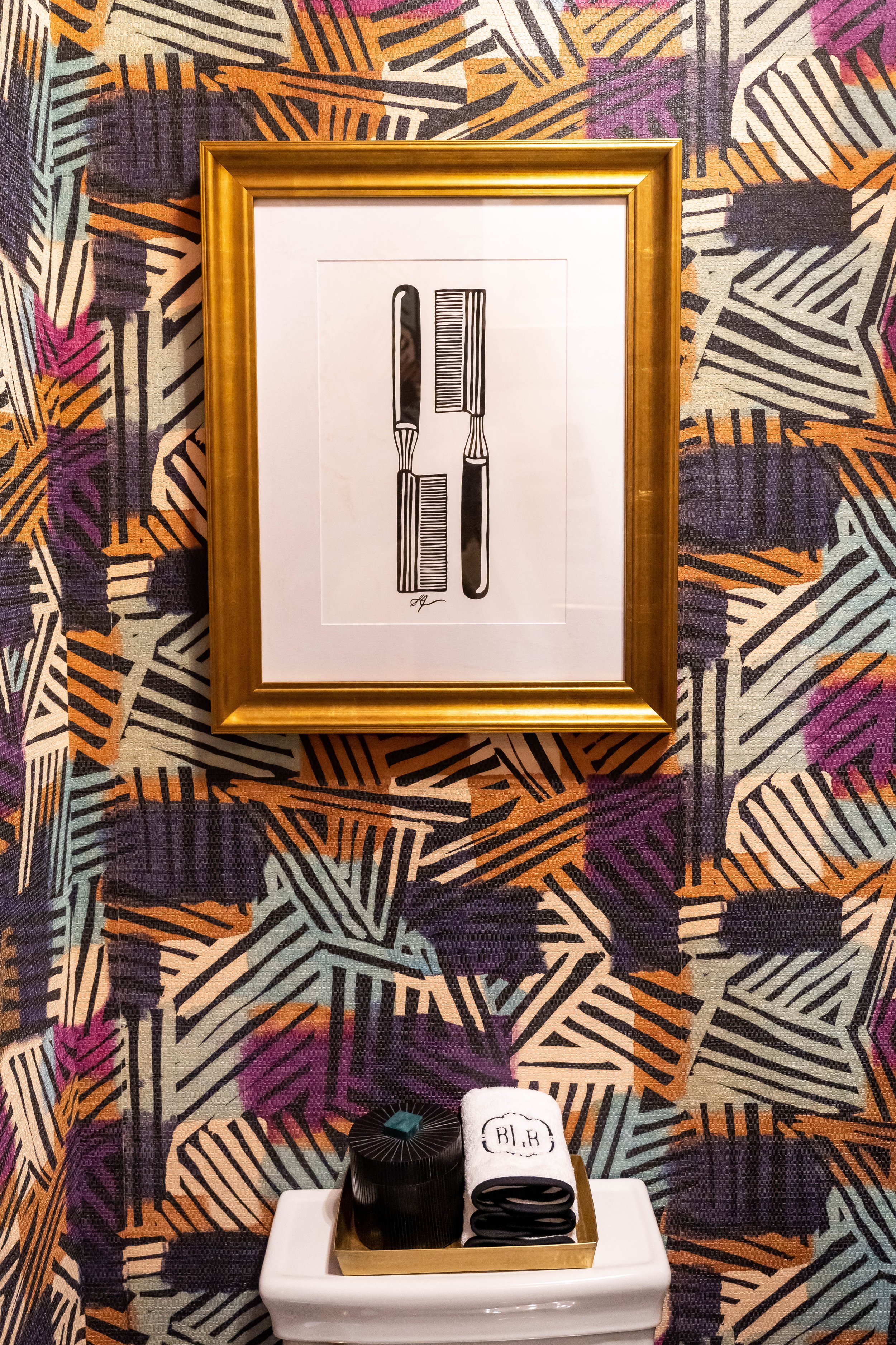
I also wanted the powder room to feel like its own little jewel box in the house, even if it didn’t appear like anything else in the home. It was a big risk, but one I was willing to take. The tile also reminded me of an old school barber shop or beauty salon, which gave me the idea of layering nostalgic artwork of black hairstyles and beauty products on top of the textured, colorful wallpaper I selected from Pierre Frey. From there, the lucite and gilded brass semi-flush lighting from Visual Comfort, acrylic mirror and fringe ottoman from Made Goods, ornate gold frames from Framebridge, and florals designed by my new friend, Andra Brown would complete the room perfectly.
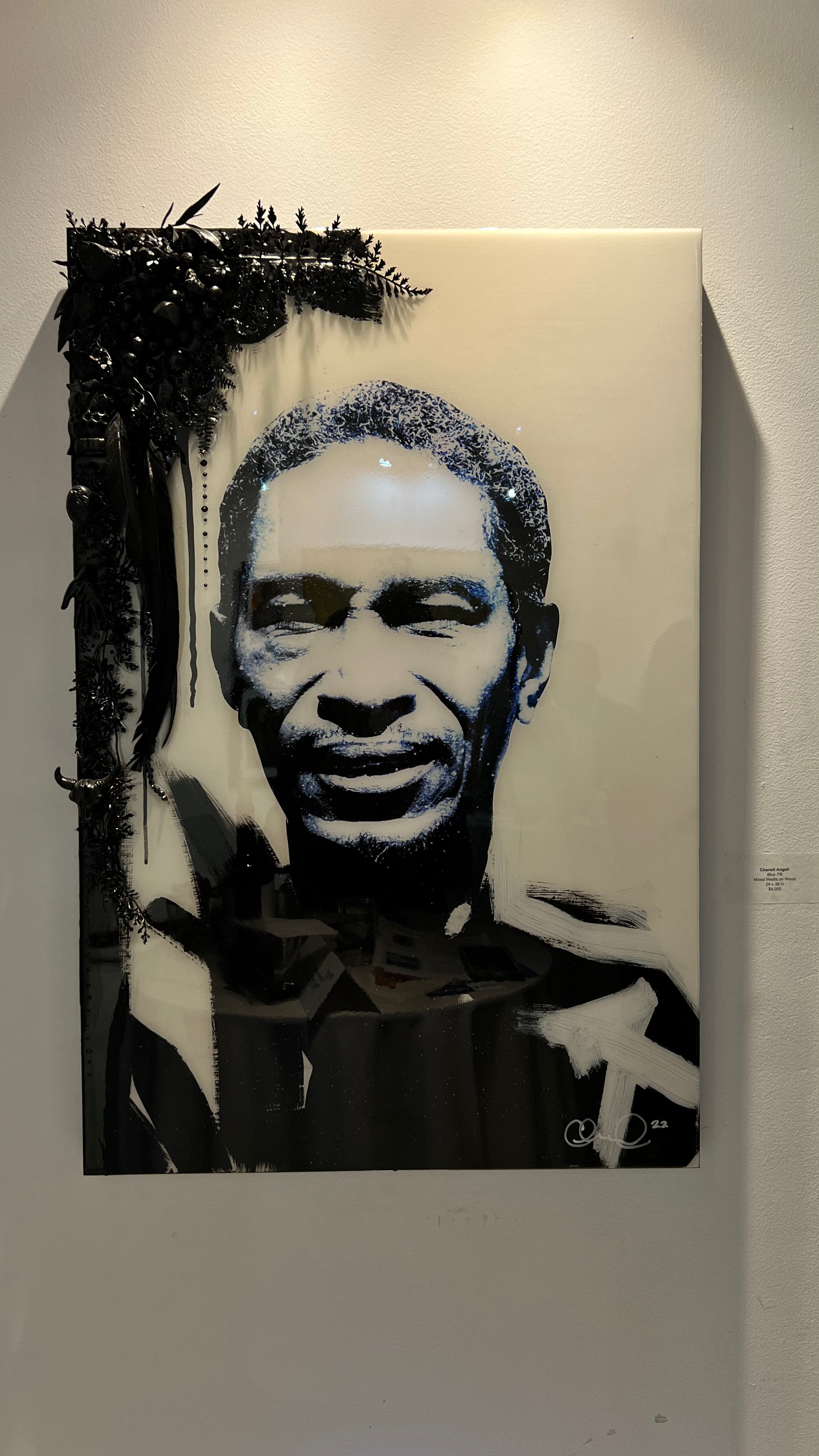
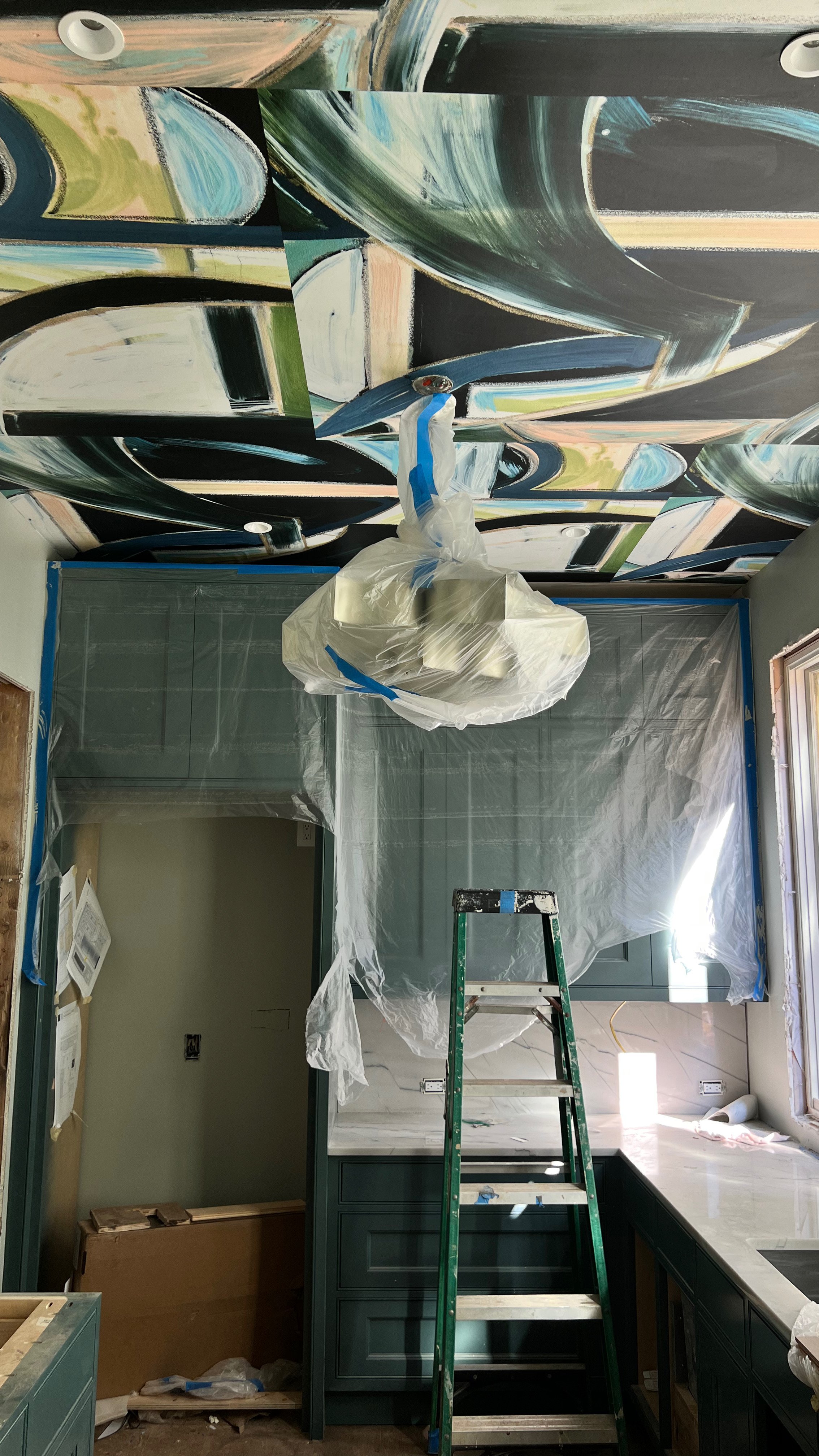
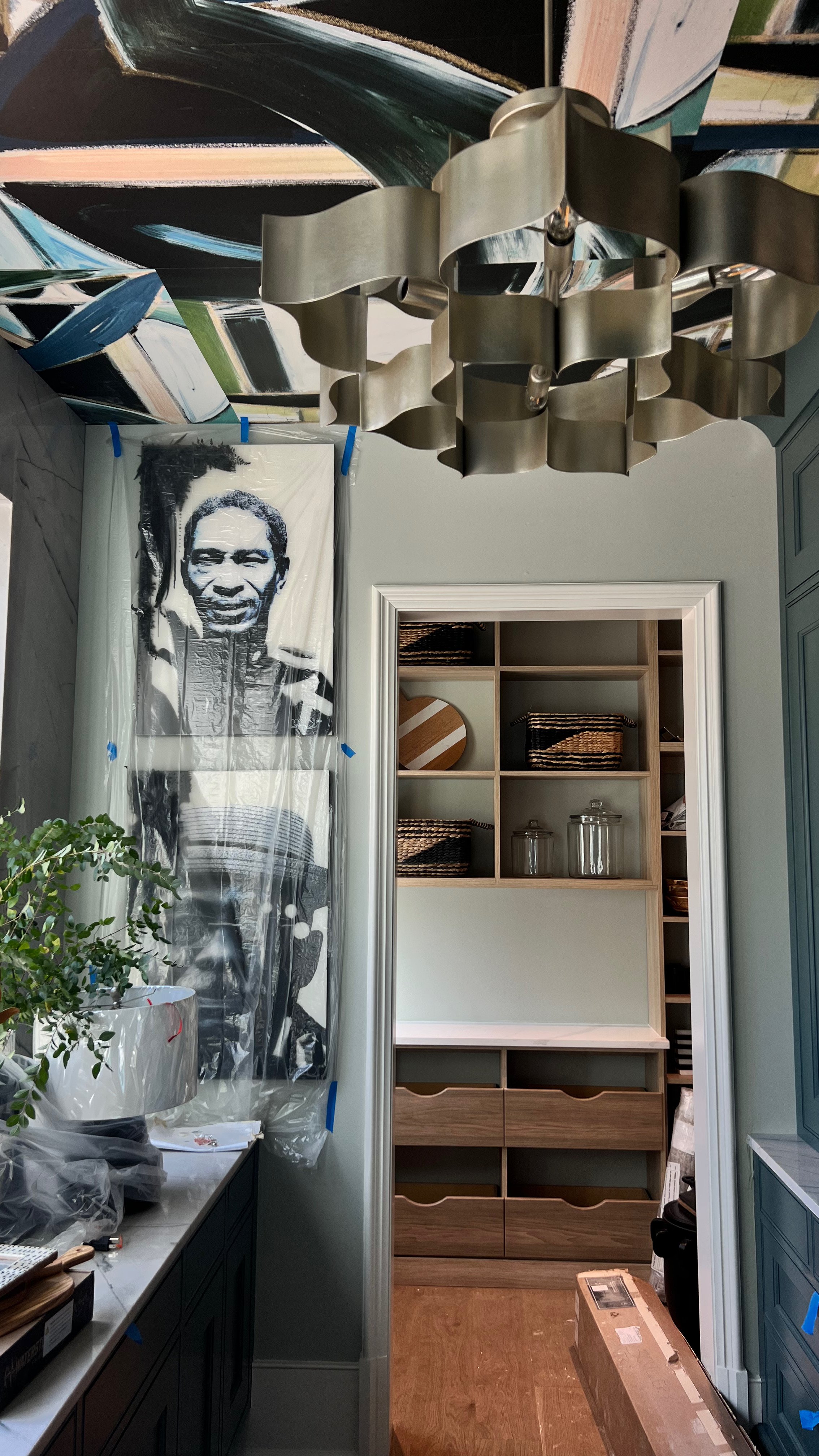
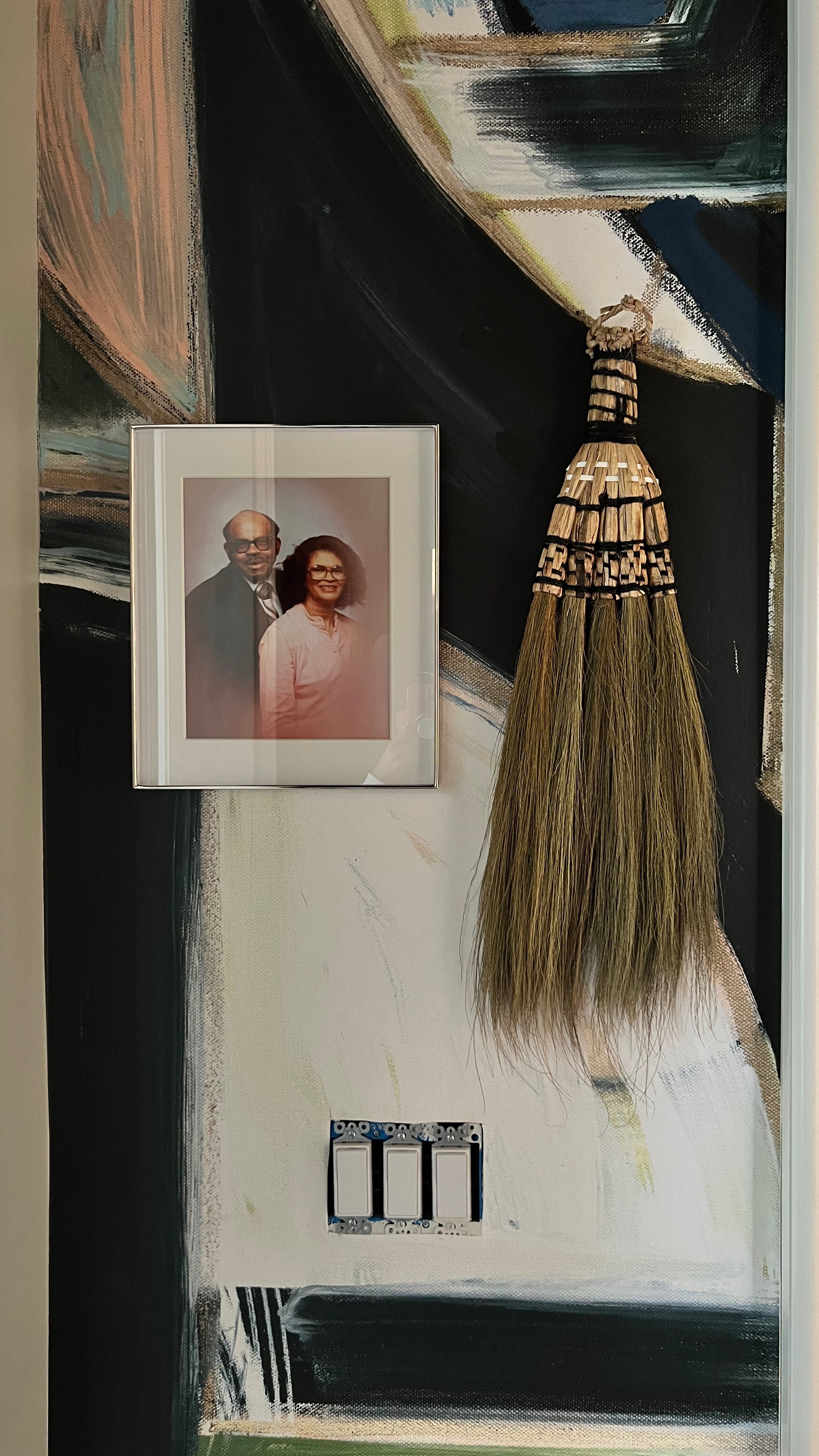
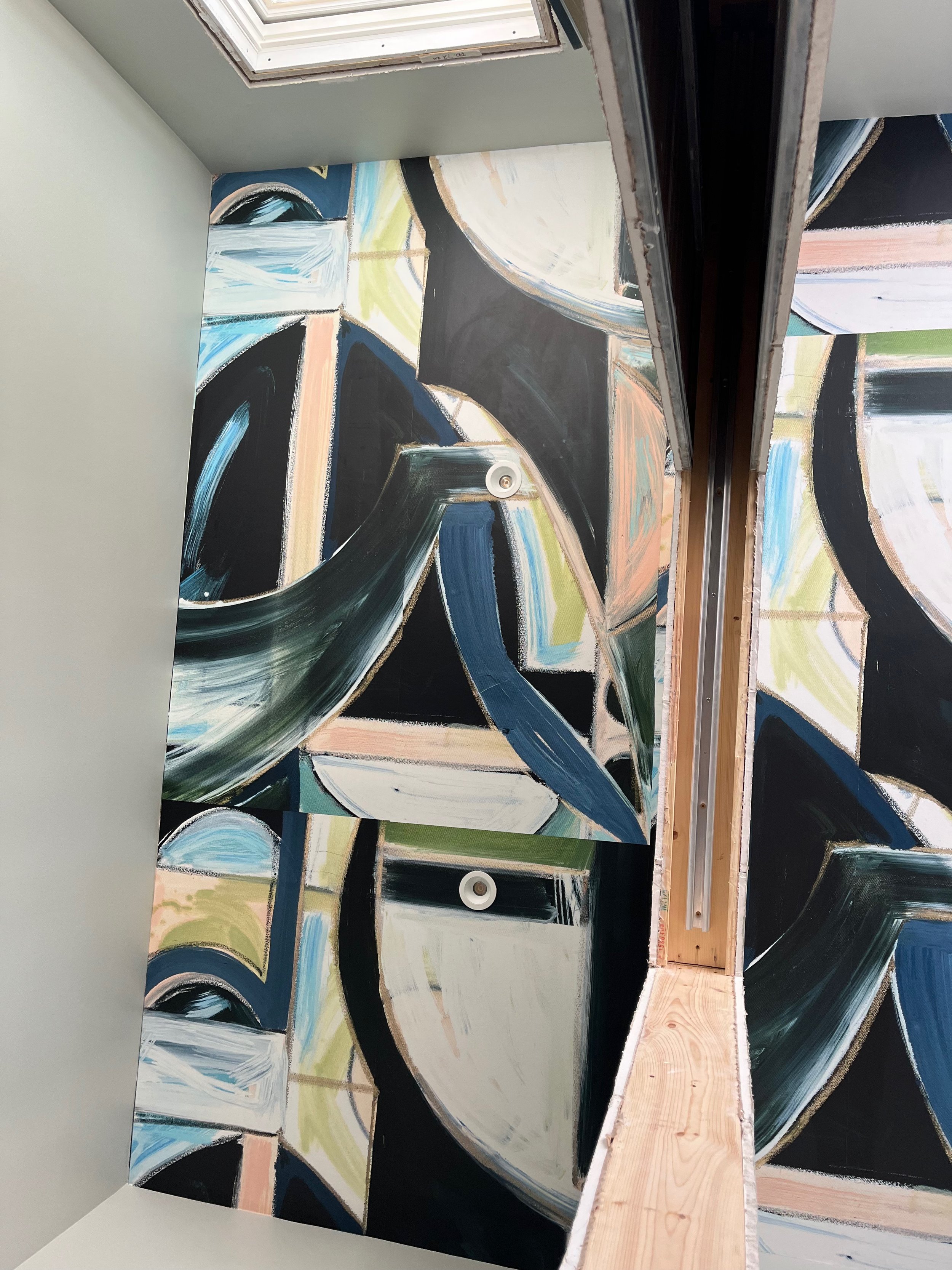
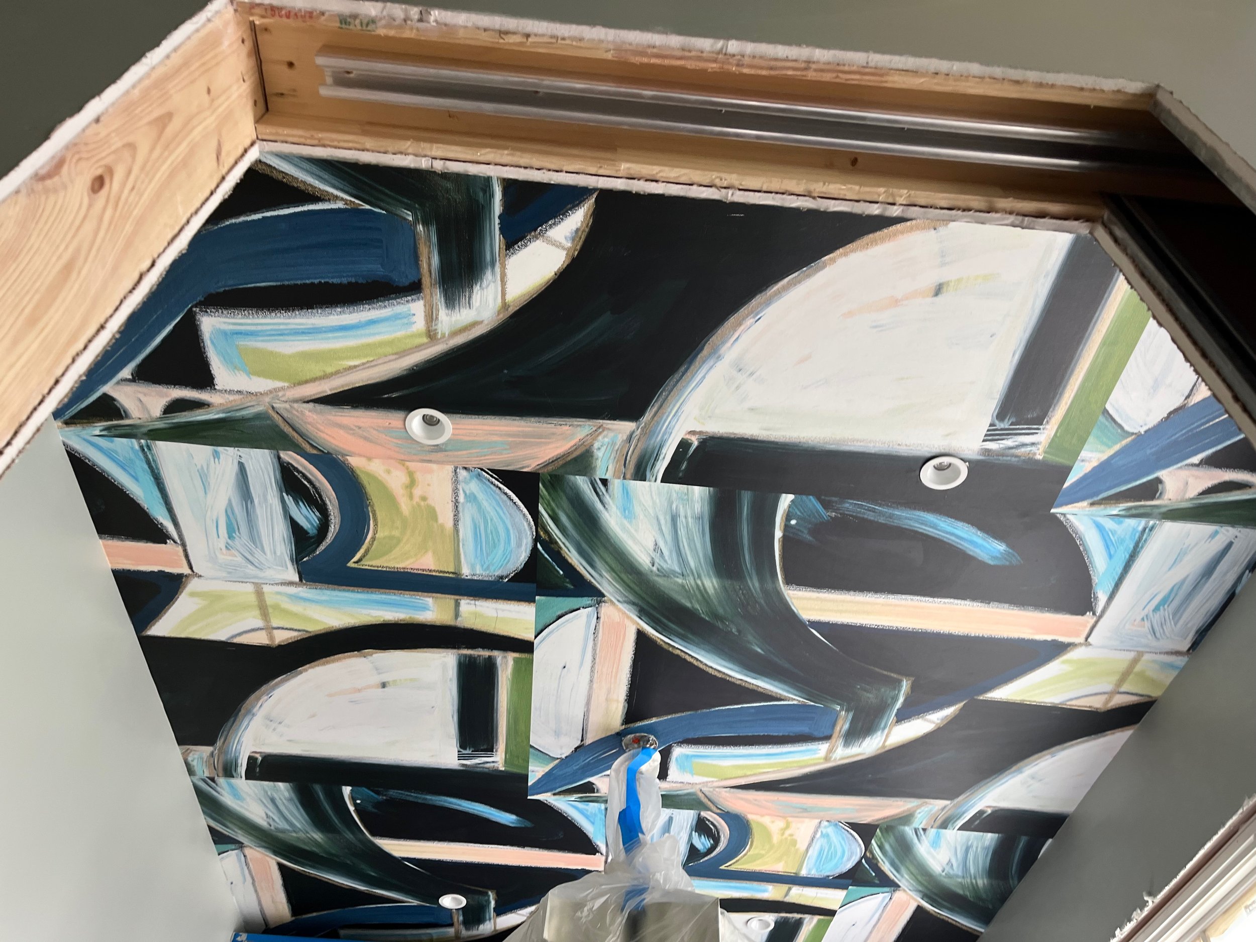
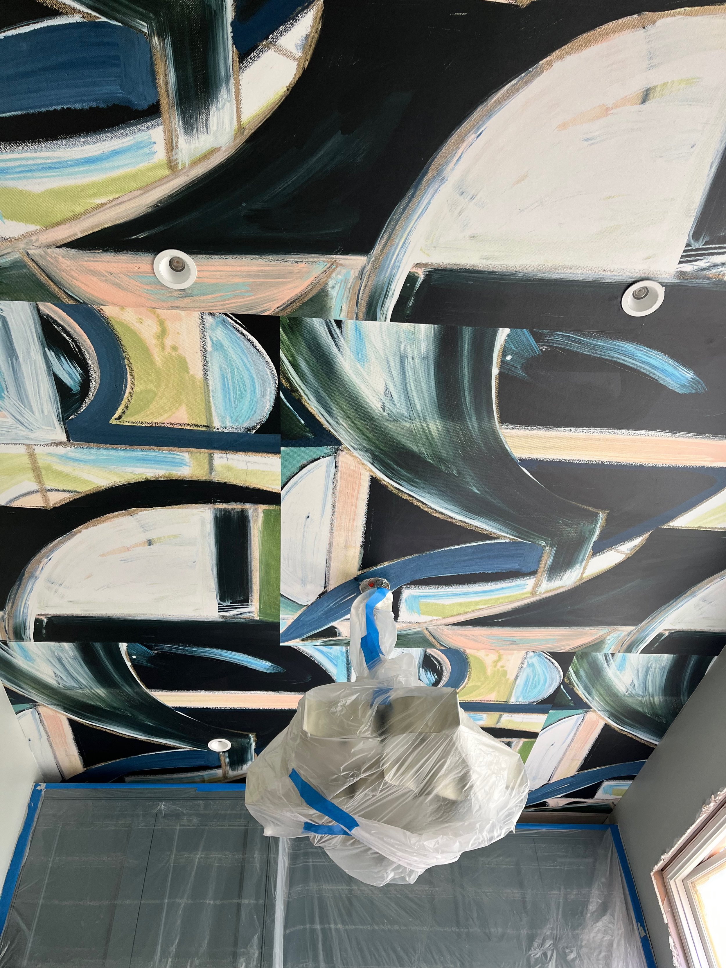
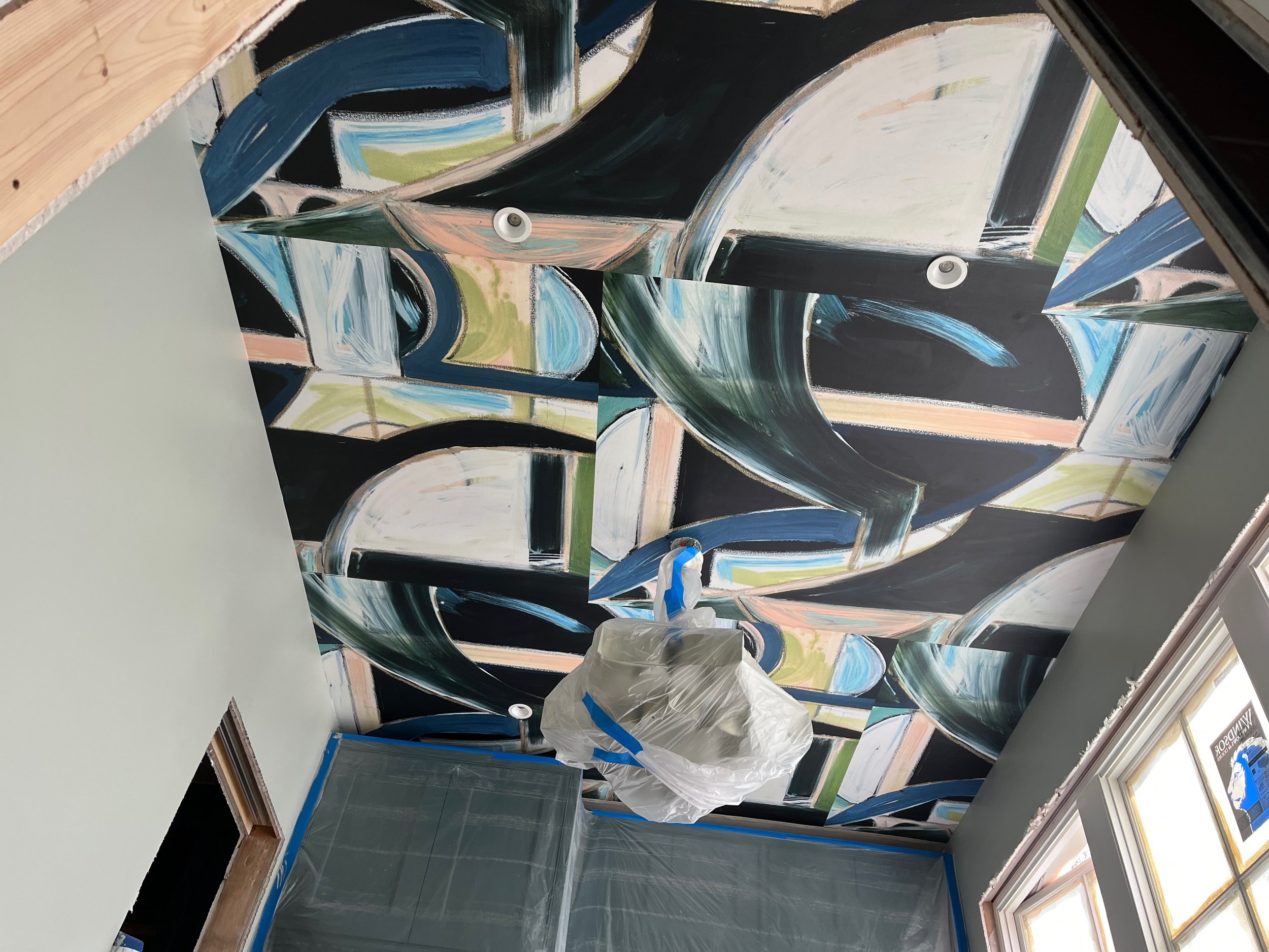
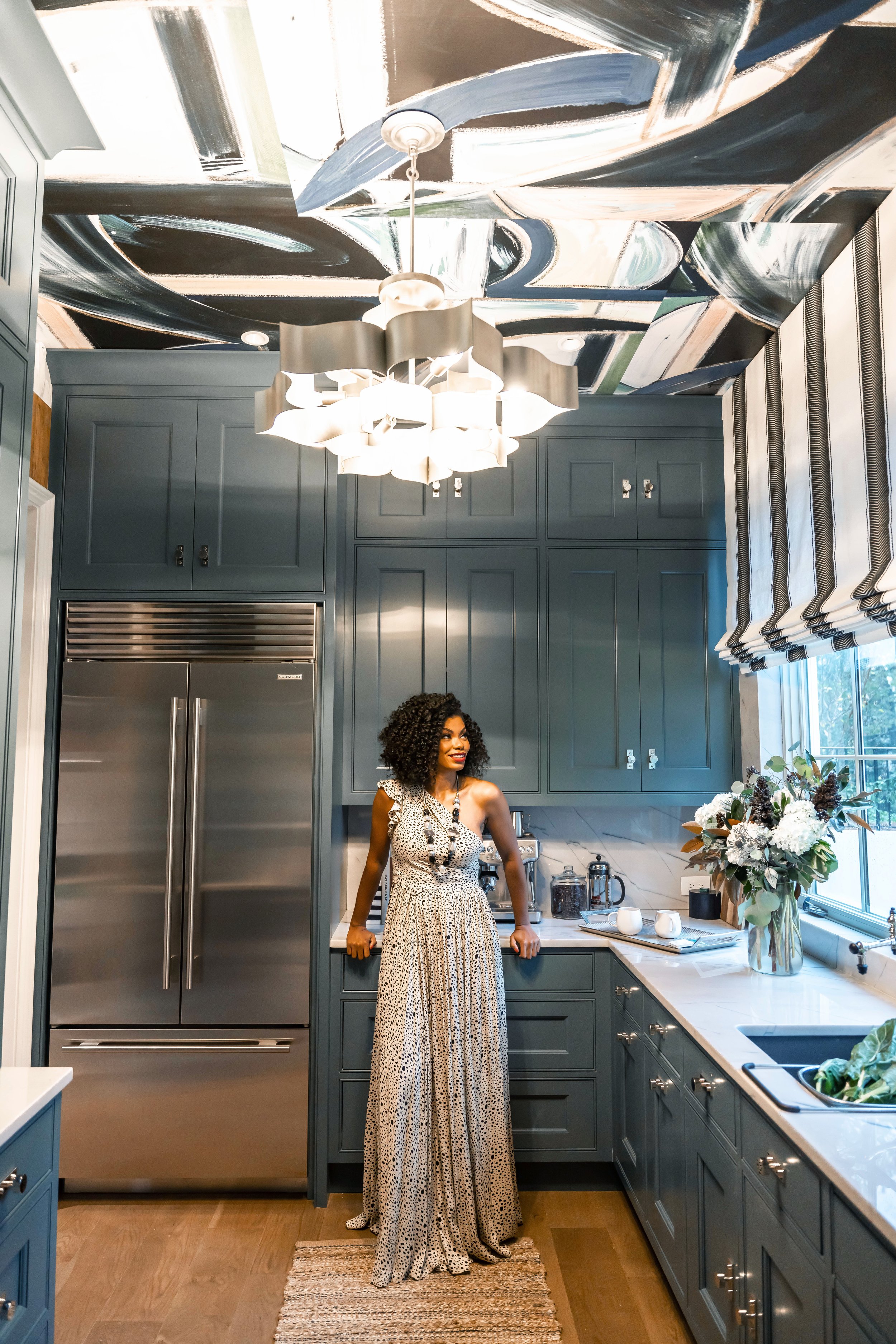
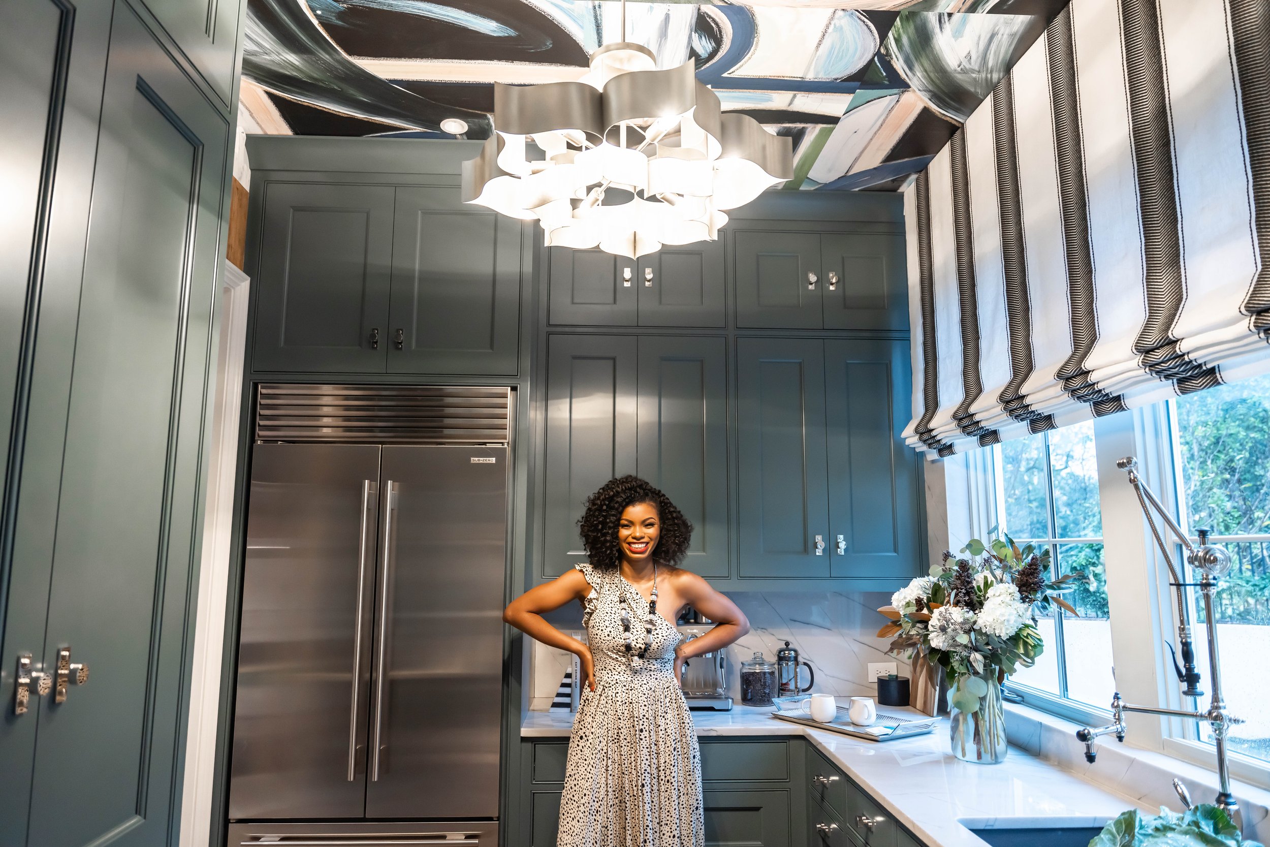
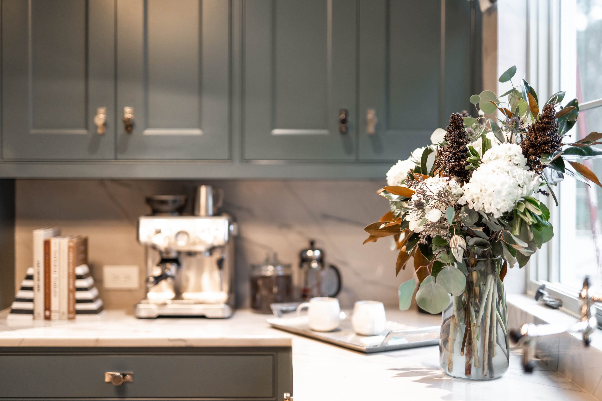
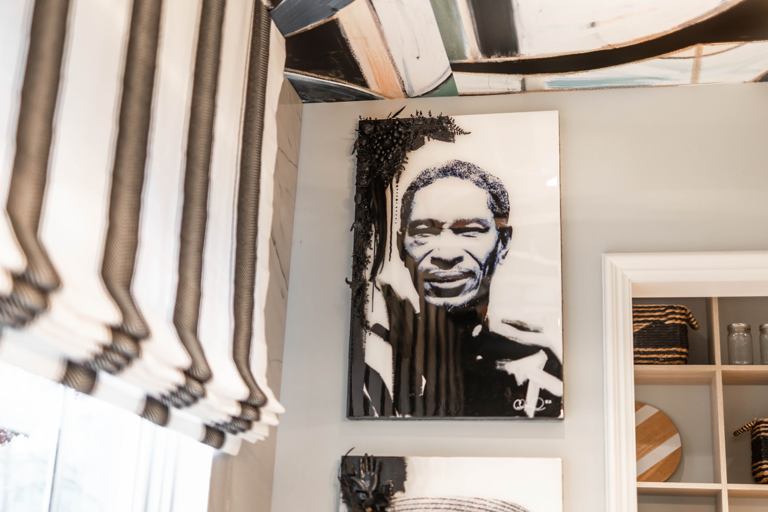
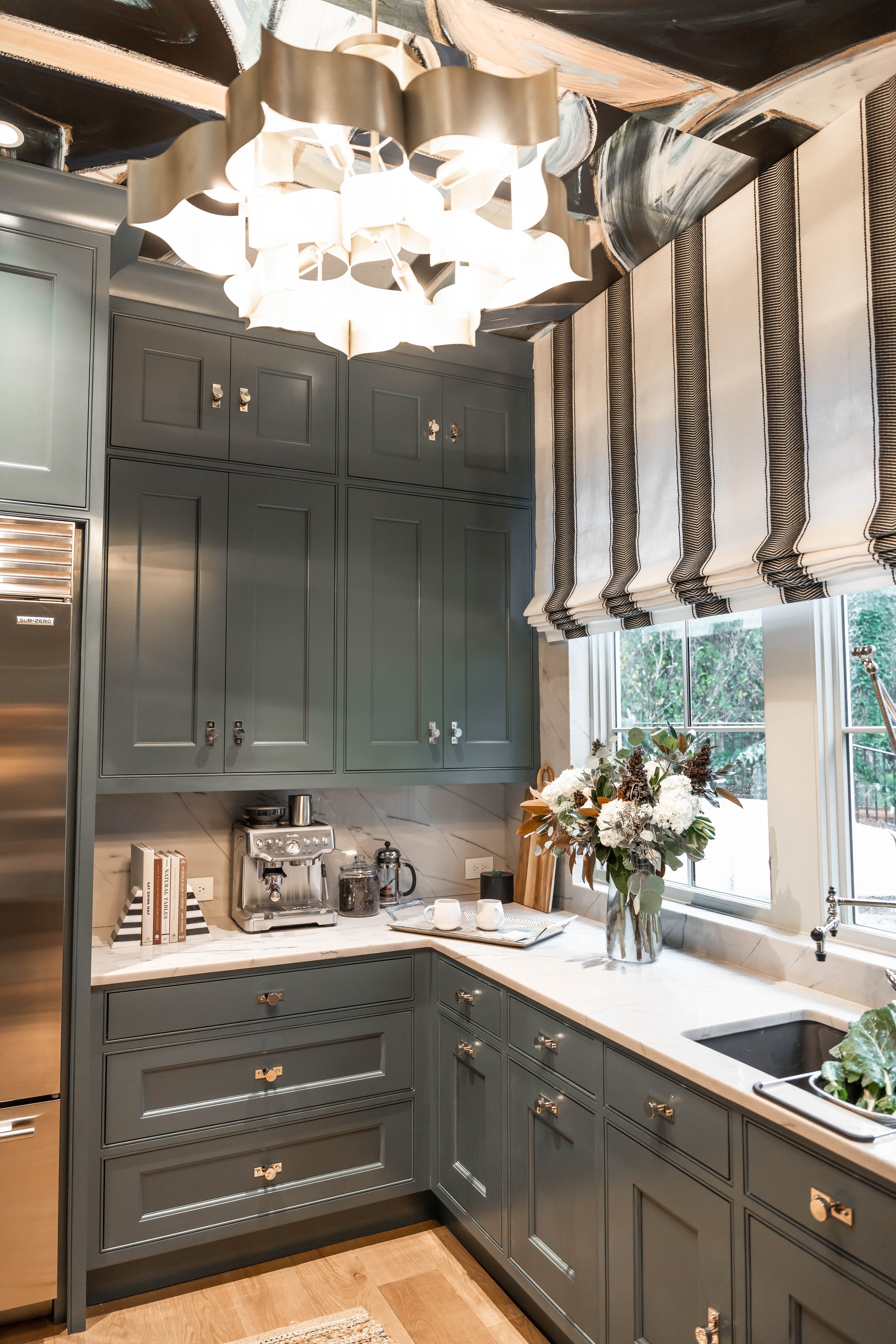
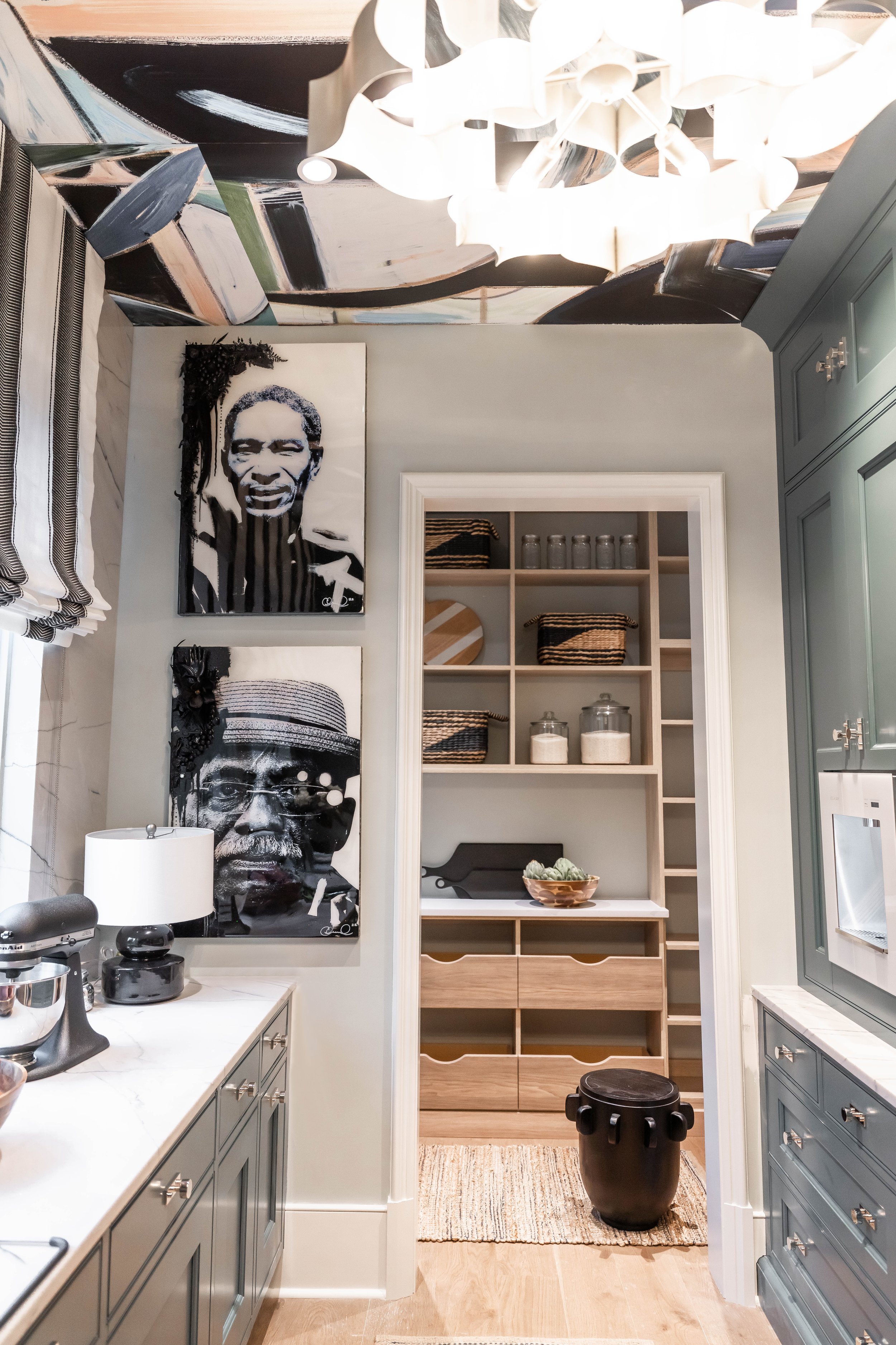
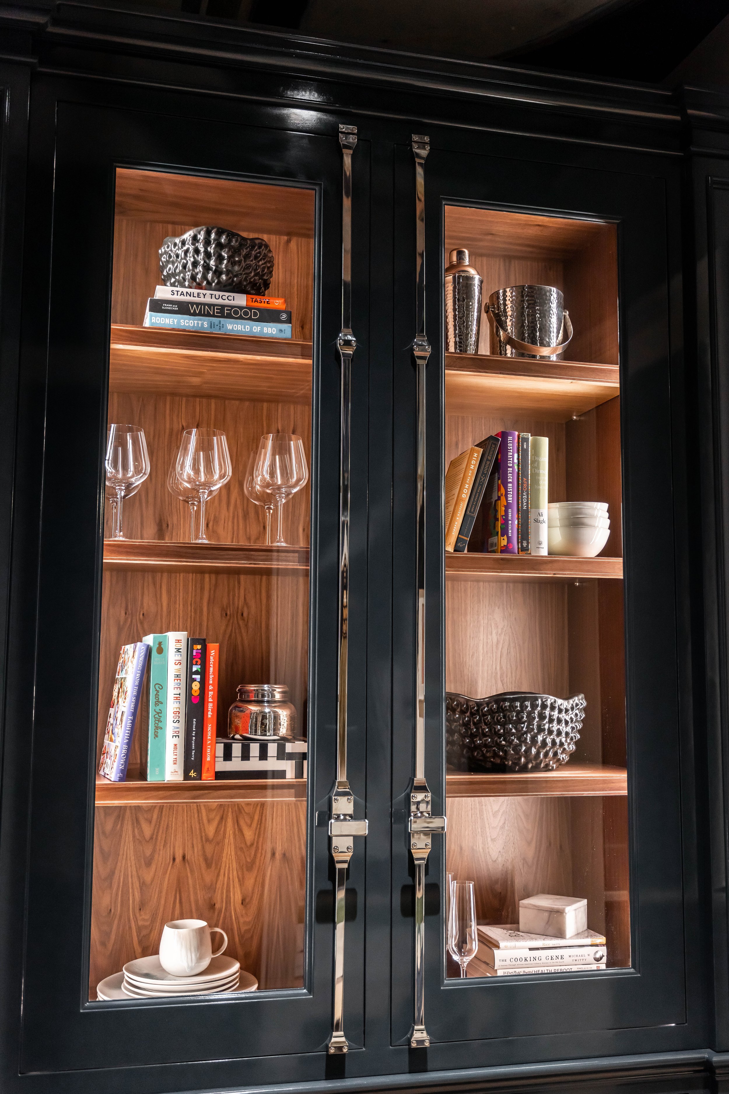
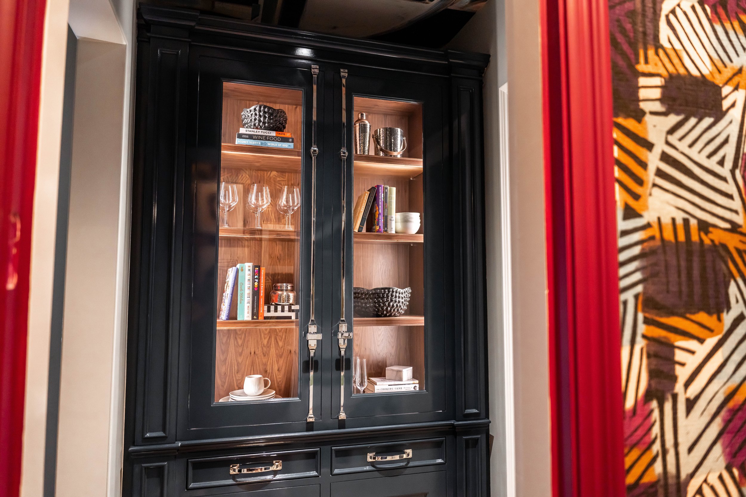
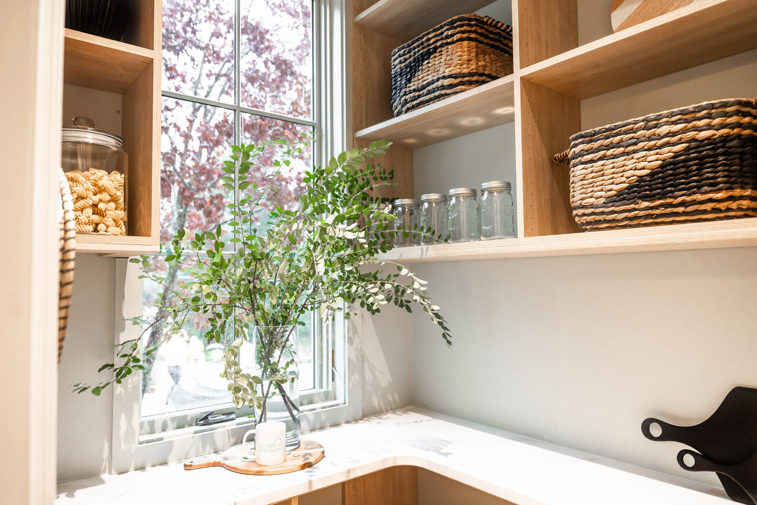
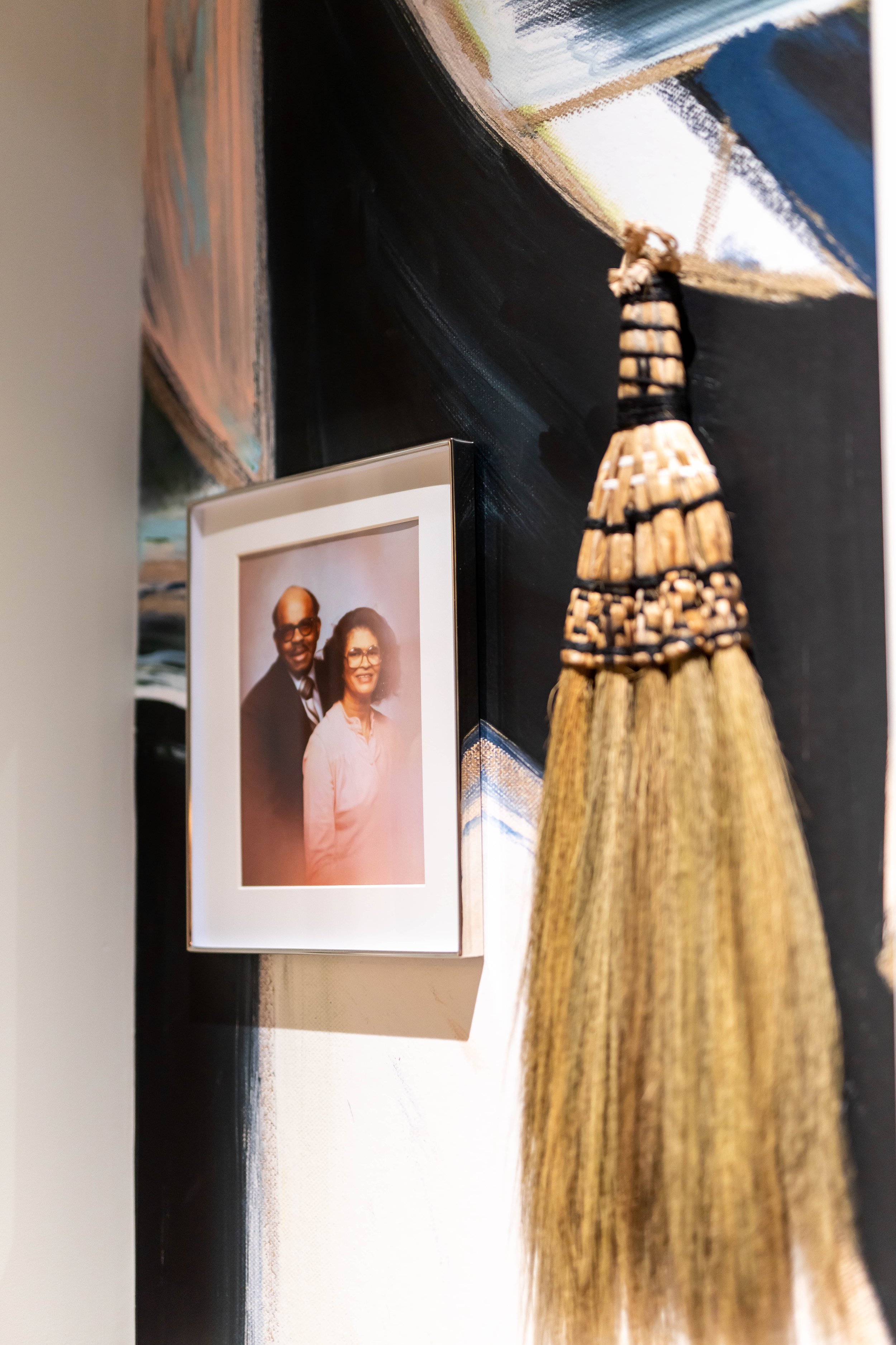
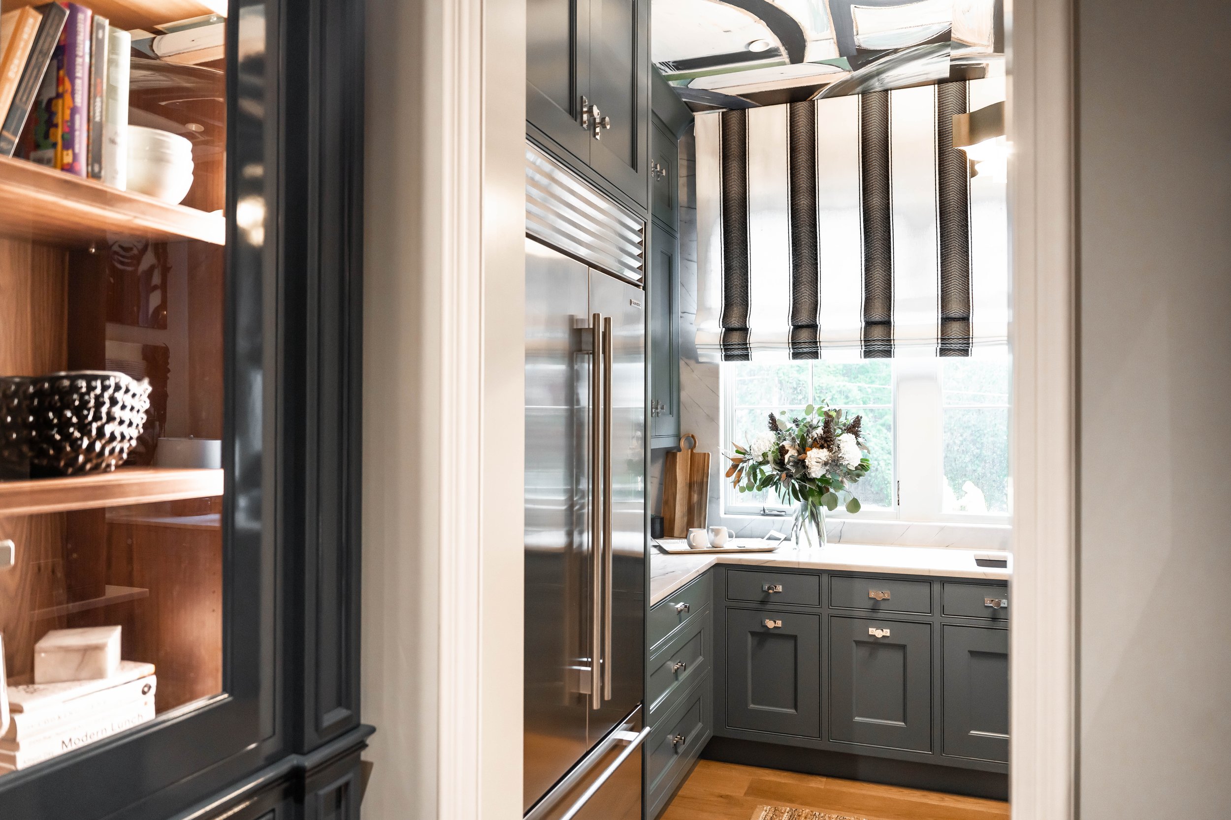
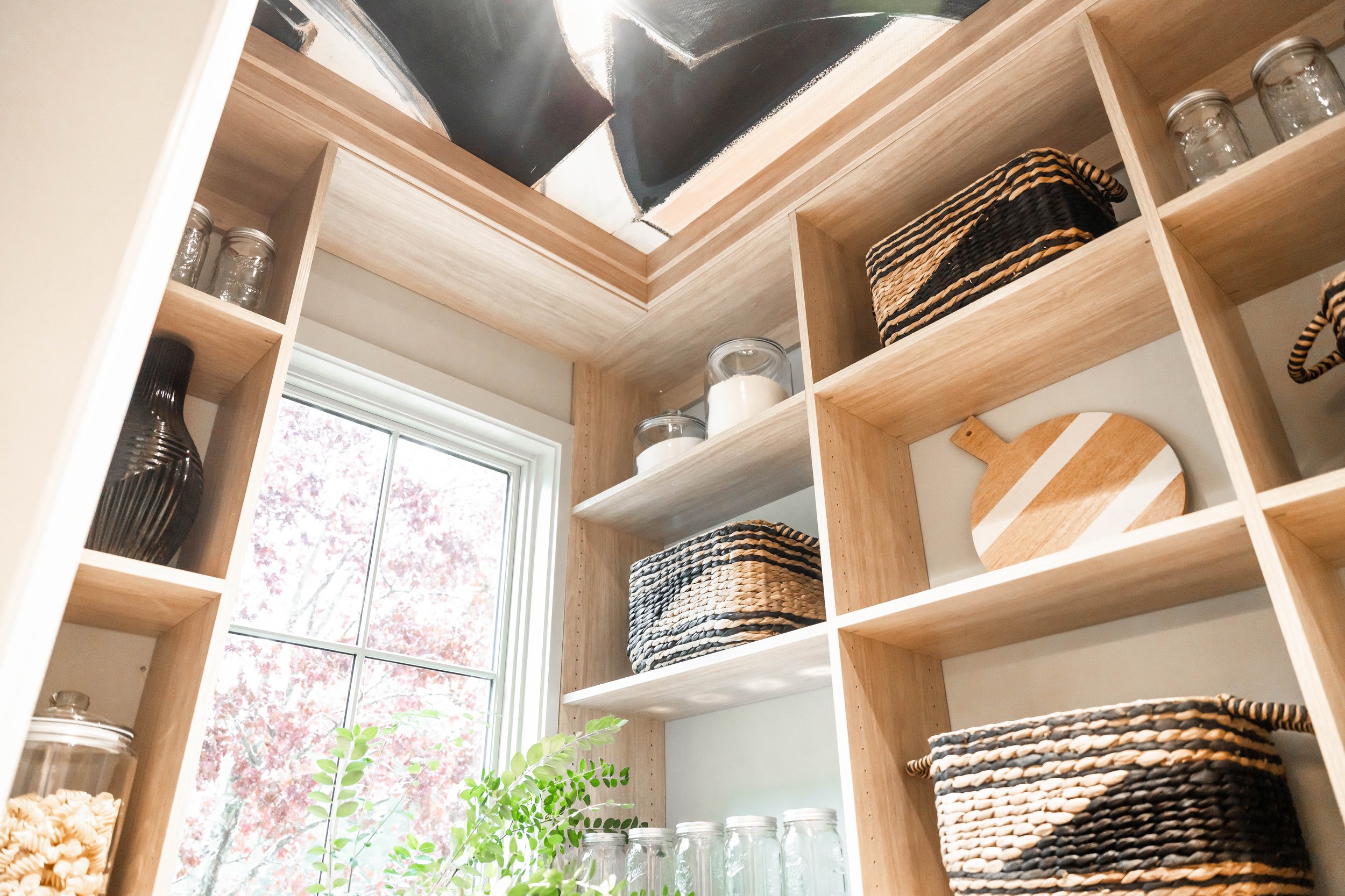
Unlike the powder room being based on the west coast and city, the scullery and pantry would be inspired by the South and country. Most of my fondest childhood memories are of my grandparents’ house in South Carolina. It was a very large home for the Southern rural town we lived in and my grandmother spent so much time in the kitchen identically shaped like this scullery. She’d always stare out the kitchen window above the sink at her laundry waving in the wind on the clothesline beyond the hydrangea bushes as she washed dishes or cleaned vegetables from her garden. My grandfather would usually be outside in his navy blue or denim coveralls tinkering with his tractor or lawnmower or talking to neighbors under their tree. Using the Lauren’s cabinet color choices from Farrow & Ball, I created a palette that is a modern twist on the warmth and safety of my grandparents’ home, reflecting the blue hues of their clothing, flower gardens, and the bright sky in my hometown of Pineville, South Carolina. The graphic wallcoverings from Lindsay Cowles would be a modern twist on these nostalgic southern memories. I dedicated this space to the late George and Wilhelmina Rogers and their 54 years of marriage by adorning the butler pantry’s wall with their photo.
Now that all the paint colors, fixtures, wallcoverings, furniture, and décor were selected, I had to put on my “partnership hat” and seek help in covering the expenses of each item. I’m so grateful that I was gifted the powder room lighting from Visual Comfort, Jute runner rugs from Jaipur Living, and the custom Martyn Lawrence Bullard striped roman shades from The Shade Store. I was also able to borrow items from Made Goods and Heirloom to accessorize each space. Lastly, I was so grateful to the incomparable artist, Chanell Angeli and ZuCot Gallery for allowing me to borrow her recent works, Blue Pill and Bernard for the scullery wall.
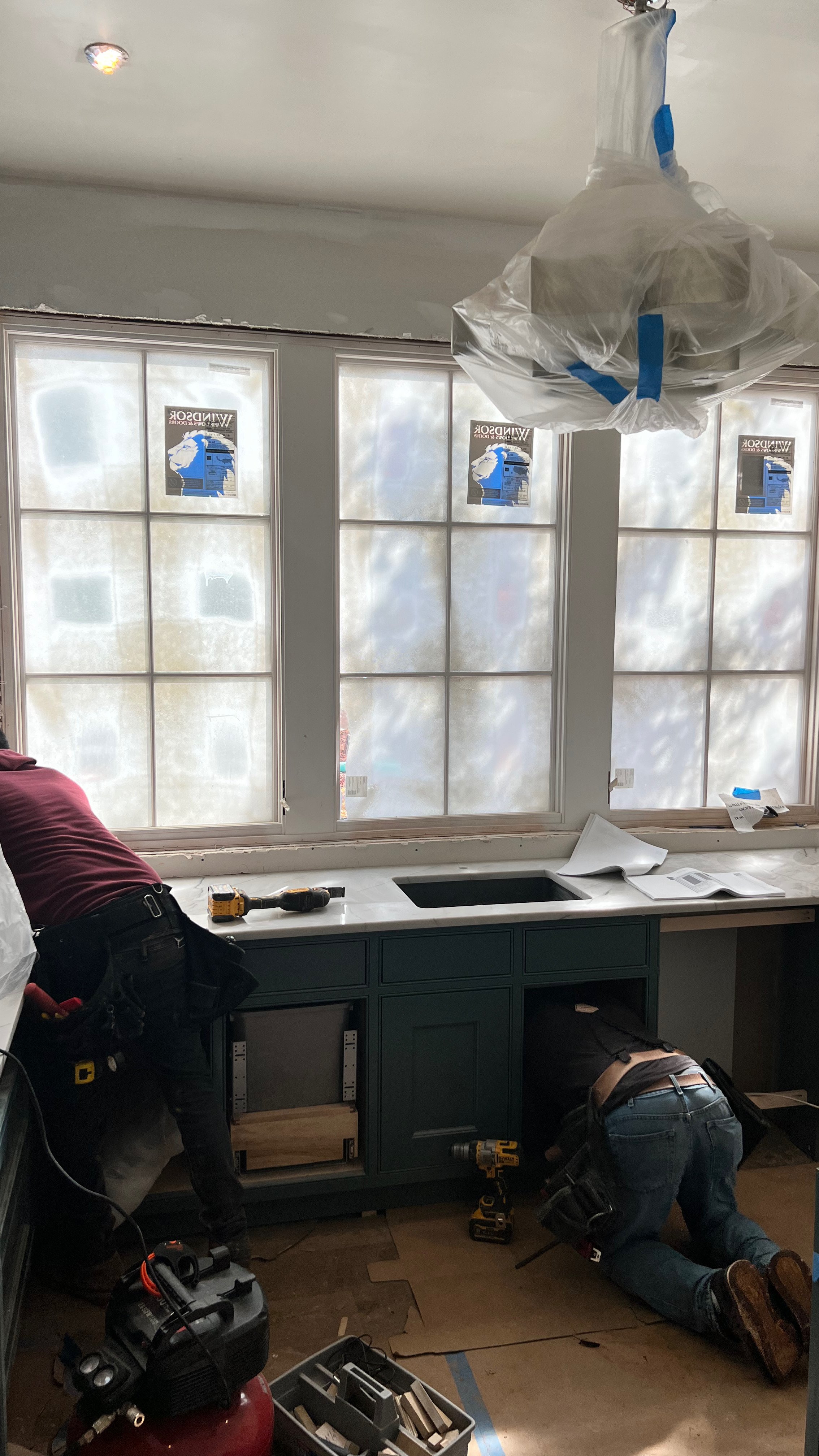
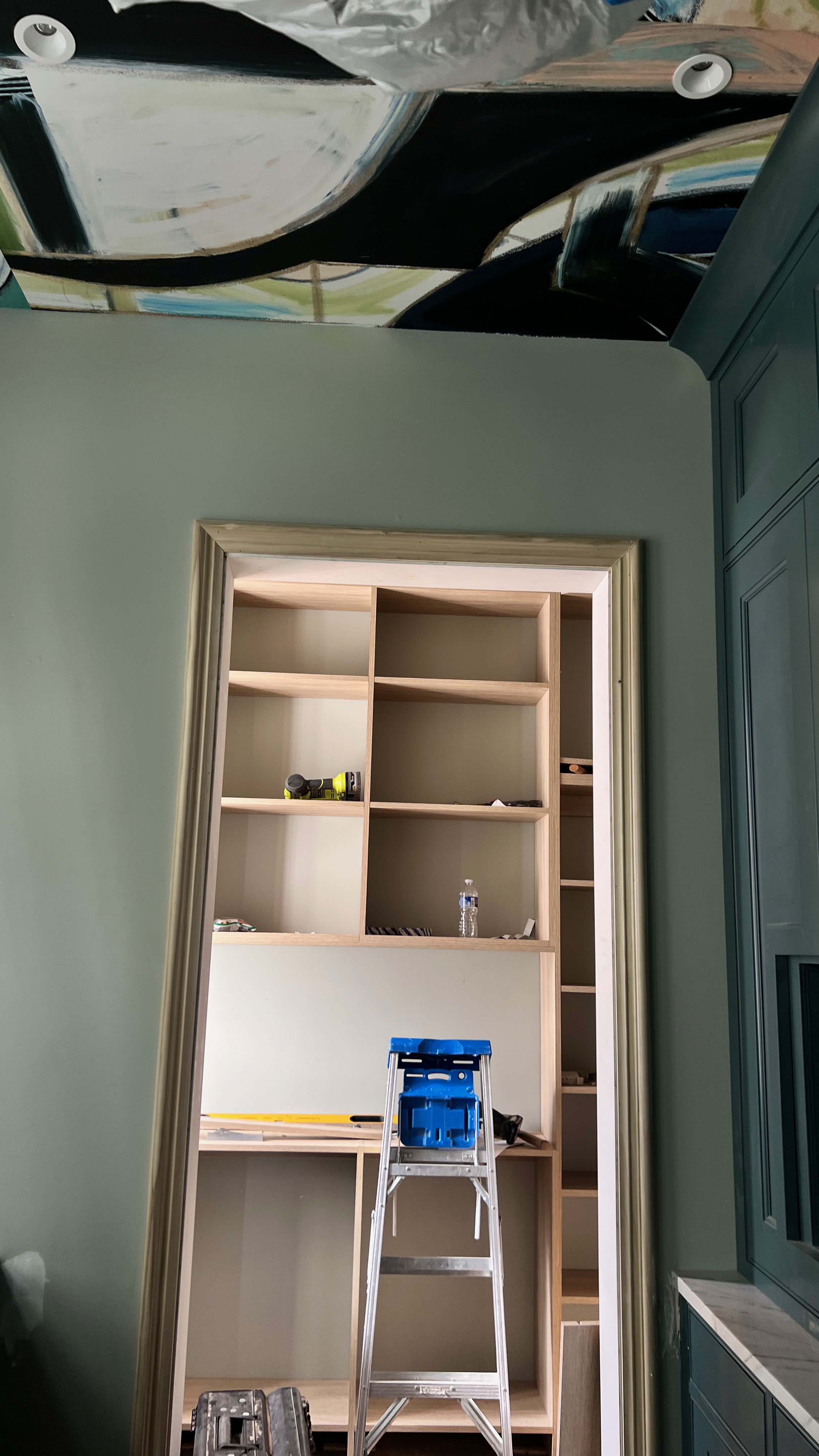
Here's the thing they don’t tell you about showhouses…. Although you have complete creative freedom and control with your designs, you must be okay not being in control when it comes to the house itself. Because most of my spaces were filled with cabinetry and construction that needed to be completed by tradesman (cabinetry, counter tops, slab, windows, flooring, etc.), the delays in actually being able to get into my spaces to start my design execution were VERY stressful. I’d come by the house to have it wallpapered with my friend, Rafael at Atlantic Wallpapers, but the drywall, base boards and trim were not complete. I’d come by the next day and my flooring or painting wasn’t done yet. I couldn’t have the electrician install my lighting because you physically couldn’t enter the space because of all the unfinished cabinetry everywhere. The cabinetry wasn’t done, so the countertops couldn’t be brought in. Which meant The Shade Store couldn’t enter the space to install my roman shades because the slab around the windows wasn’t finished… You know, because of the missing countertops. It was an endless rigamarole of delays and the domino effects that followed because of them. This stress was one I wasn’t prepared for, but somehow, sone way, things got done and I was able to get in to complete each space in time for the final photography the week before the house opened.
Ready to see how it all came out?
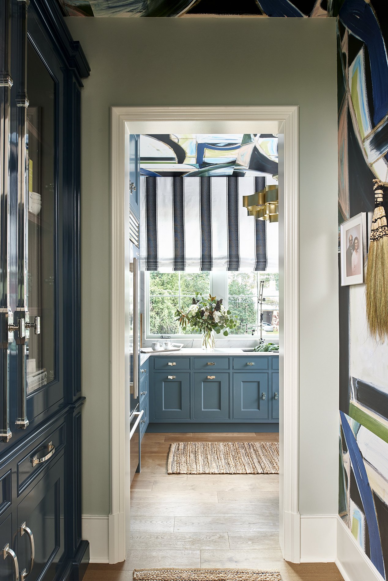
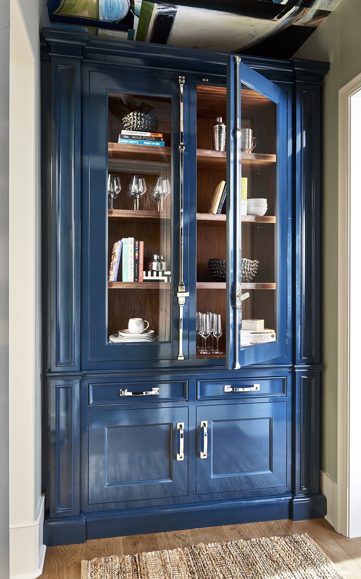
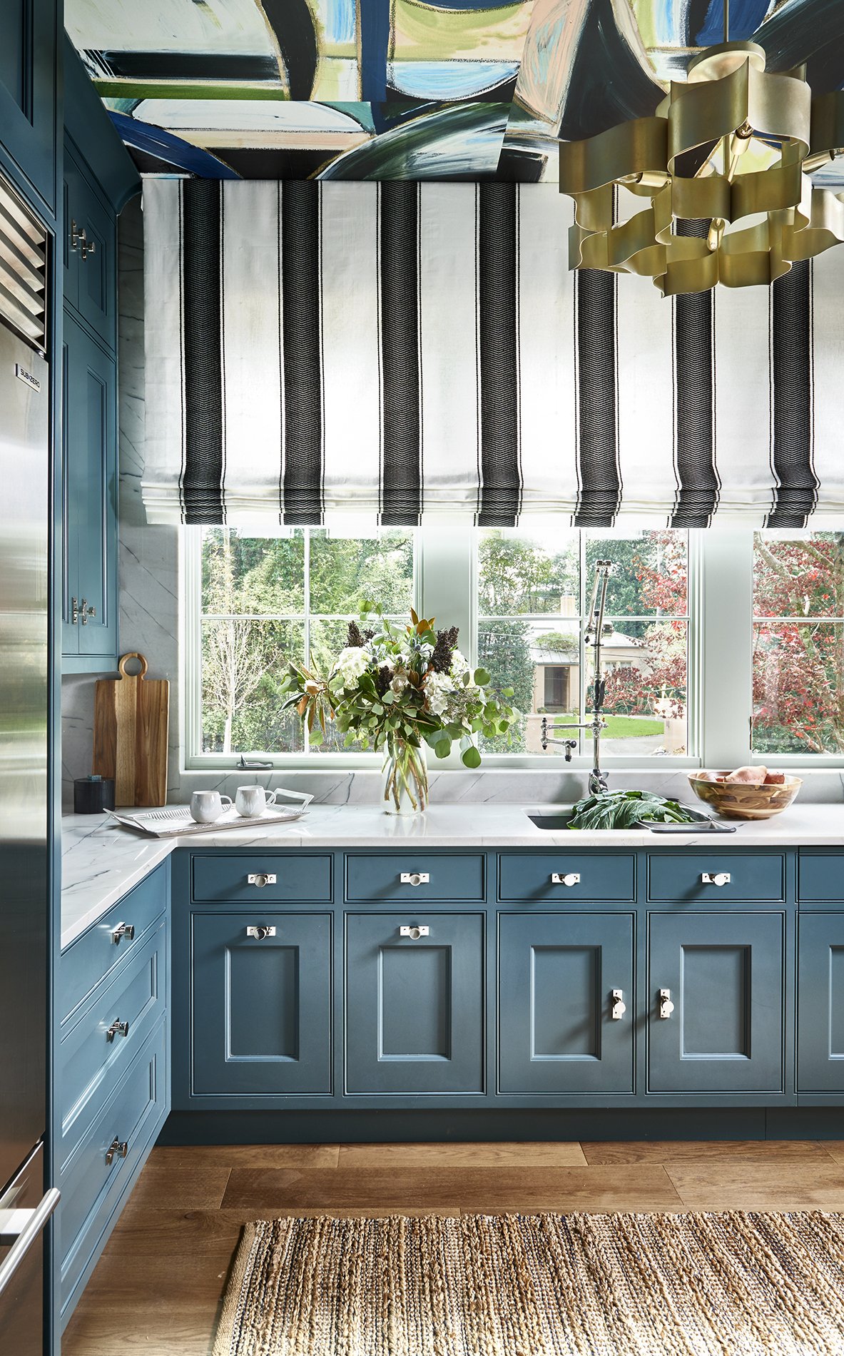
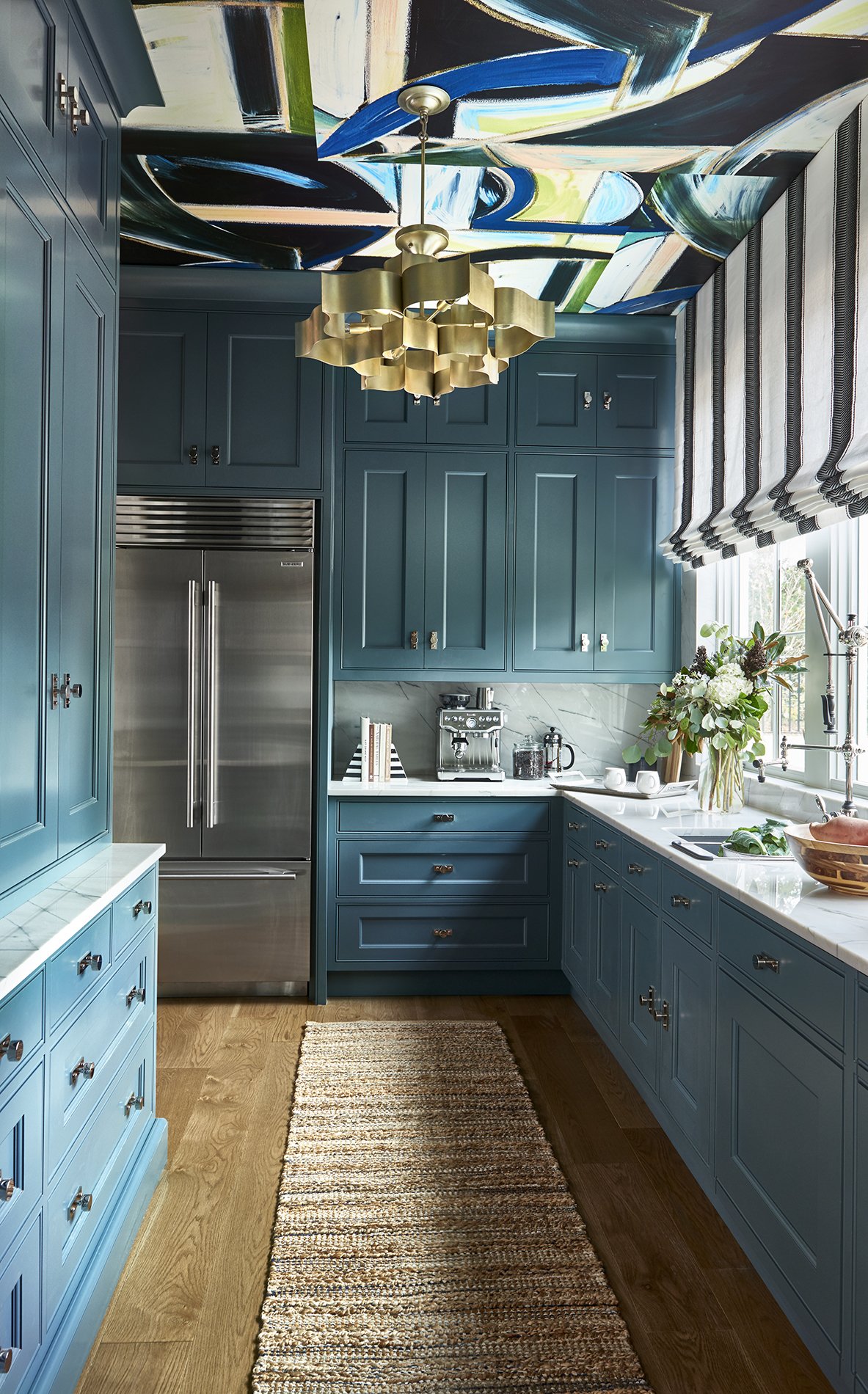
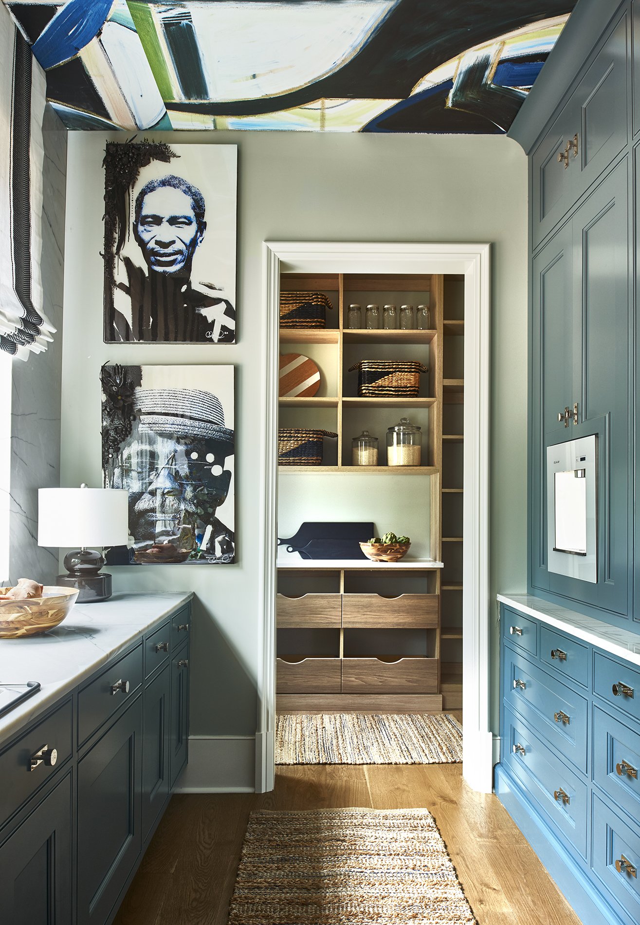
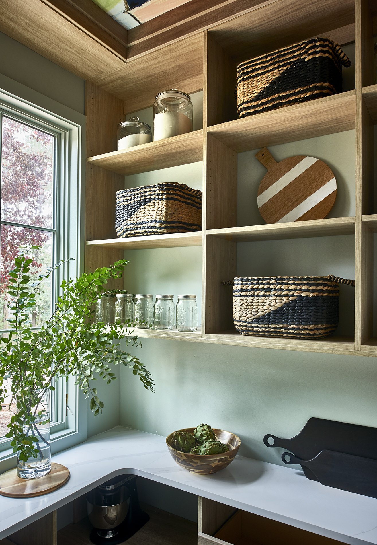
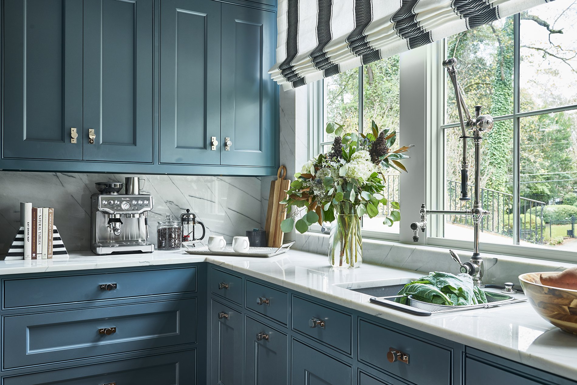
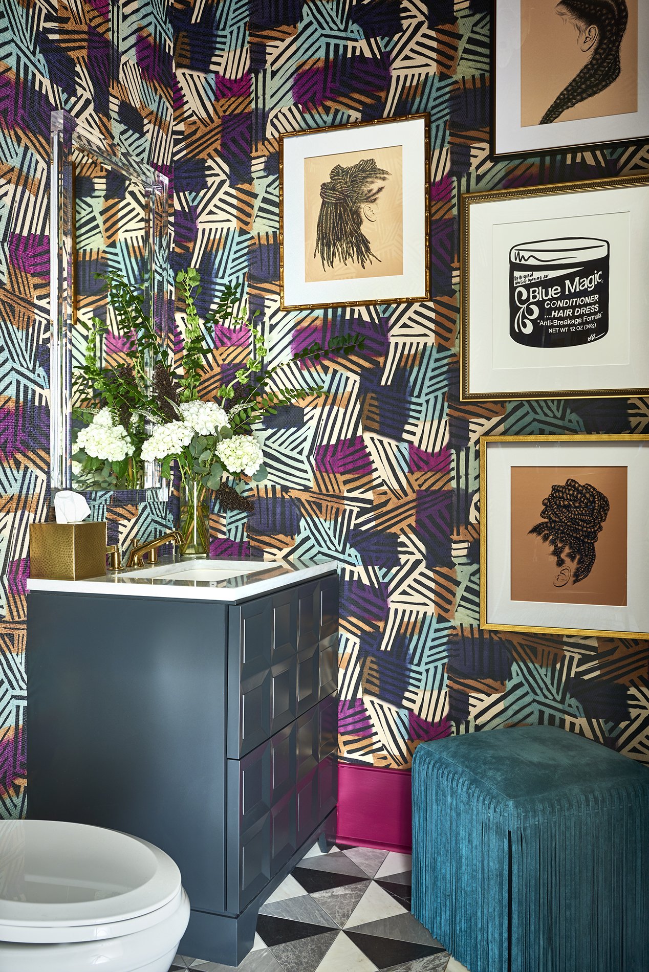
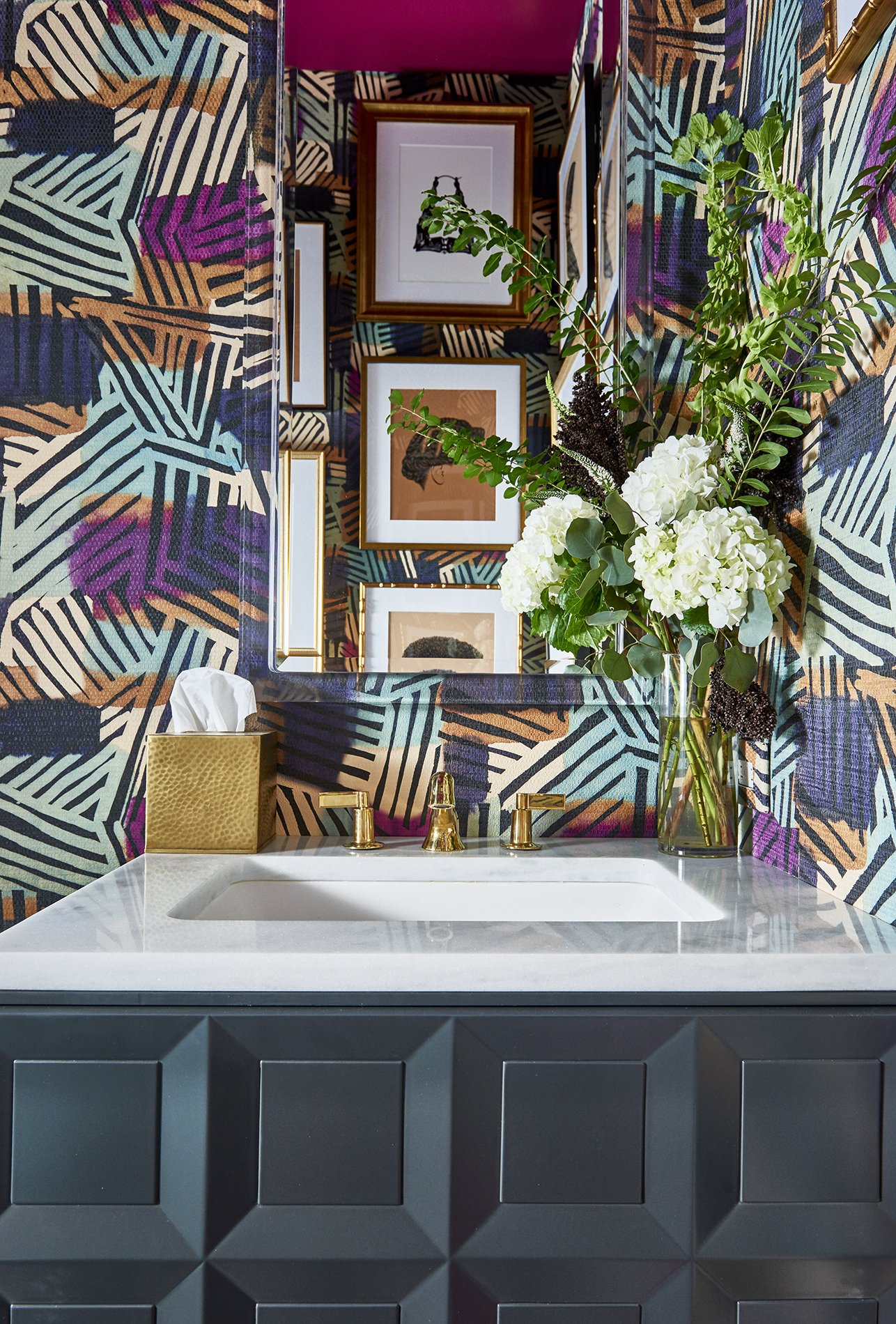
Interior Photography by Marc Mauldin Photography
Videography by Teko Lewis of The First Look Photography and LaJoy Photography
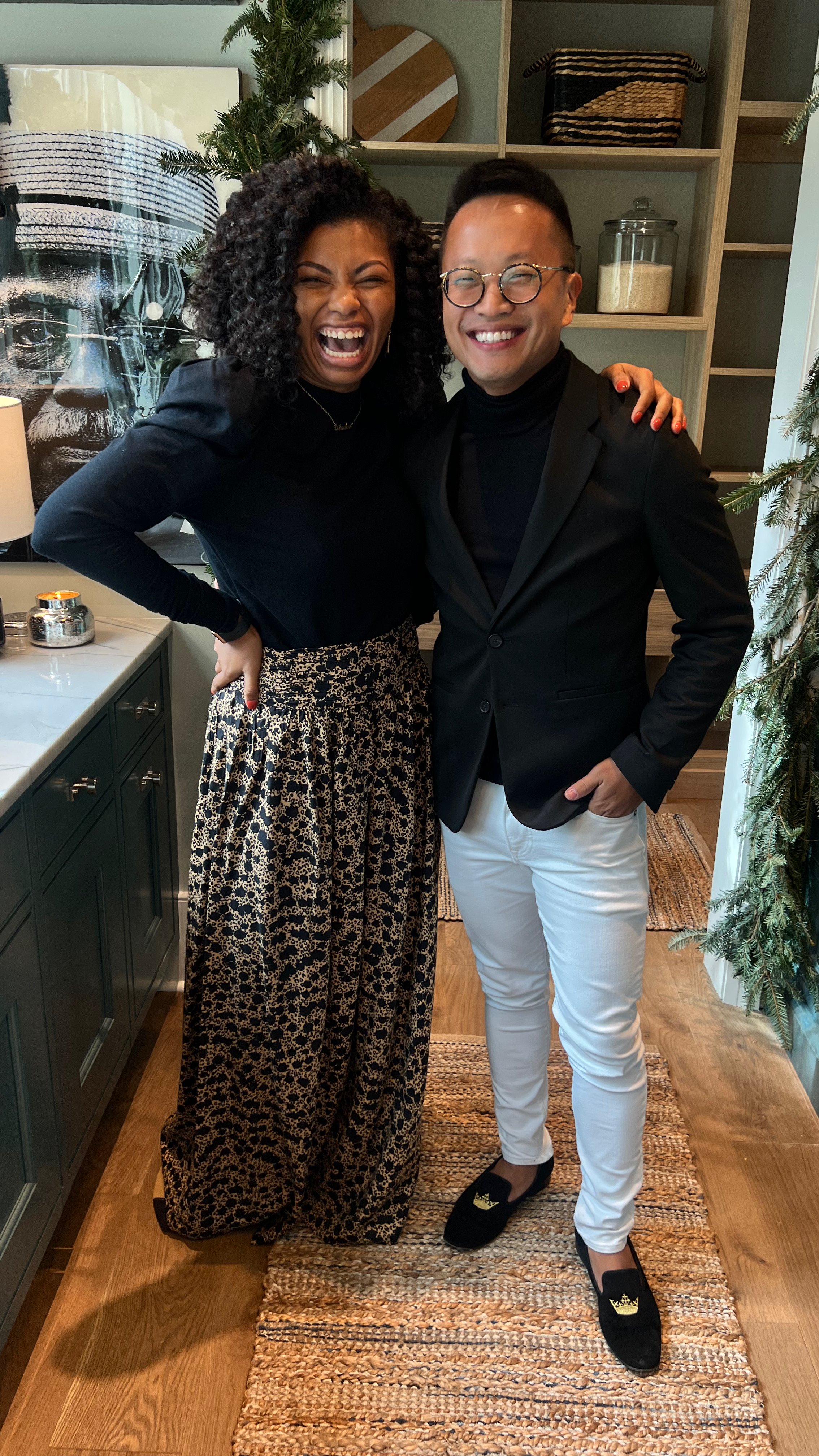
The one consistent piece of advice received from other designers was to “go big or go home!” “Give it your all and show them who you are.” And boy, did I. I made each of my spaces intentional and authentically me filled with color, culture and character within every inch leaving no corner without wonder. And to hear that feedback from every person of different ages, ethnicities, and walks of life, it brought me so much joy. I did it, y’all. And I am so proud.
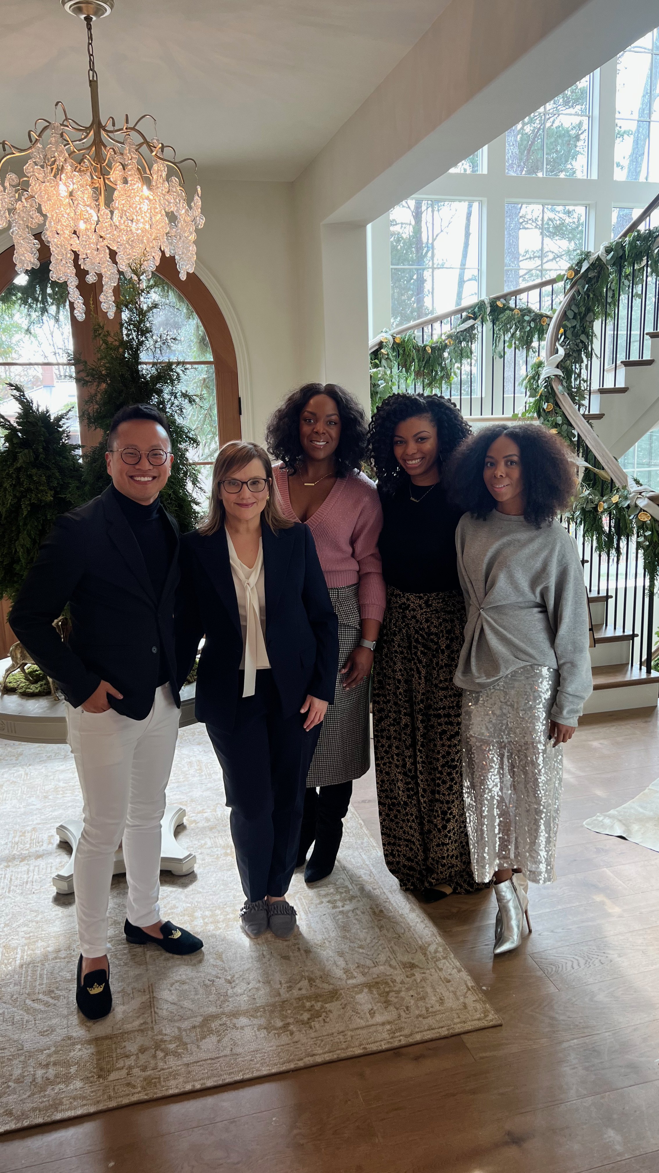
There are so many people to thank for this incredible opportunity that was truly the icing on my cake for such a phenomenal year. To Lauren, Lori, Elizabeth, Brad, Evan, Anna, and the Atlanta Homes & Lifestyles magazine team - thank you for believing in and trusting me amongst the 18 selected interior designers to make this beautiful house a home. Chris and Jeff of KBD Development and Harrison Design, what a HOUSE! Thank you for all your hard work and juggling dozens of contractors, delays, anxious designers, and my endless and questions as we brought these sticks to life. To our incredible spec designer, Lauren and all my fellow showhouse designers – you all were the best part. Getting to know each of you, it’s like I have a new little family. What we shared and created is priceless and these memories will live with me forever. To my contractors, vendors, sponsors, and partners –Atlantic Wallpapers, ATL Handyman, The Shade Store’s amazing team, Jaipur Living, Visual Comfort, Heirloom, FrameBridge, Pierre Frey, Made Goods, Kingdom Woodworks, A Touch of Stone, Andra, Chanell Angeli, ZuCot Gallery, photographers and videographers Marc, LaJoy, and Teko, and so many more – my design wouldn’t have been possible without you.
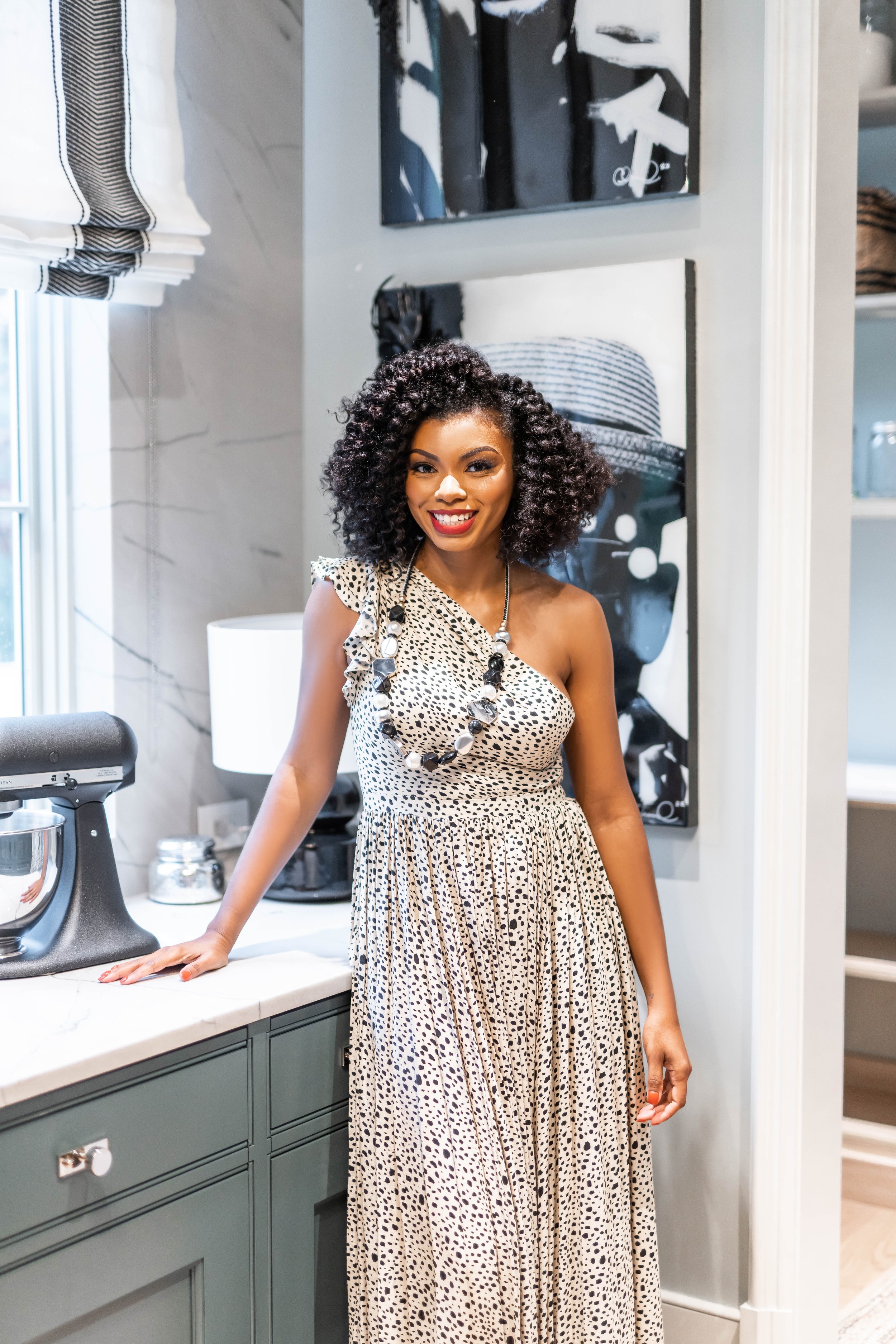
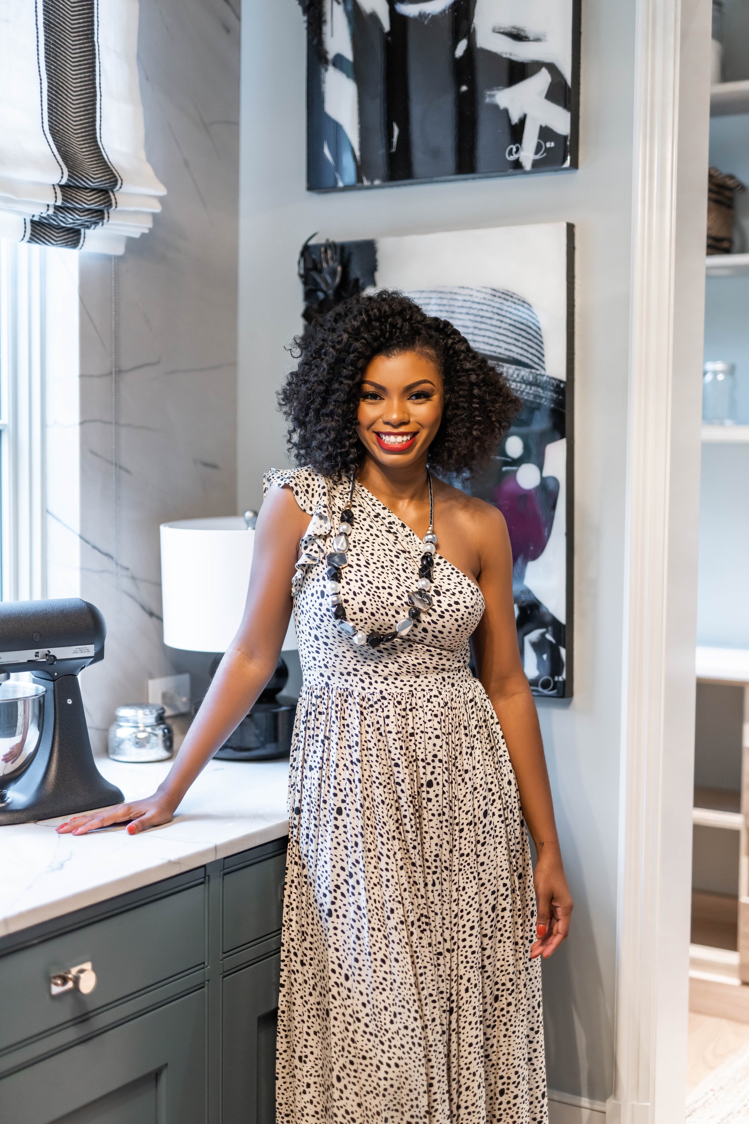
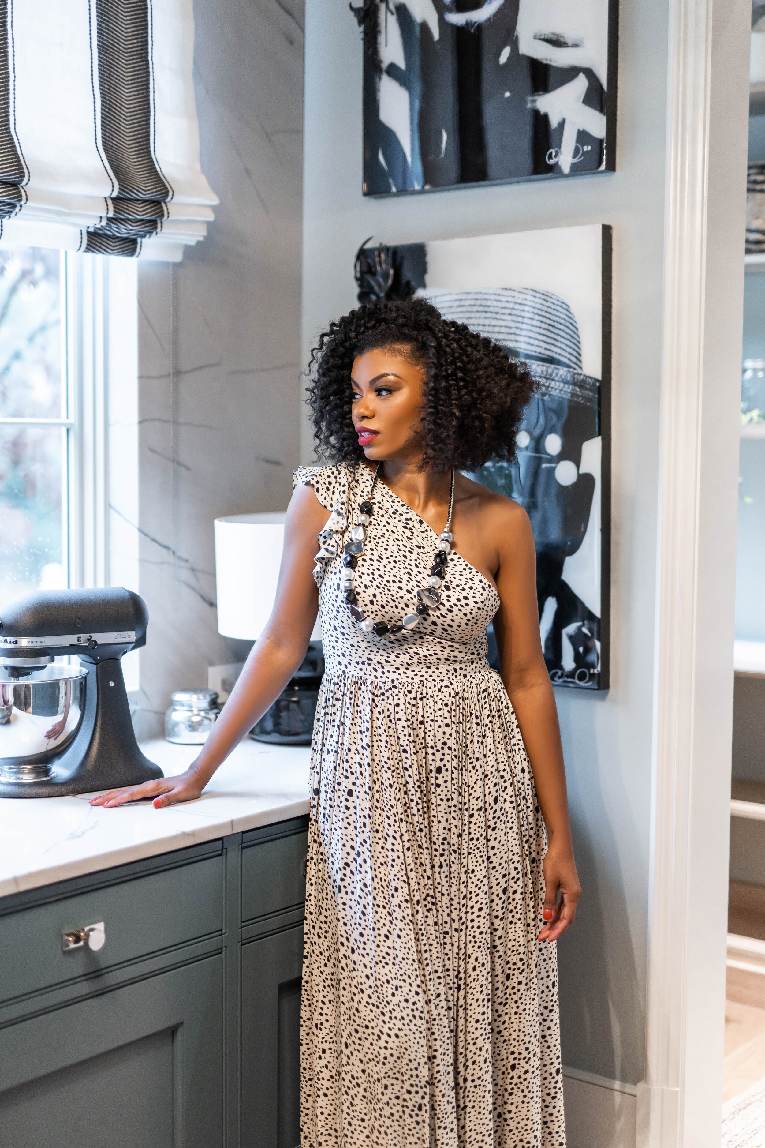
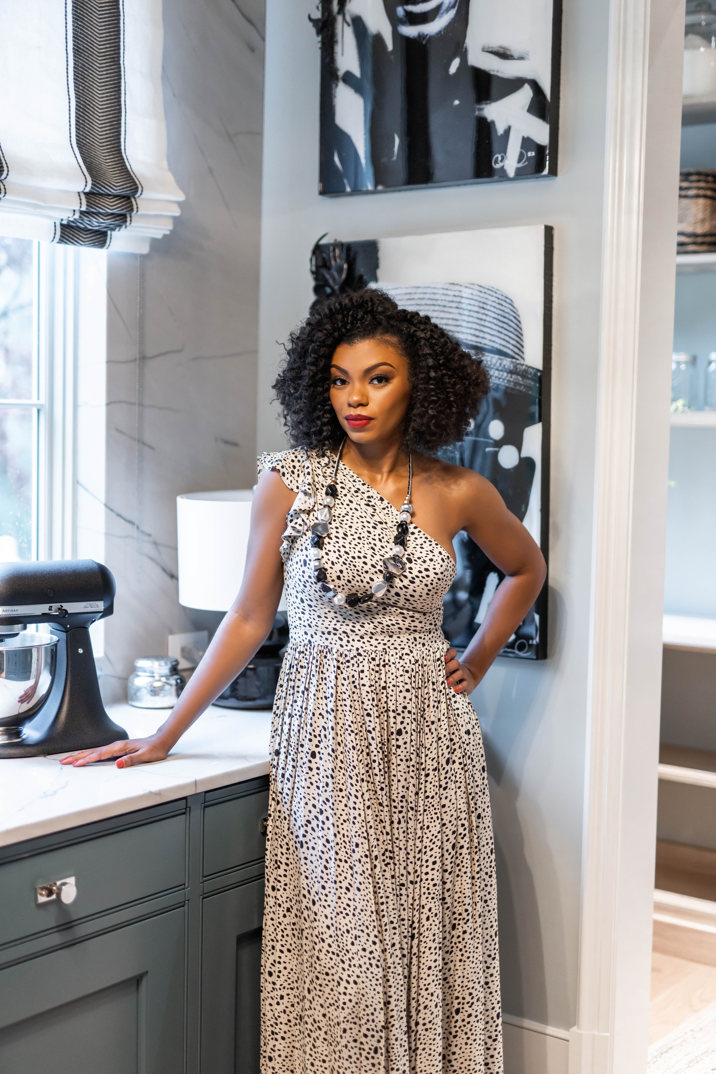
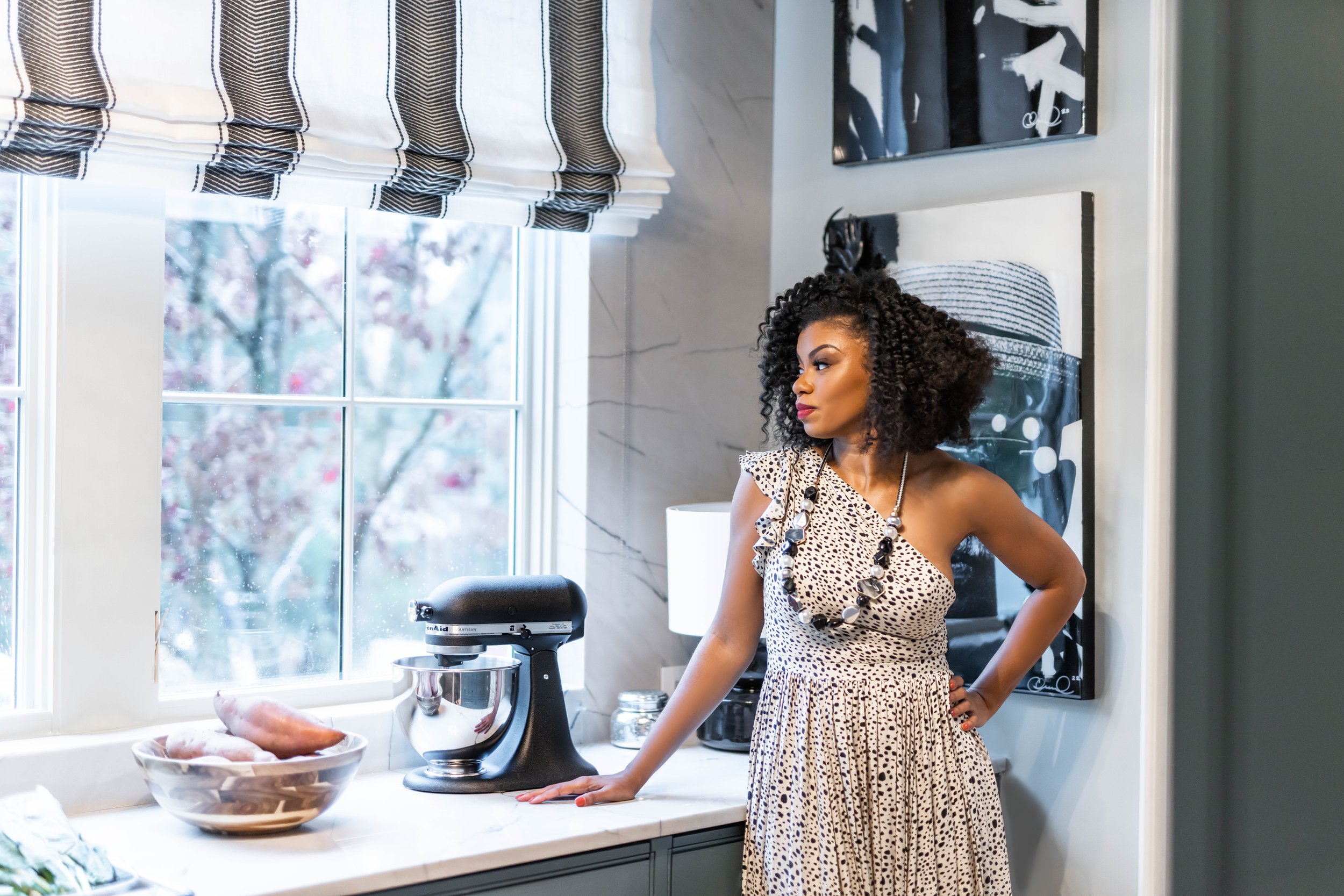
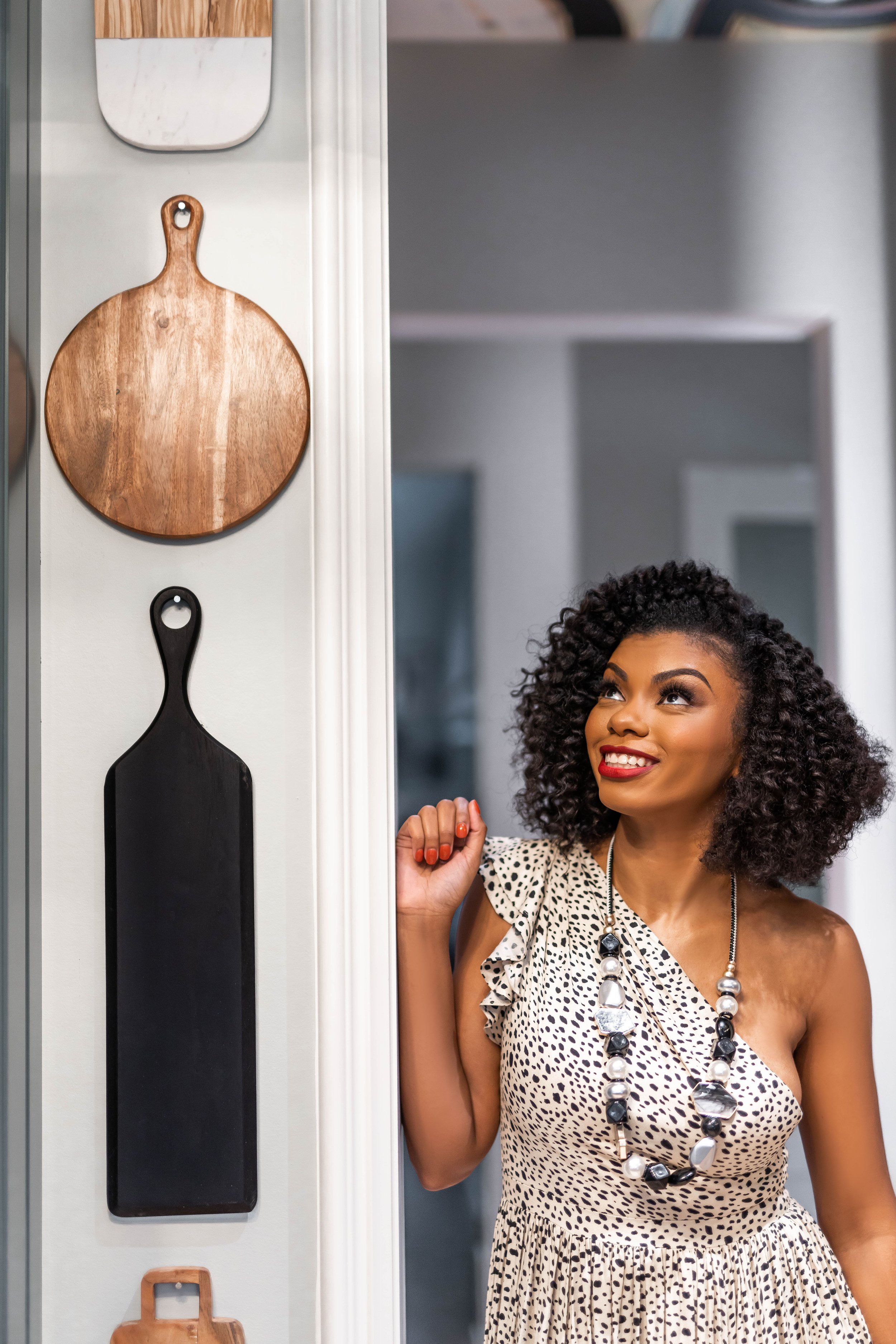
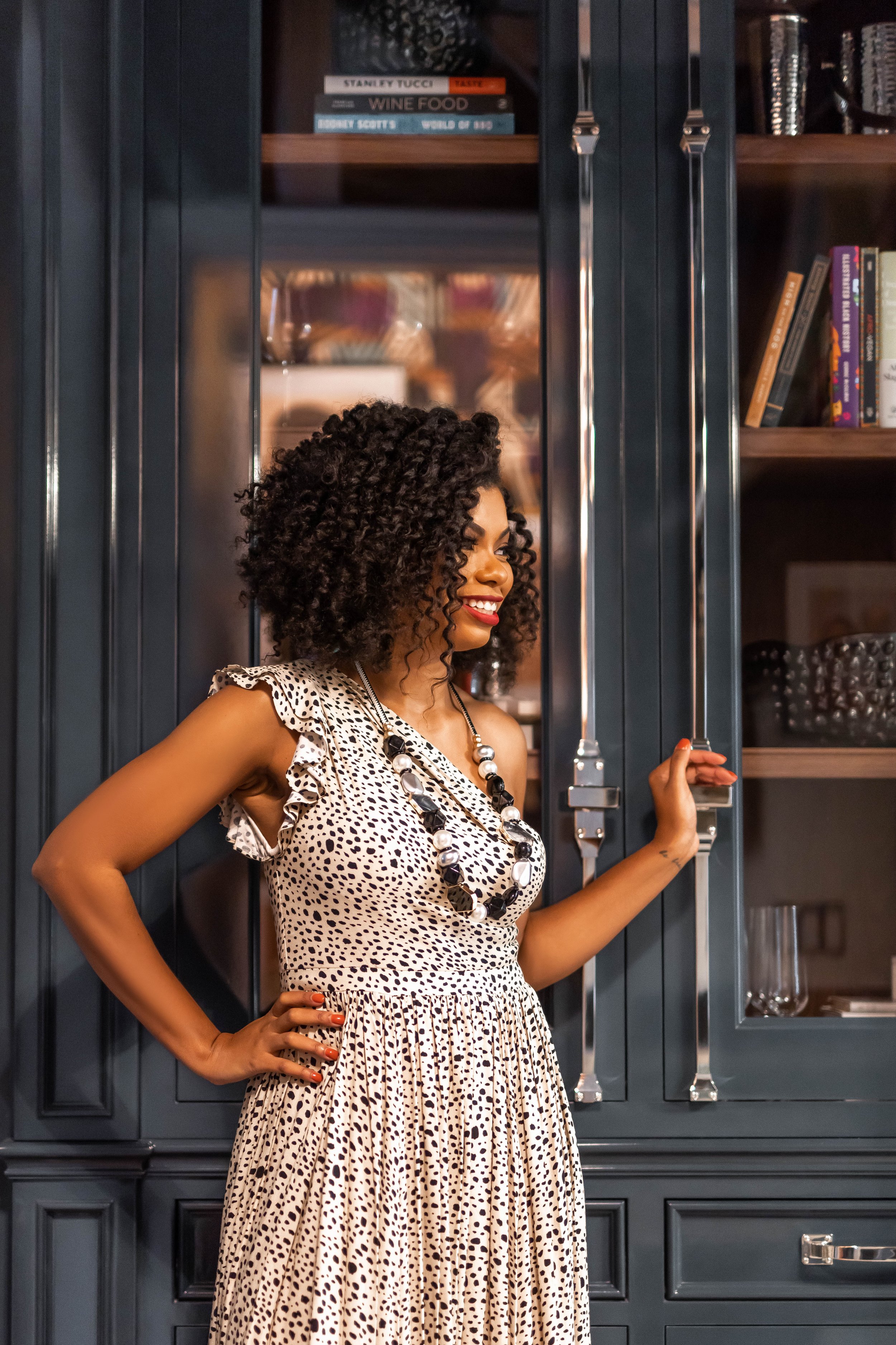
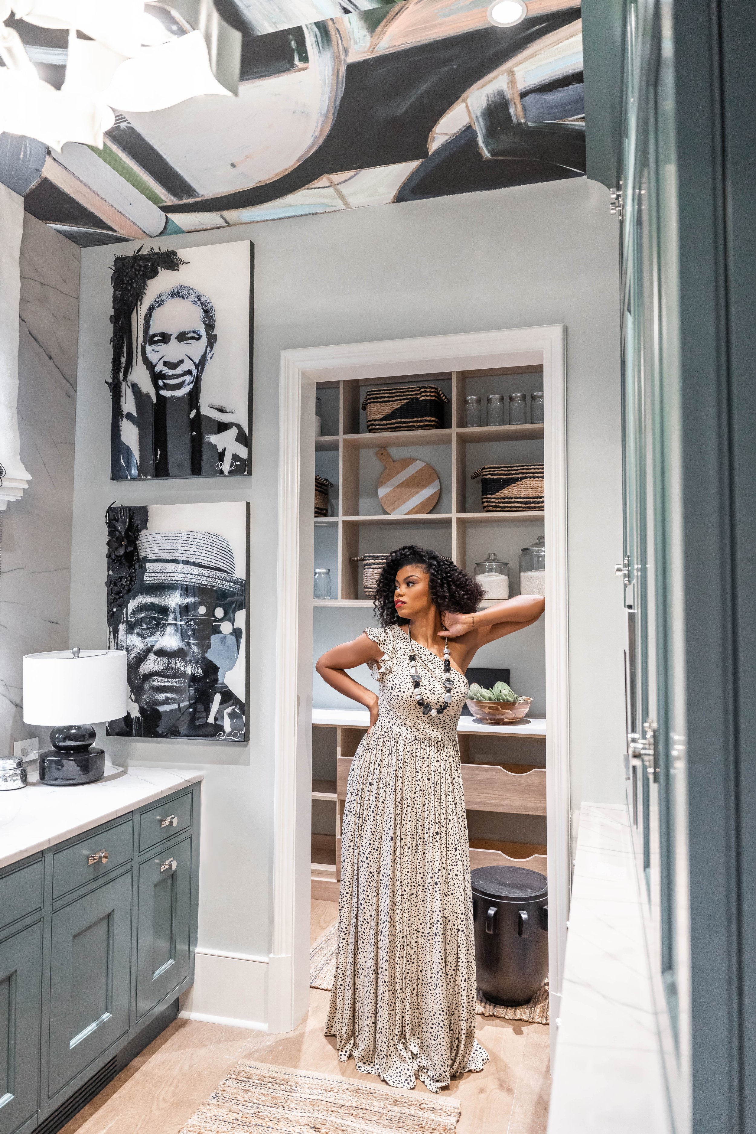
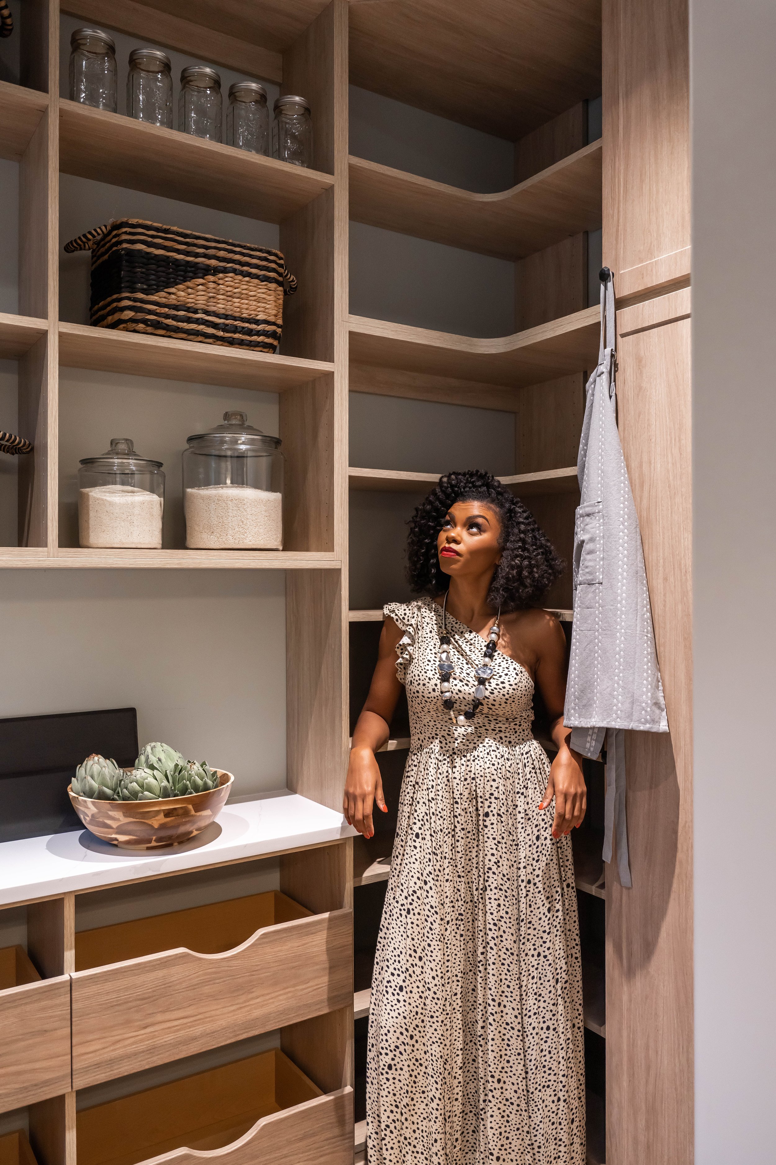
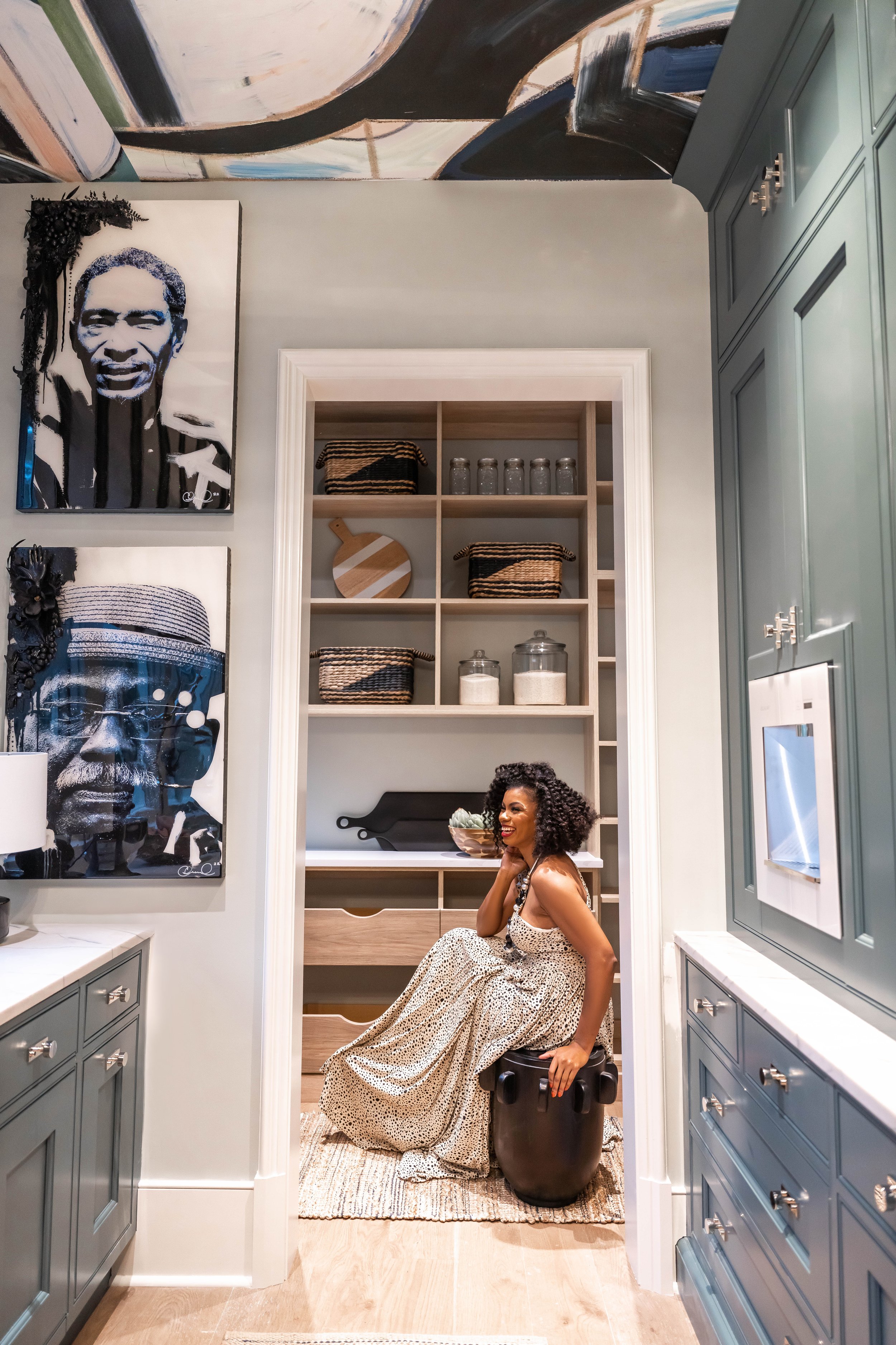
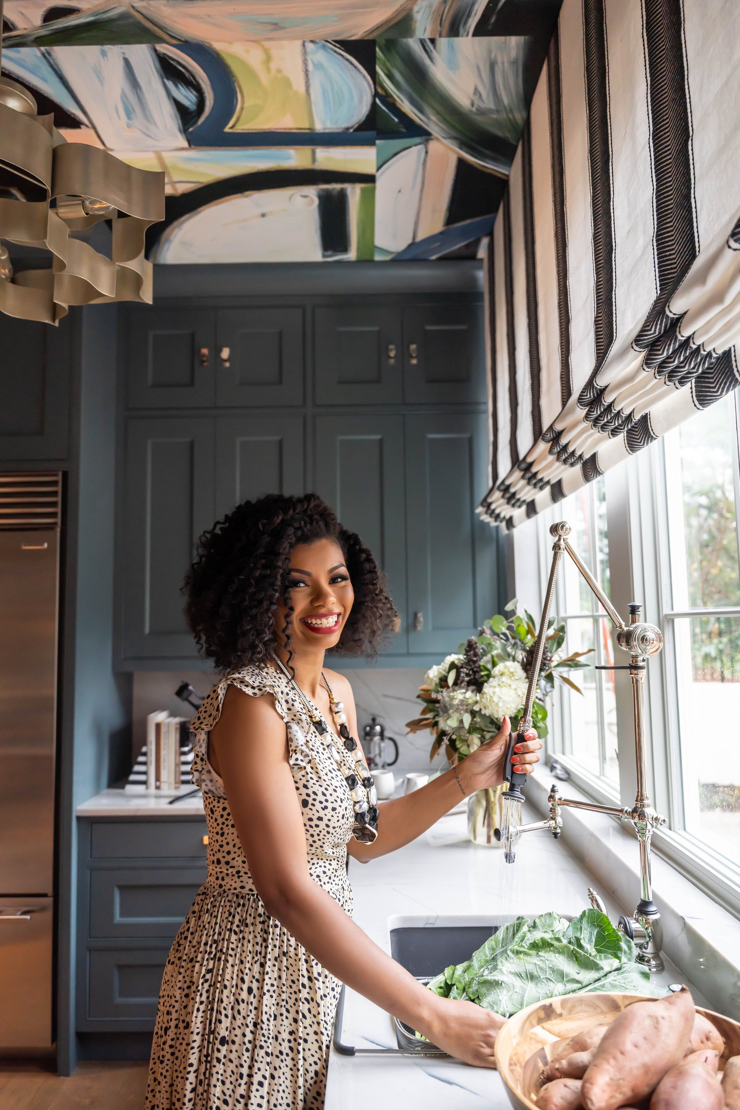
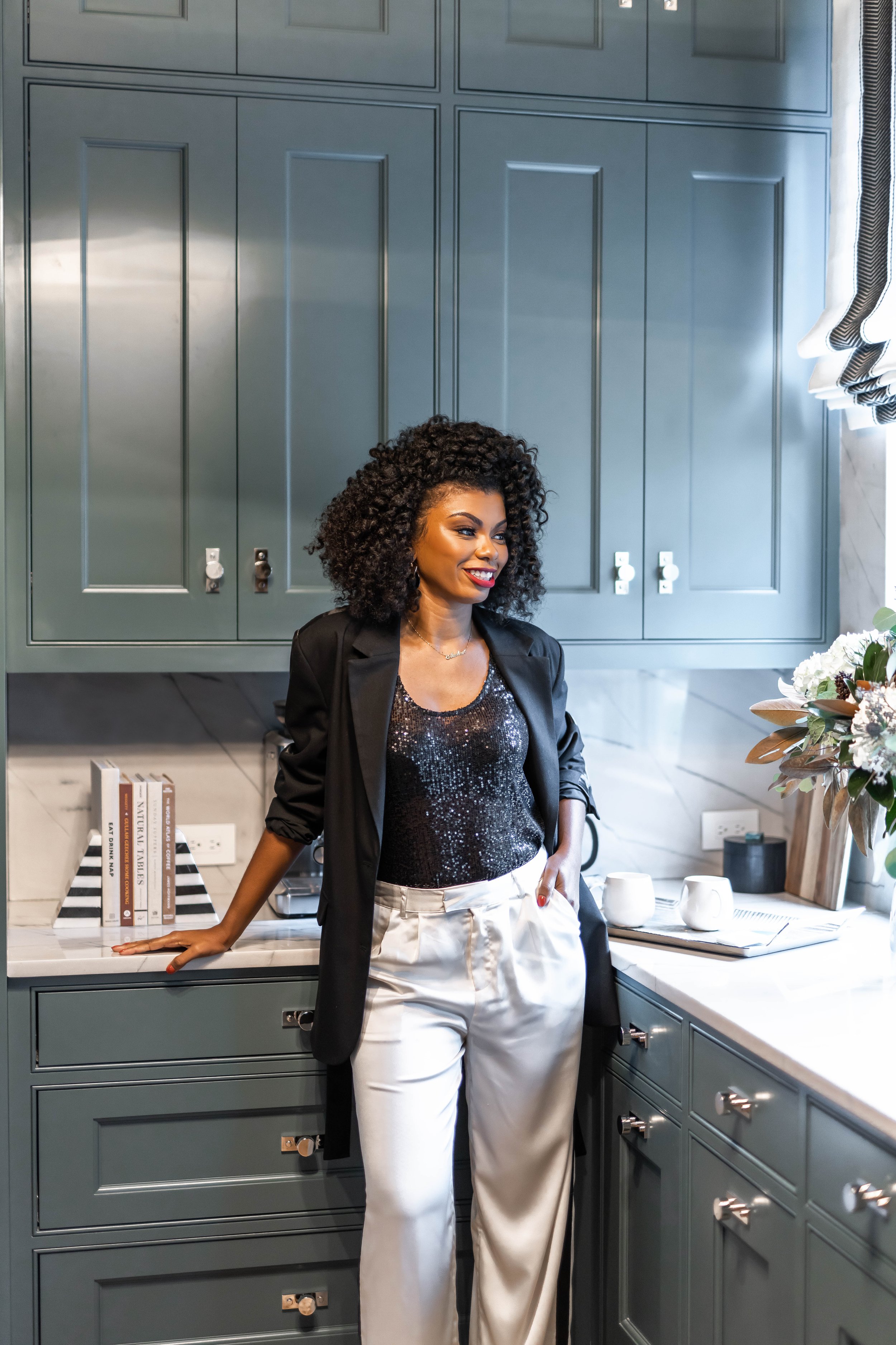
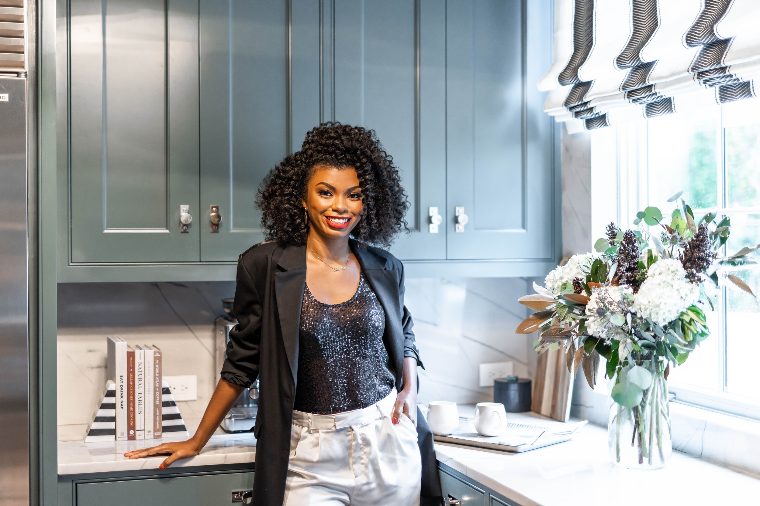
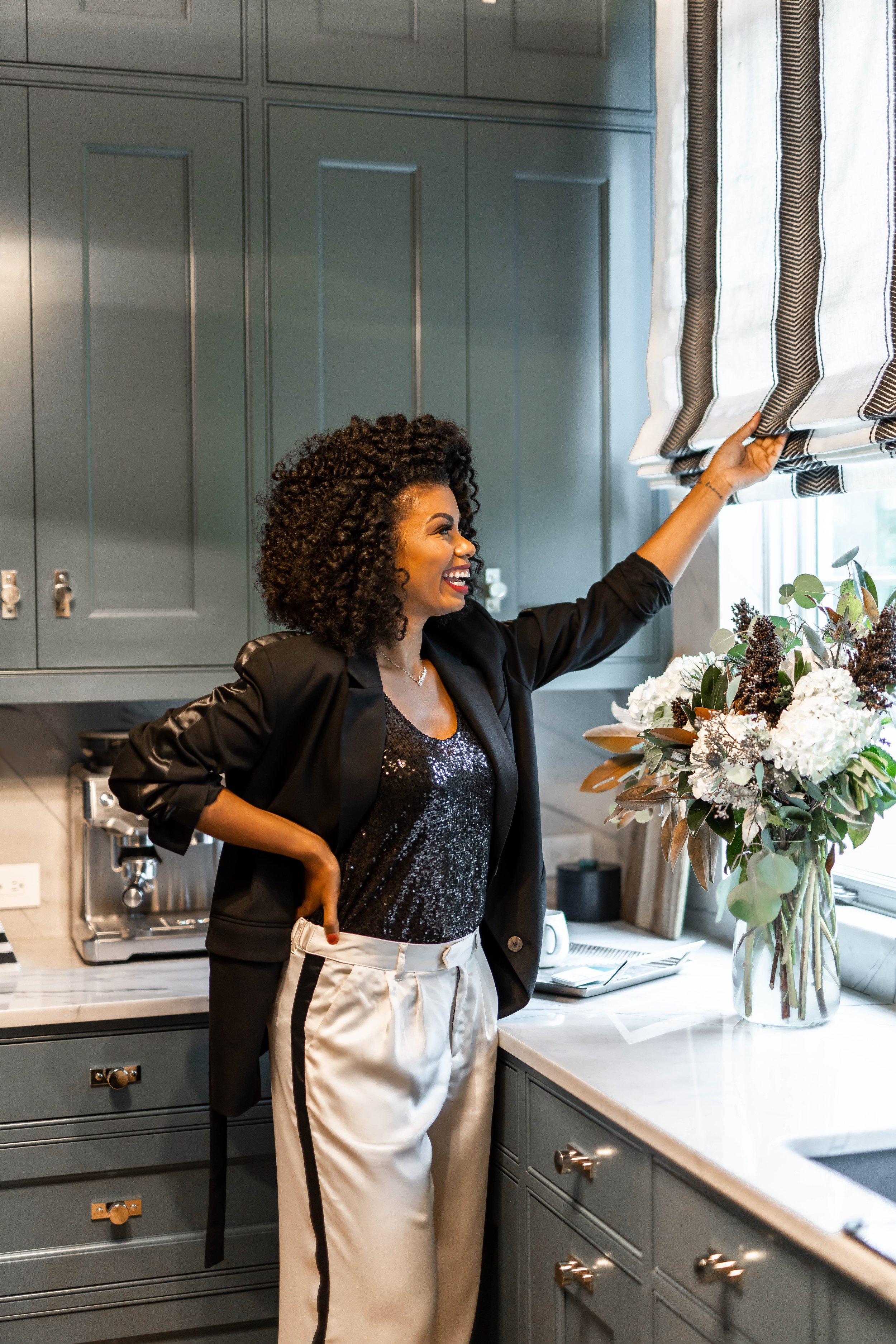
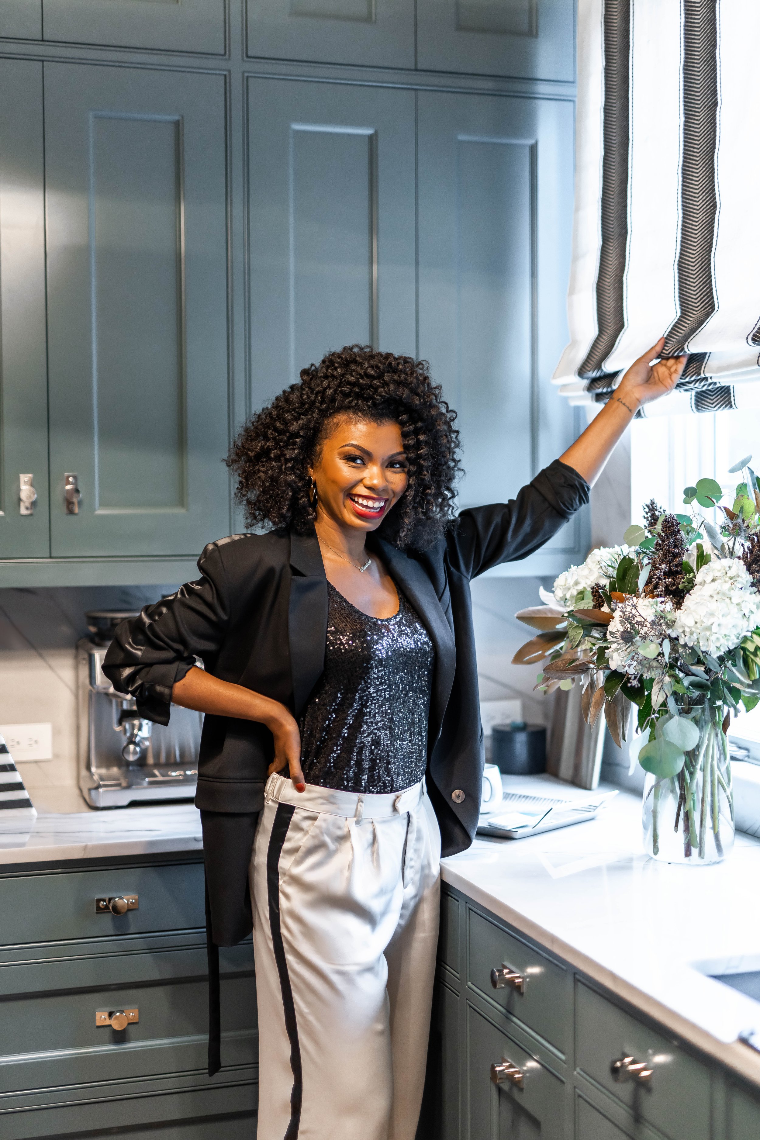
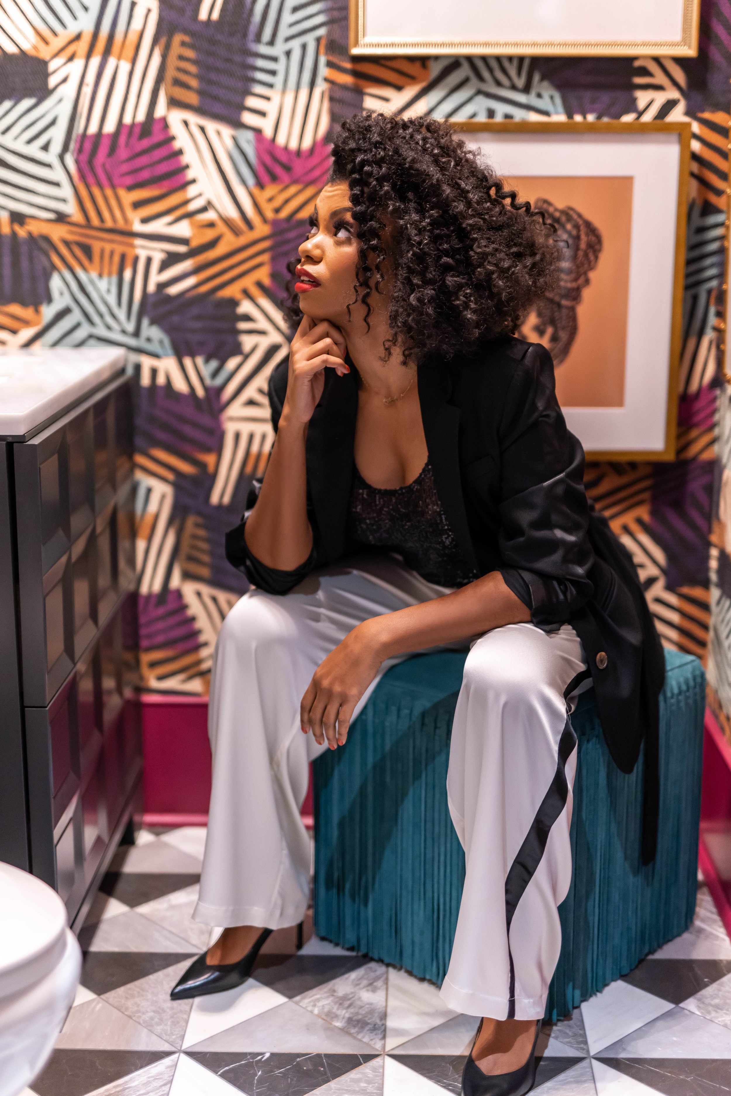

Branding Photography by LaJoy Photography
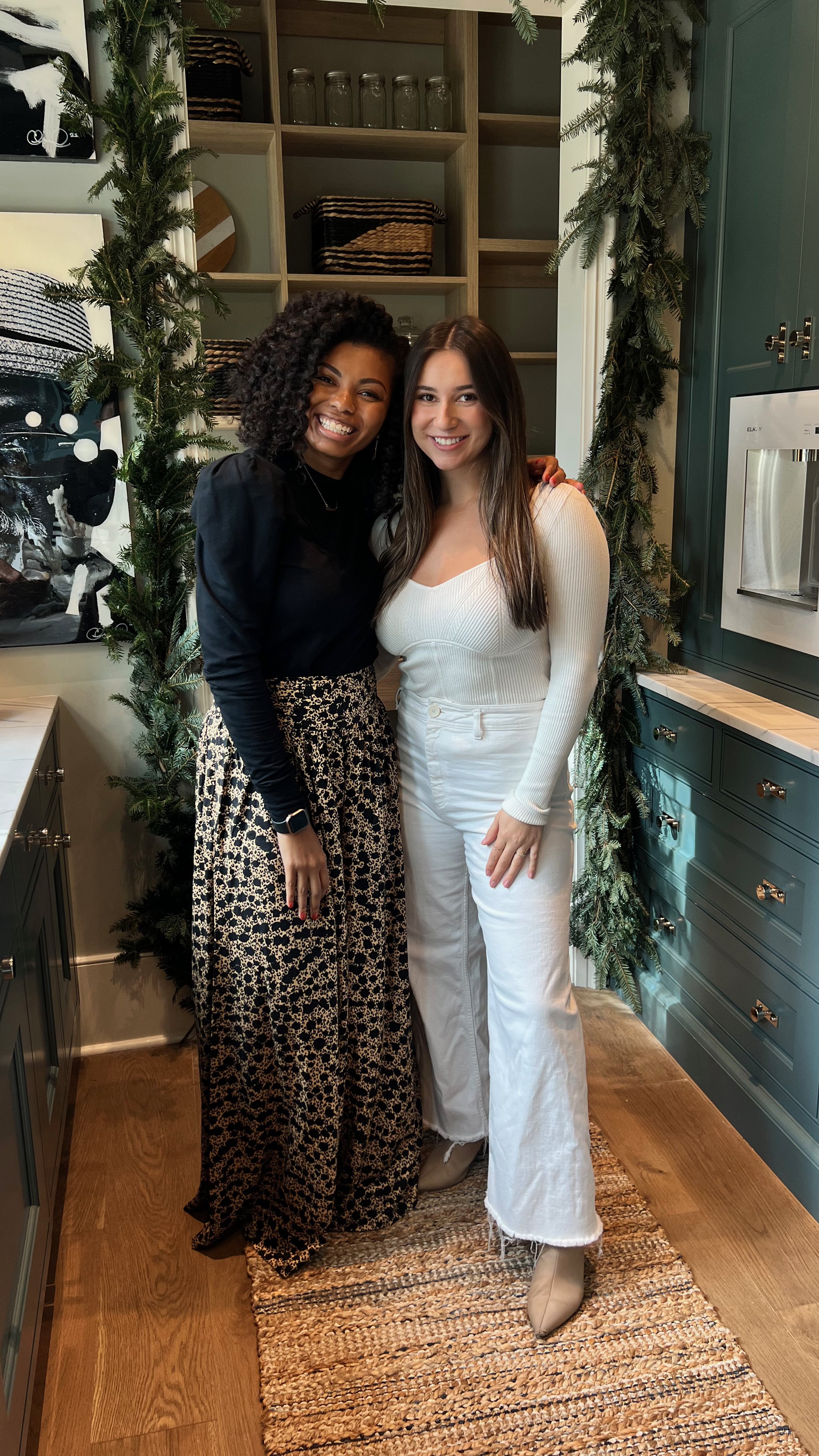
To my loved ones, family, and friends – thank you for your support from Day 1, listening to my stressful days and keeping me calm and motivated. I am nothing without you and I’m so grateful you all got to see it in person. To my fellow designers, friends, and BLB followers that literally traveled across states and around Atlanta to come support me, video and photograph the space, ooo and ahhh, shake my hand, give me a hug, and tell me “job well done,” you brought so many smiles and happy tears over these past four weeks. Thank you for all the love. And for those that were unable to attend this weekend due to not-so-nice neighbors, I am so sorry, but please know your support is appreciated too. And lastly - we did it for the kids! Children’s Healthcare of Atlanta, thank you for being our amazing beneficiary! The AH&L Home for the Holidays team, designers, volunteers, and visitors did it all for you!
Thank you all for everything. This is an experience I will never forget.
Be Blessed,
ACG
Design Deets:
Powder Room
Wallpaper – Pierre Frey
Flooring – Renaissance Tile & Bath
Cabinet Paint – Iron Ore by Sherwin-Williams
Ceiling and Trim Paint – Framboise by Sherwin-Williams
Artwork – Gerell Saunders for Society 6, Sable Muse
Custom Frames – Framebridge
Mirror – Made Goods
Lighting – Visual Comfort, Circa Lighting
Ottoman – Made Goods
Tissue Paper Box and Tray – Pigeon & Poodle
Waste Basket - Pigeon & Poodle
Toilet Paper Holder – CB2
Sink – MTI
Faucet – O’Neil Ruppel
Towels – Weezie
Scullery, Butler’s Pantry and Pantry
Cabinetry – Kingdom Woodworks
Flooring – European Wood Co.
Sink – Elkay
Faucet – Waterstone
Appliances – WOLF
Water Dispenser – Elkay
Cabinetry Paint – Hague Blue and Inchyra Blue by Farrow & Ball
Wall Paint - Soft Sage by Sherwin-Williams
Ceiling and Wall Wallcovering – Lindsay Cowles
Chandelier – Currey & Company
Roman Shades – Martyn Lawrence Bullard for The Shade Store
Rug Runners – Jaipur Living
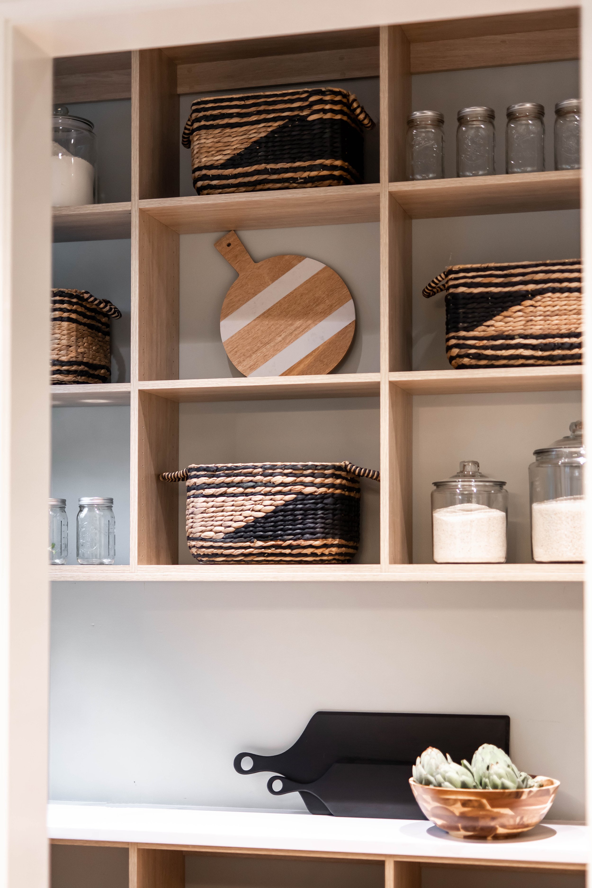
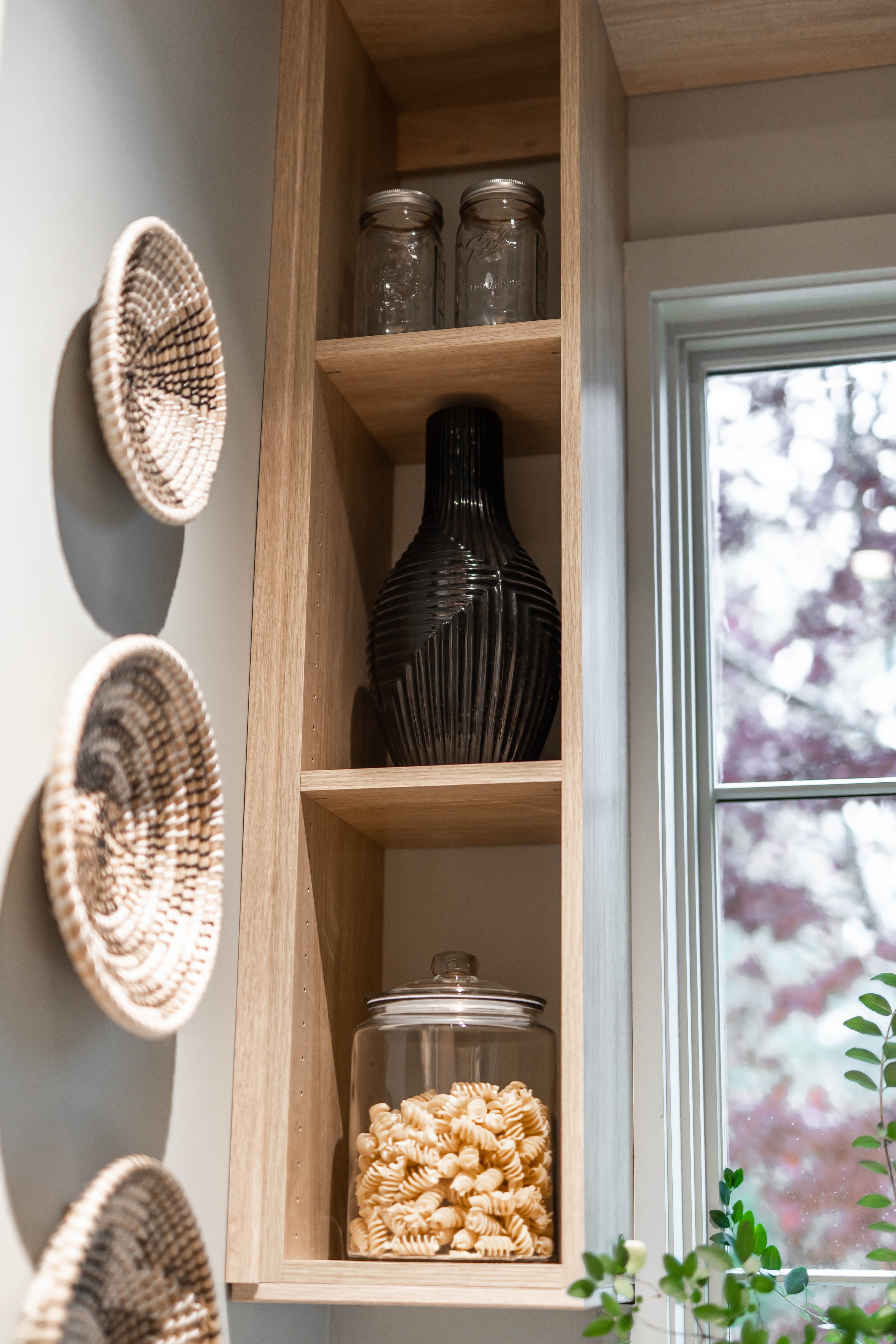
Baskets – The Container Store
Canisters – Crate & Barrel
Lamp – Safavieh
Dinnerware – Crate & Barrel
French Press – Crate & Barrel
Espresso Machine – Breville
Electric Mixer – KitchenAid
Artwork – Blue Pill and Bernard by Chanell Angeli, ZuCot Gallery
Decorative Bowls – Made Goods
Stool – Made Goods
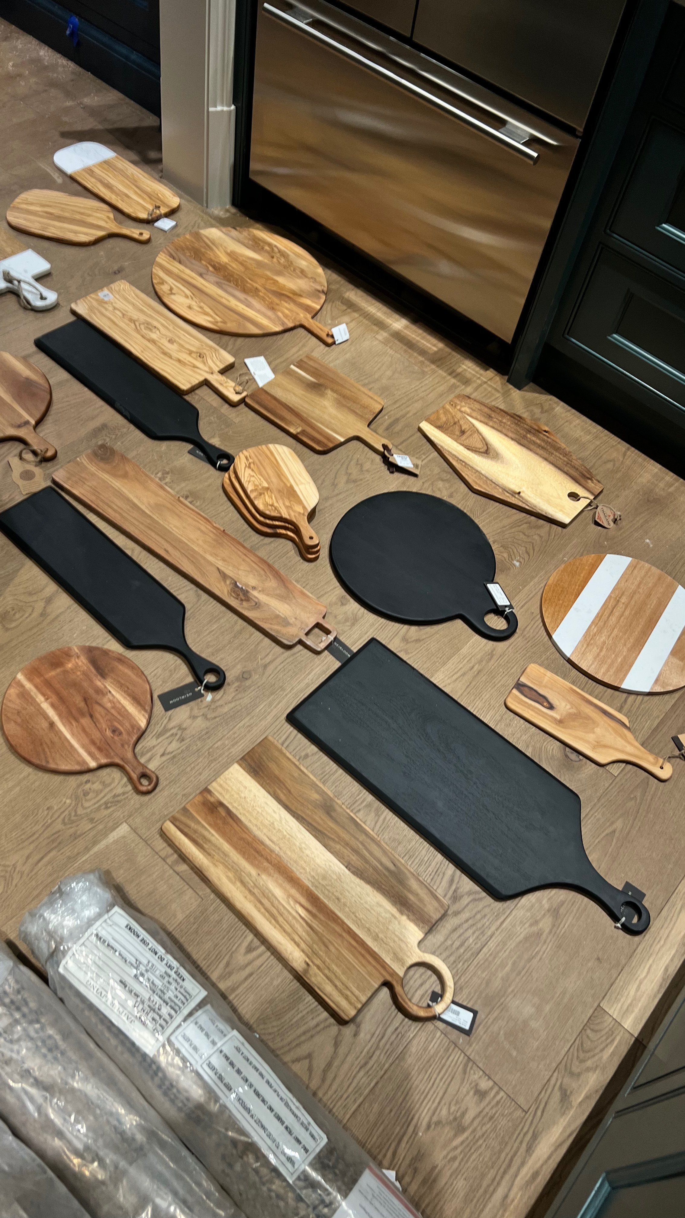
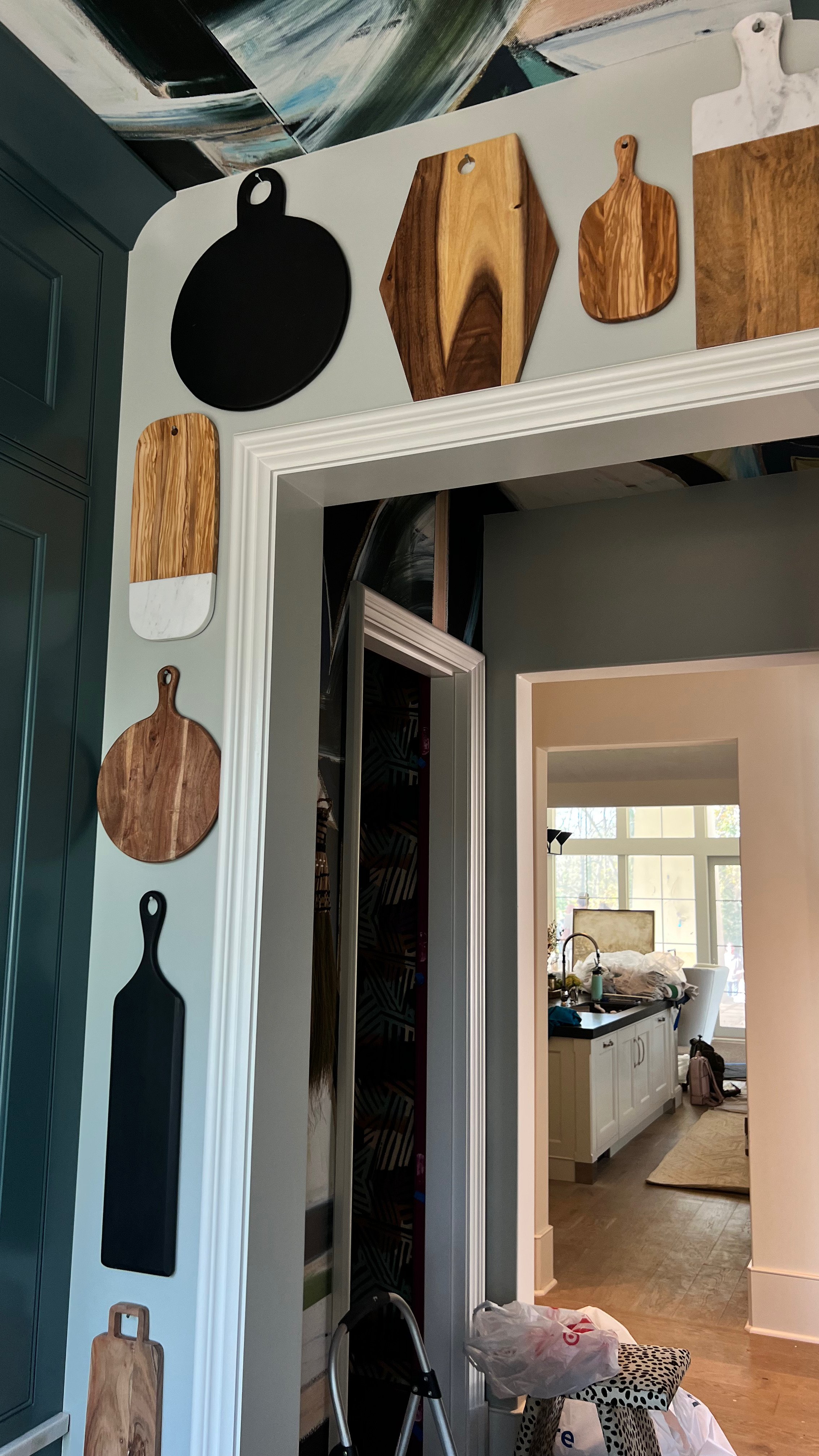
Assorted Cheese and Bread Boards – Shoppe Heirloom, Williams Sonoma, World Market, Home Goods, Target
