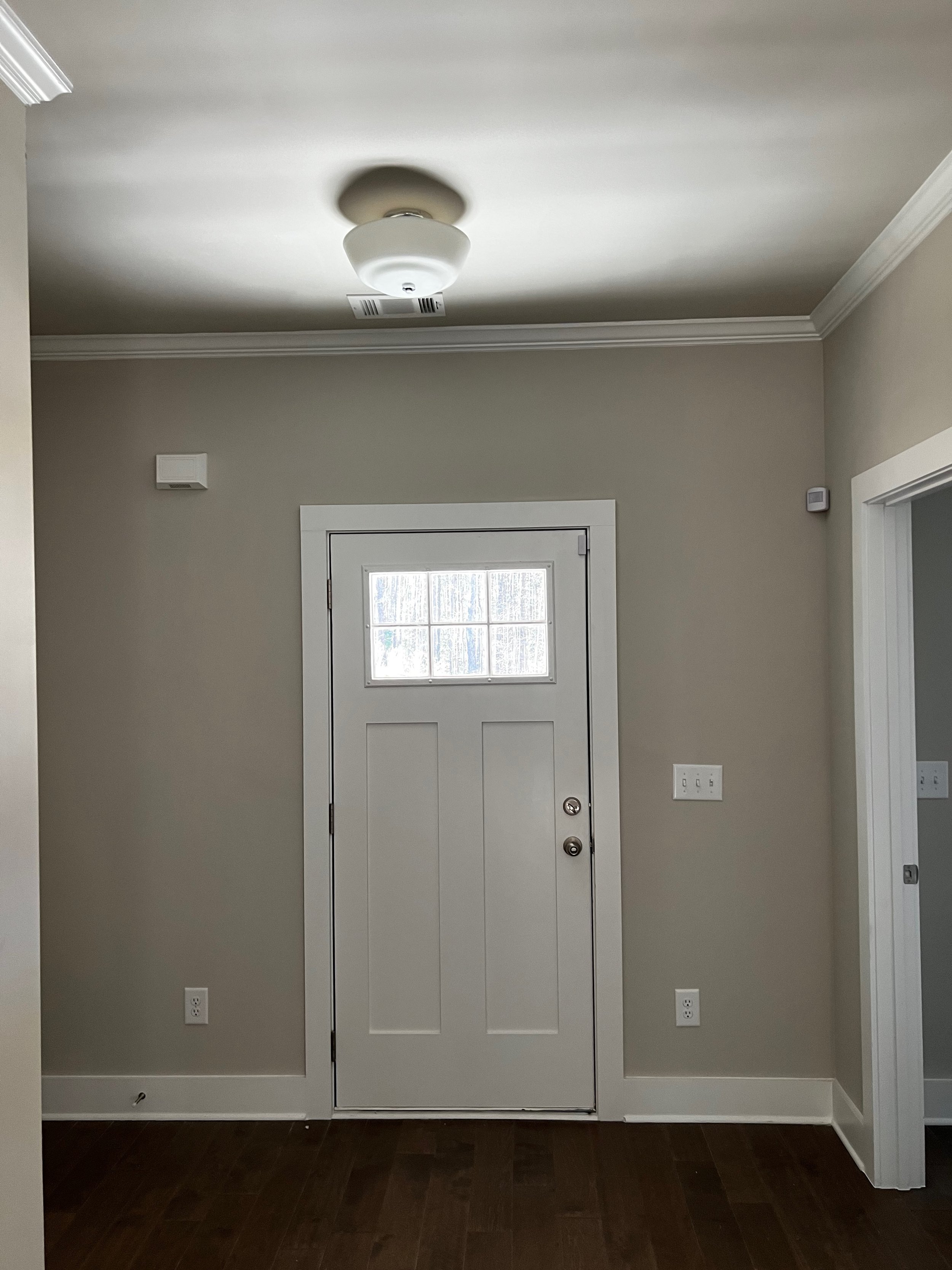
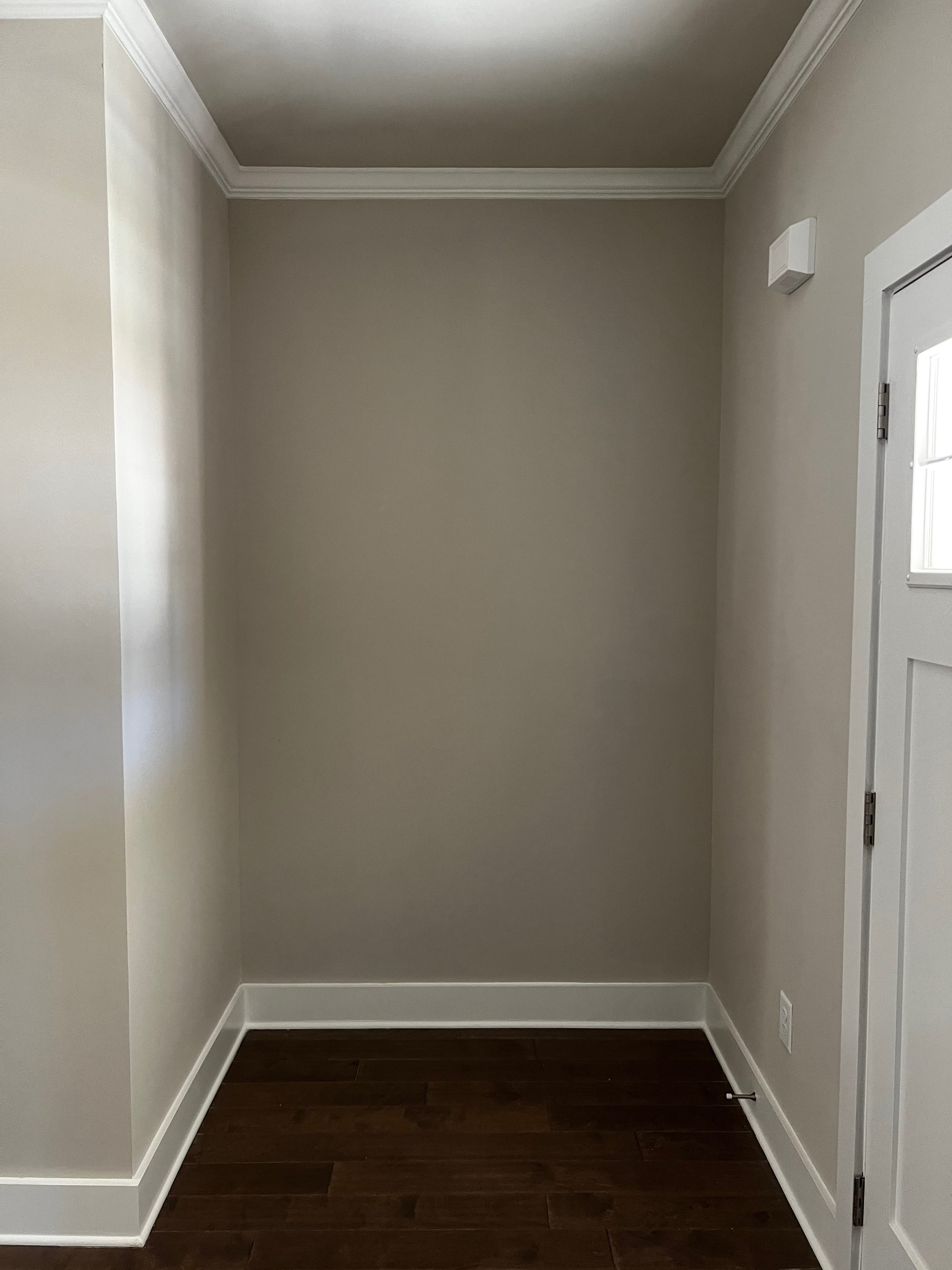
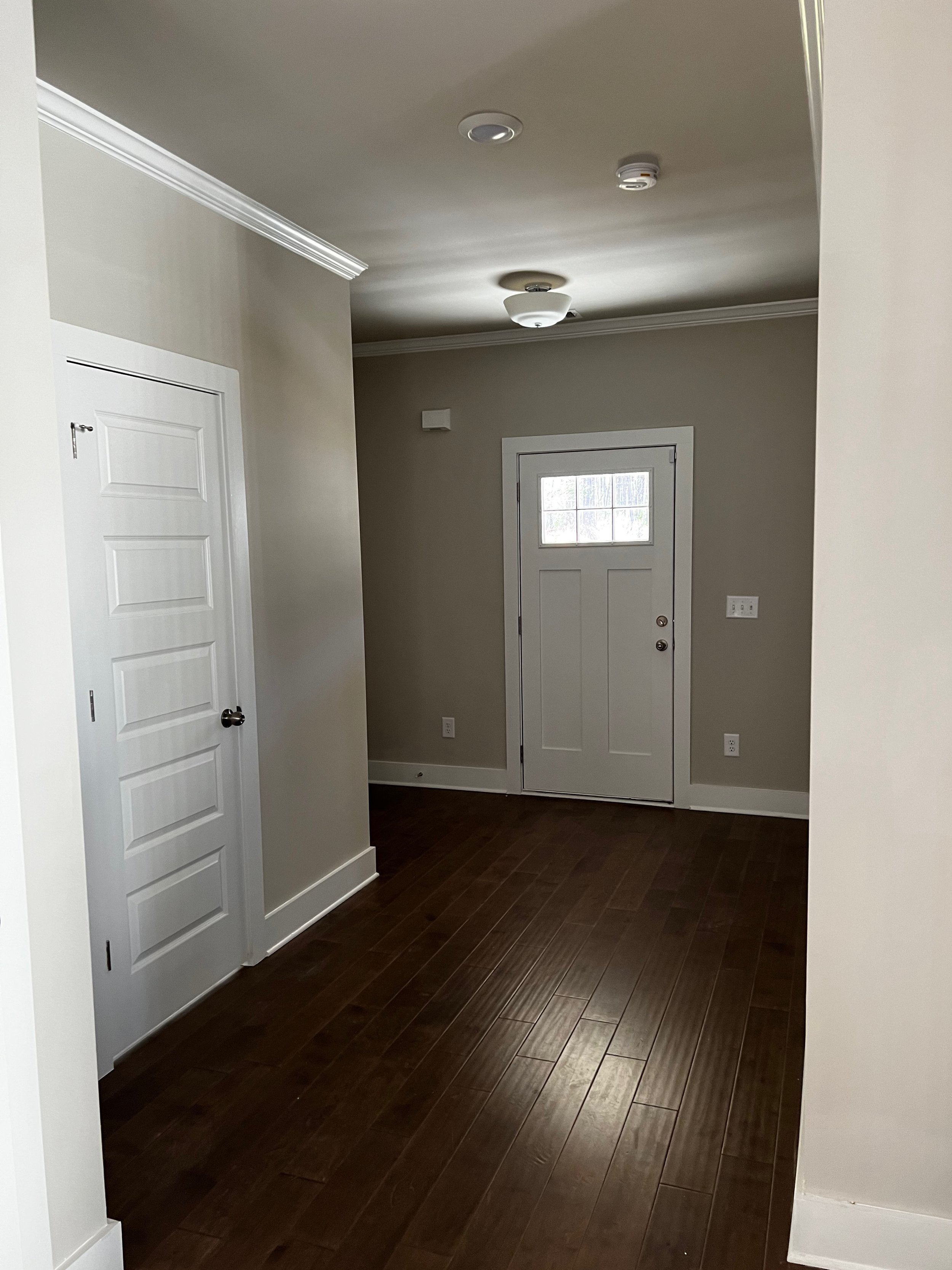
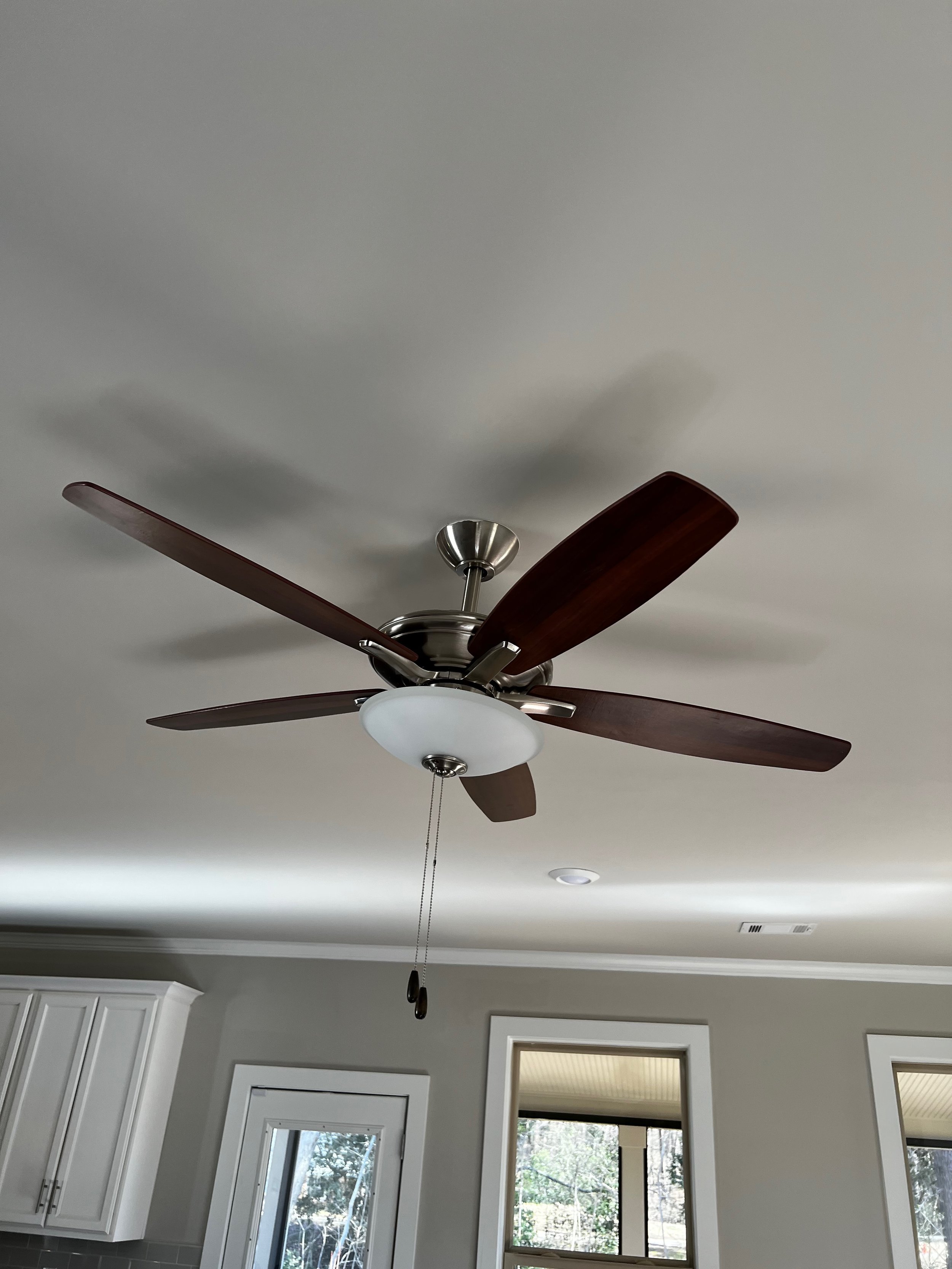
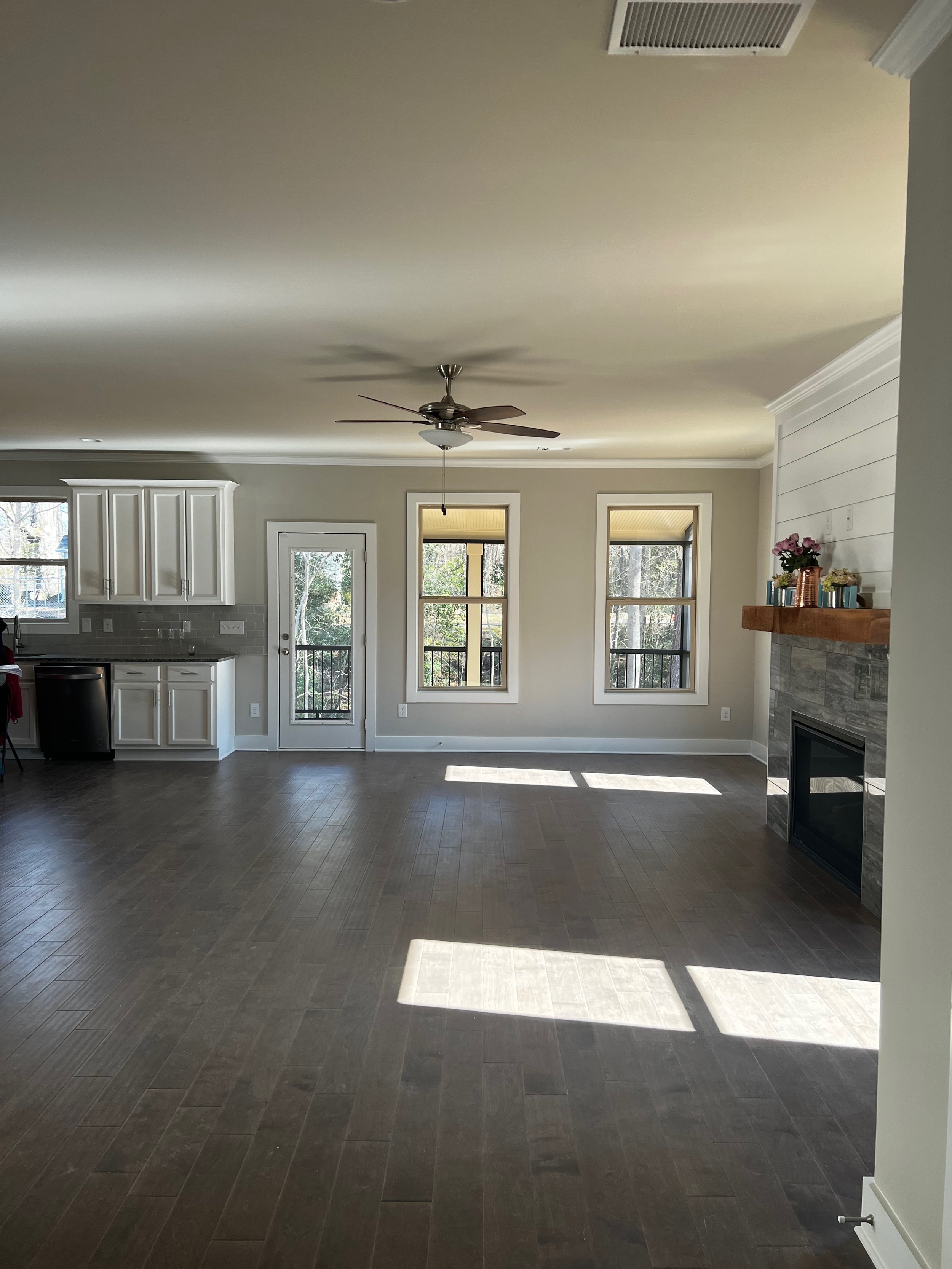
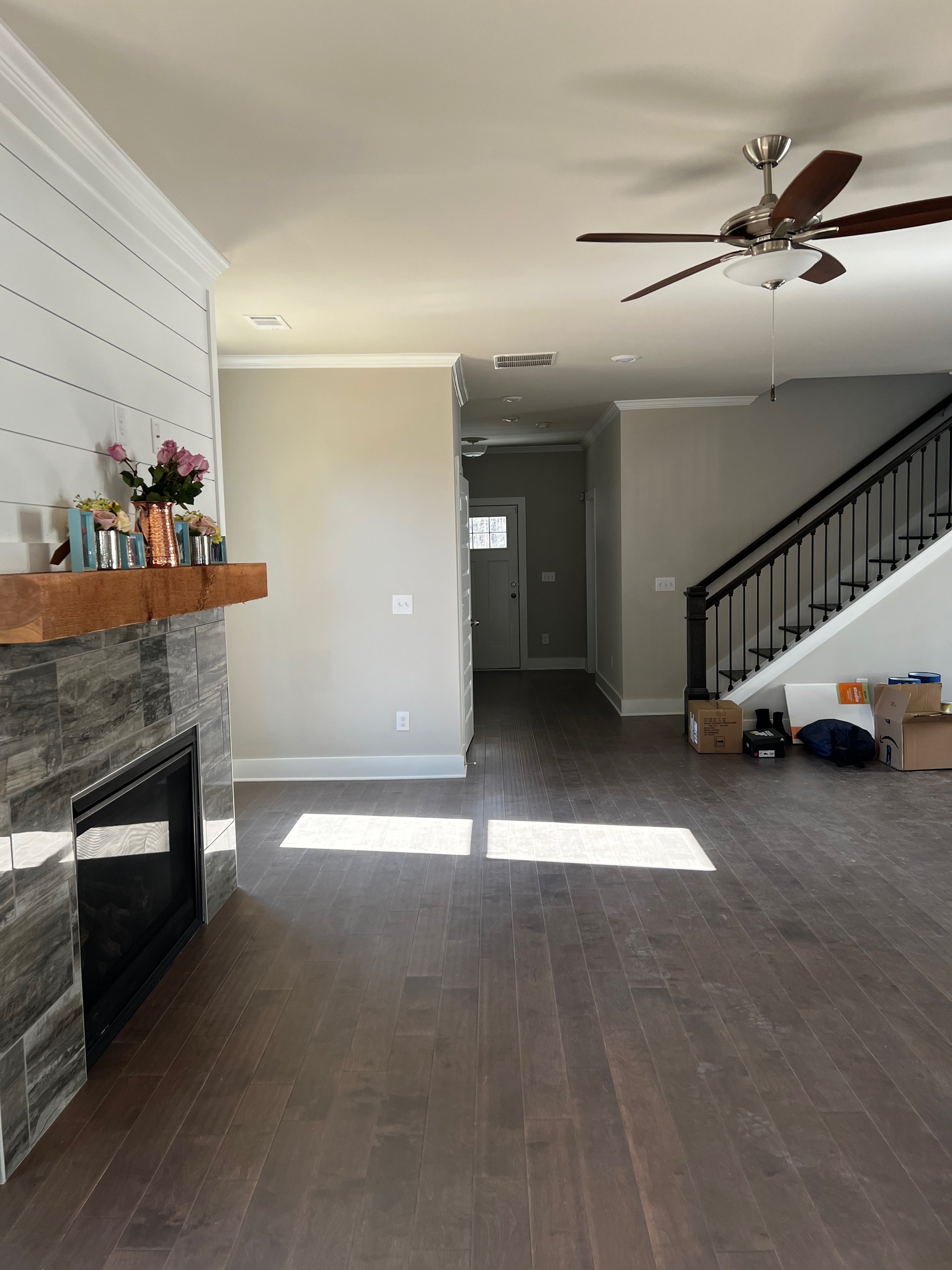
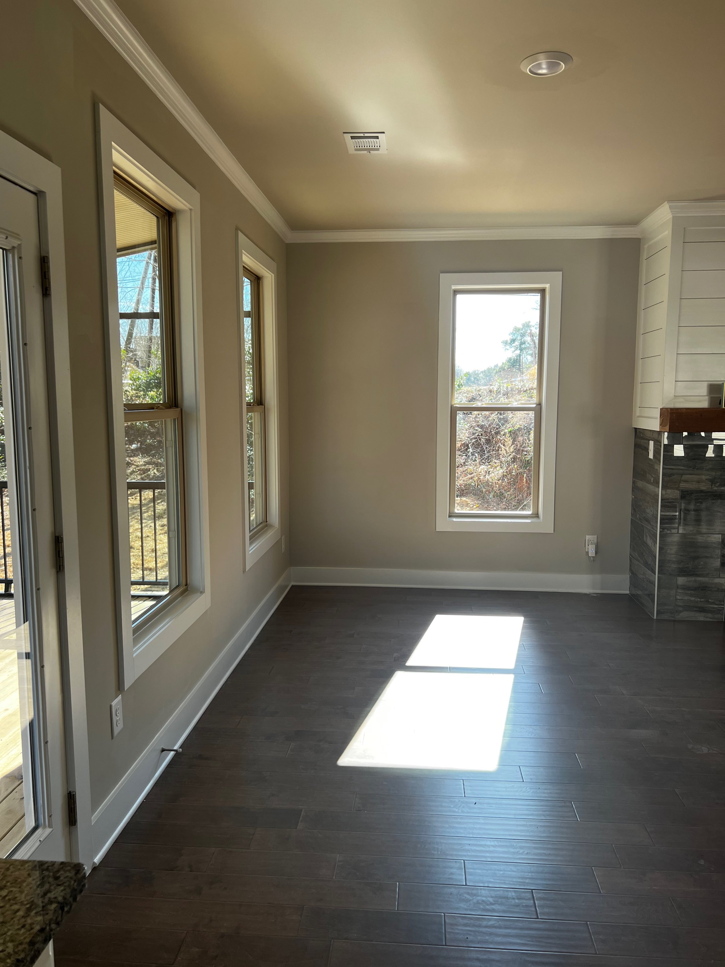
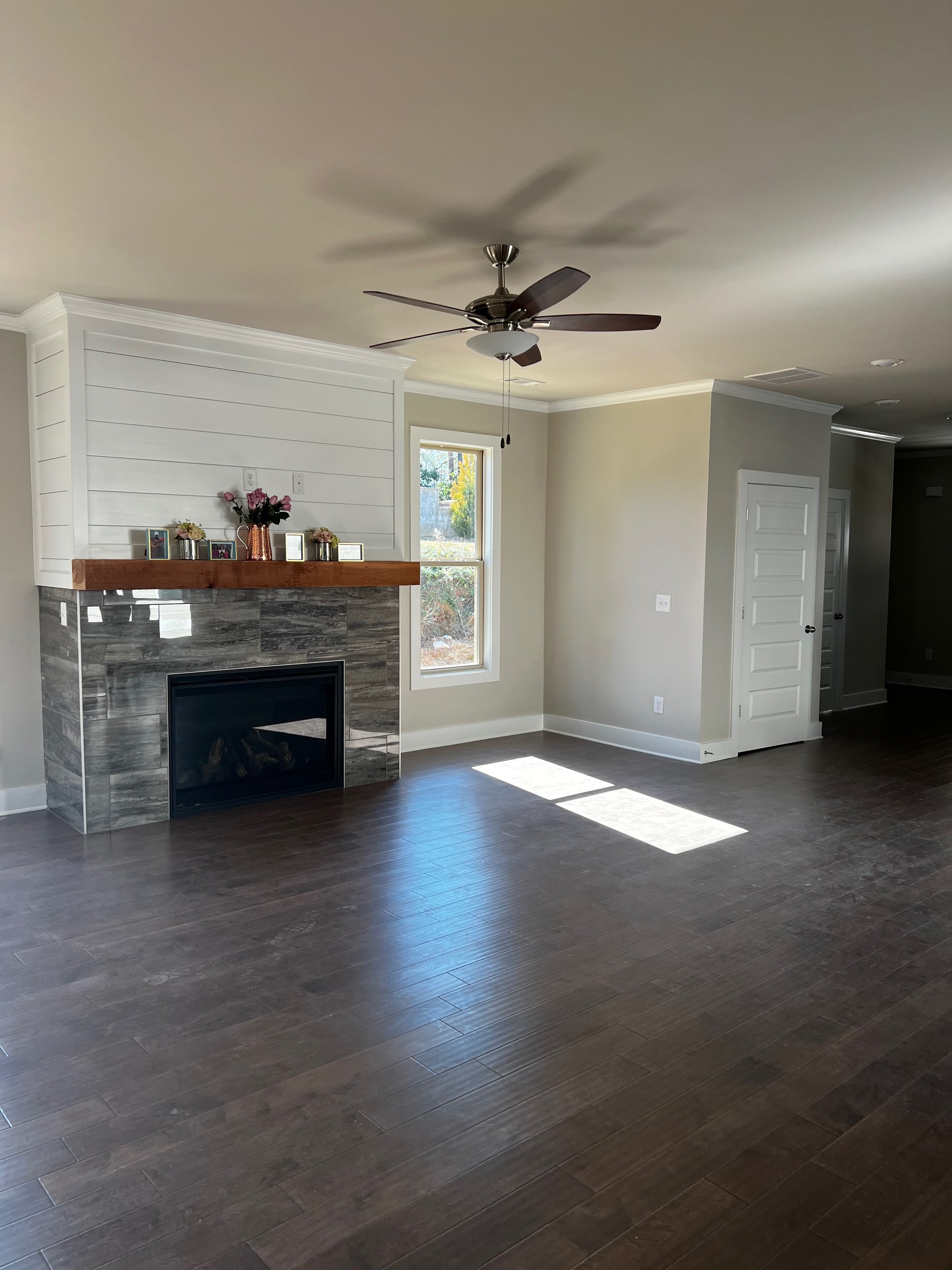
Last spring, I was hired by a new client that was excited about her recent move to Atlanta and purchase of a new construction home to start the next phase of her career and life. I was thrilled to help her add some character and charm in every space.
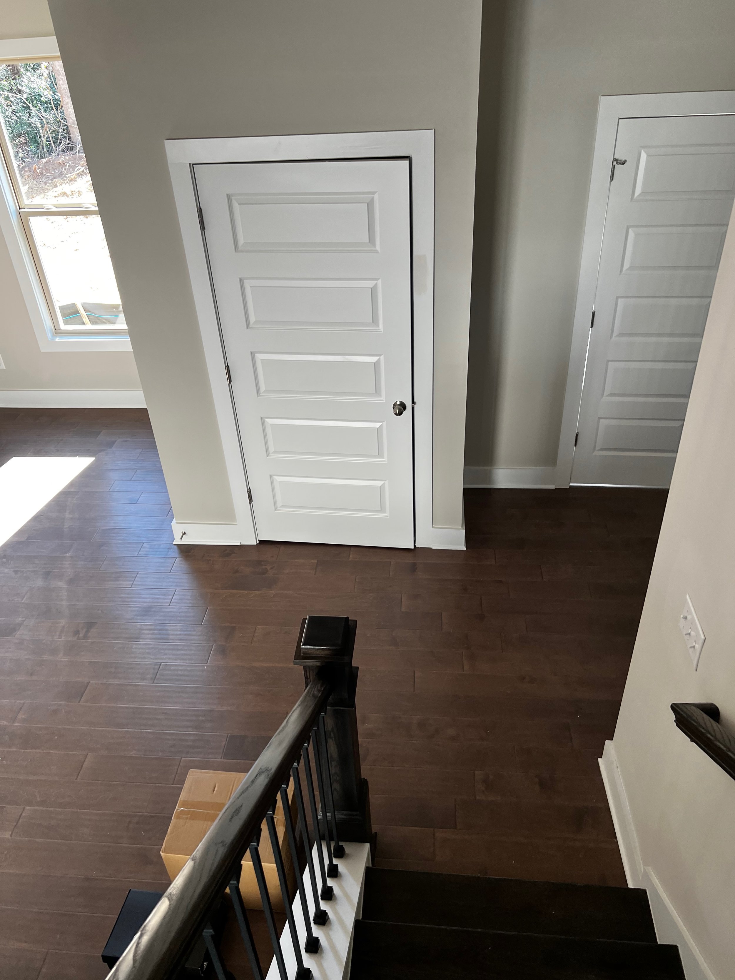
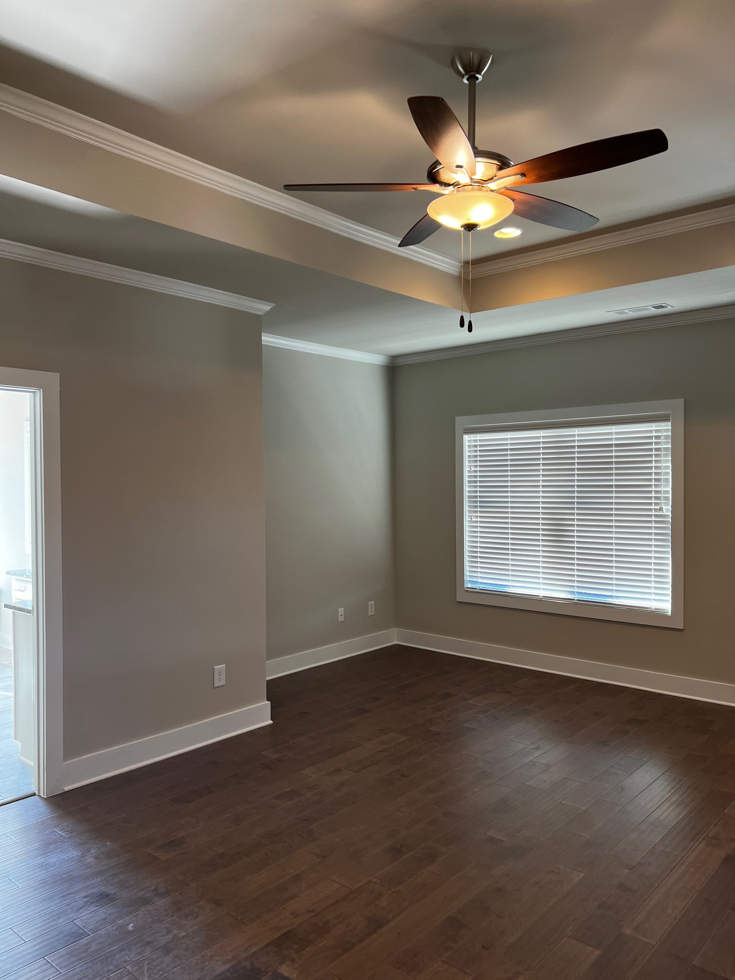
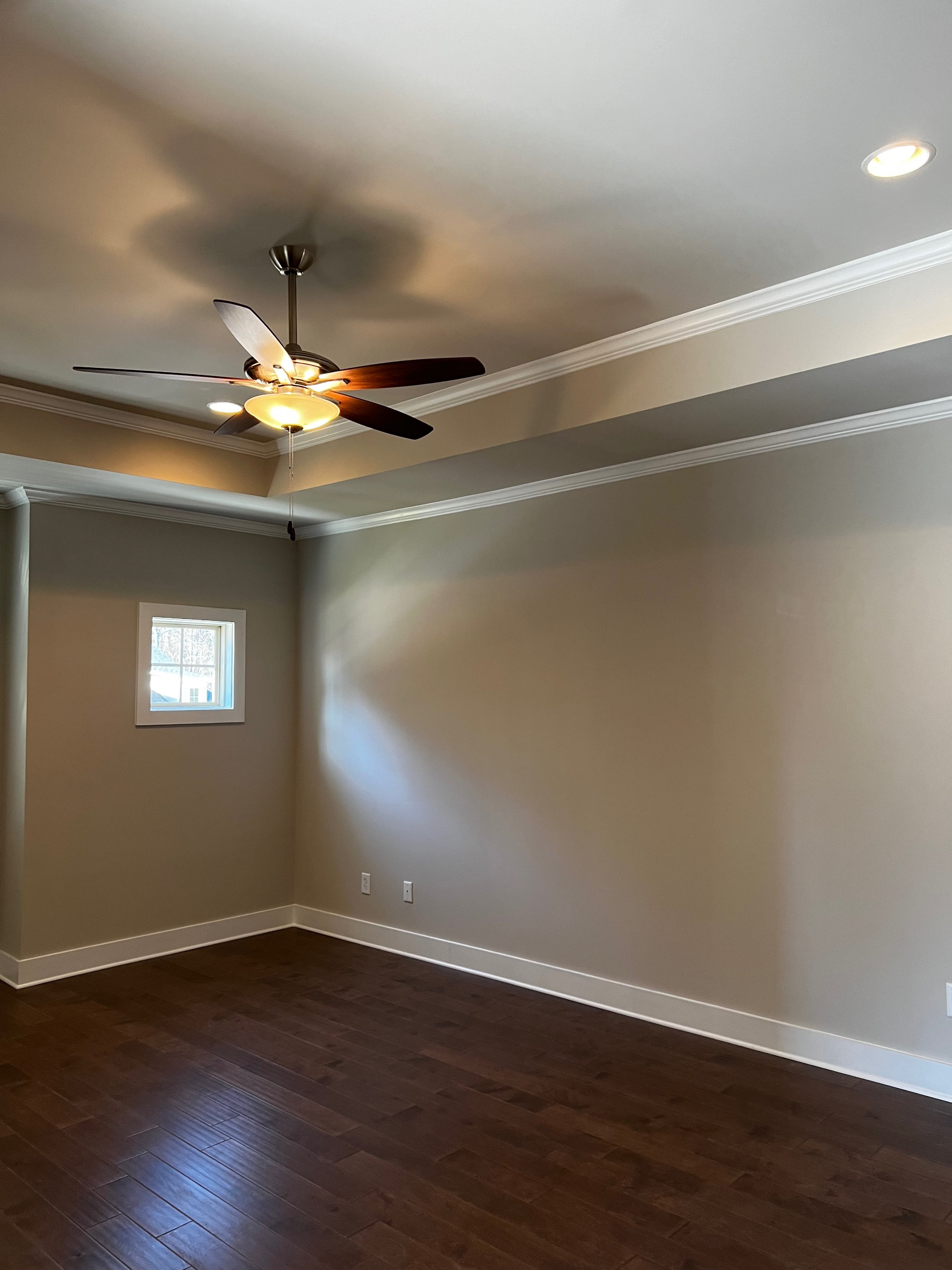
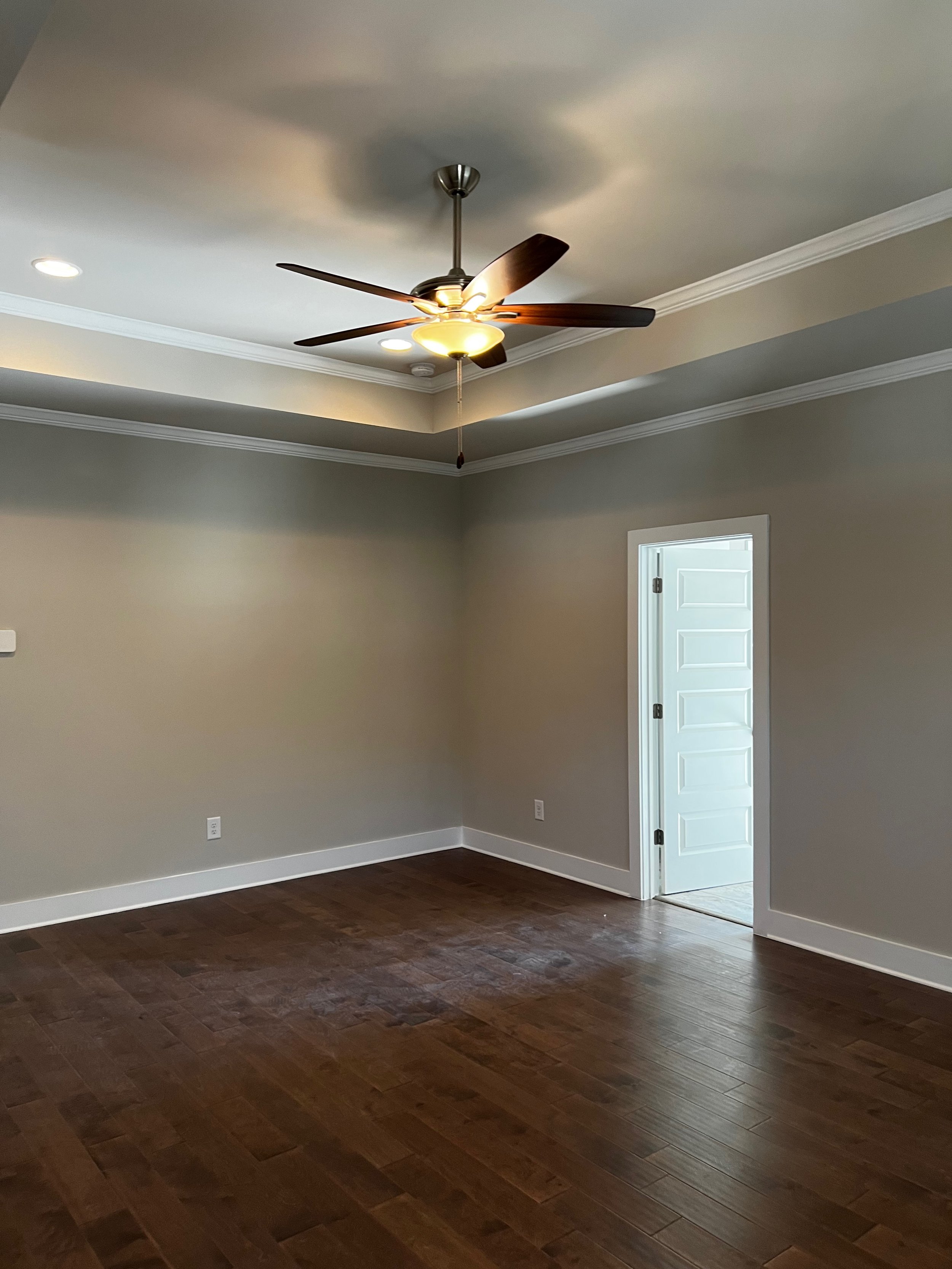
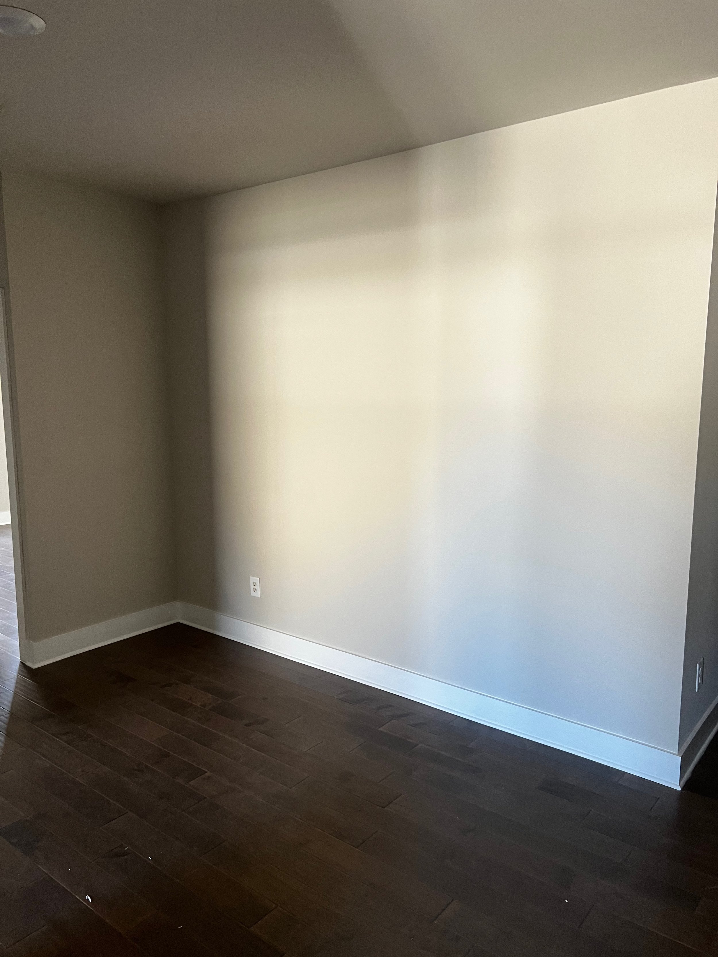
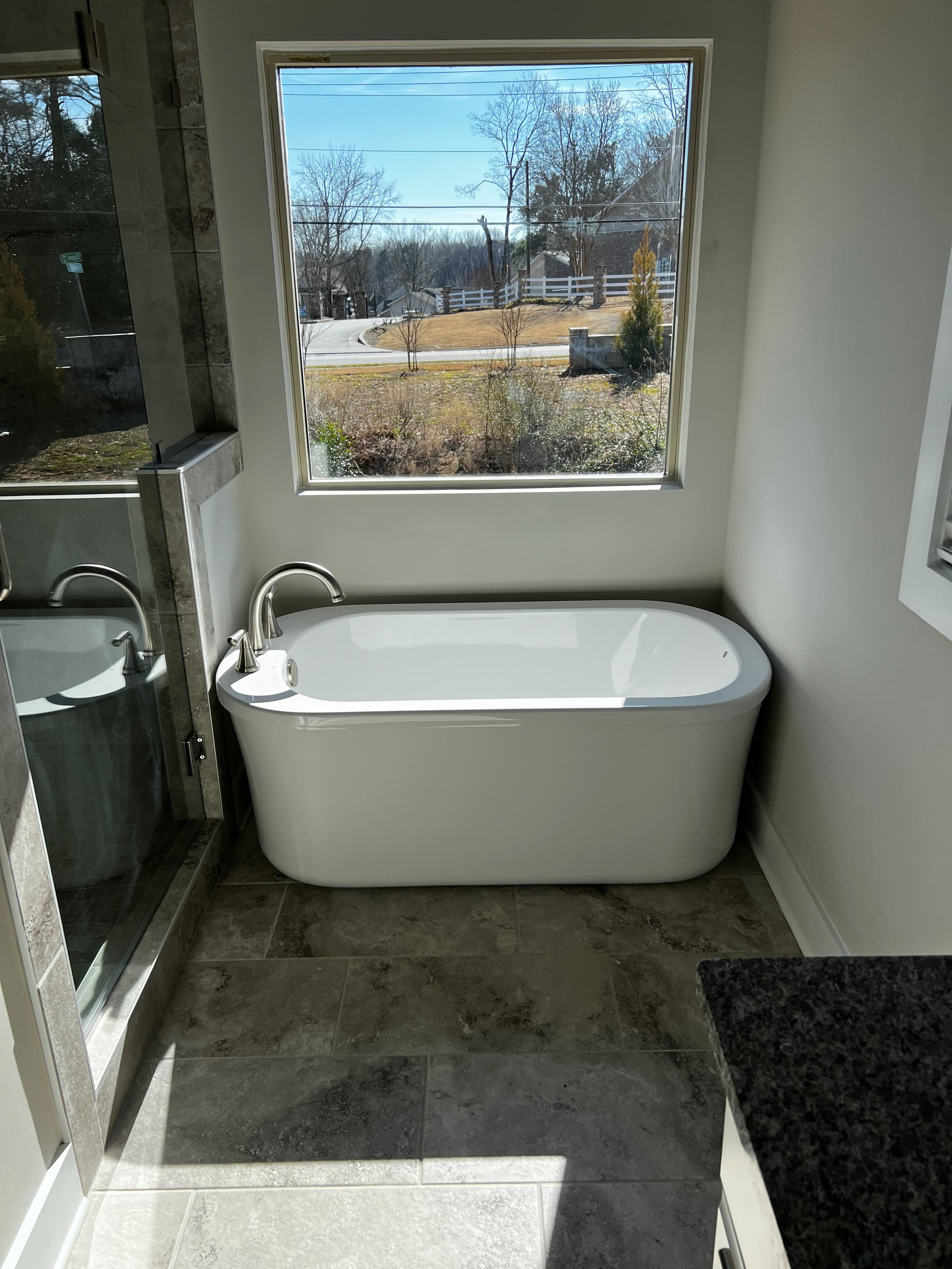
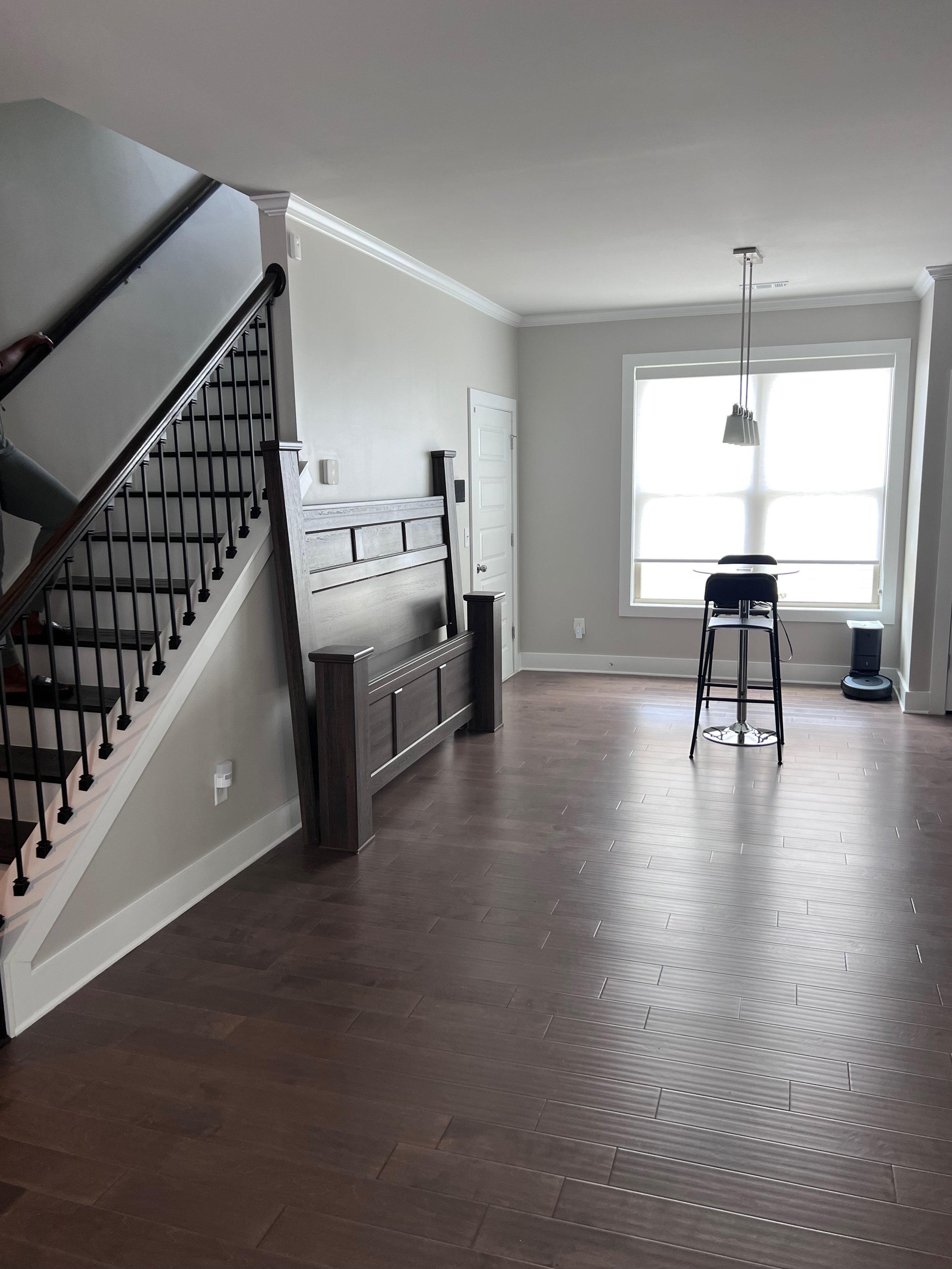
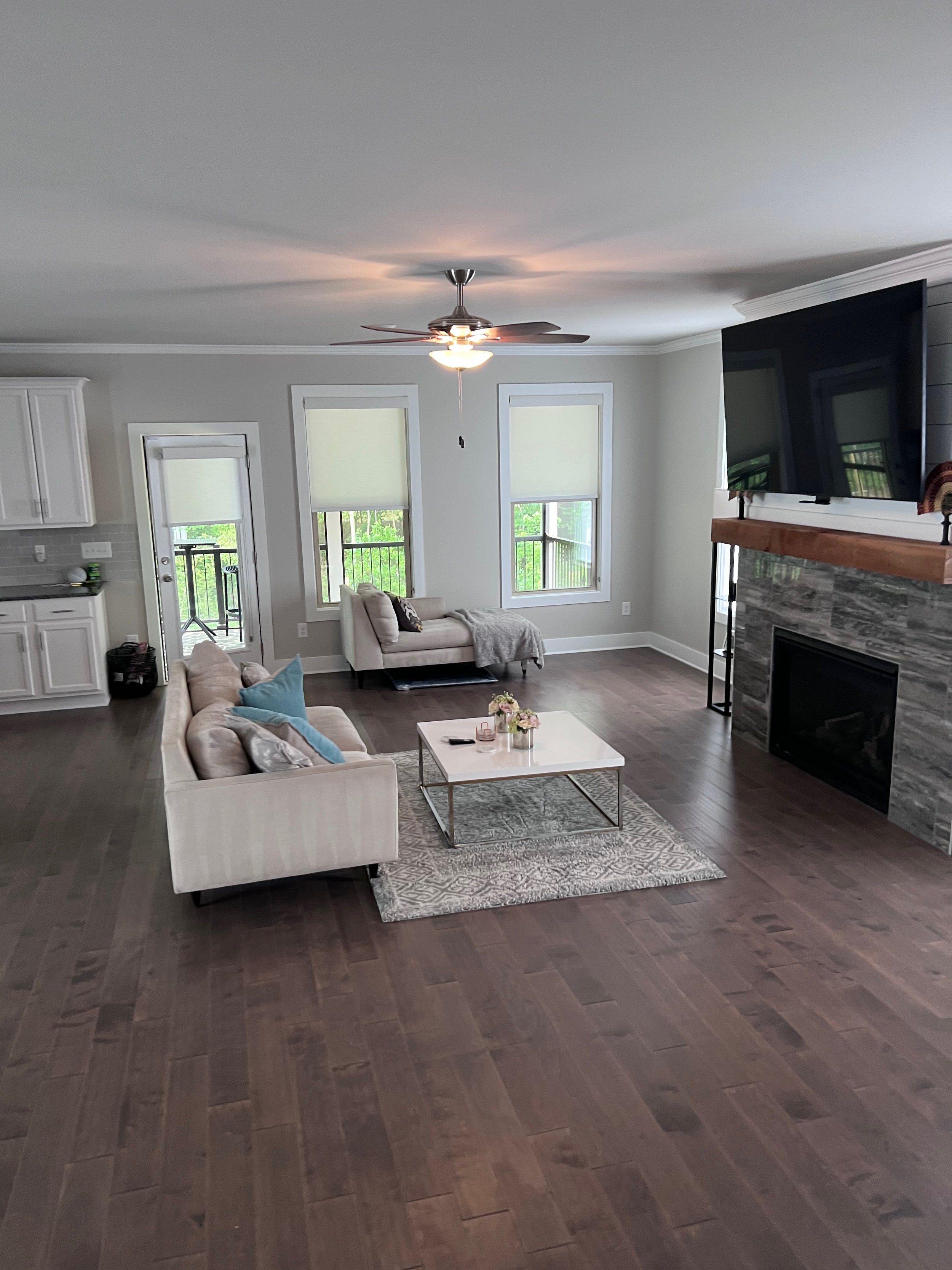
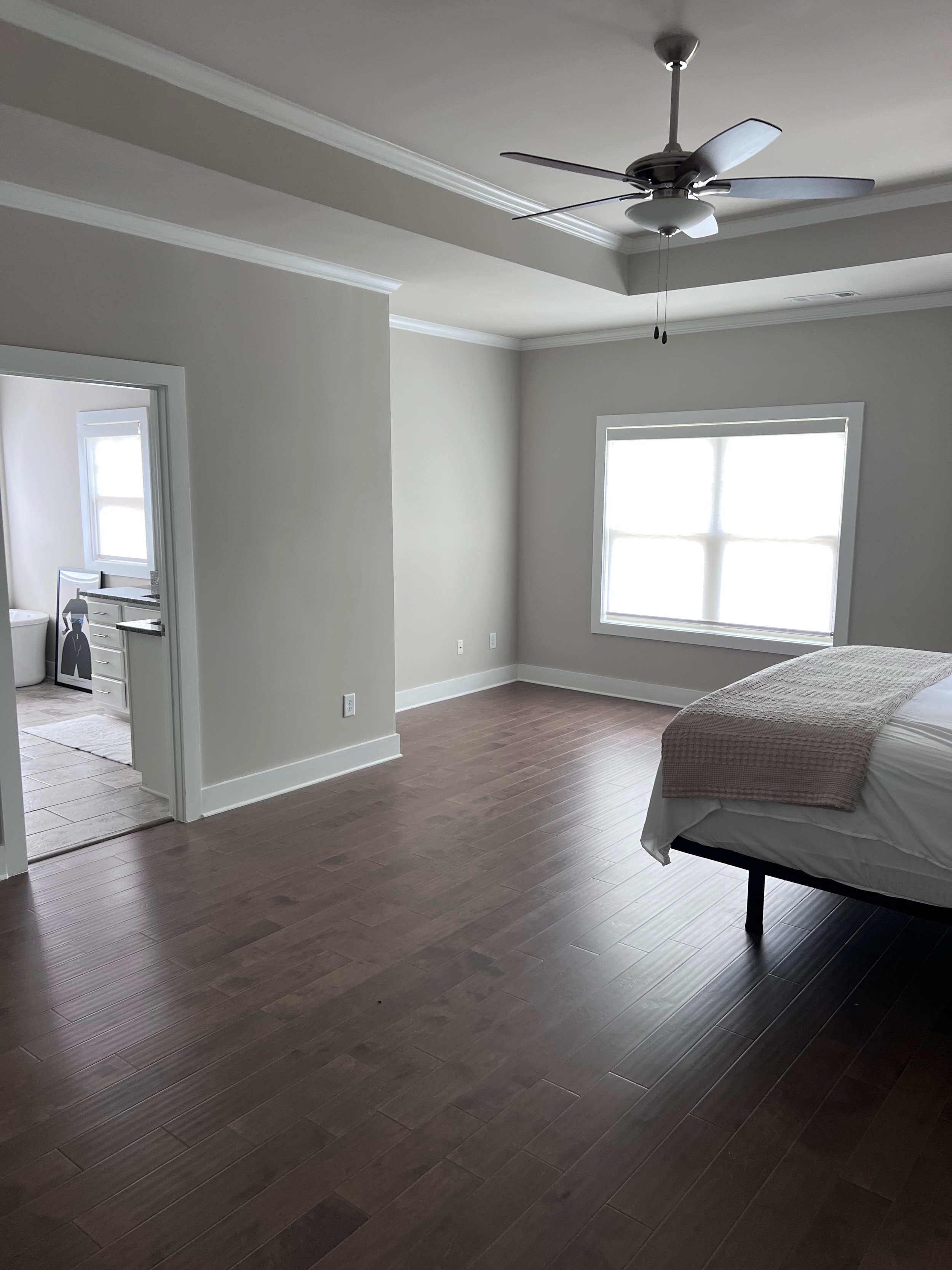
Crystel’s new home was beautiful and a complete blank canvas. The craftsman style home had 3 floors, 4 bedrooms and 4.5 bathrooms. The first level was open concept. Upon entry in the foyer, the dining, kitchen, and living spaces were all connected, with an entry to the garage and covered back porch nearby. Crystel described her style as classy and sophisticated, but she wanted her home to be comfortable and inviting for all the guests she’d entertain and host in the future. She was draw to neutral tones and the aesthetics of retailers such as Restoration Hardware, CB2, Arhaus, and Pottery Barn. Although she wanted to keep things neutral and all of her chrome and brushed nickel finishes, she was open to adding some bold colors, African prints, and artwork that inspired her daily. In addition to downstairs, she asked that I design her master suite on the second floor as well as the flex space at the center of all the bedrooms. For her master bedroom, she was okay with making things a bit more bold and colorful, as she loved black and white combos, purple, magenta, gold, and dark green.
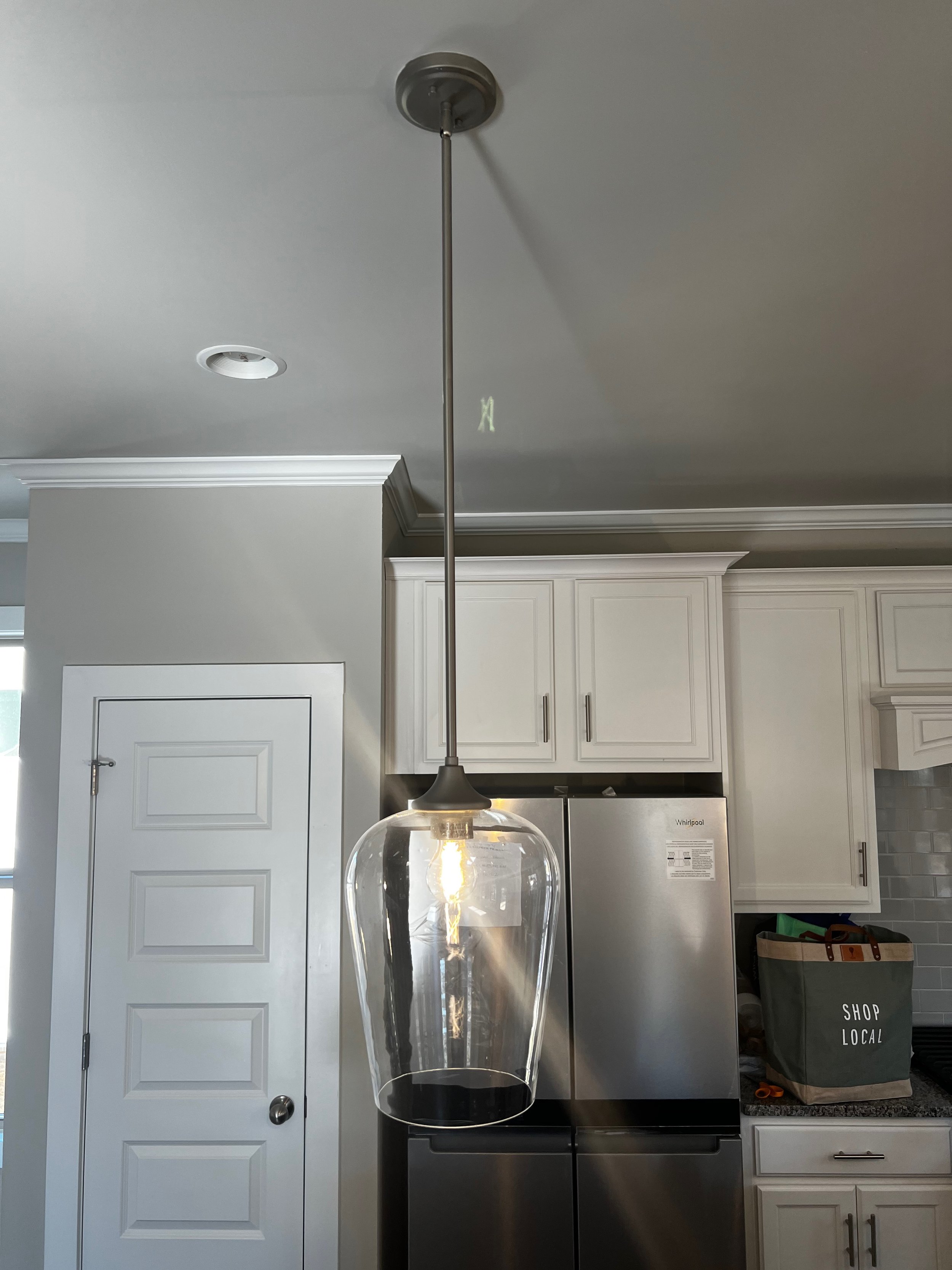
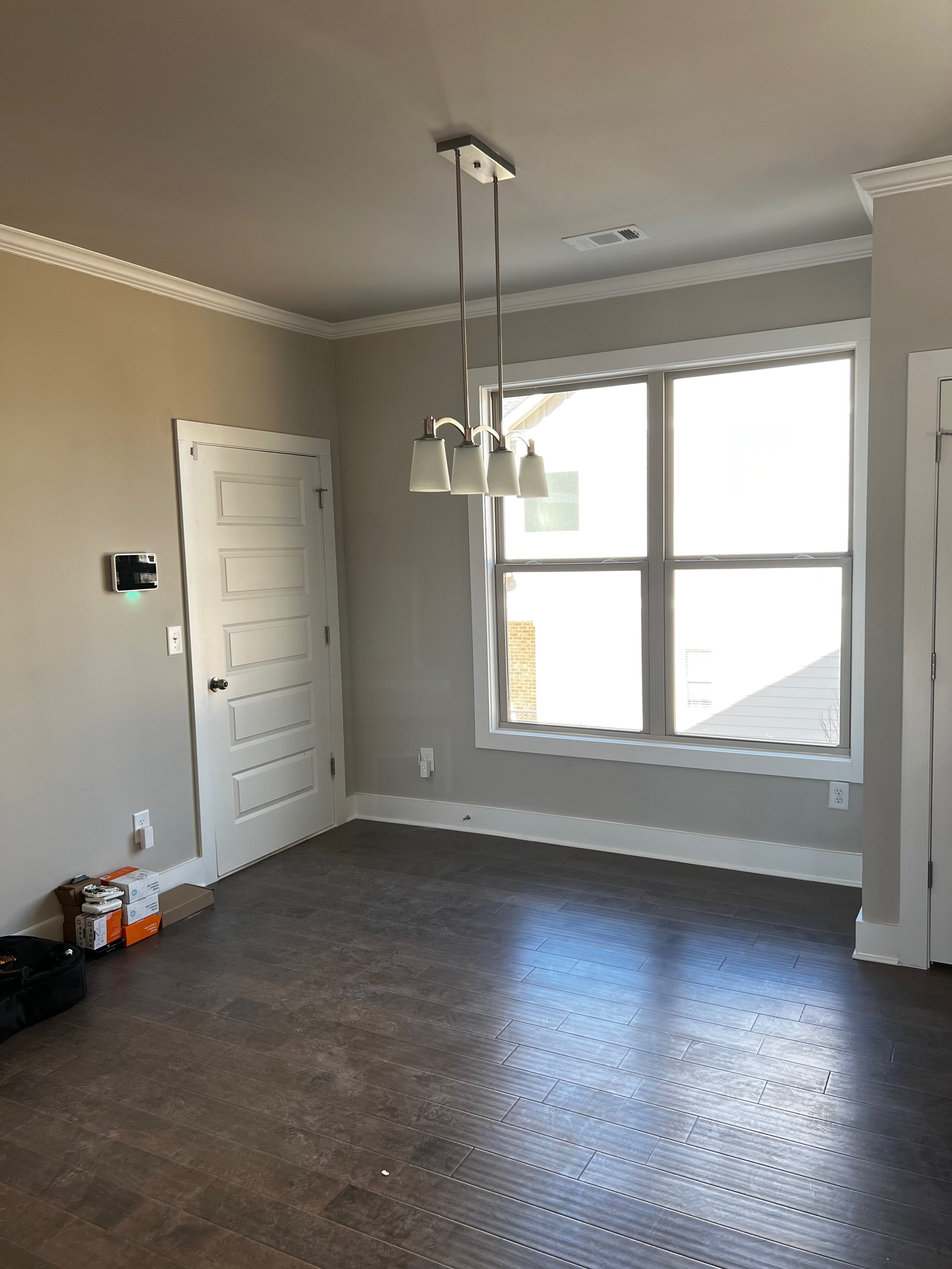
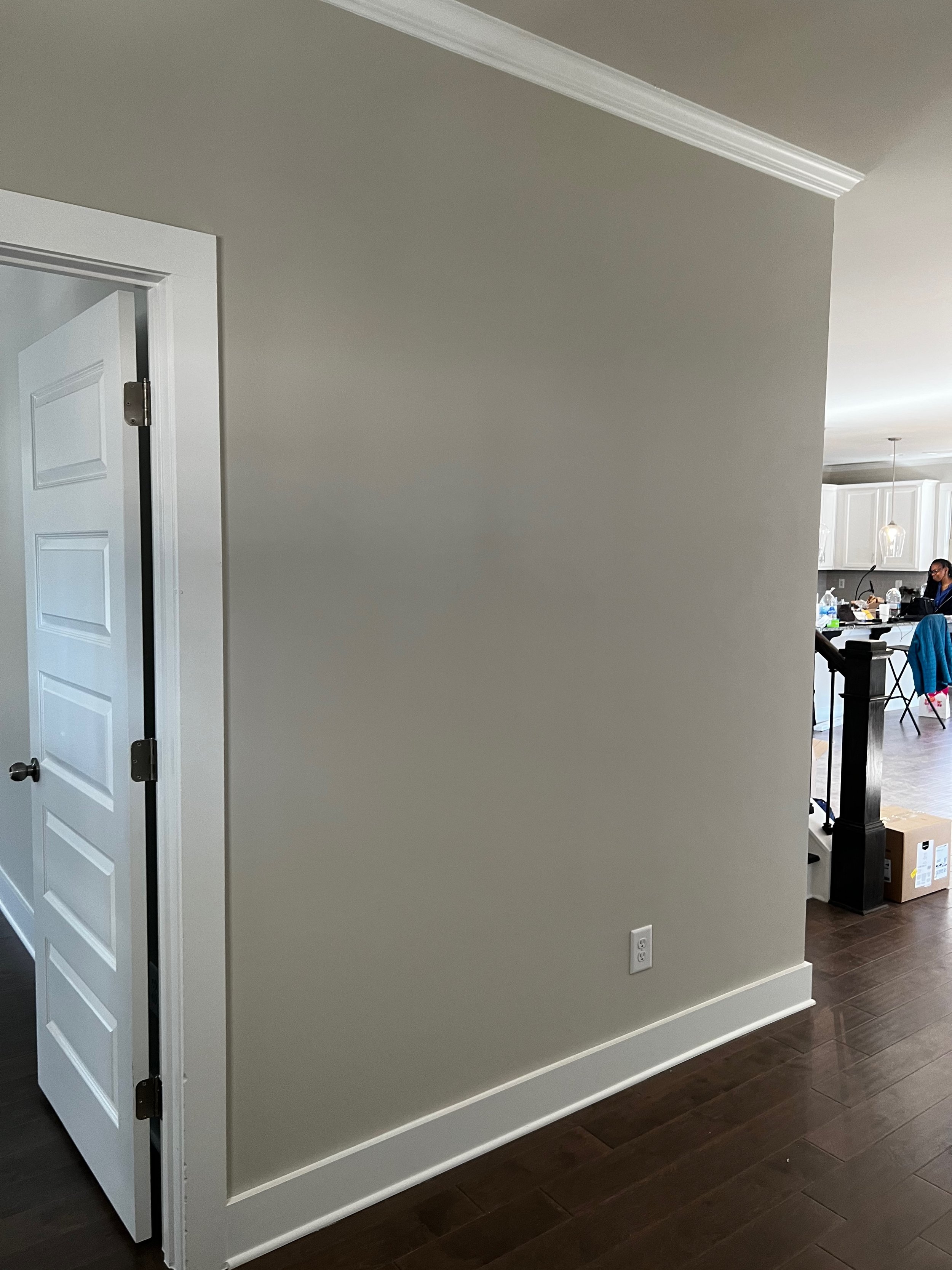
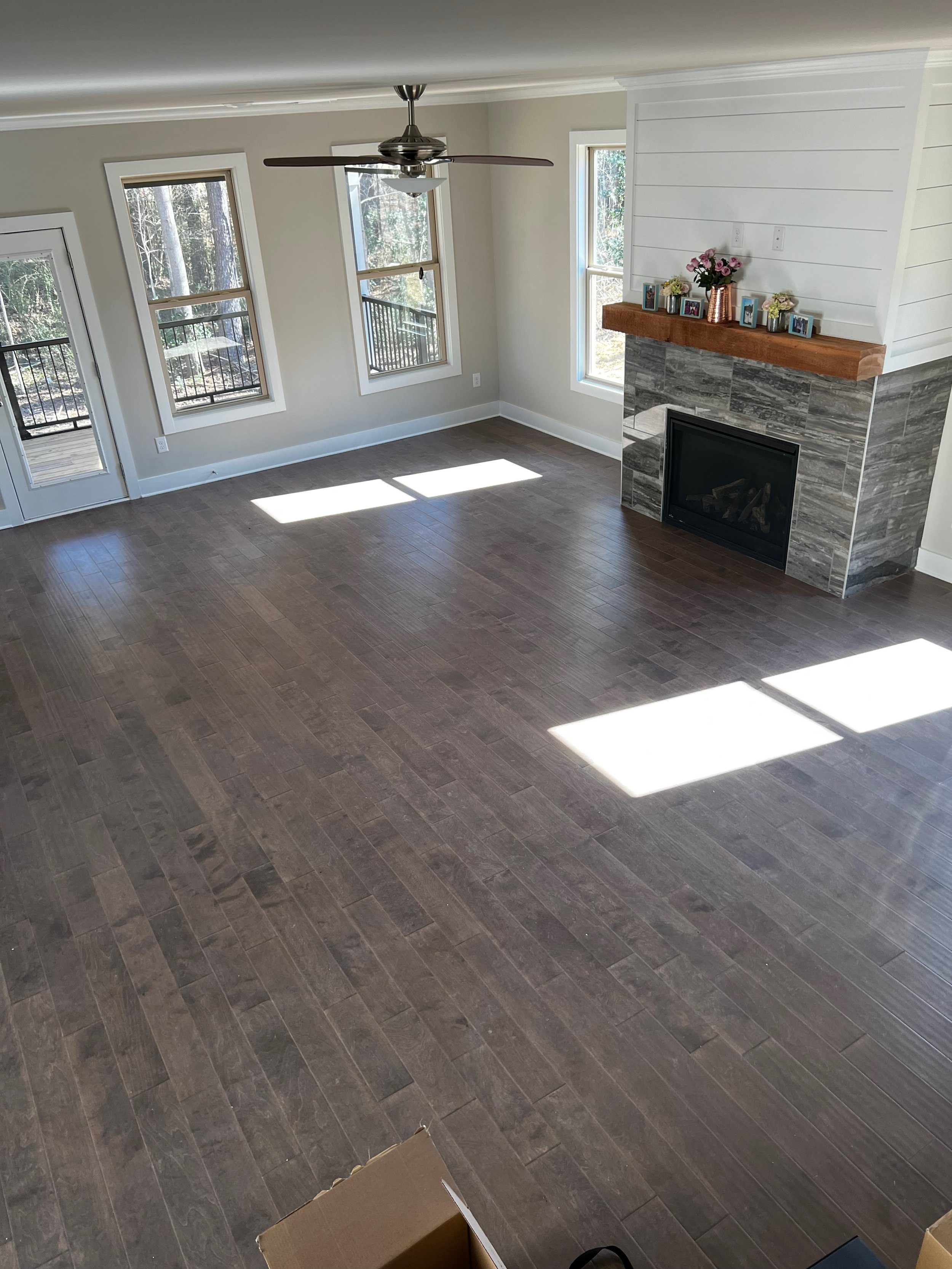
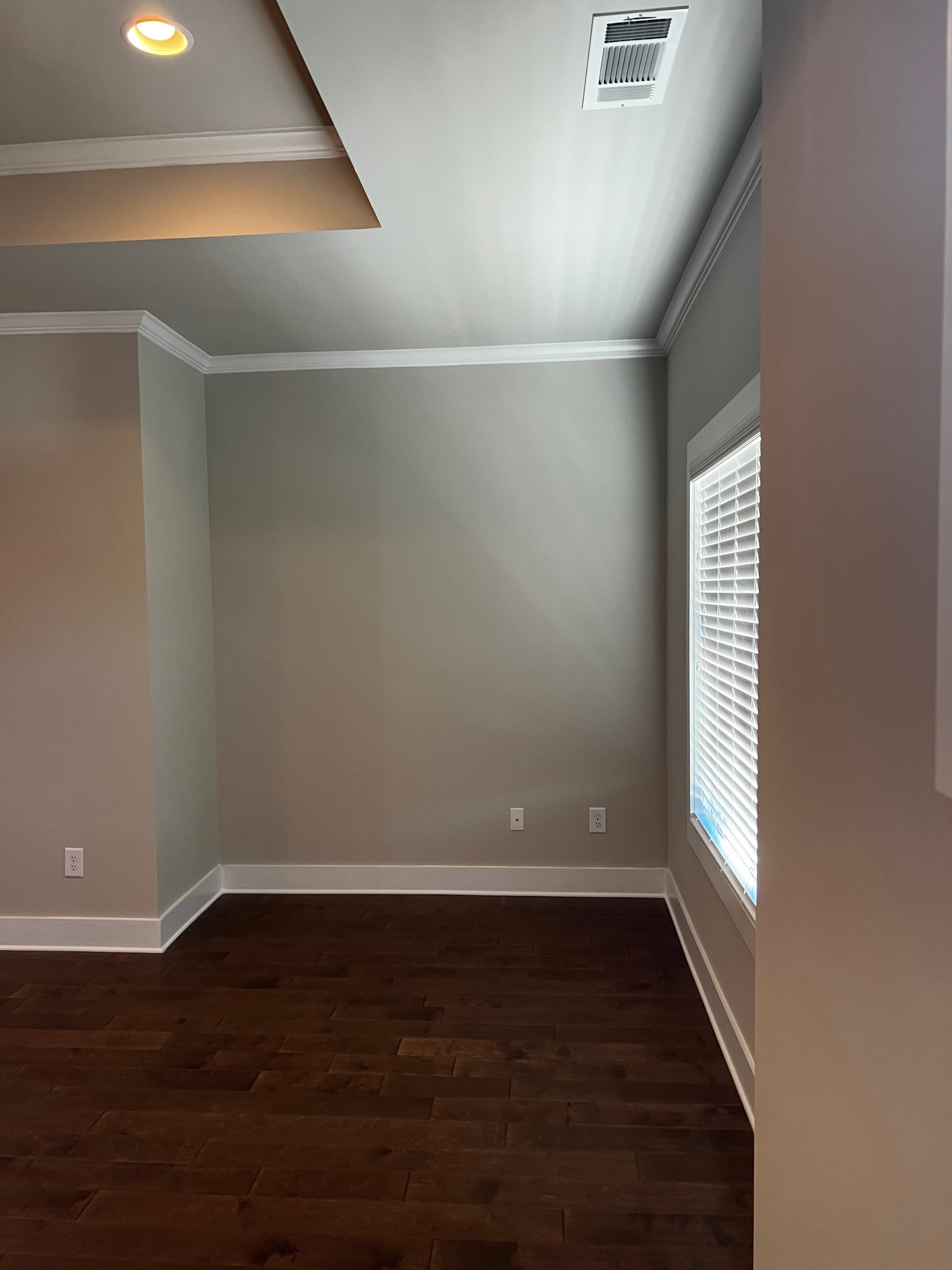
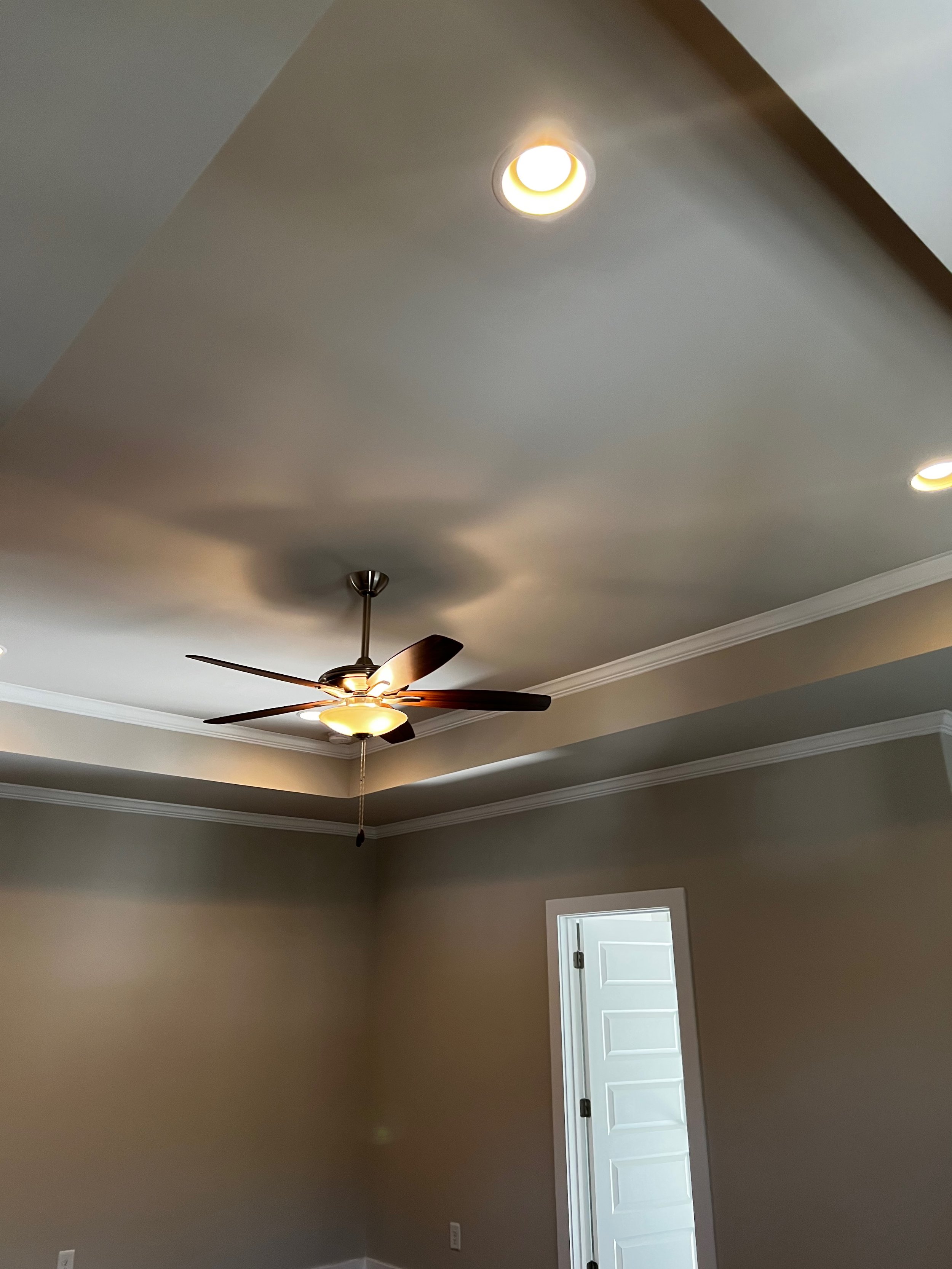
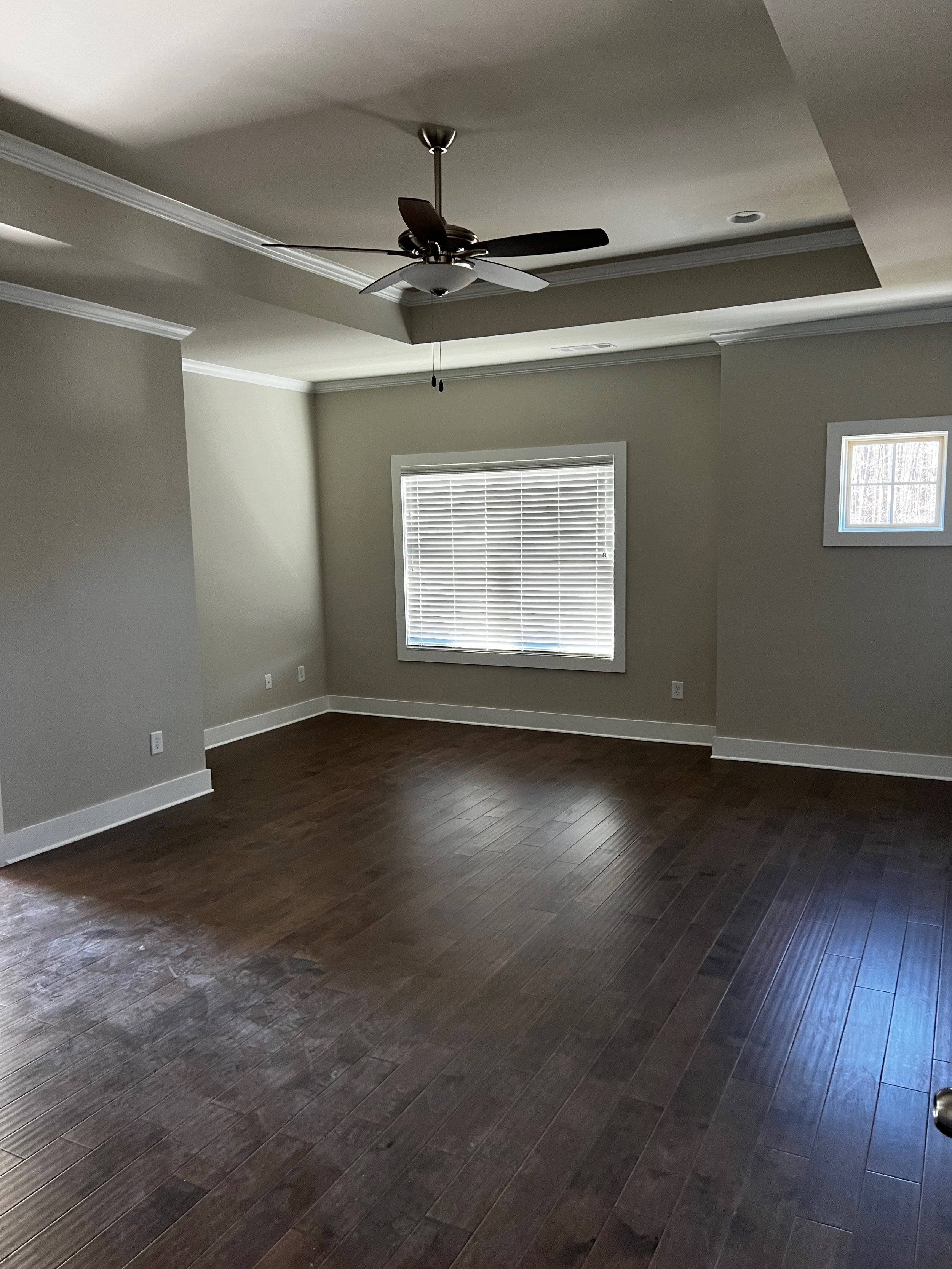
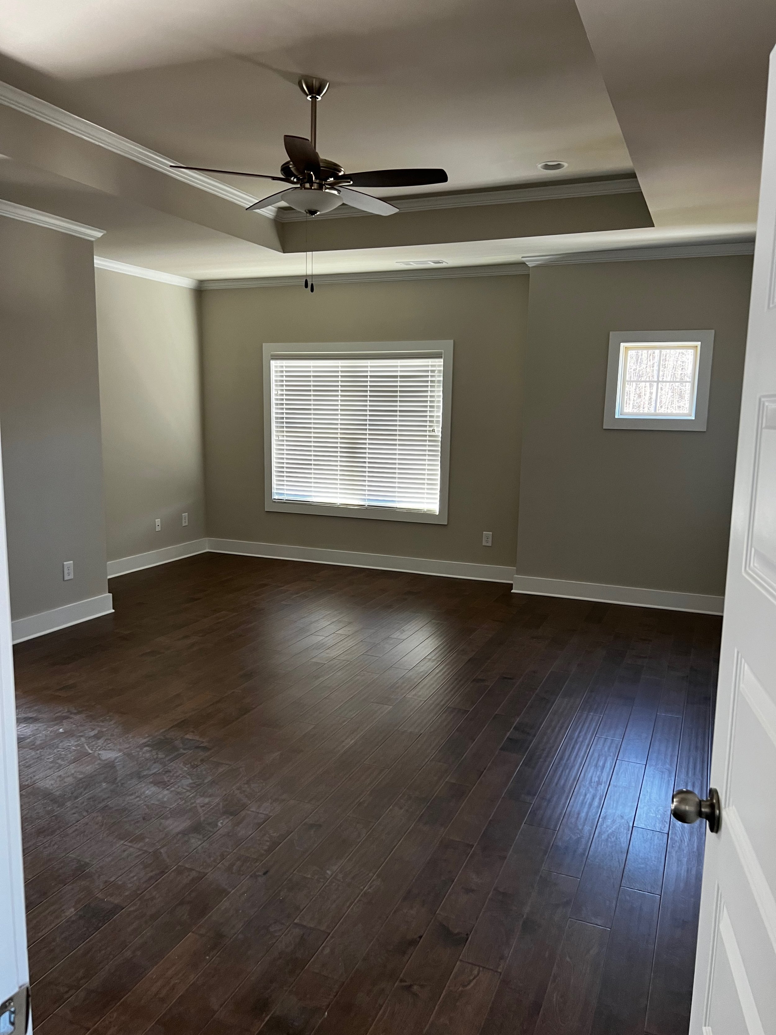
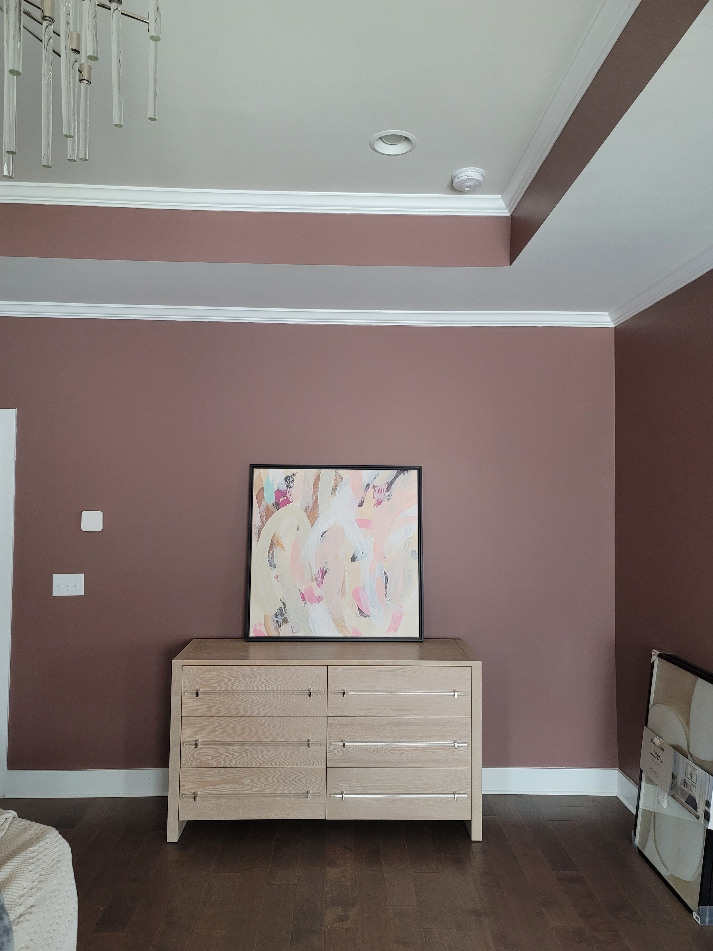
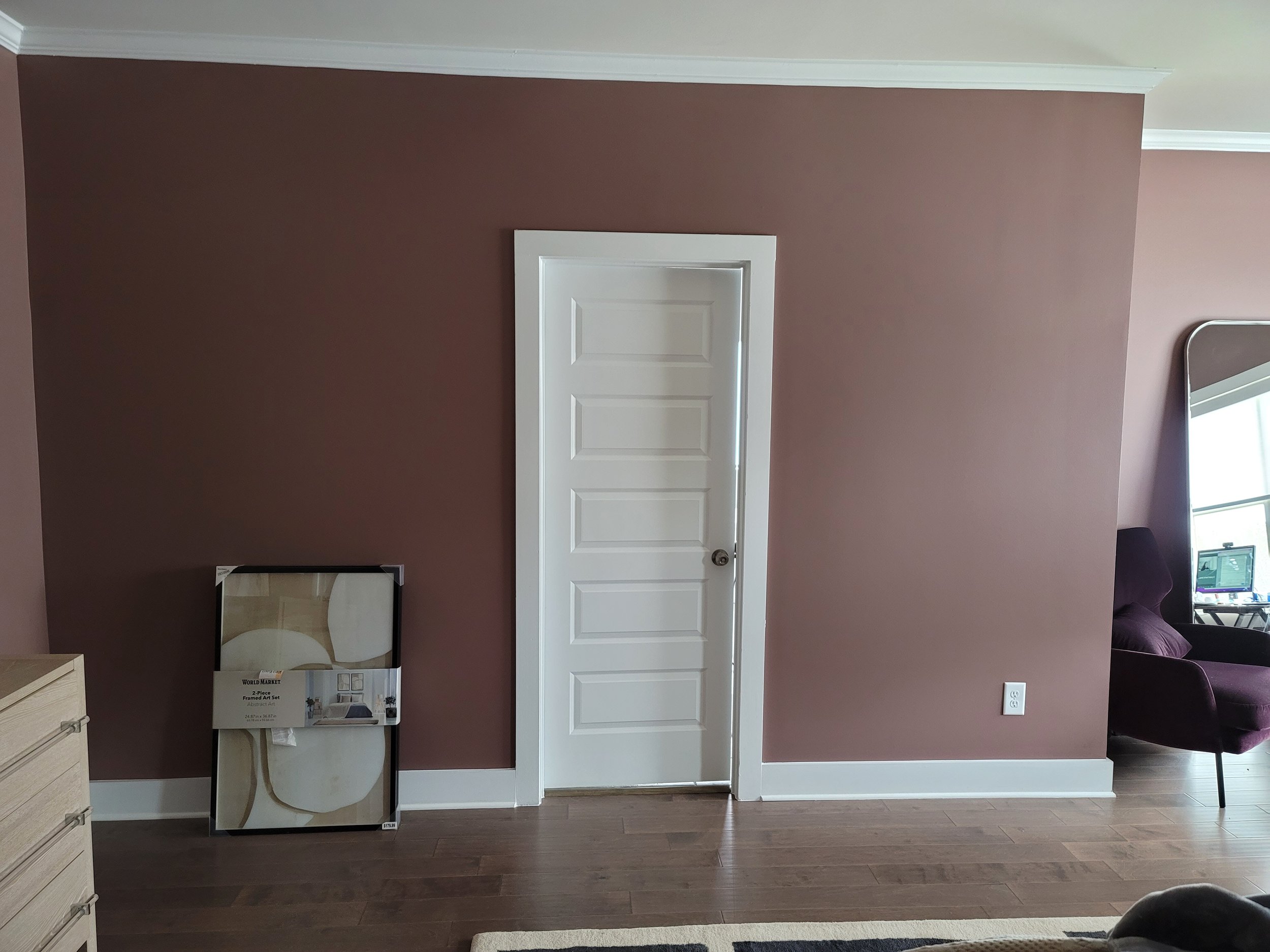
BEFORE
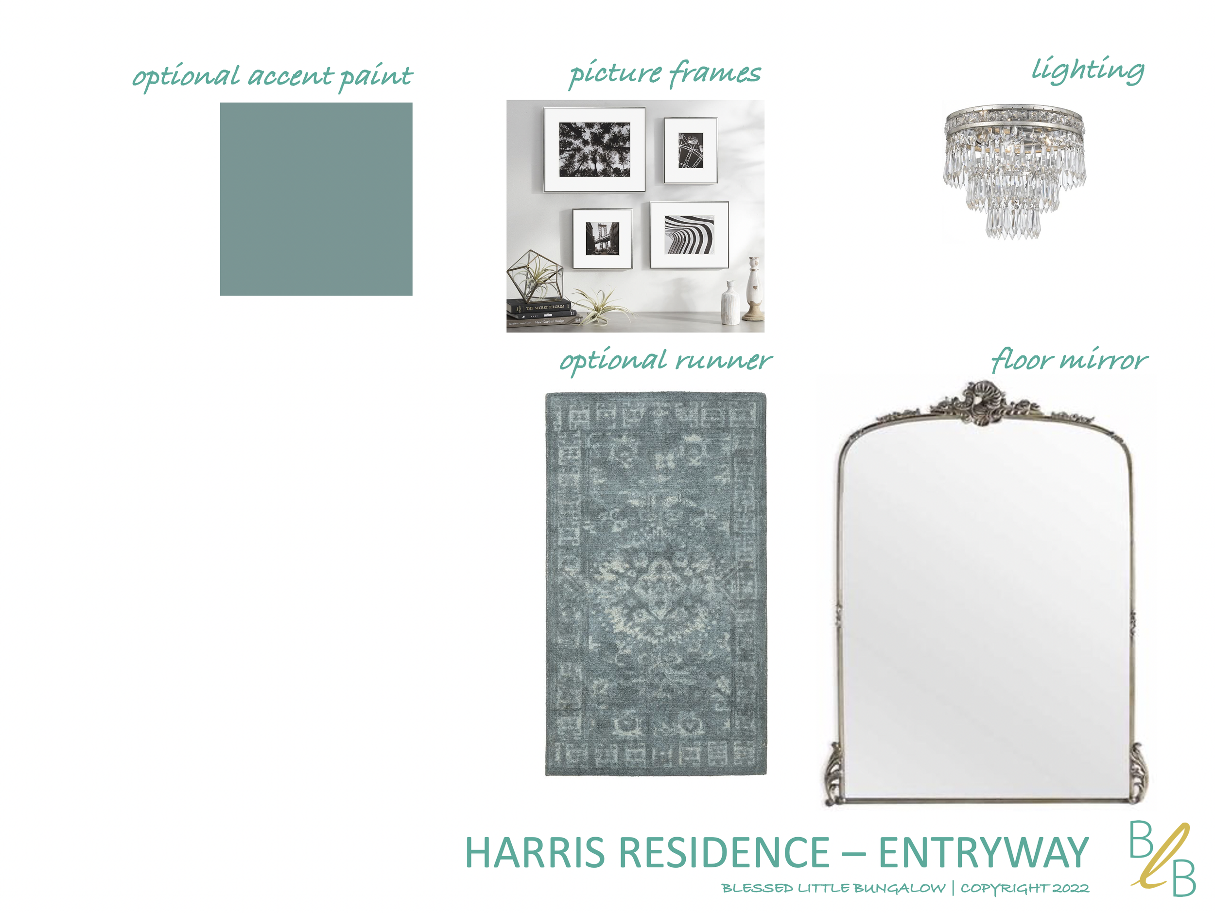
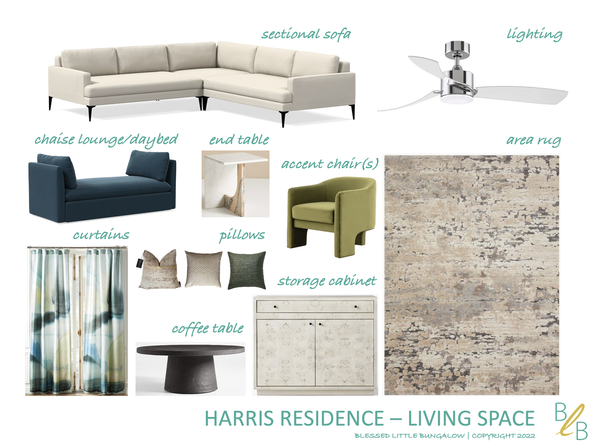
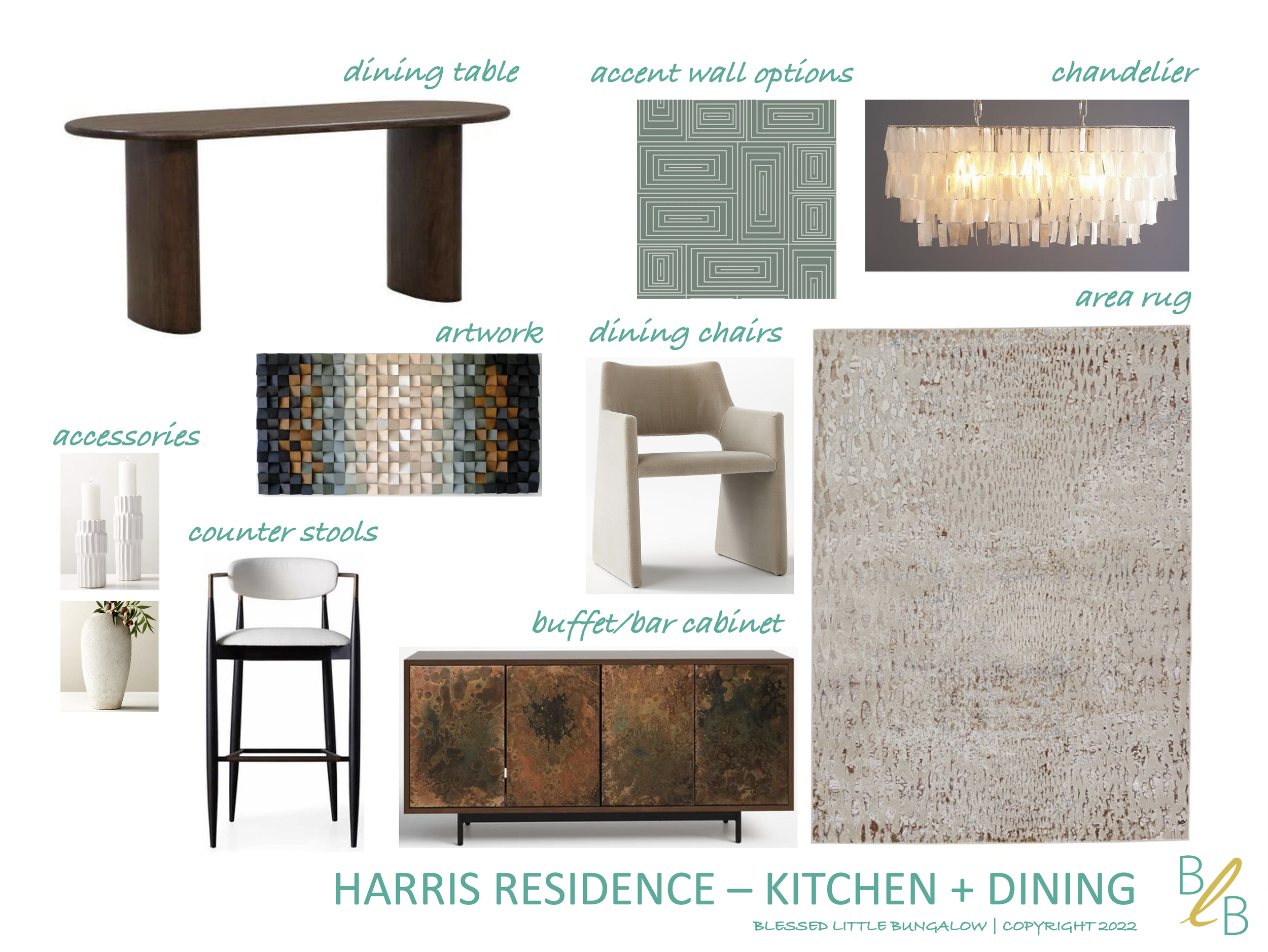
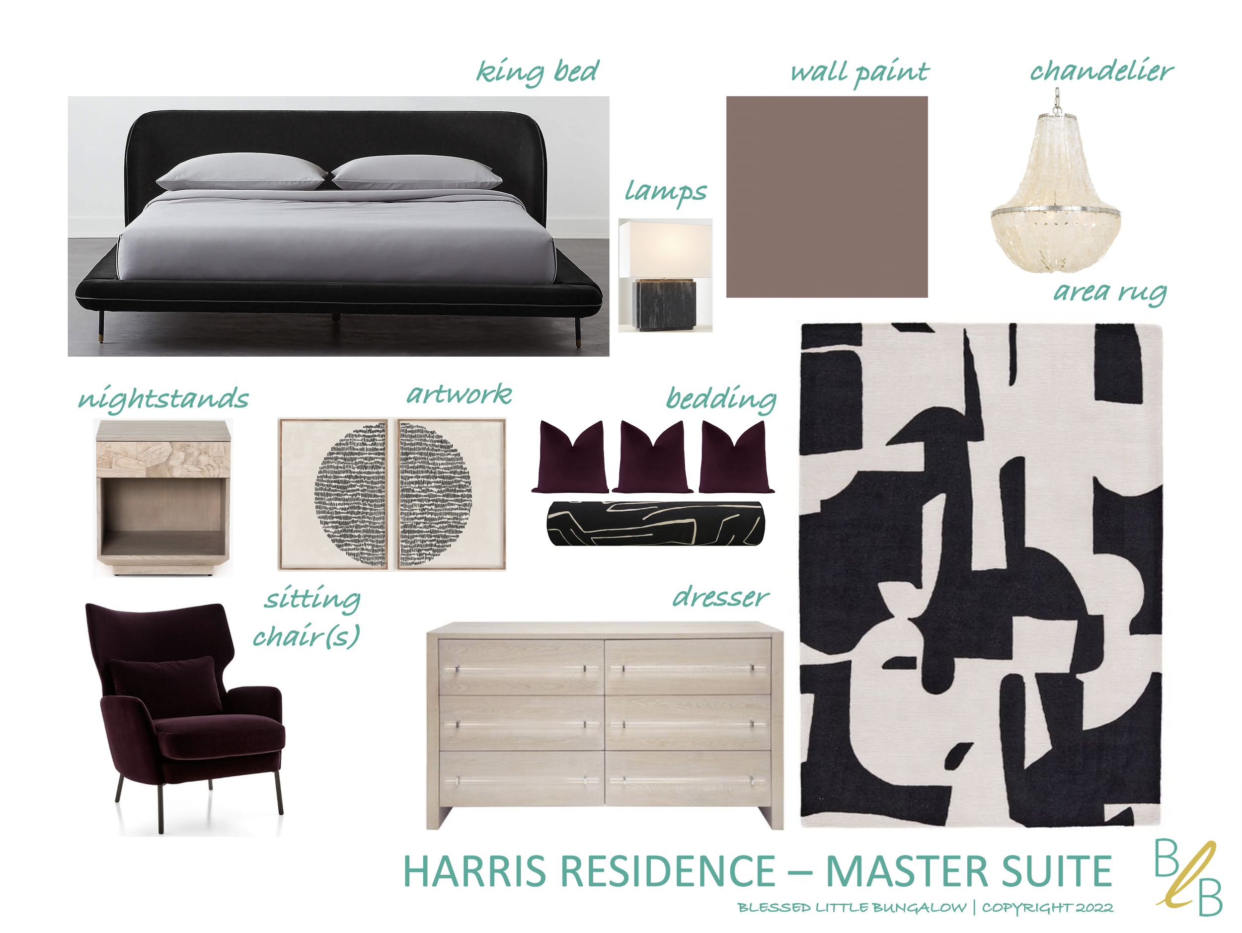
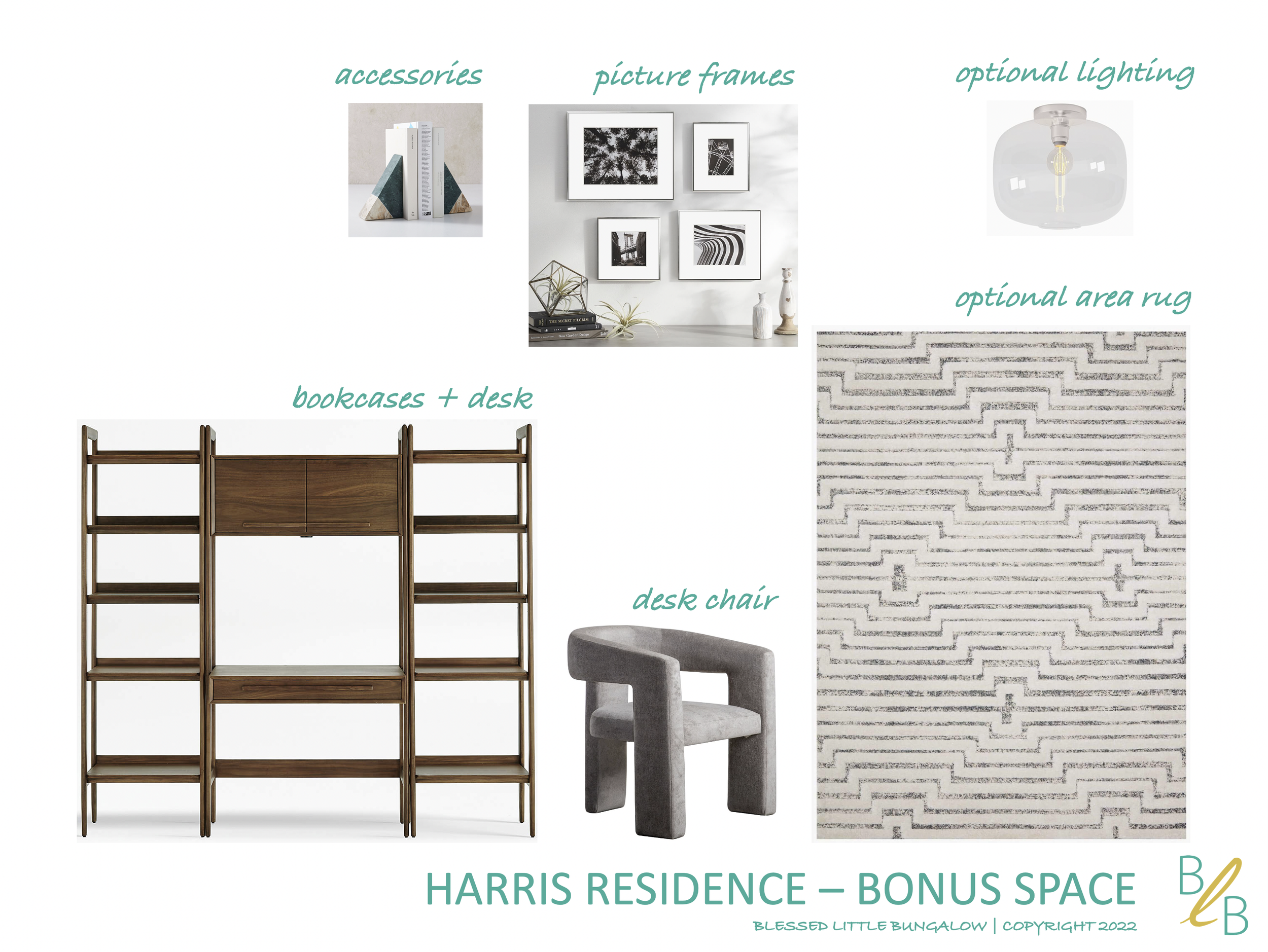
With all of this in mind, I created the following mood boards for each space:
MOOD BOARDS
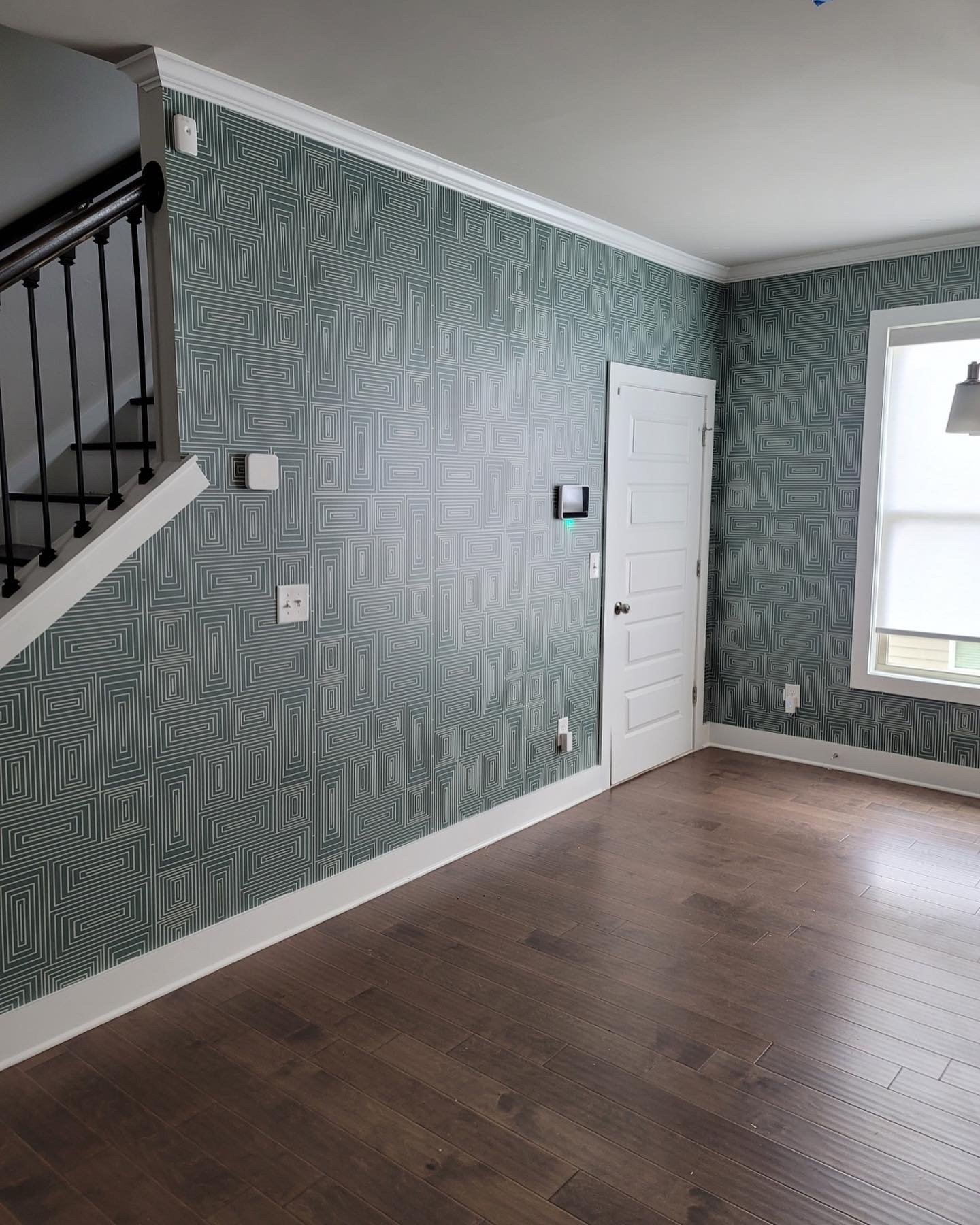
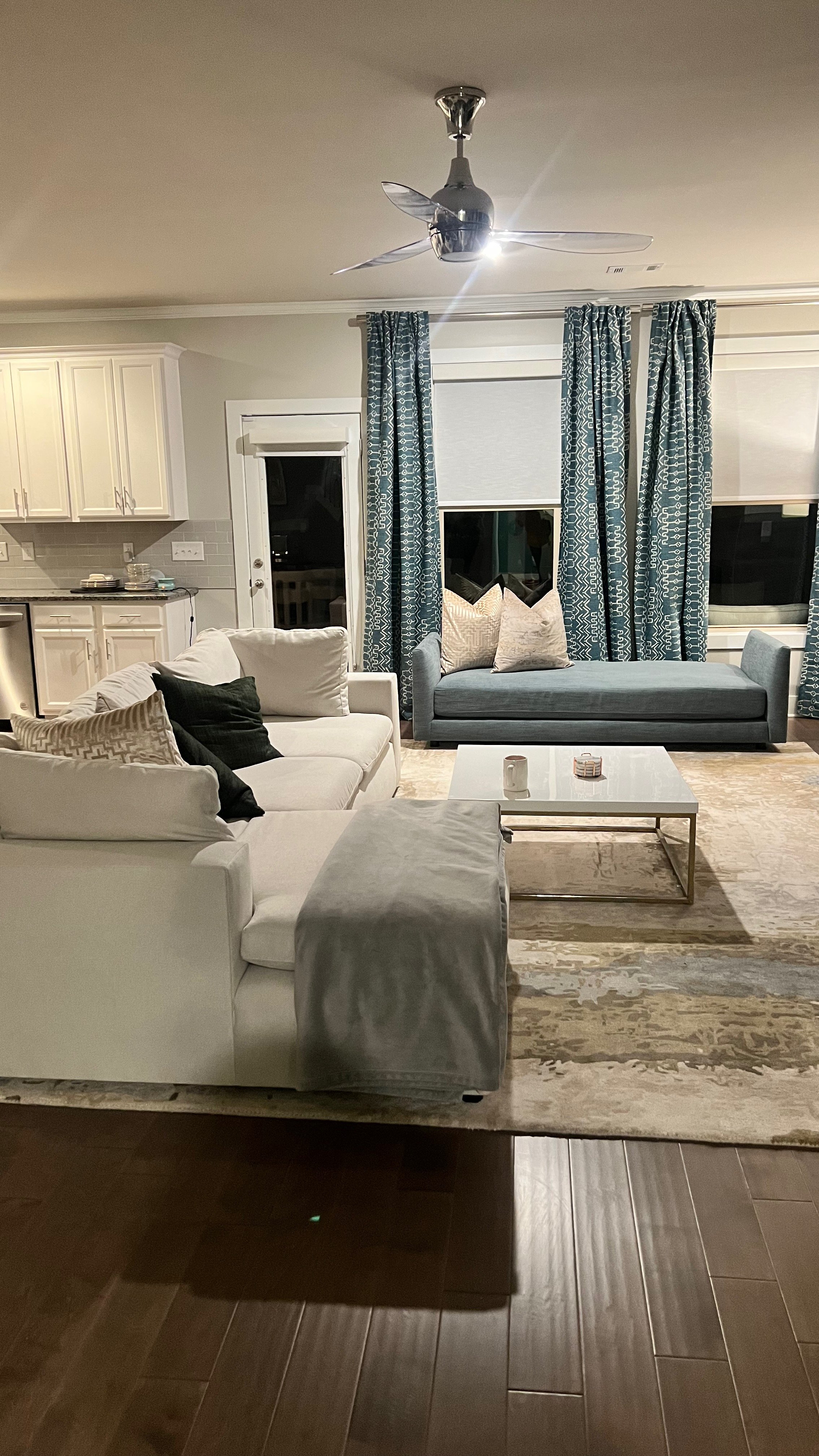
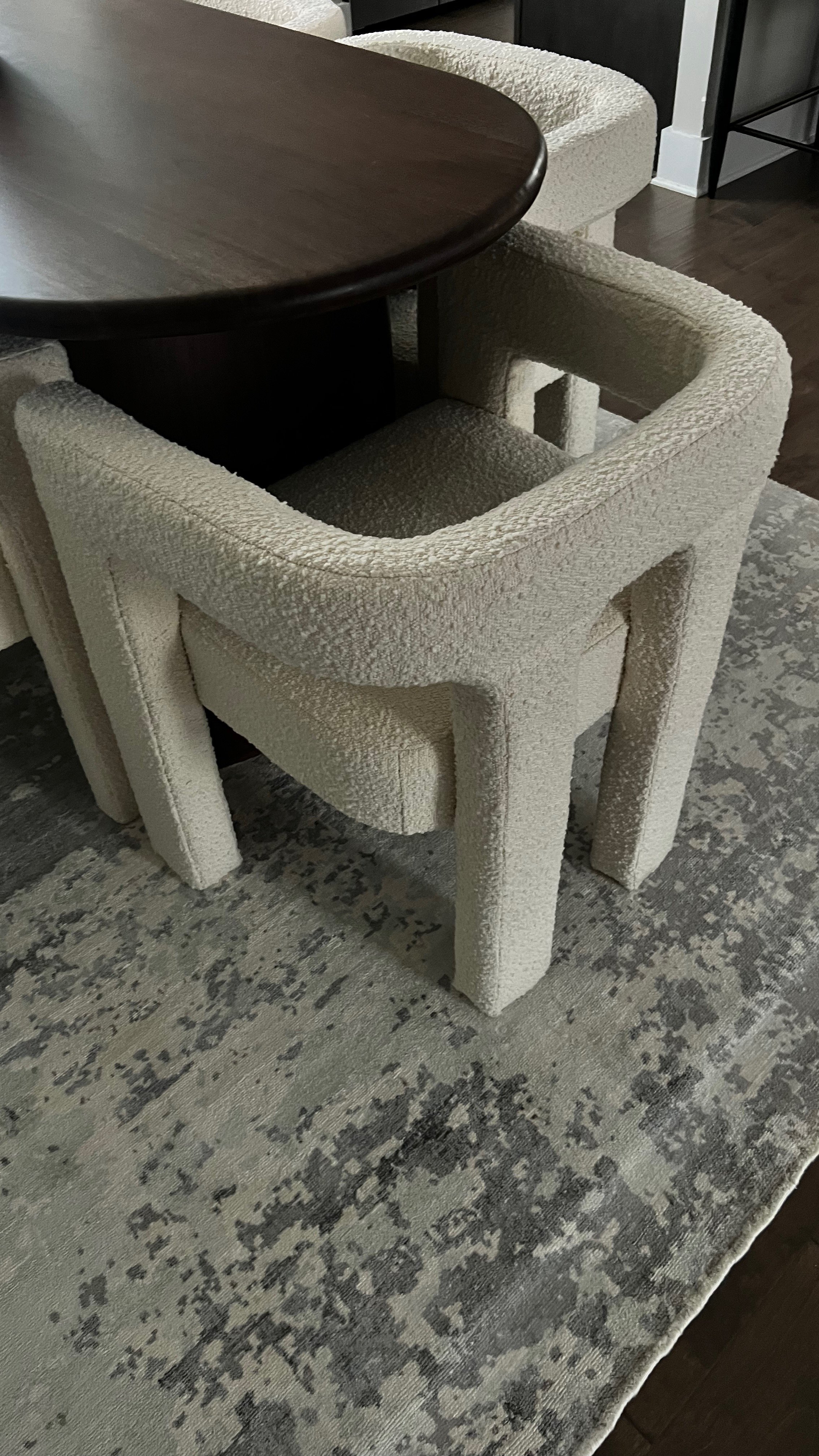
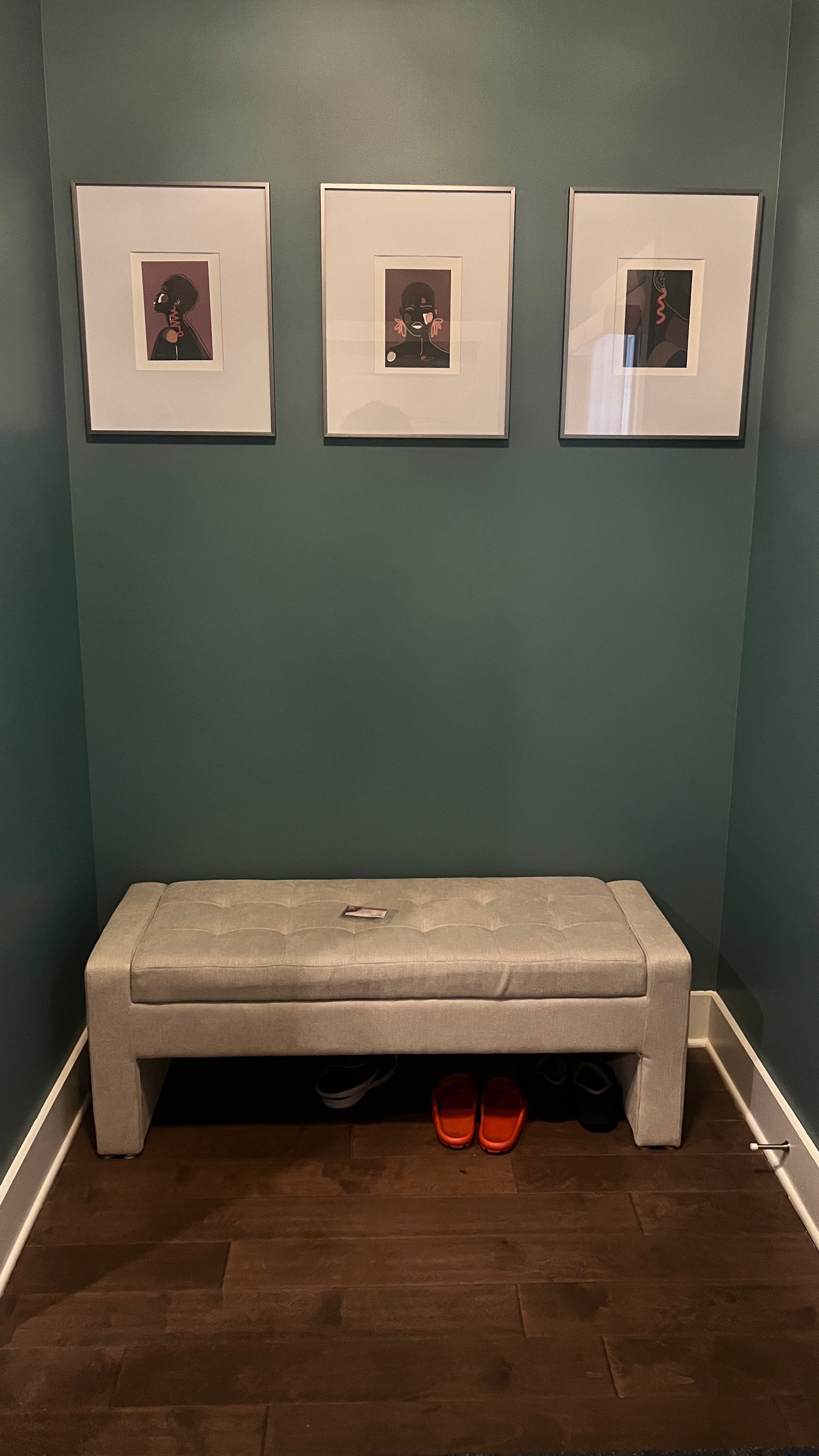
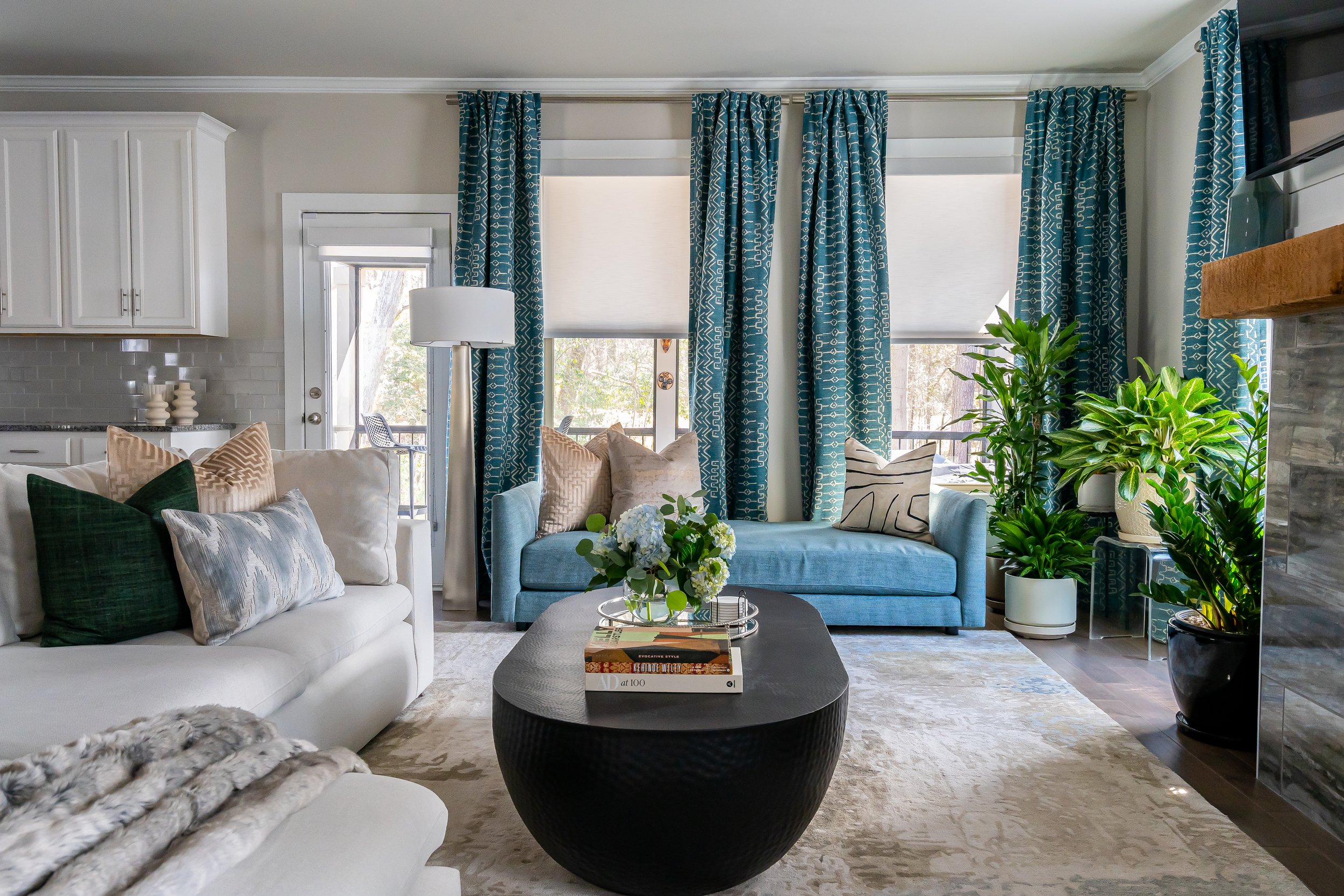
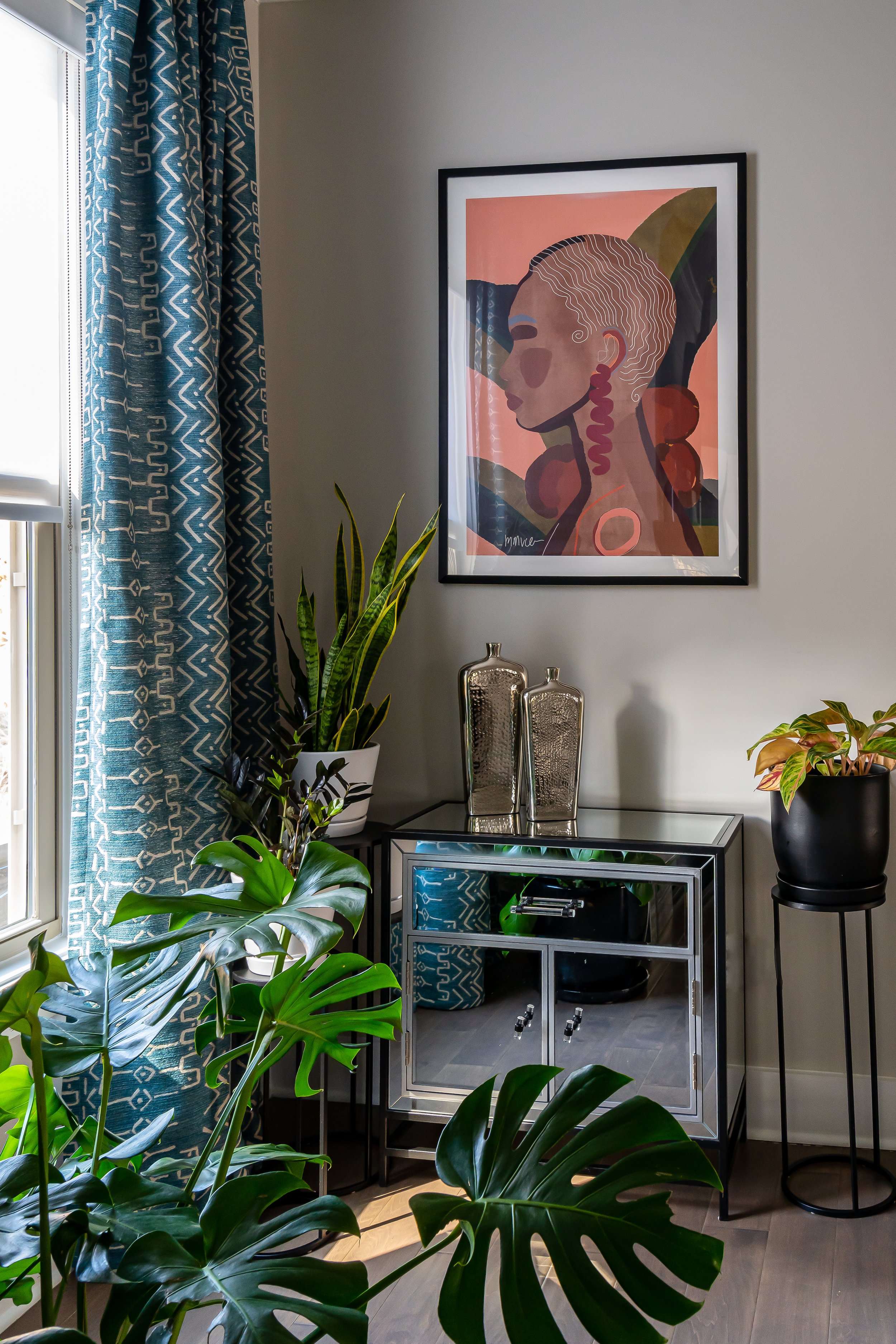
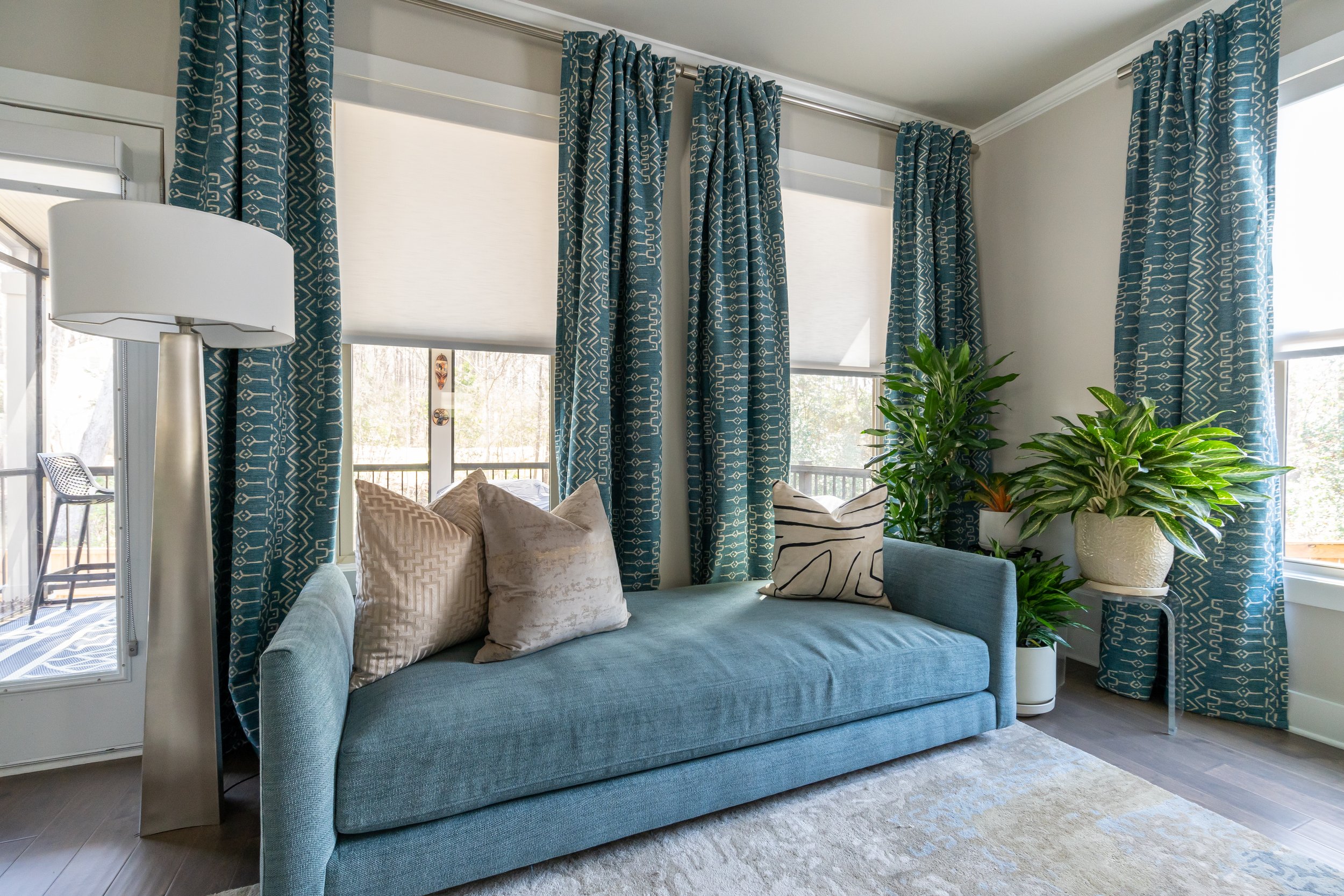
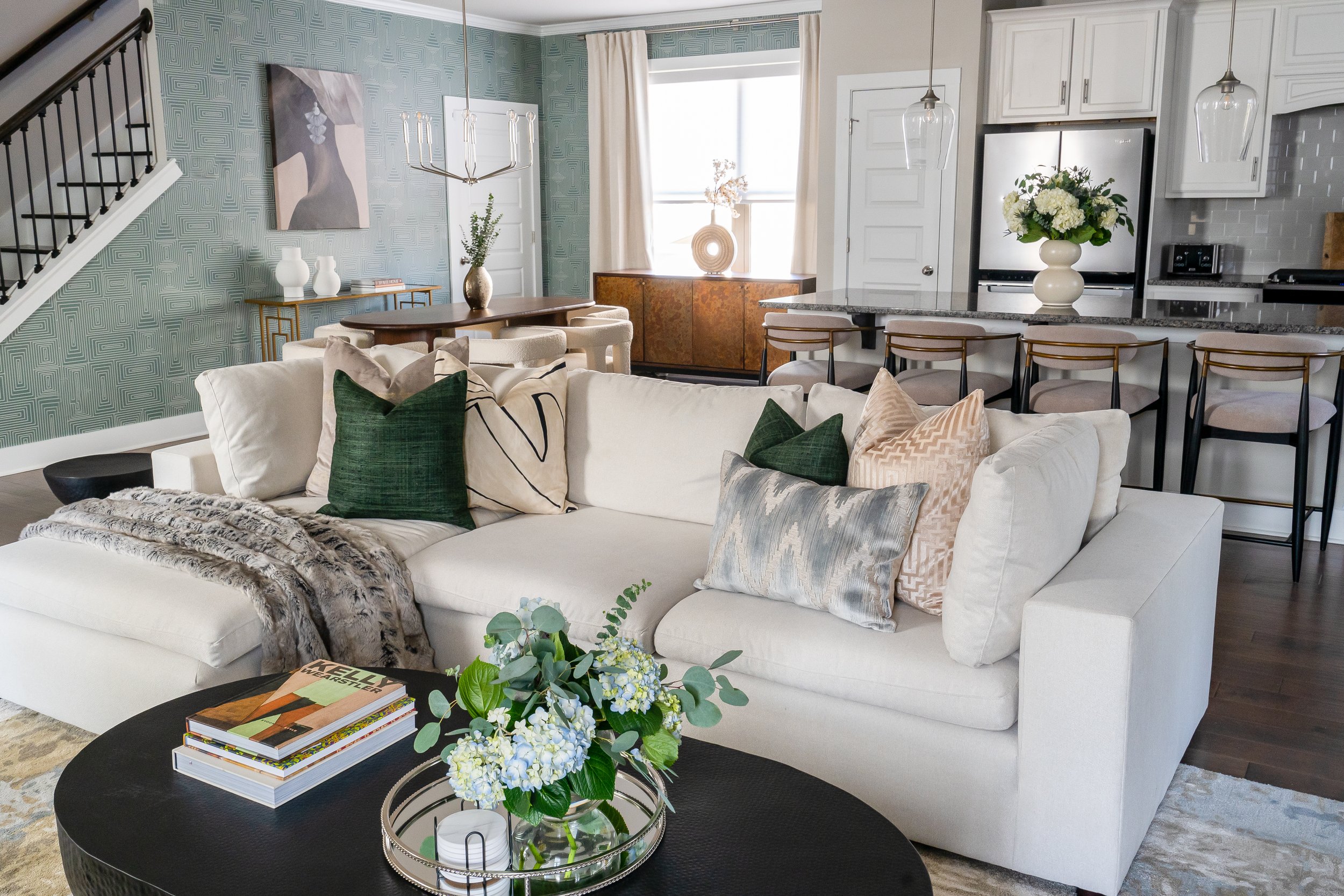
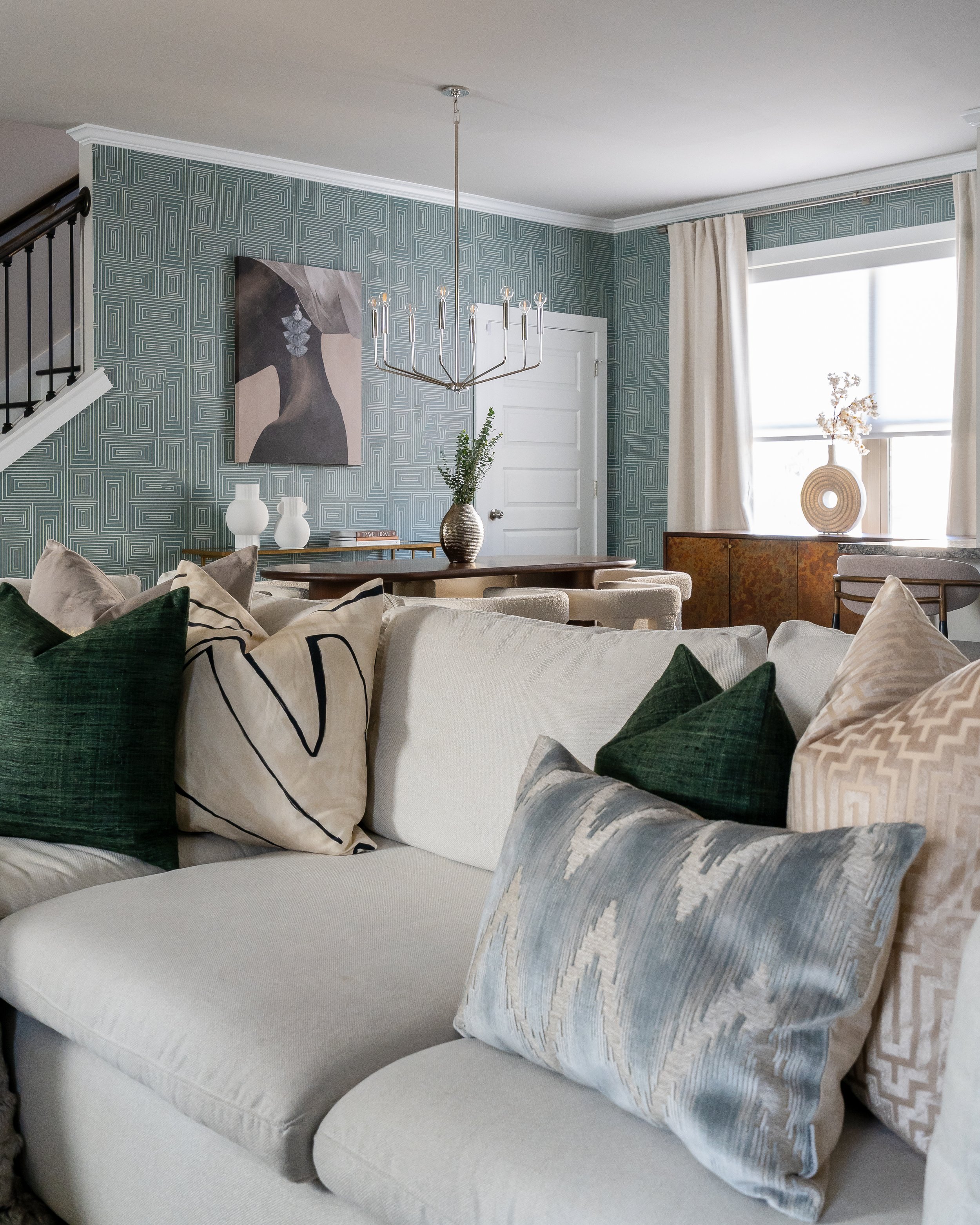
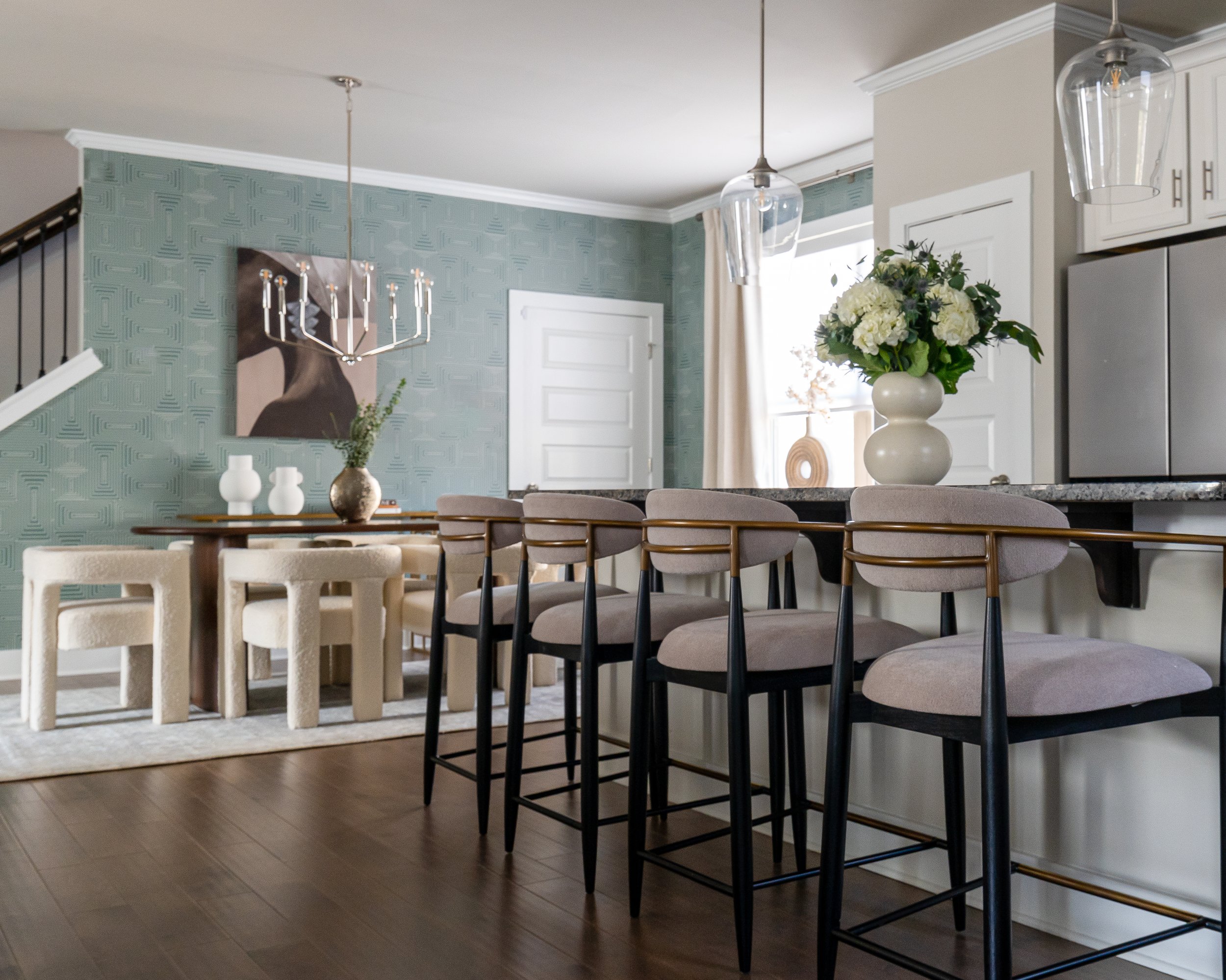
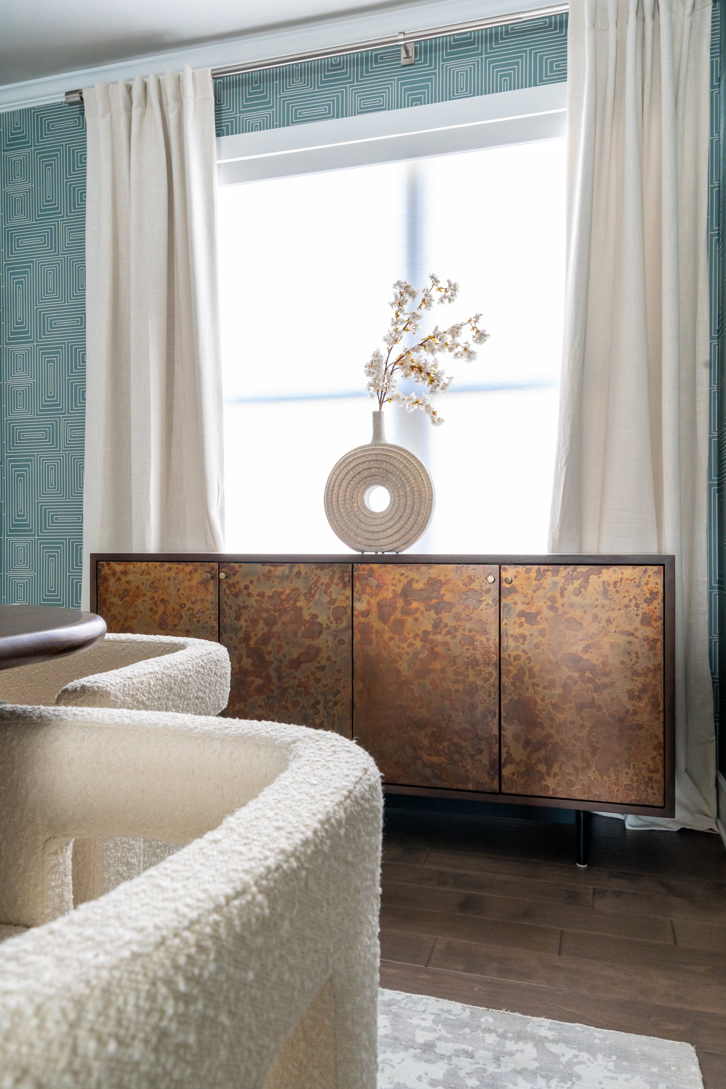
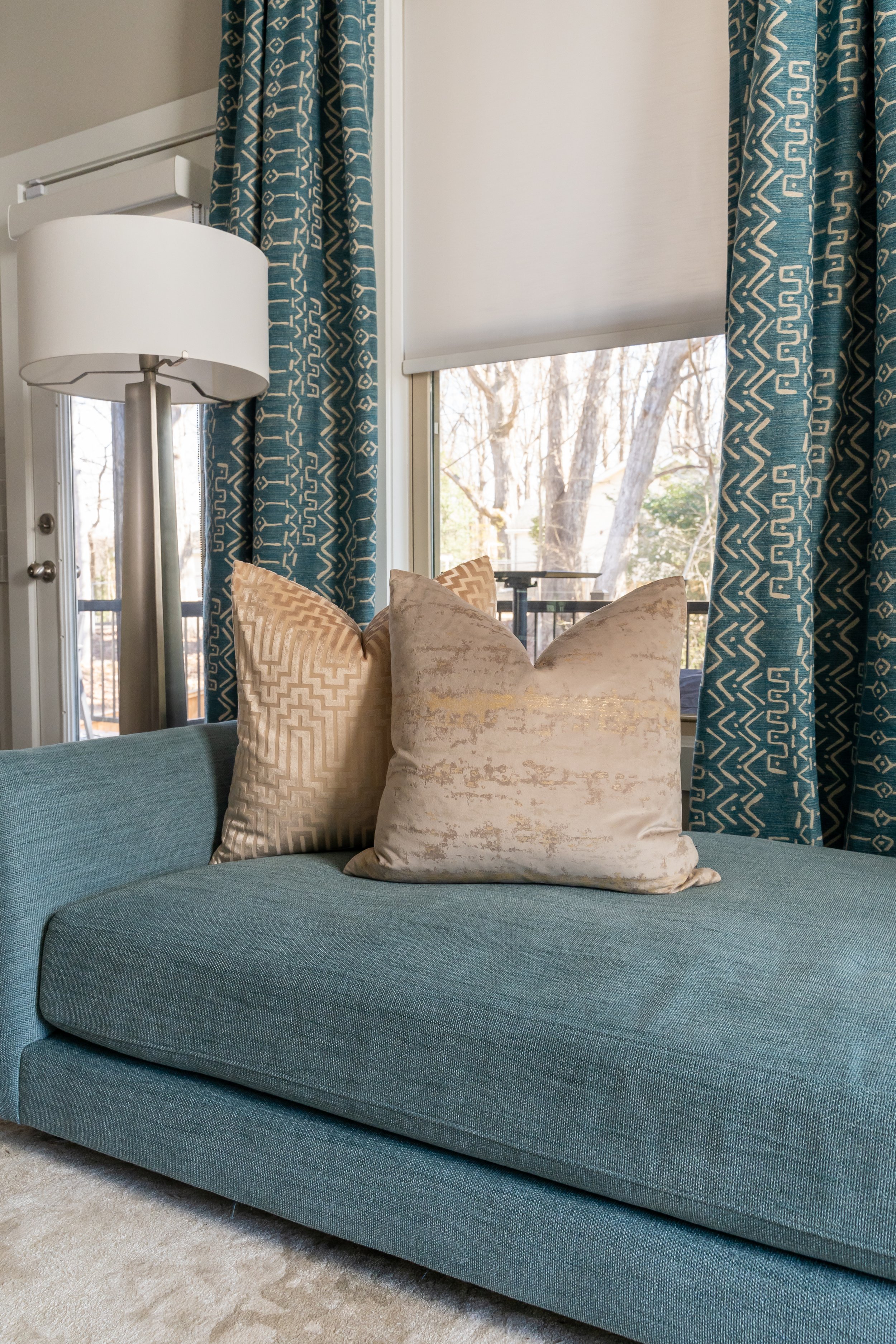
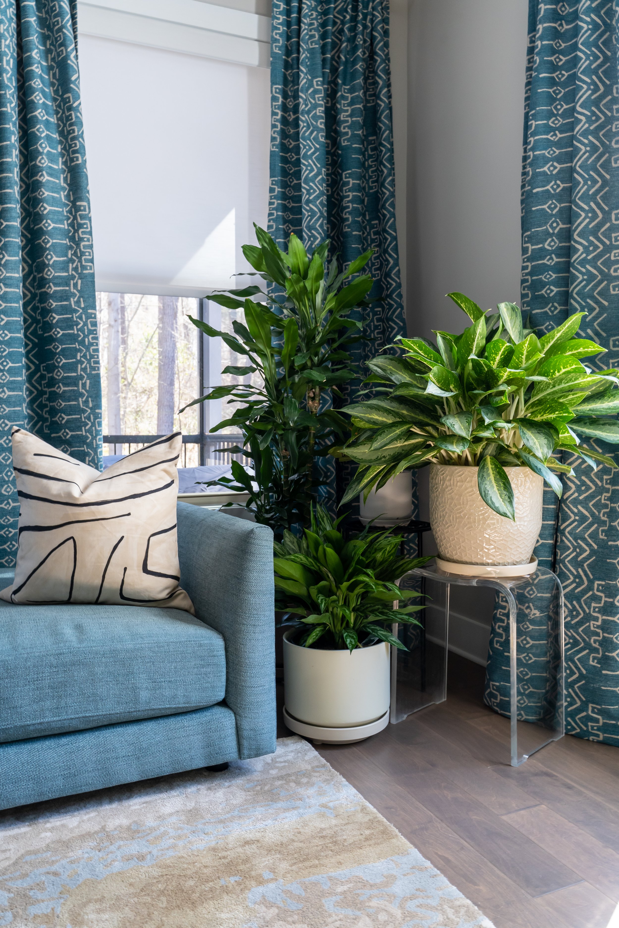
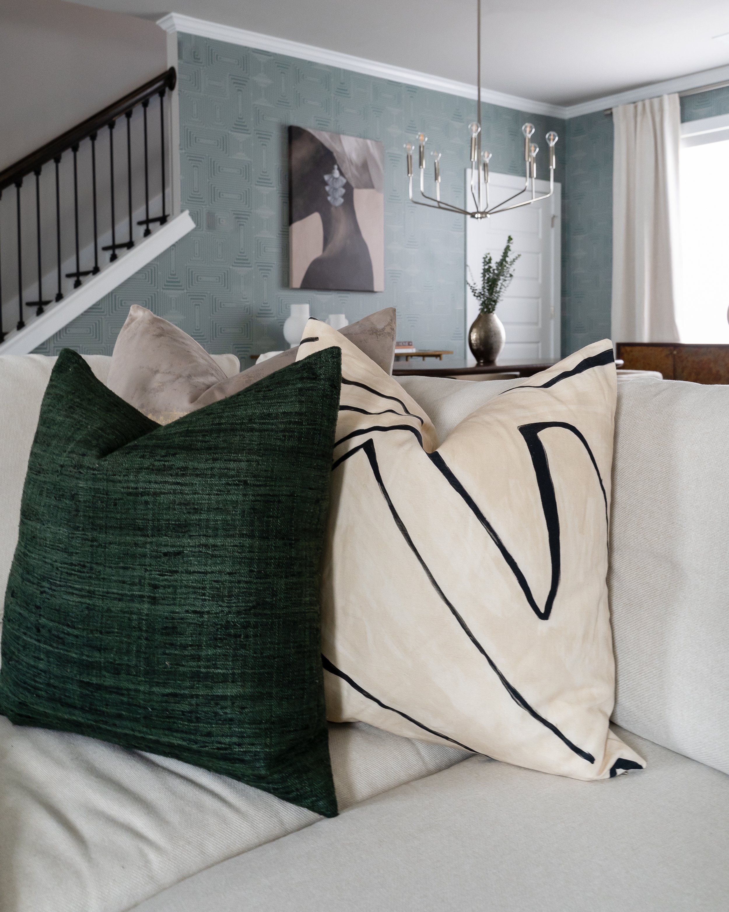
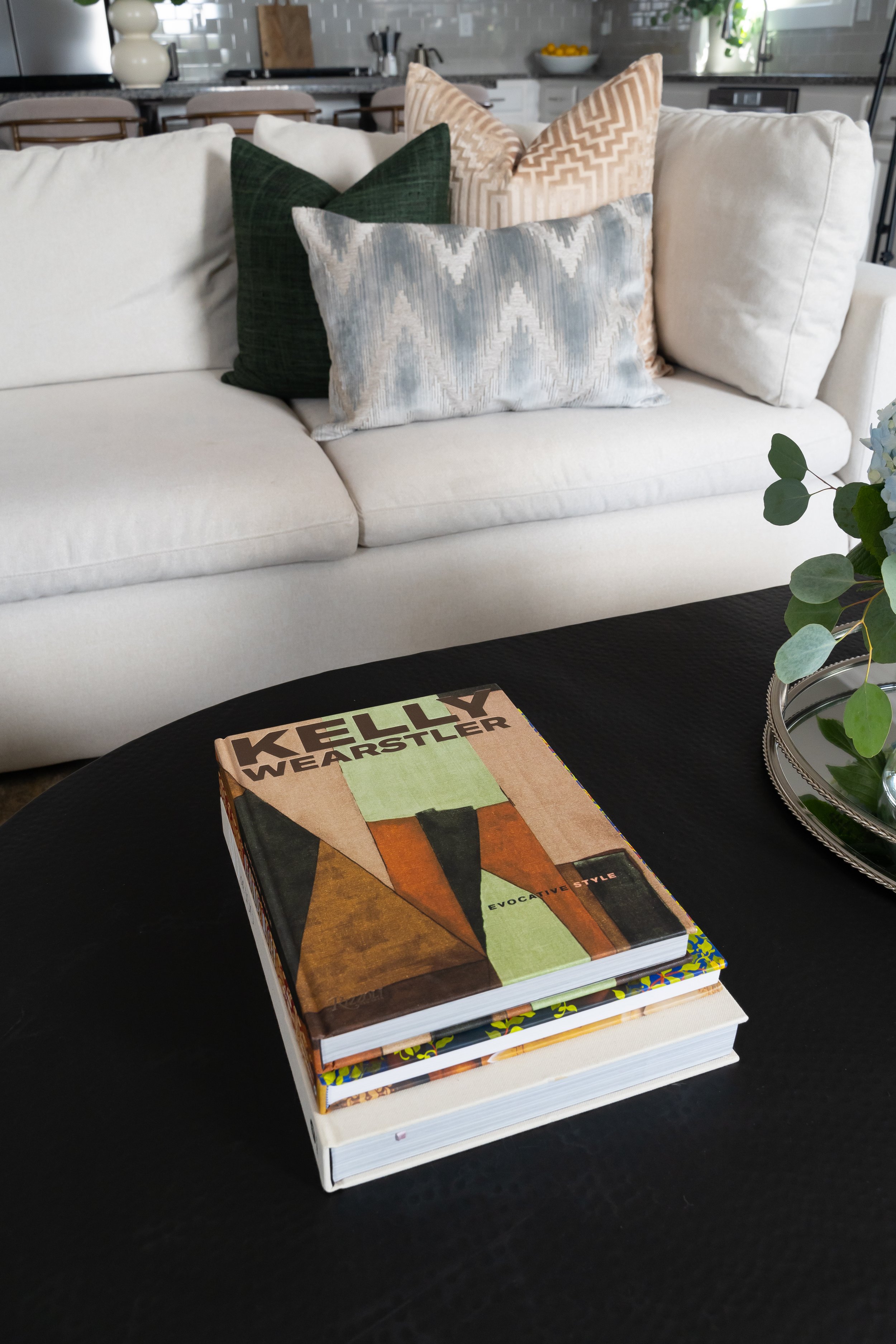
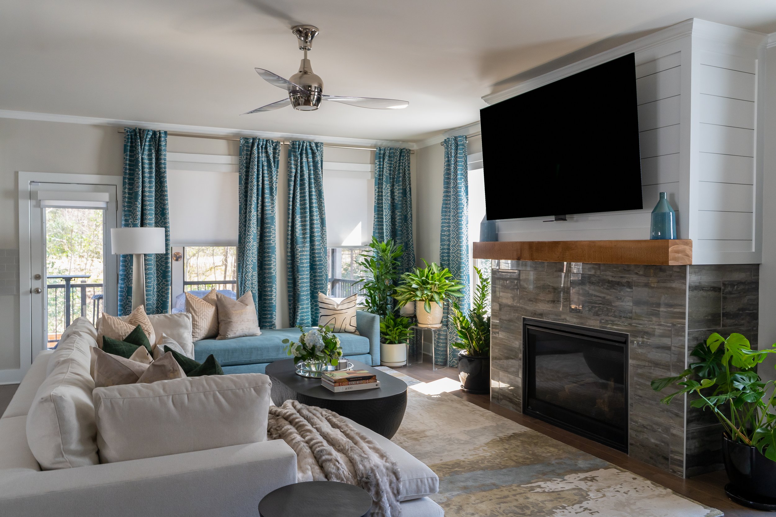
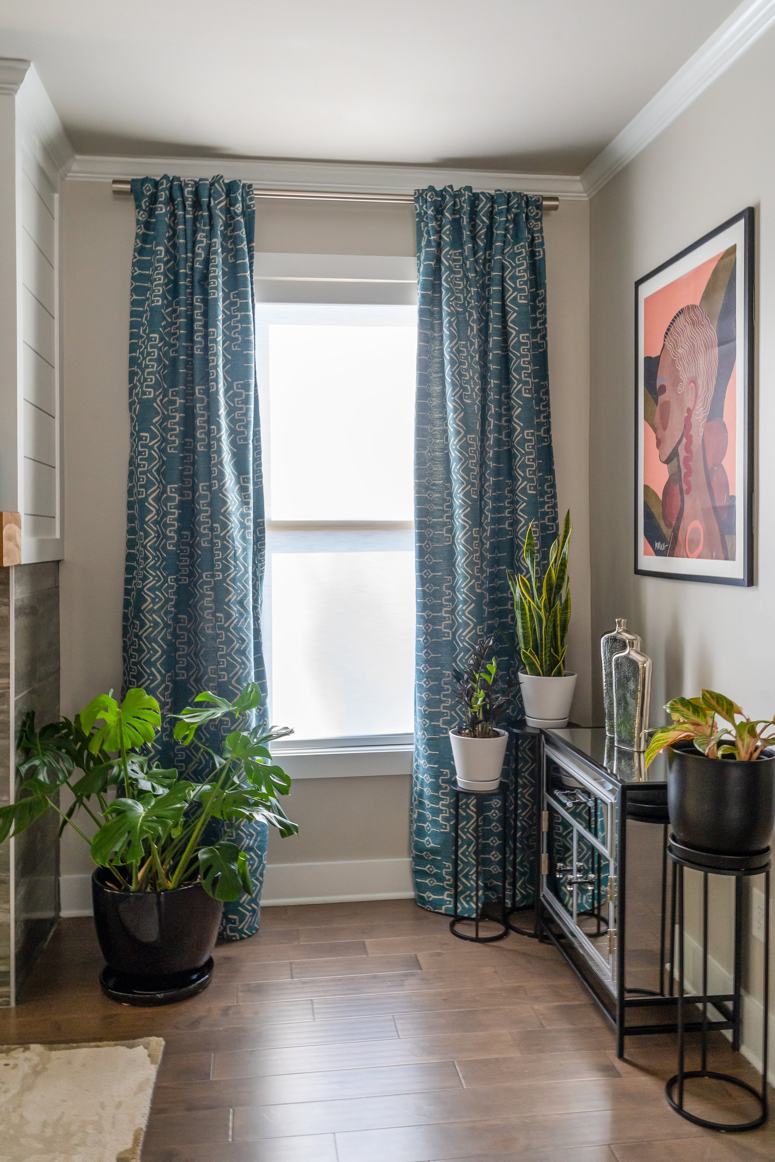
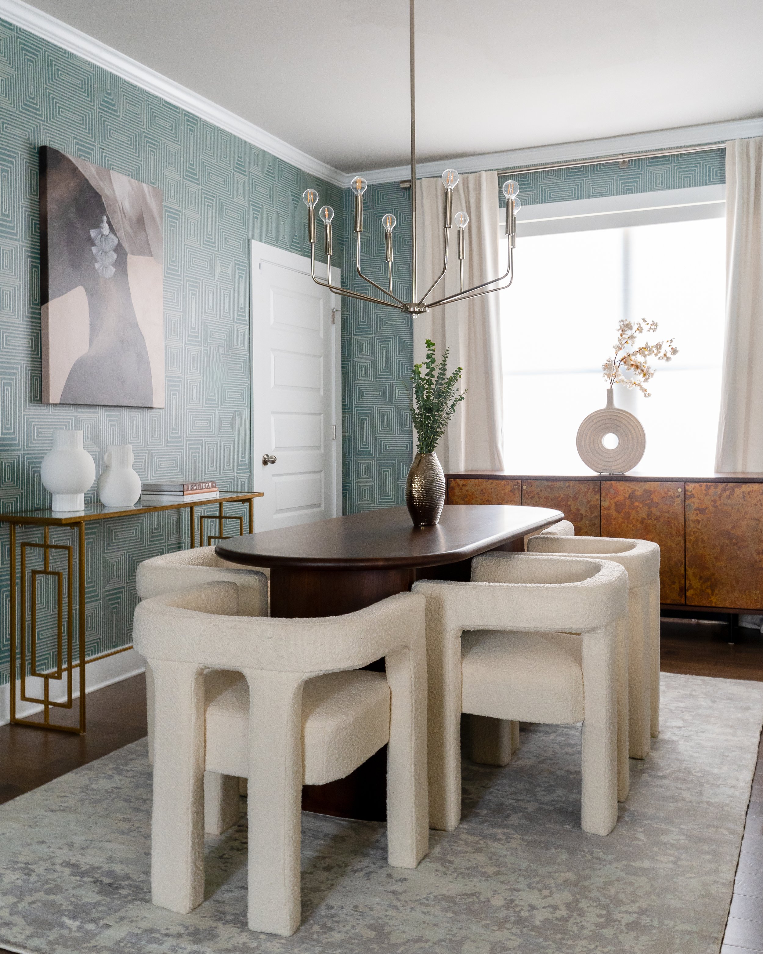
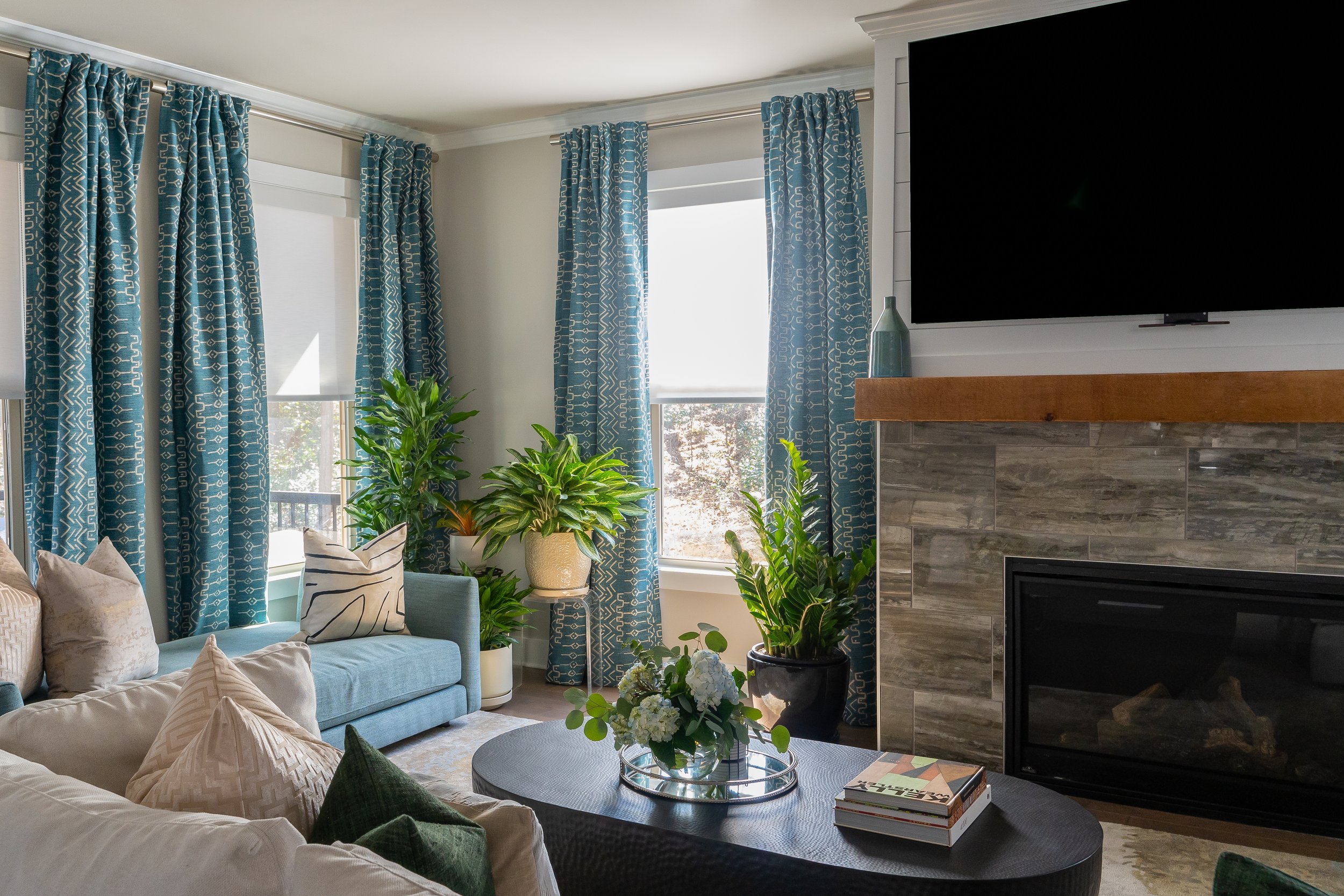
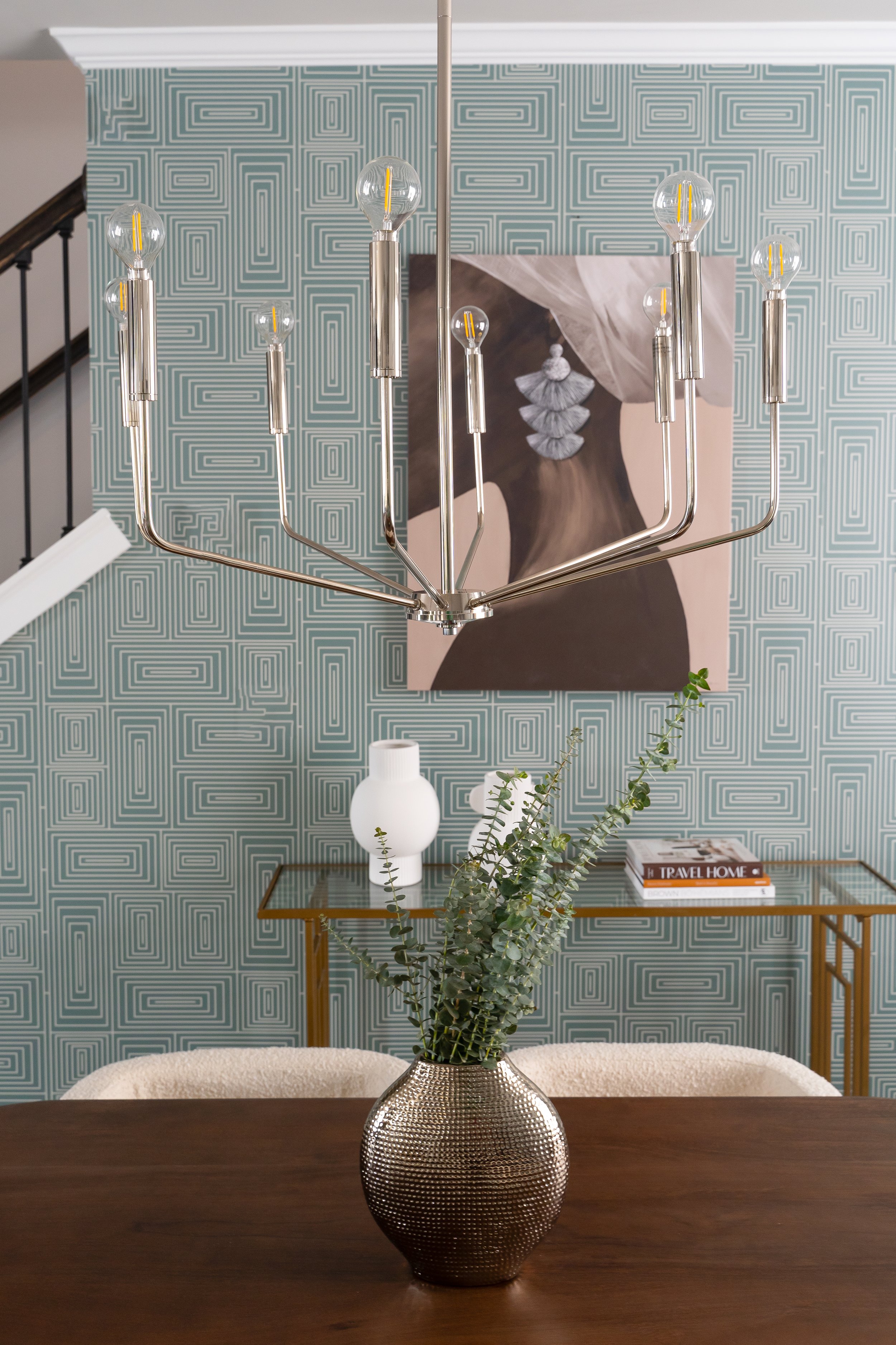
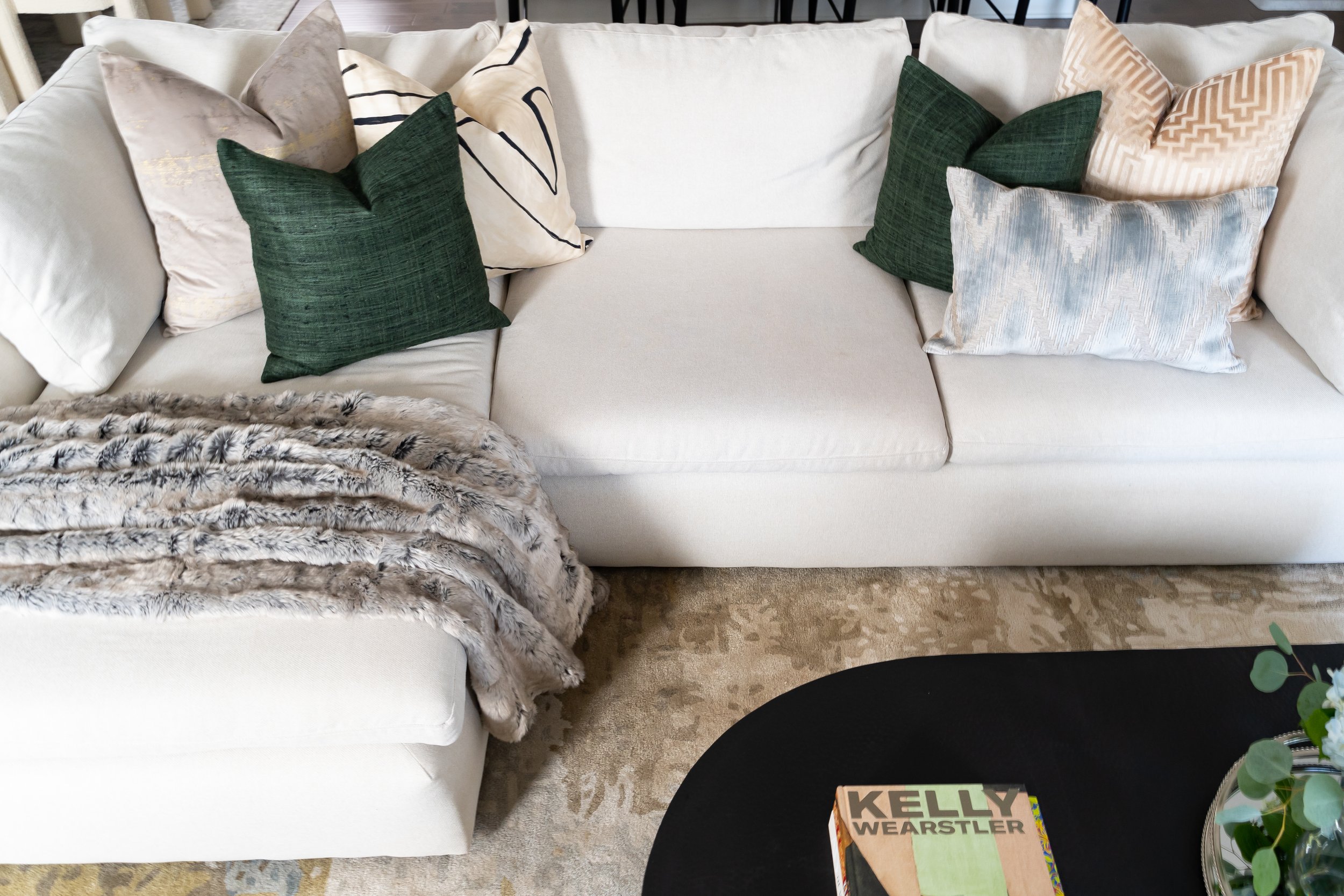
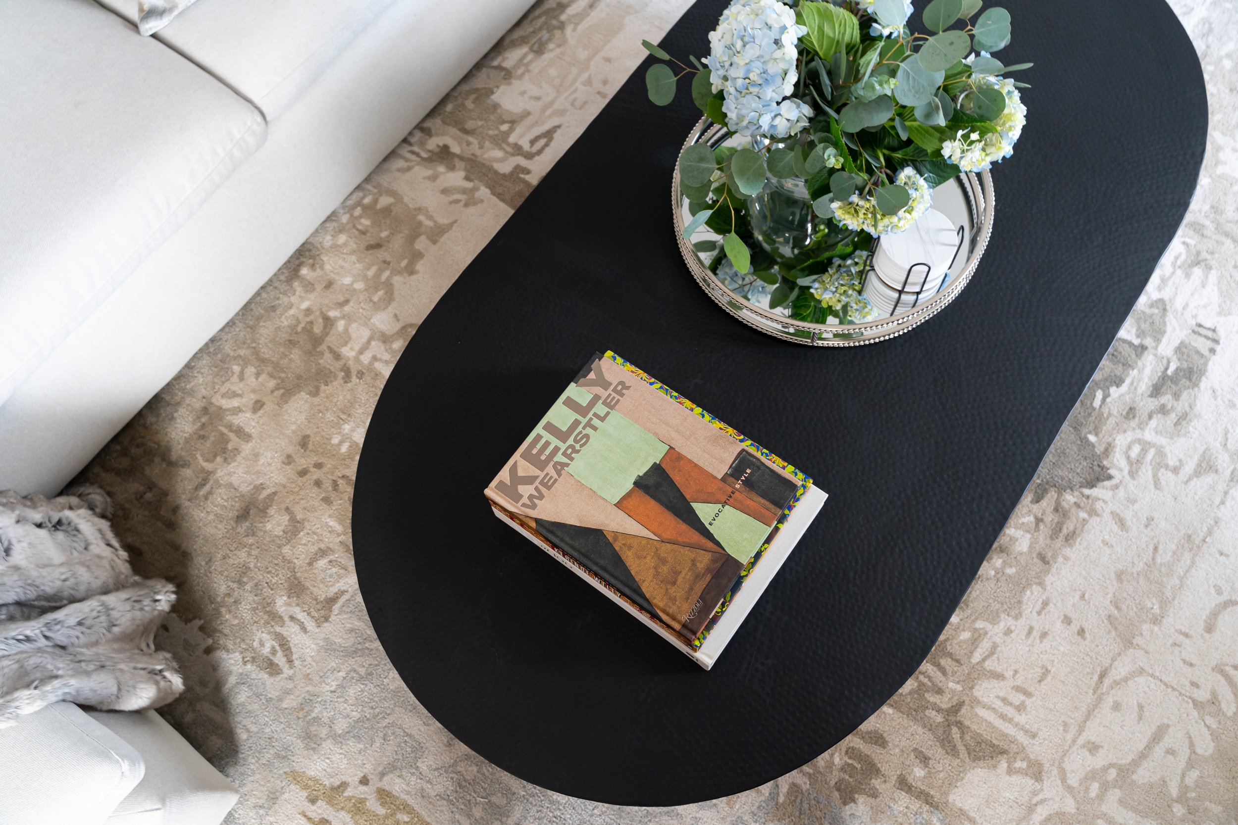
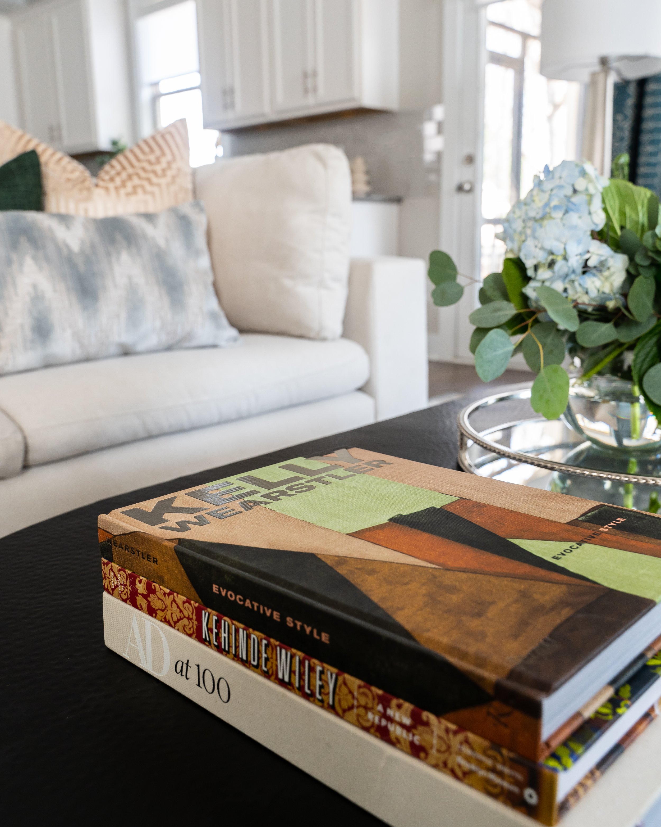
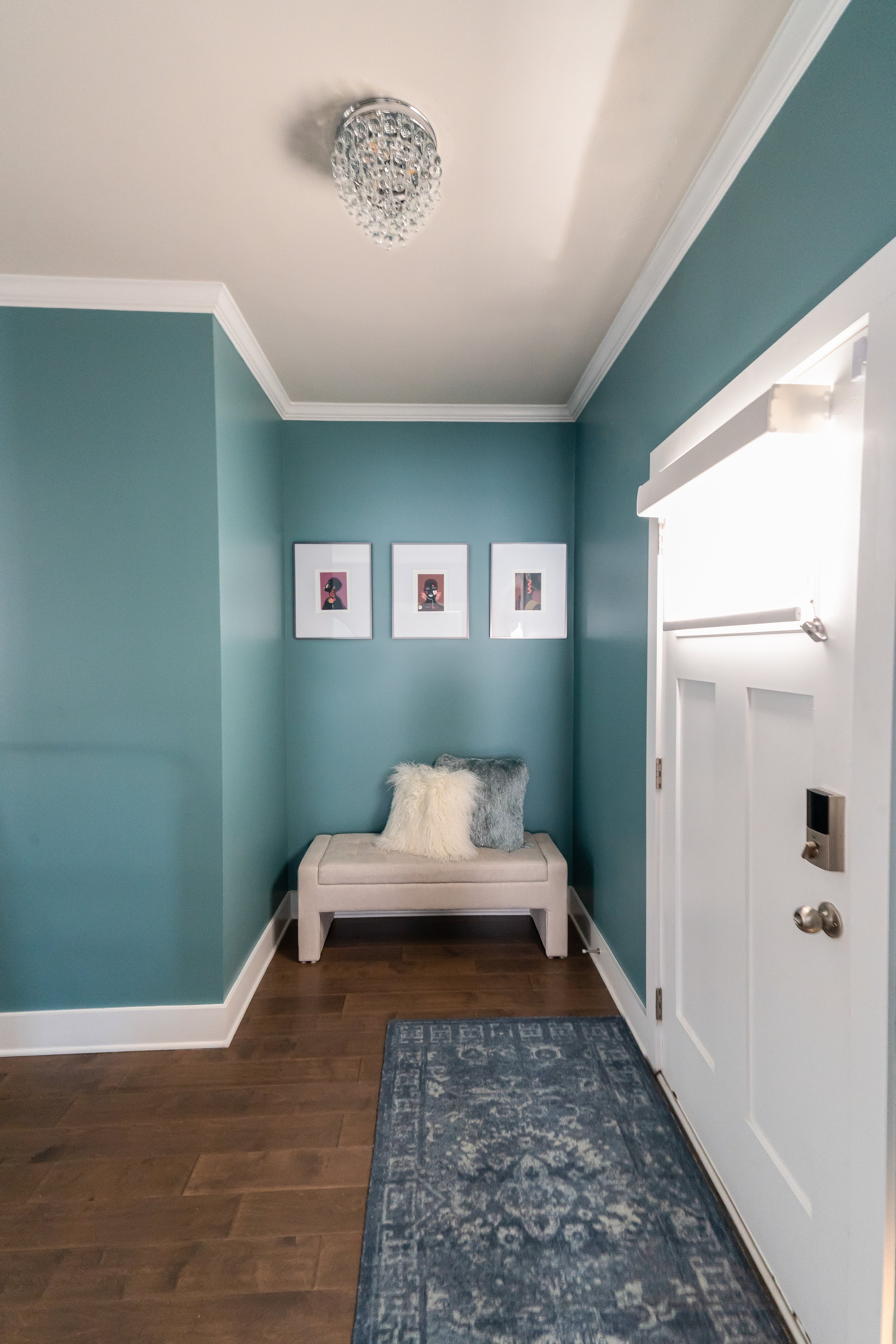
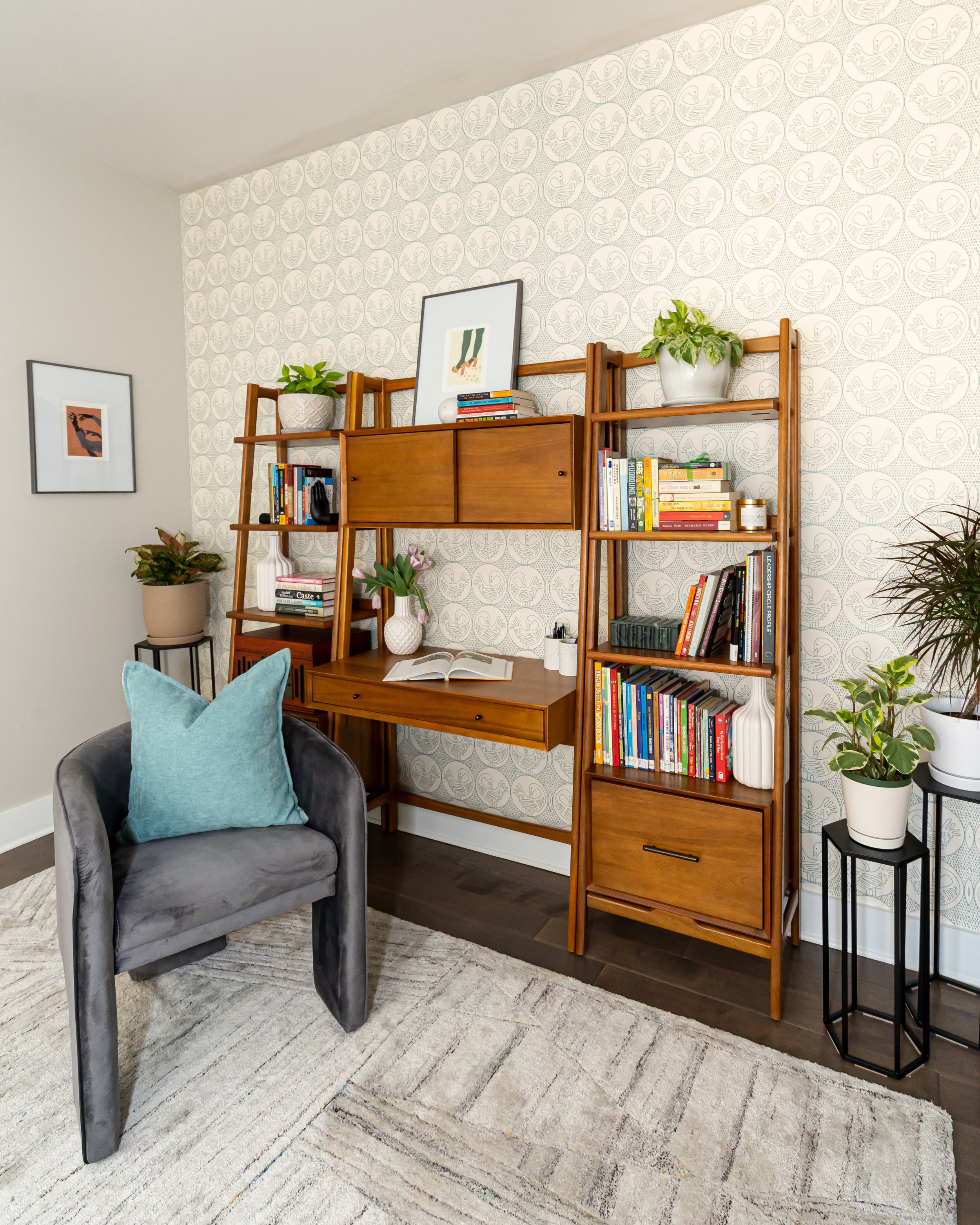
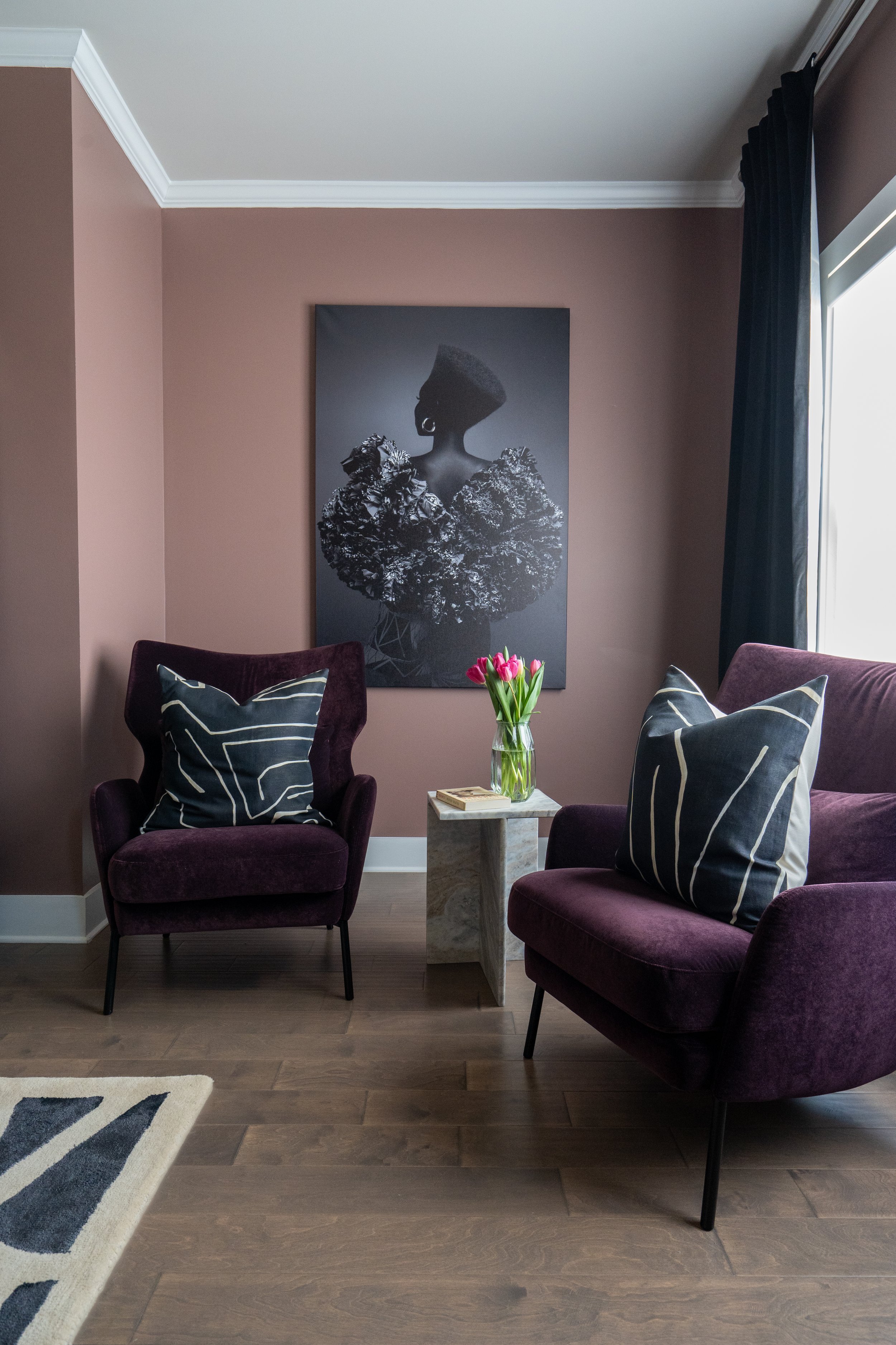
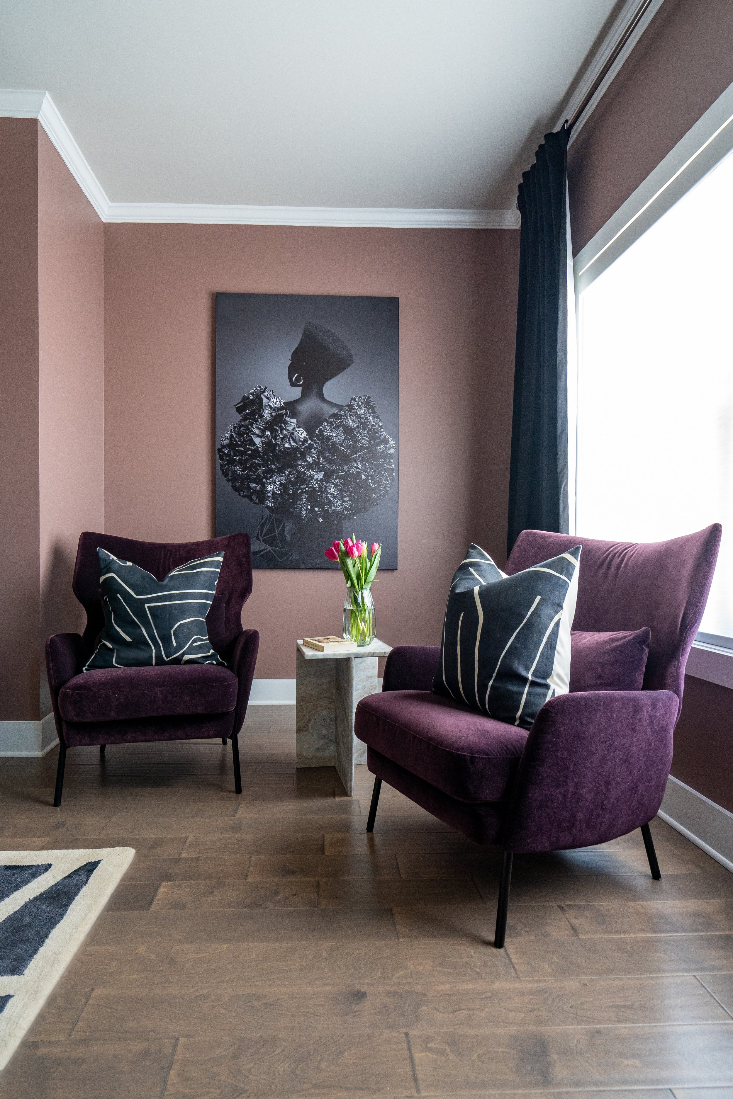
Once reviewed and approved, We began placing orders for the larger furniture pieces and painted the foyer, master bedroom, and wallpapered the dining and flex spaces. We painted the foyer Sherwin-Williams’ Peacock Plume, a nice blend of seafoam teal color that complemented the dining space’s wallpaper and living room’s patterned curtains perfectly. Although we started from scratch with all the furniture (sectional sofa, daybed rugs, dining table and chairs, buffet, etc.), I wanted to make it feel collected and layered, and not straight from the showroom floor. We also updated the foyer flush mount lighting, living space ceiling fan, and dining chandelier, as the fixture selections by the builder were not giving what they needed to give! The pattern mixing and intentionality of keeping things neutral but adding culture in a subtle way (fabric prints, artwork, etc.) made the space feel serene, “grown up” and welcoming to anyone who walked in. Oh, and plants! By adding real greenery to each corner of the main floor, we filled the living room with items that were actually living. We continued this cool blues and neutrals color palette upstairs into the flex space that we staged as a cozy reading nook and office for guests to use if needed.
DURING
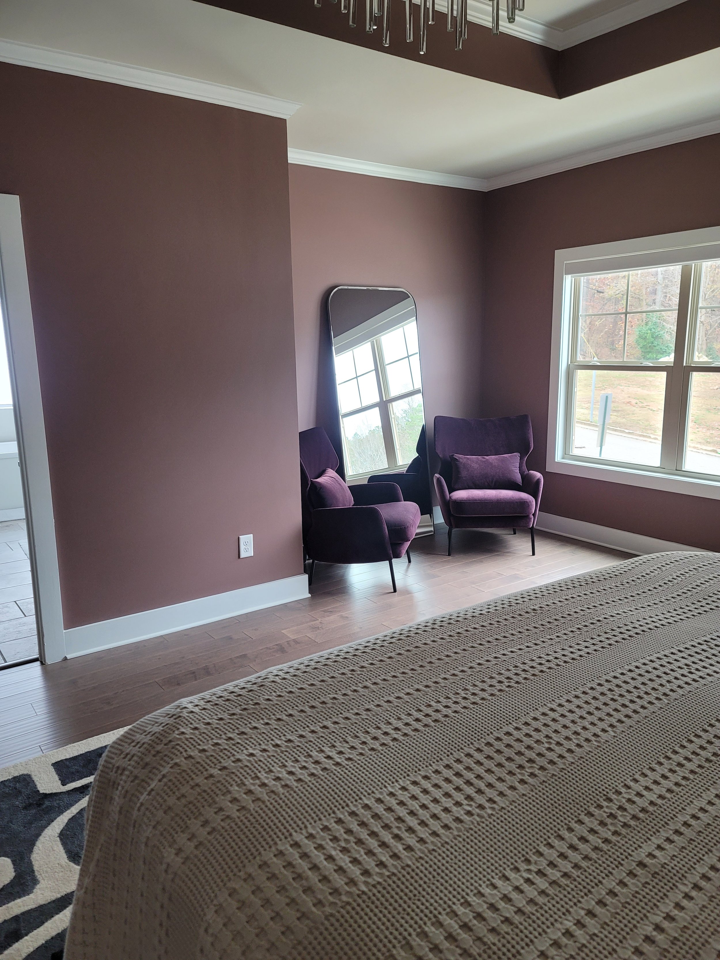
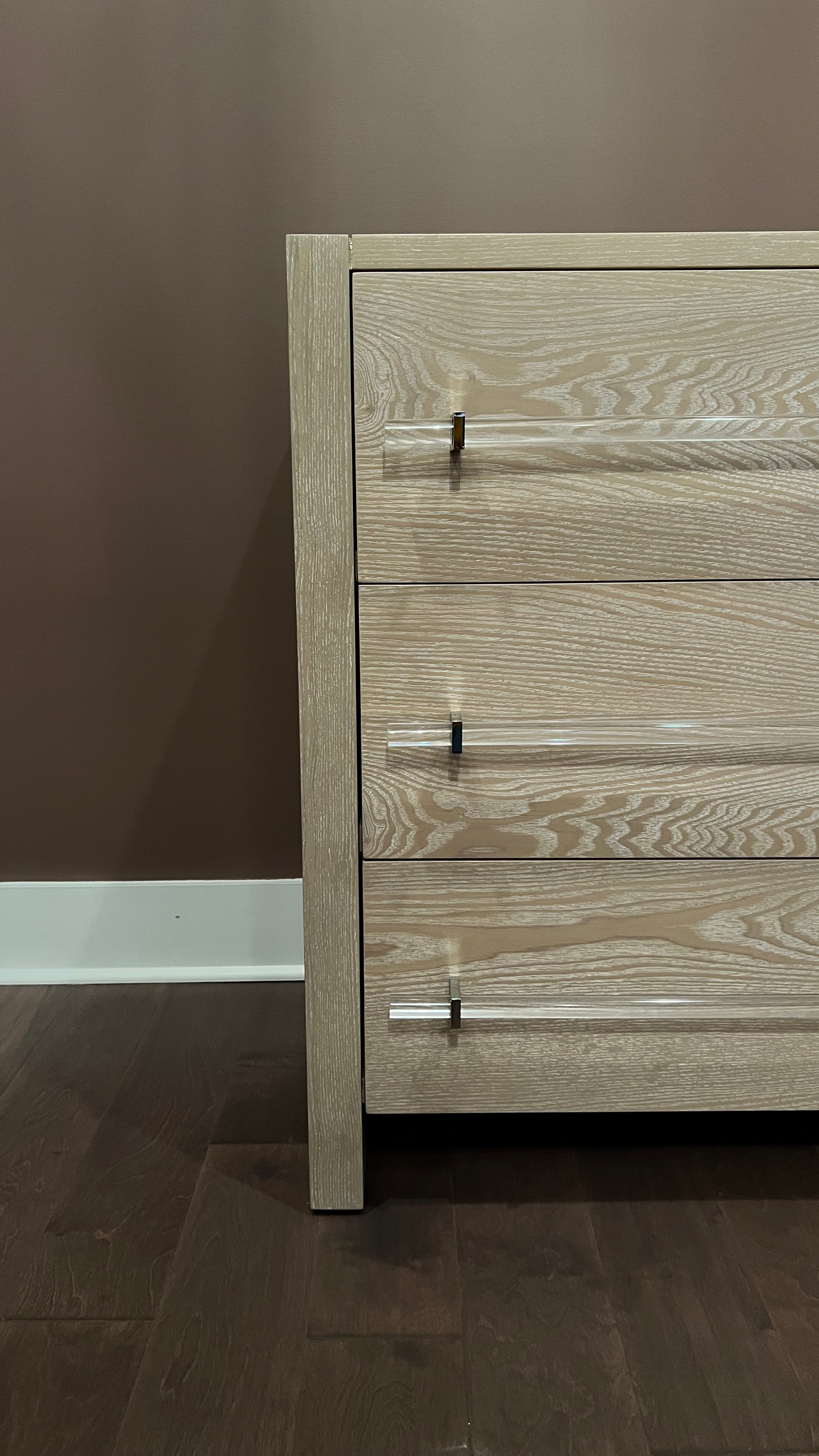
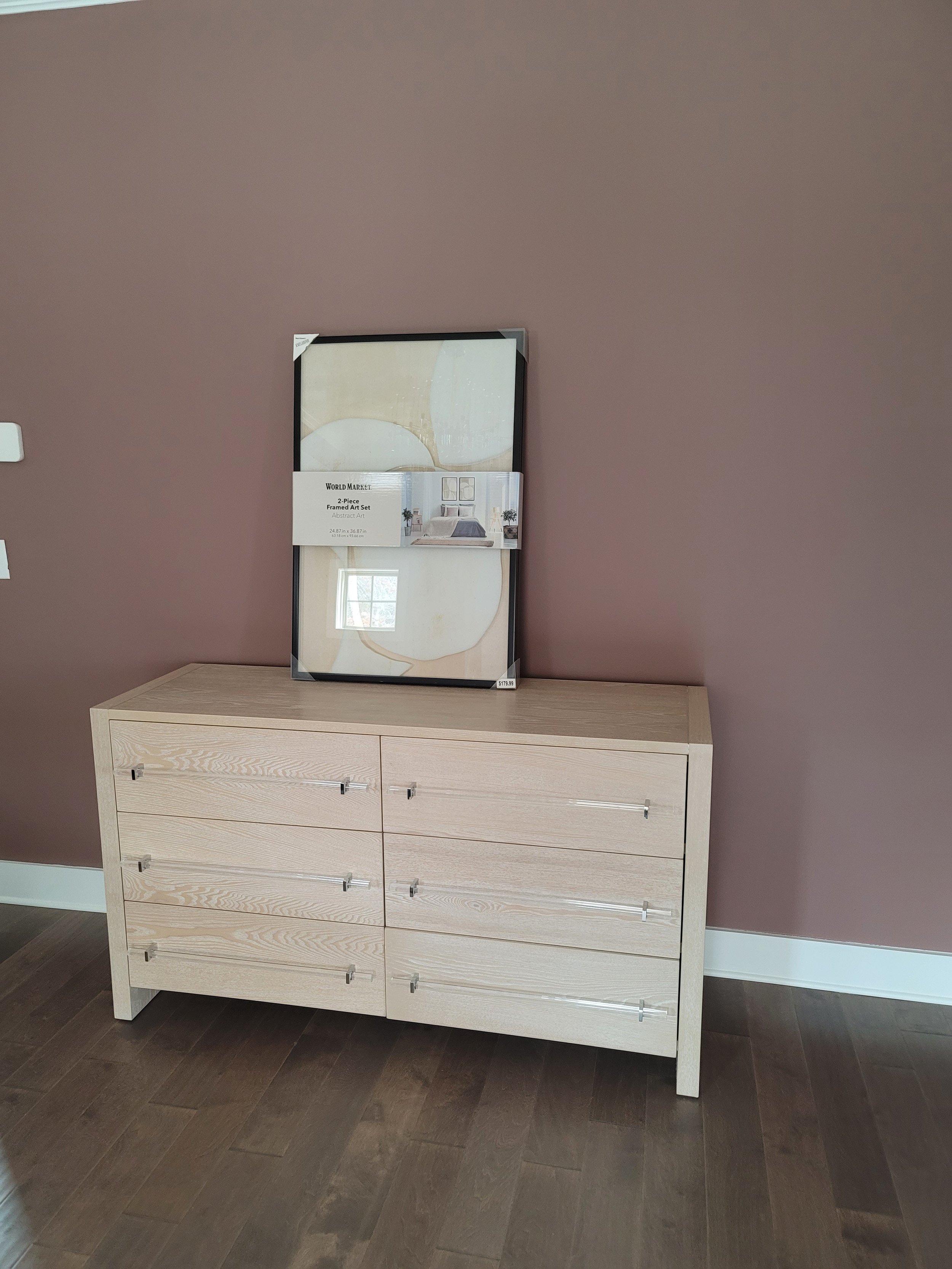
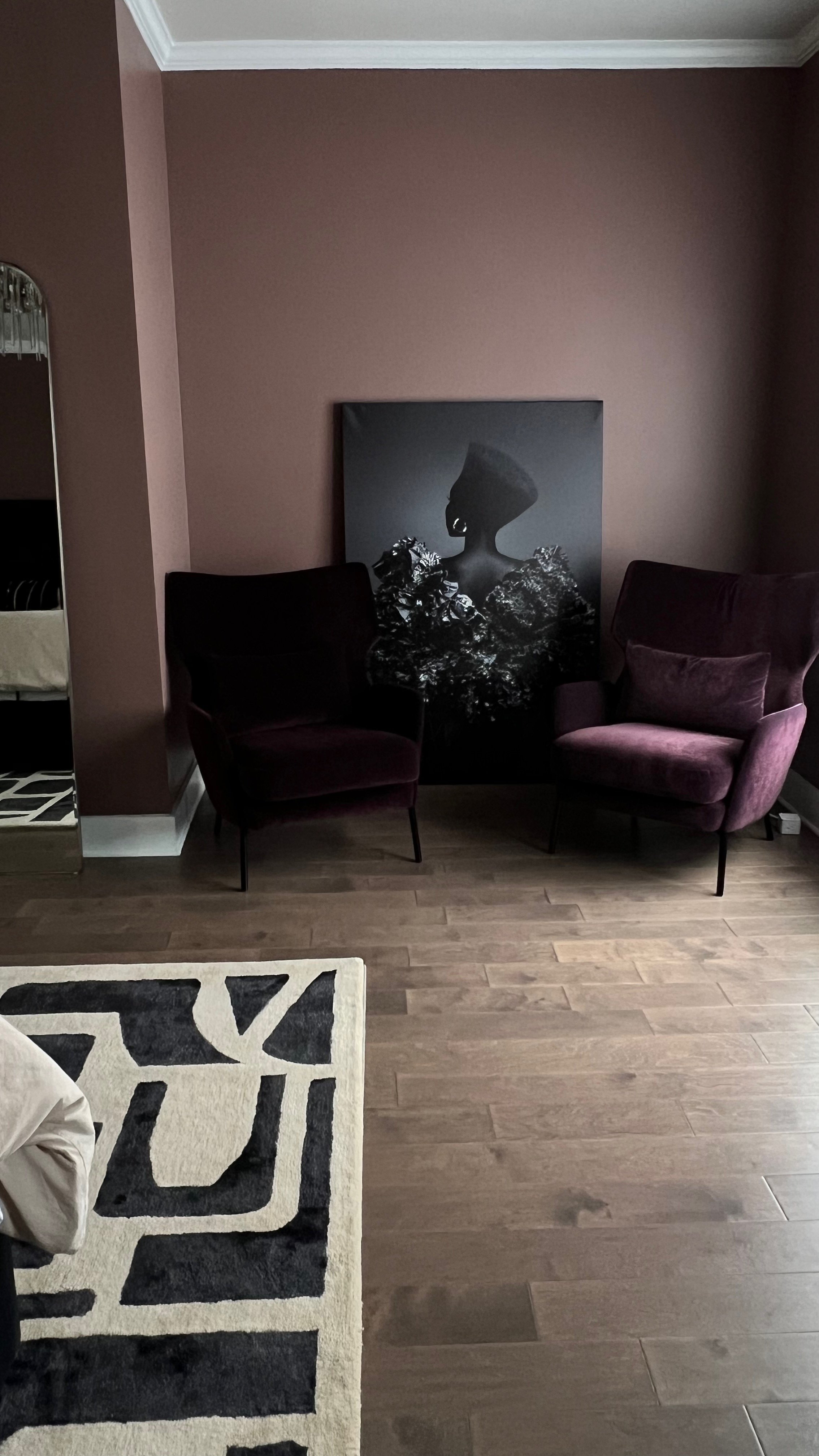
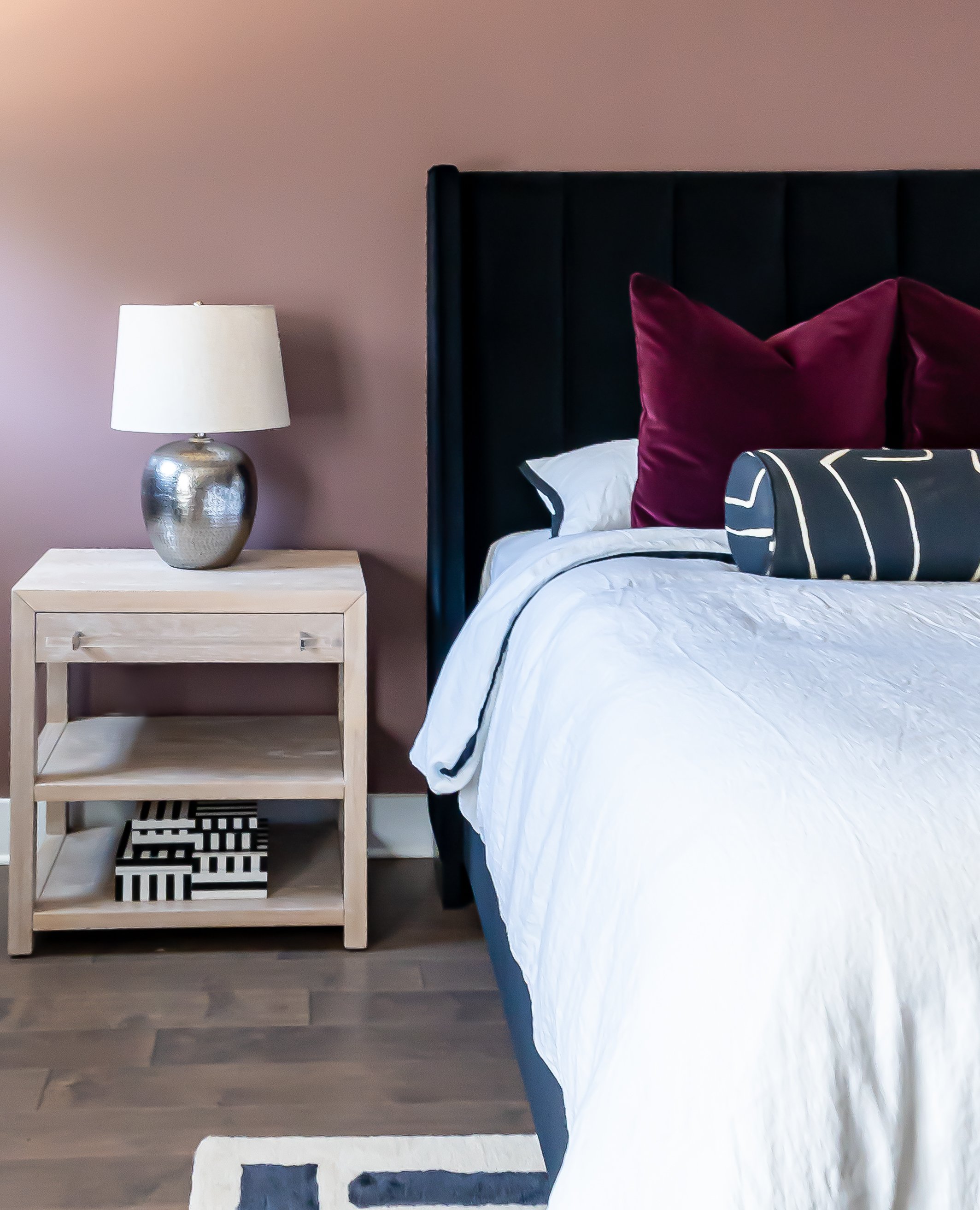
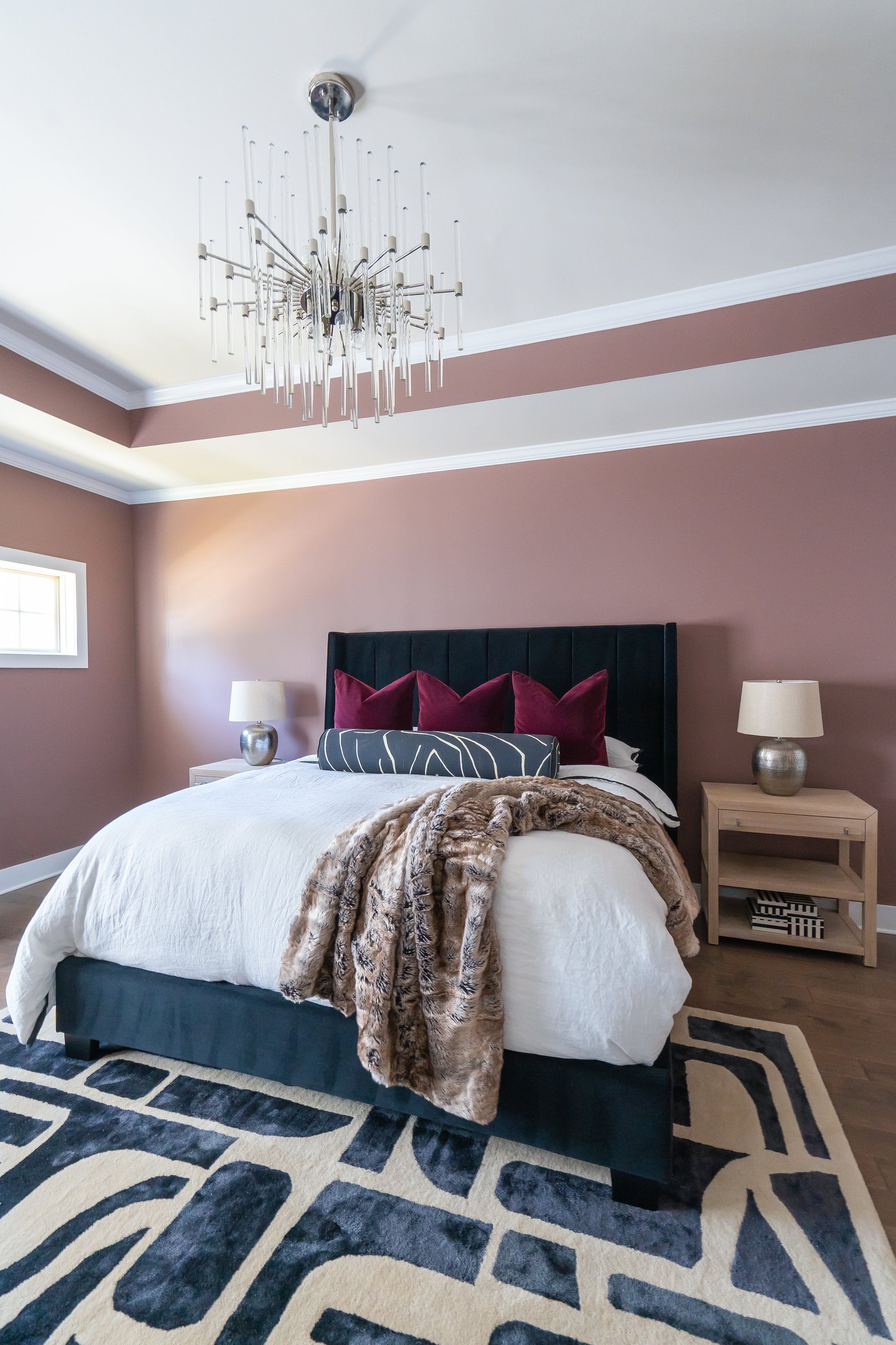
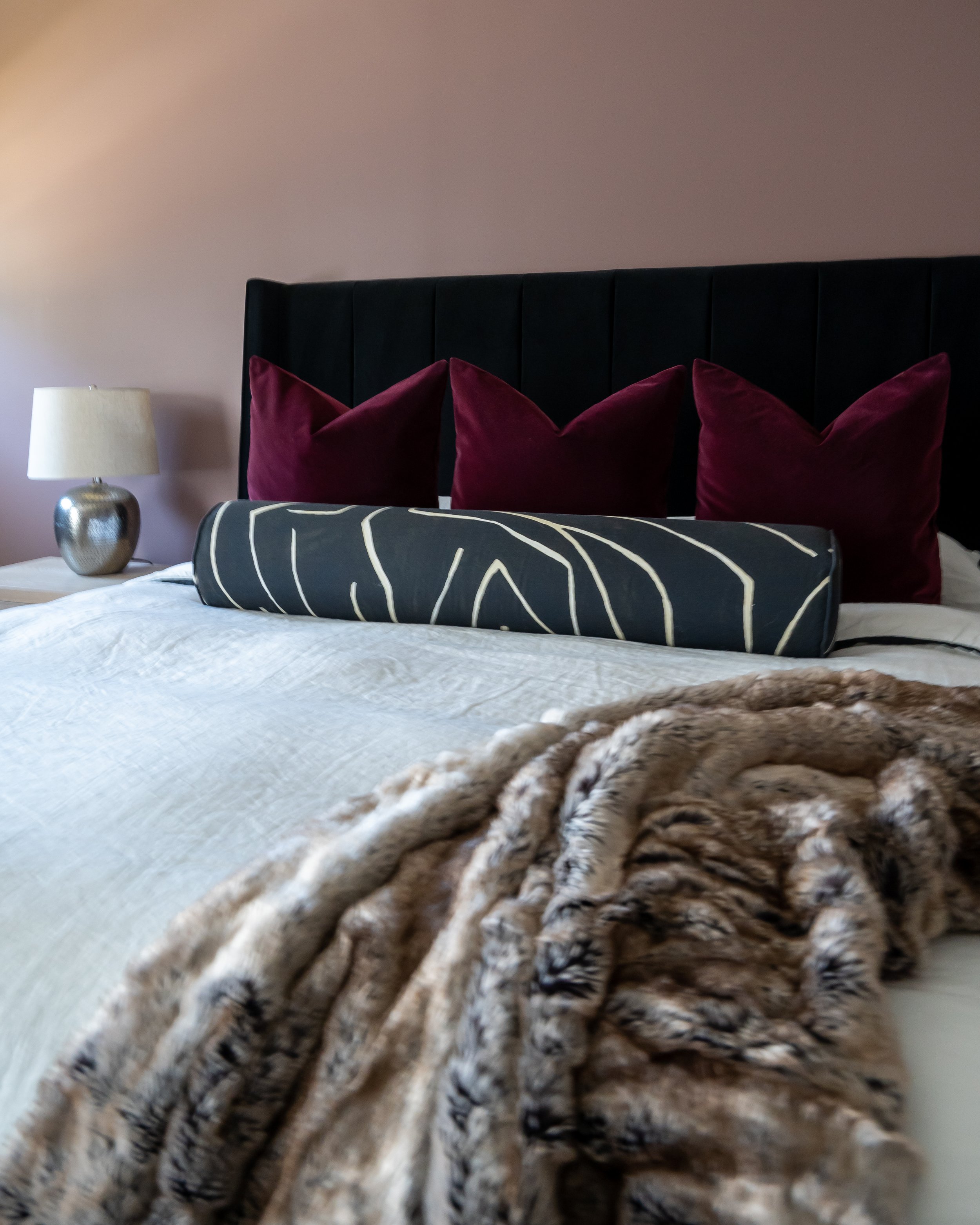
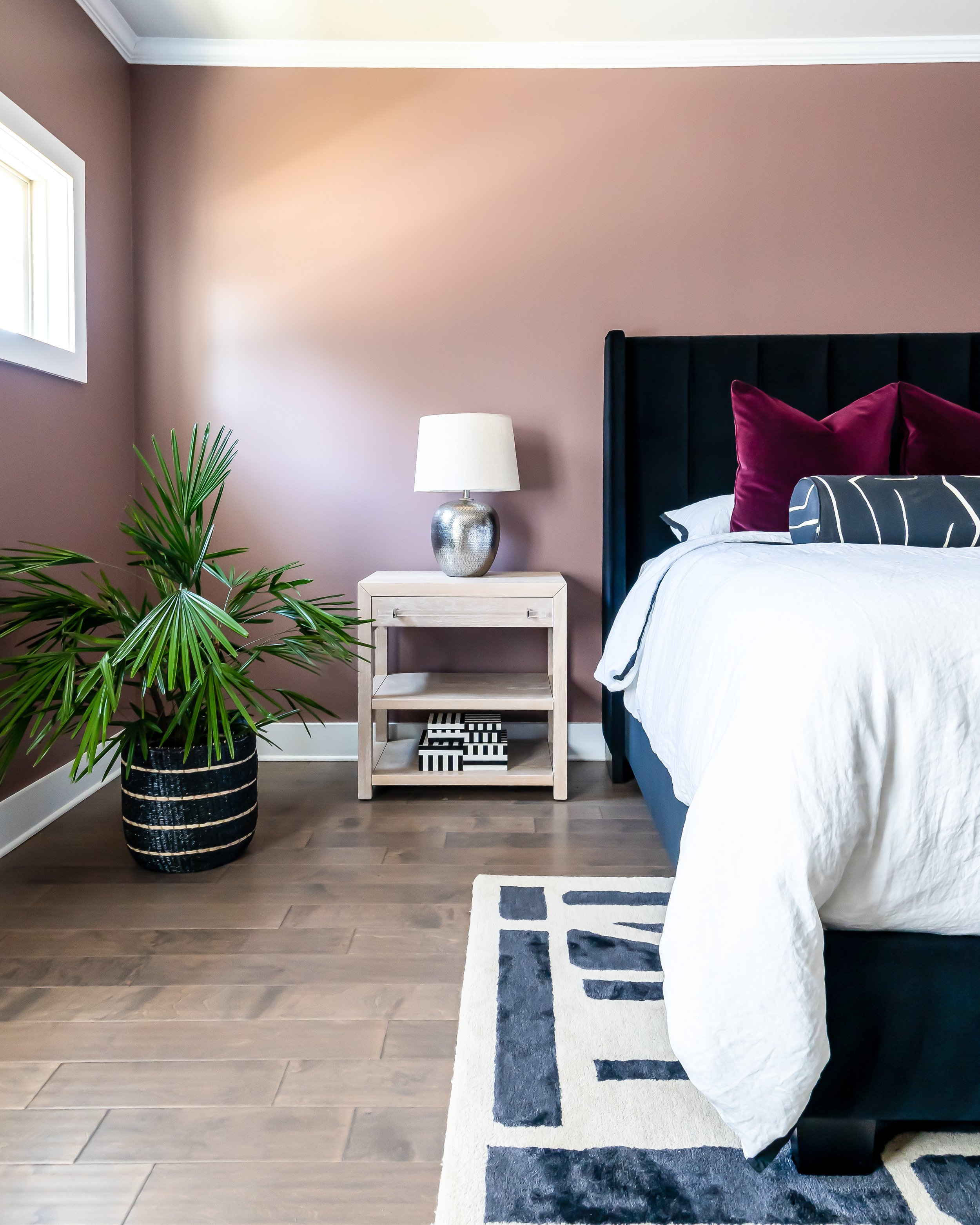
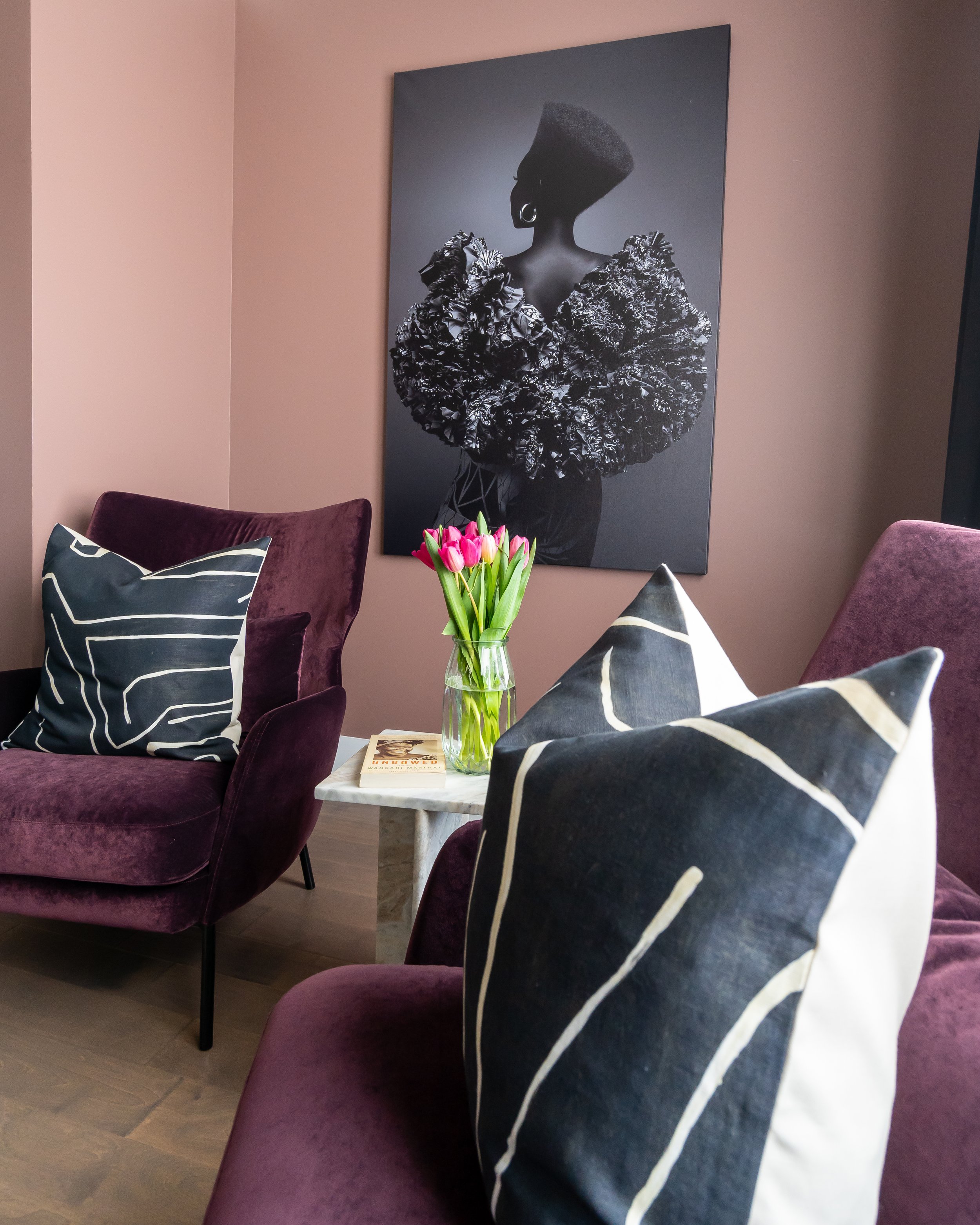
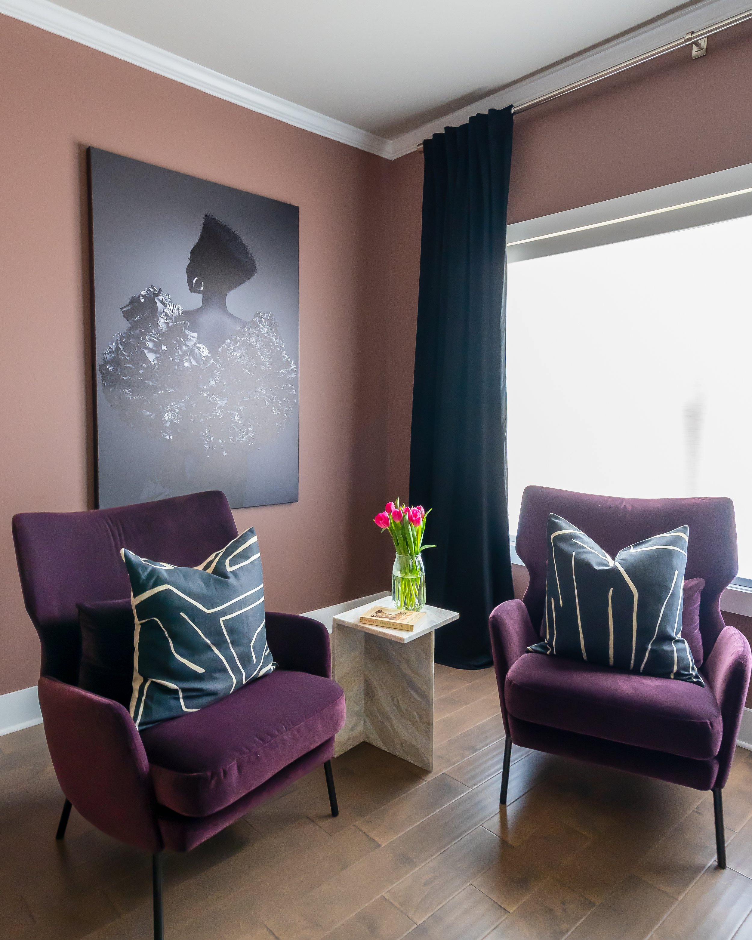
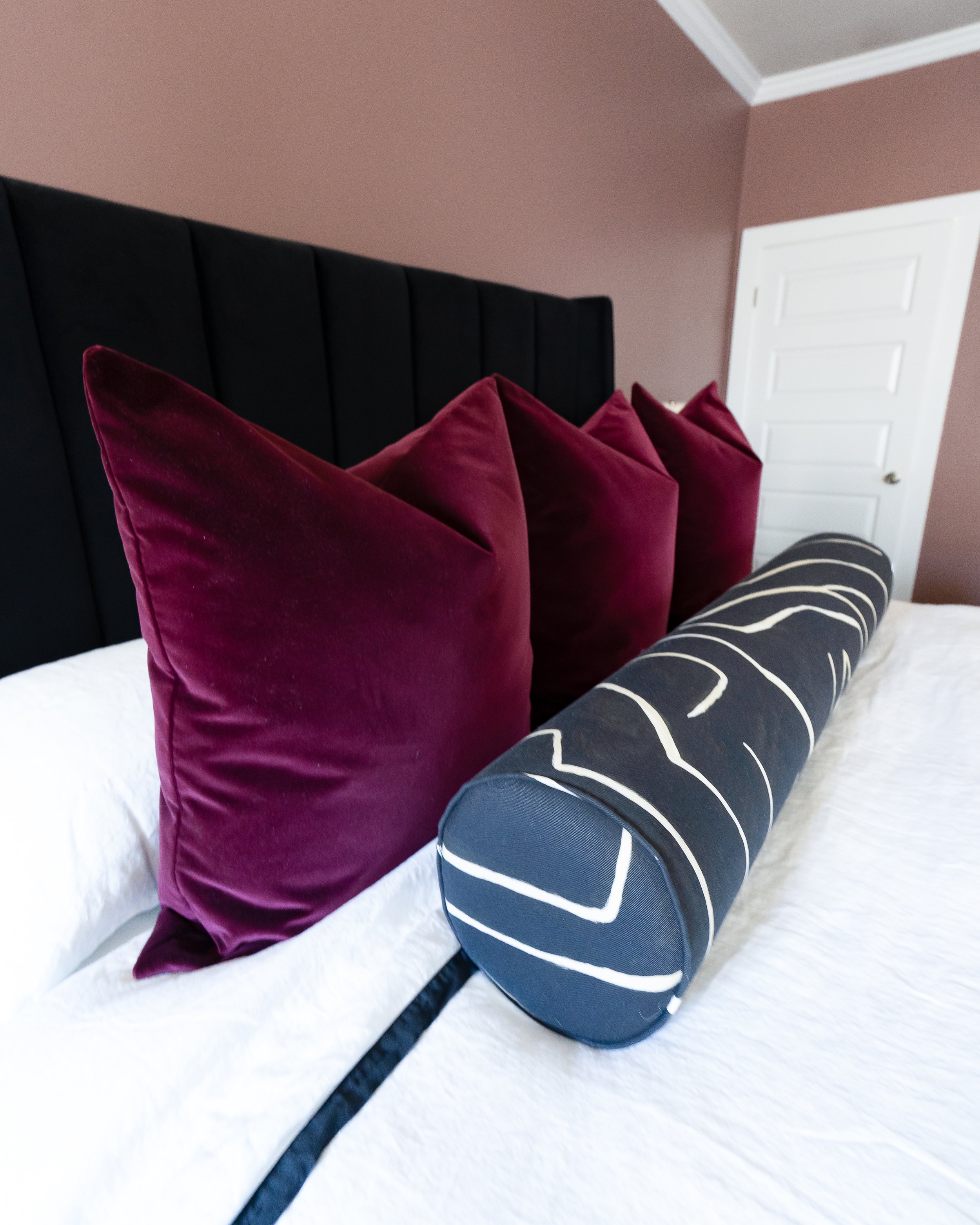
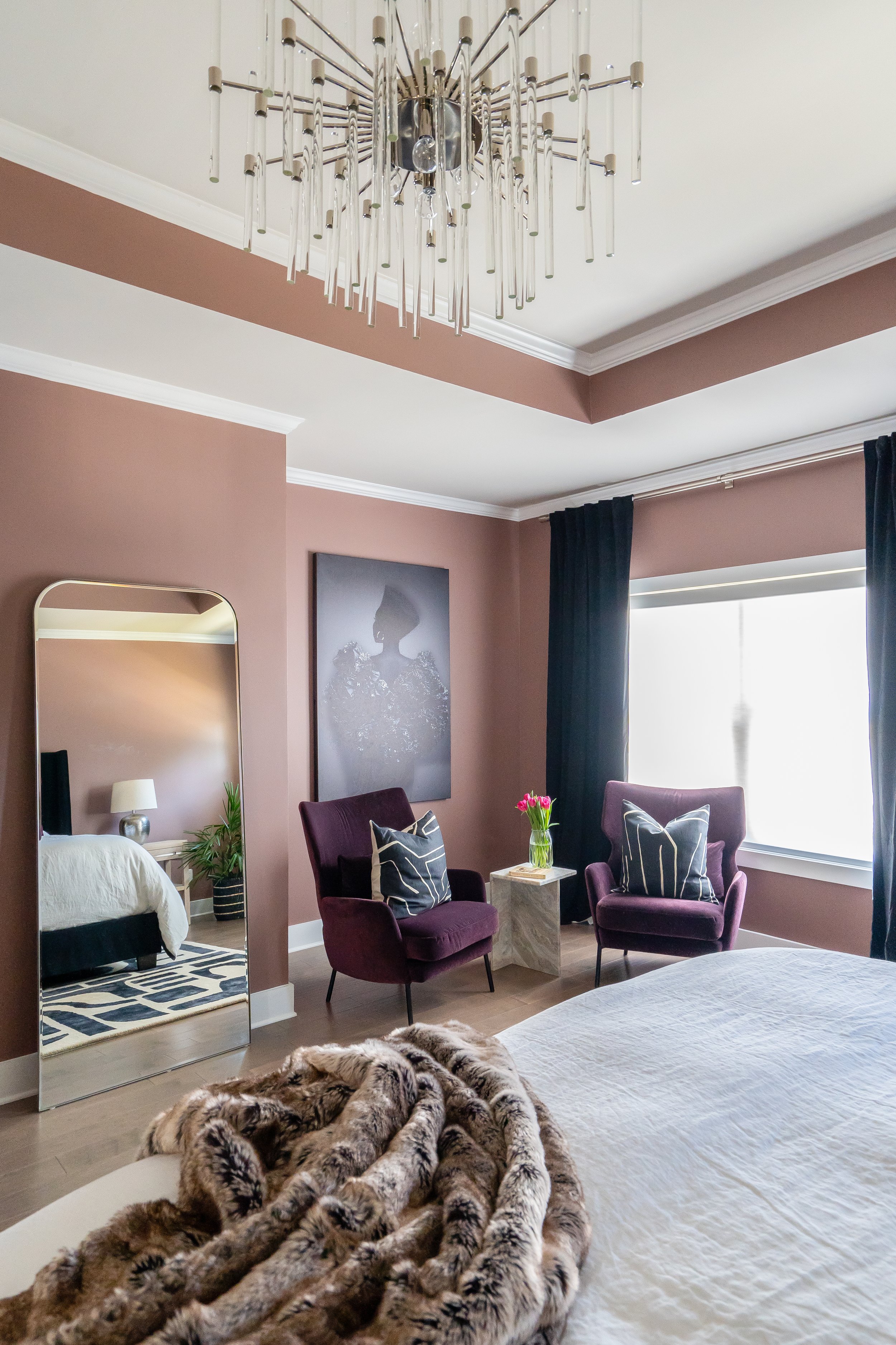
Although I love all the color palettes we chose, the colors used in the master bedroom were my favorite. Because Crystel loves black and white, I wanted to start with that as the foundation, while adding pops of mauve and aubergine to the space. I’m obsessed with the Sherwin-Williams’ Dutch Cocoa walls and colors added that contrasted so well with the white cerused oak furniture and acrylic and chrome accents throughout. It turned out to be such a vibe!
We experienced several delays with furniture and other hiccups throughout this design process, but I’m so grateful to Crystel for her patience throughout the journey as we transformed her empty new house into a colorful space with style and grace that she could proudly call home. Take a look!
AFTER
Thank you, Crystel for trusting me with your beautiful new home! I wish you the very best in this next chapter of your life here in Atlanta and I hope this home continues to be a blessing to you for years to come.
For more photos of #ProjectStyleandGrace, check out my Portfolio and before, during, and after posts on Instagram.
Be Blessed,
ACG
Design Deets:
Wall Paint – Peacock Plume and Dutch Cocoa by Sherwin Williams
Lighting – Mitzi, Horchow, Lumens, Shades of Light
Ceiling Fan – Horchow
Wallpaper – Nia and Sankofa by Forbes Masters for Mitchell Black
Counter Stools – Arhaus
Sectional Sofa – Pottery Barn
Daybed – West Elm
Rugs – Overstock, Pottery Barn, Michel Smith Boyd for Z Gallerie, Overstock, West Elm
Coffee Table – Crate & Barrel
End Table – Crate & Barrel
Floor Lamp – Crate & Barrel
Accent Cabinet – Wayfair
Throws - West Elm
Dining Table – Lulu and Georgia
Dining Chairs – CB2
Sideboard – Joss & Main
Curtains – Etsy, West Elm, Overstock
Curtain Rods – West Elm
Throw Pillows – Modish Décor Pillows, Little Design Co., Z Gallerie, CB2, Crate & Barrel, Home Goods
Artwork – Michel Smith Boyd for Z Gallerie, Society 6, Dawn Wolfe via One Kings Lane, Society 6, Wayfair
Bench – Joss & Main
Mirrors – Crate & Barrel
Bed – Living Spaces
Nightstands – Worlds Away via France & Son
Dresser – Worlds Away via France & Son
Lamps – Wayfair
Accent Chairs - Crate & Barrel, Wayfair
Bedding – CB2
Desk and Shelving – West Elm
Picture Frames – West Elm
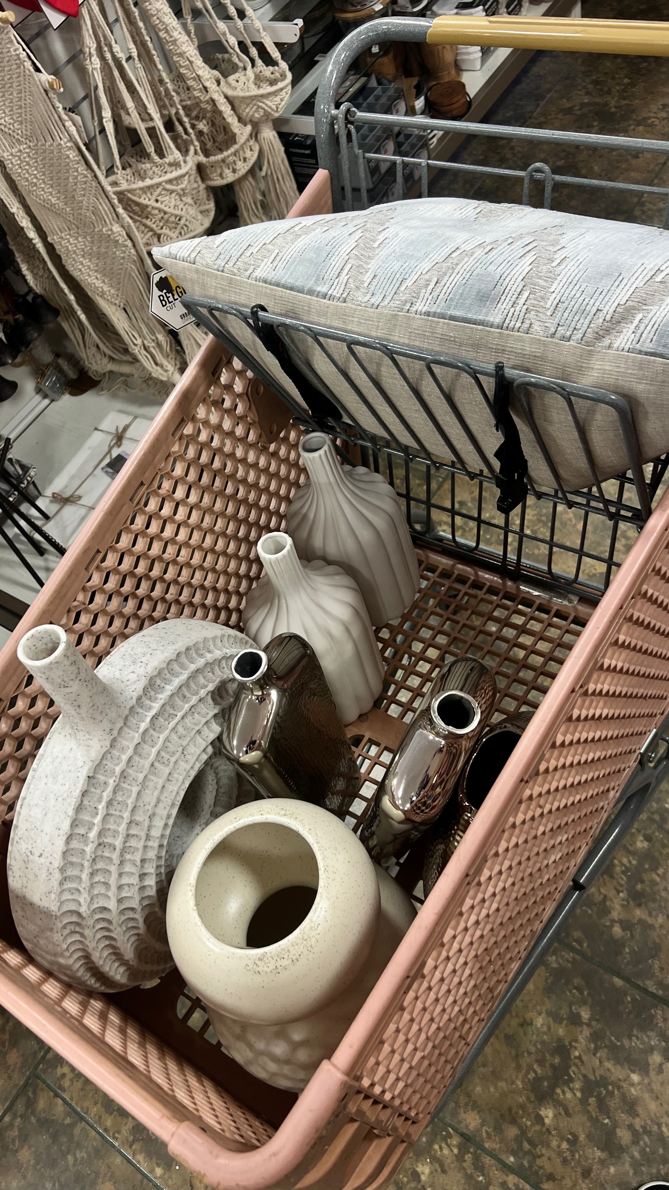
Accent Decor and Accessories – Home Goods
Professional Photography – Brittany Bah Photography
