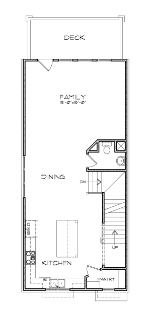
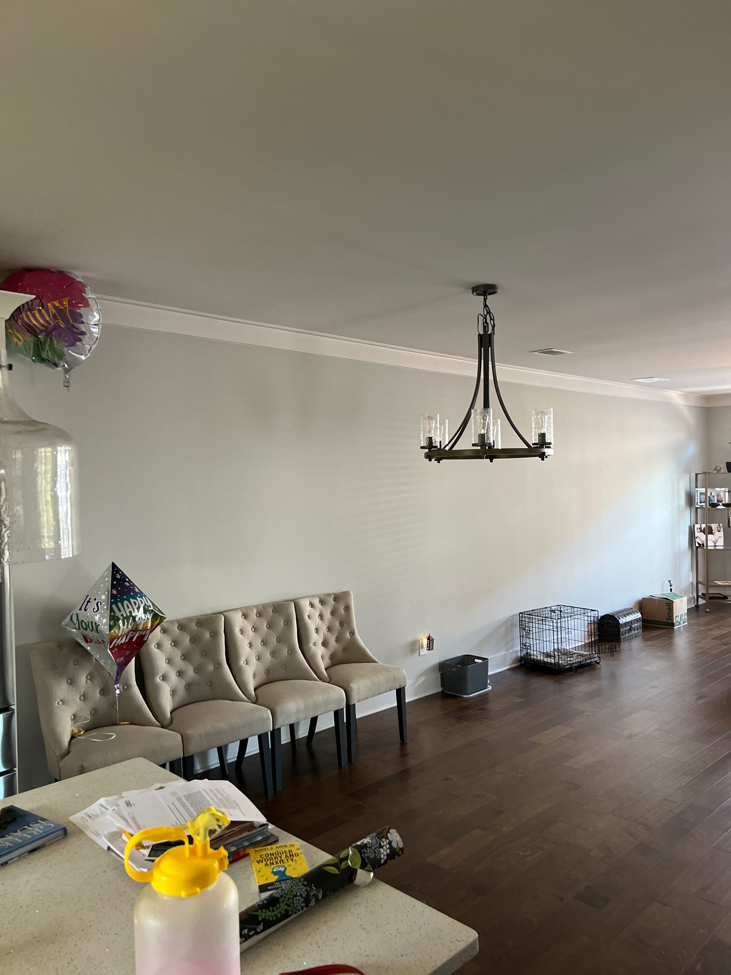
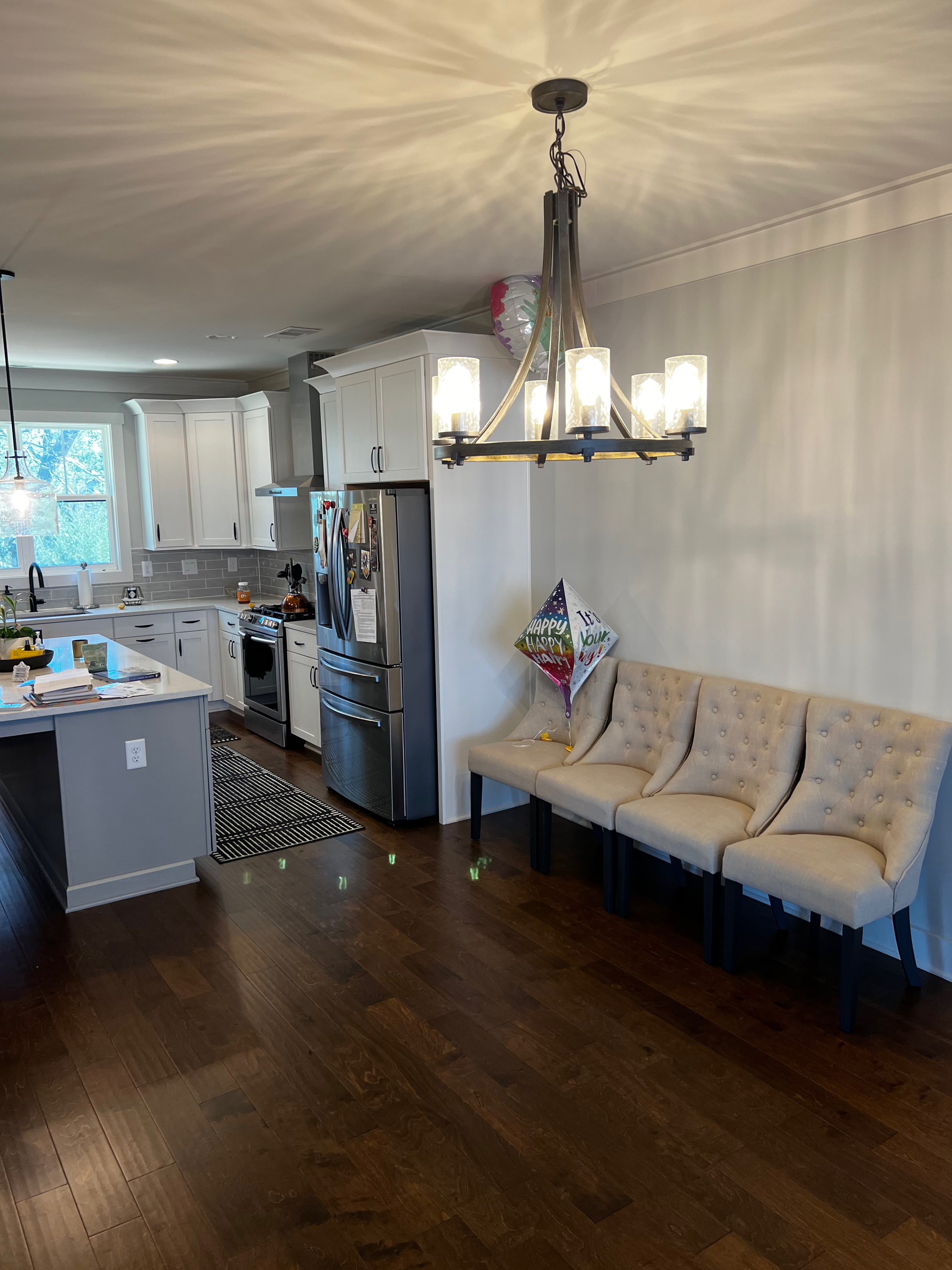
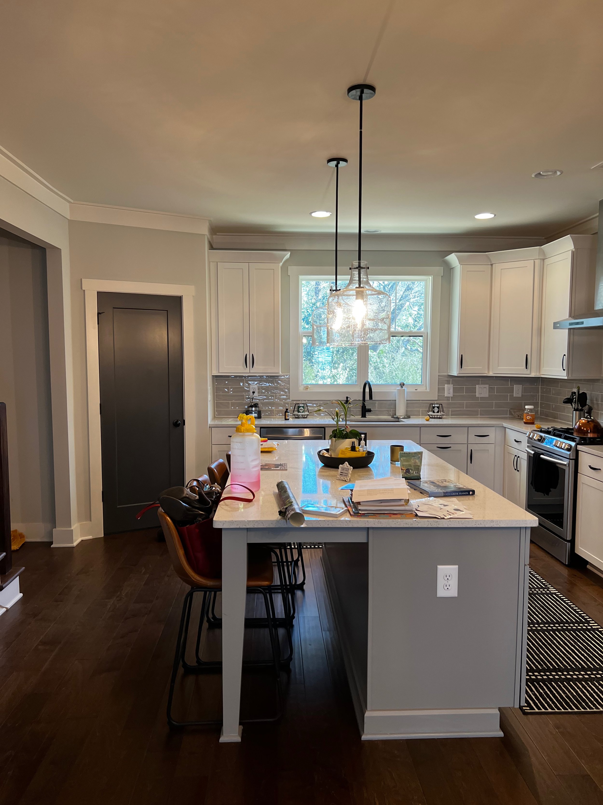
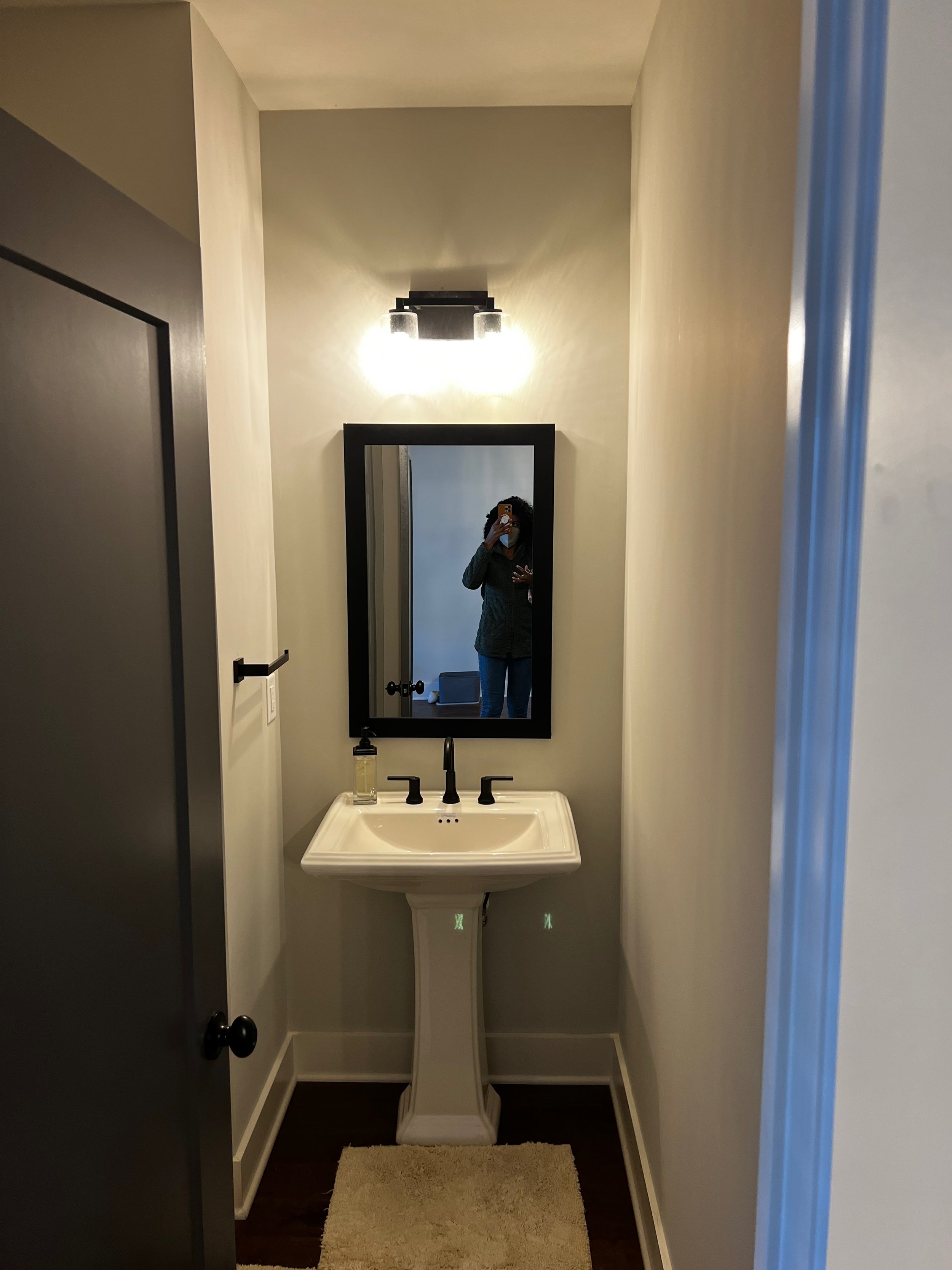
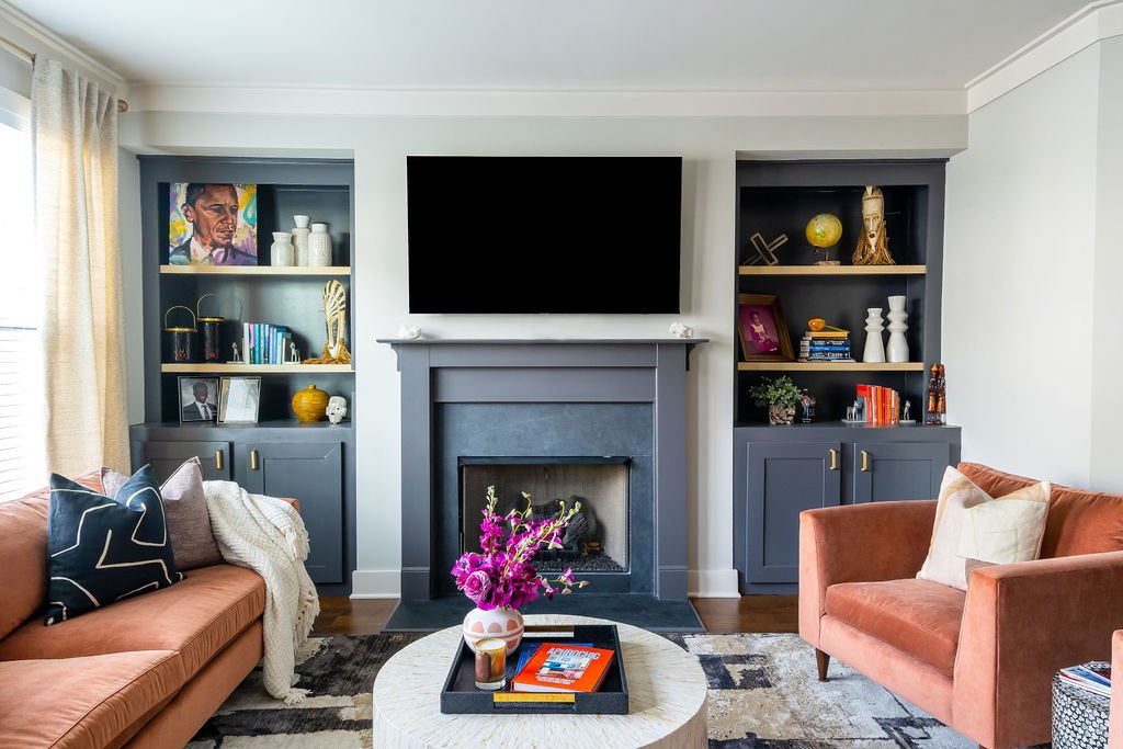
New construction can be daunting, especially those with long, open floor plans. So my client sought out BLB’s help to make her new home one she could be proud of!
Charlene is a successful dentist and dental practice owner, world traveler, and now, new homeowner. When we met last summer, she invited me into her home to see if I could assist with making her fall in love with it and create a space that reflected who she was. It was a new construction townhome with great bones and was truly a blank canvas. She’d already purchased a new furniture for her living room, but felt overwhelmed and wanted my help filling in the blanks. Although the townhouse was brand new, the design and builder-grade fixtures felt stale and impersonal. Charlene wanted BLB to give it some personality, femininity, warmth, and make it inviting for entertainment with friends and family.
Here’s where things started…
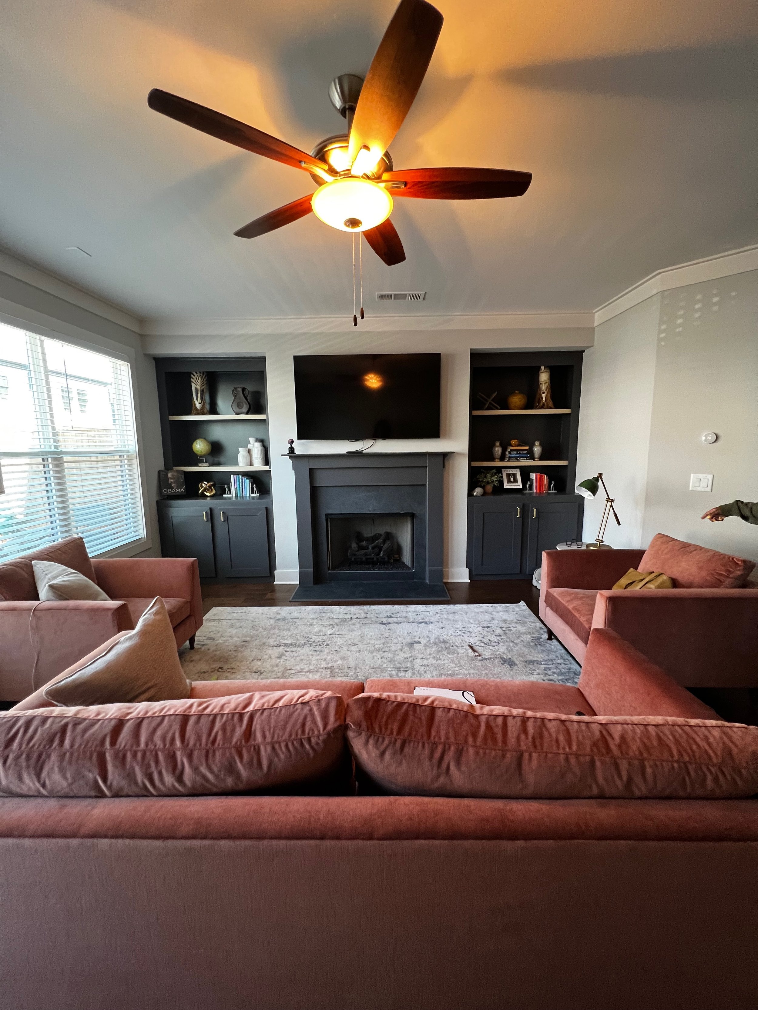
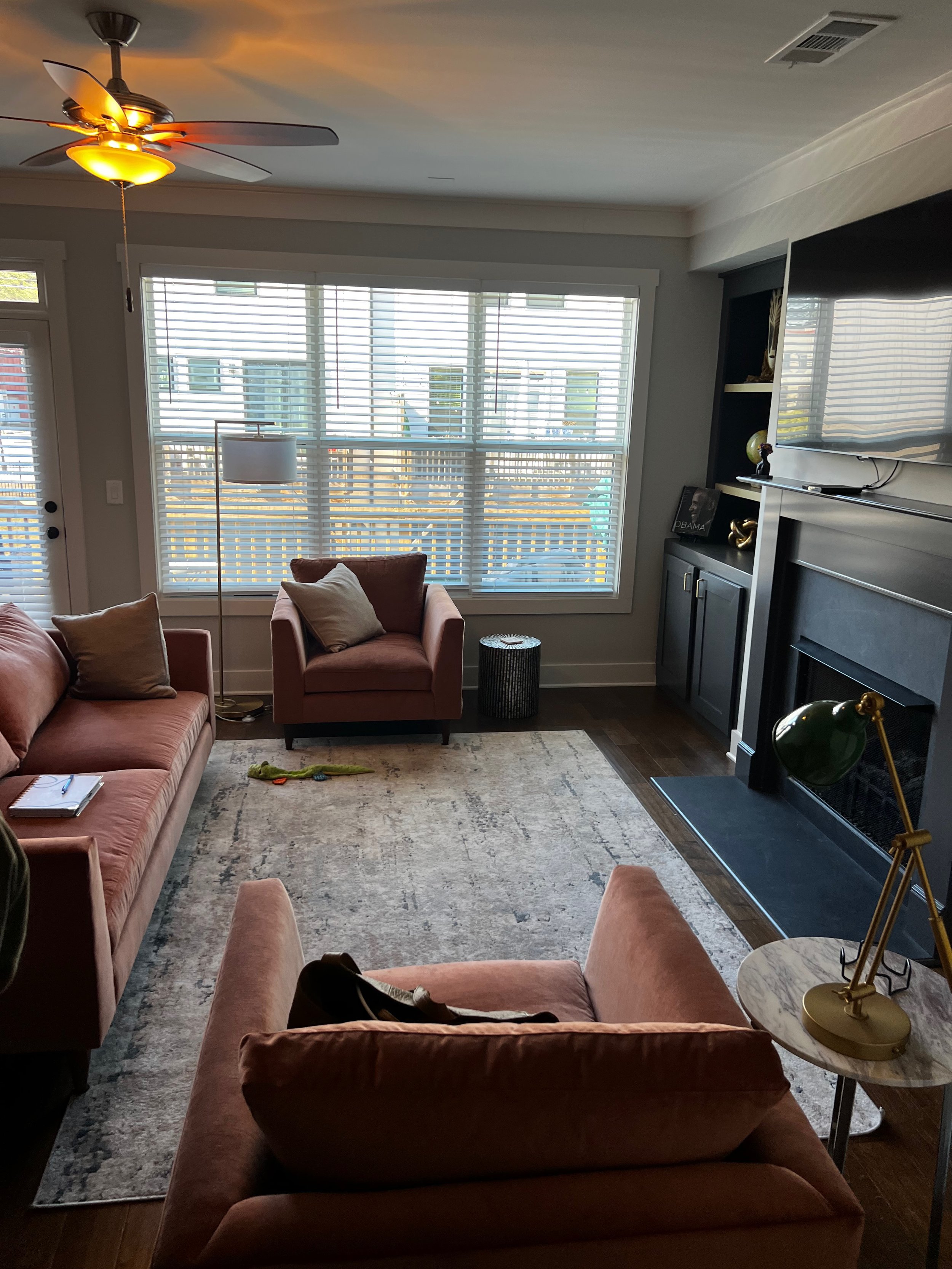
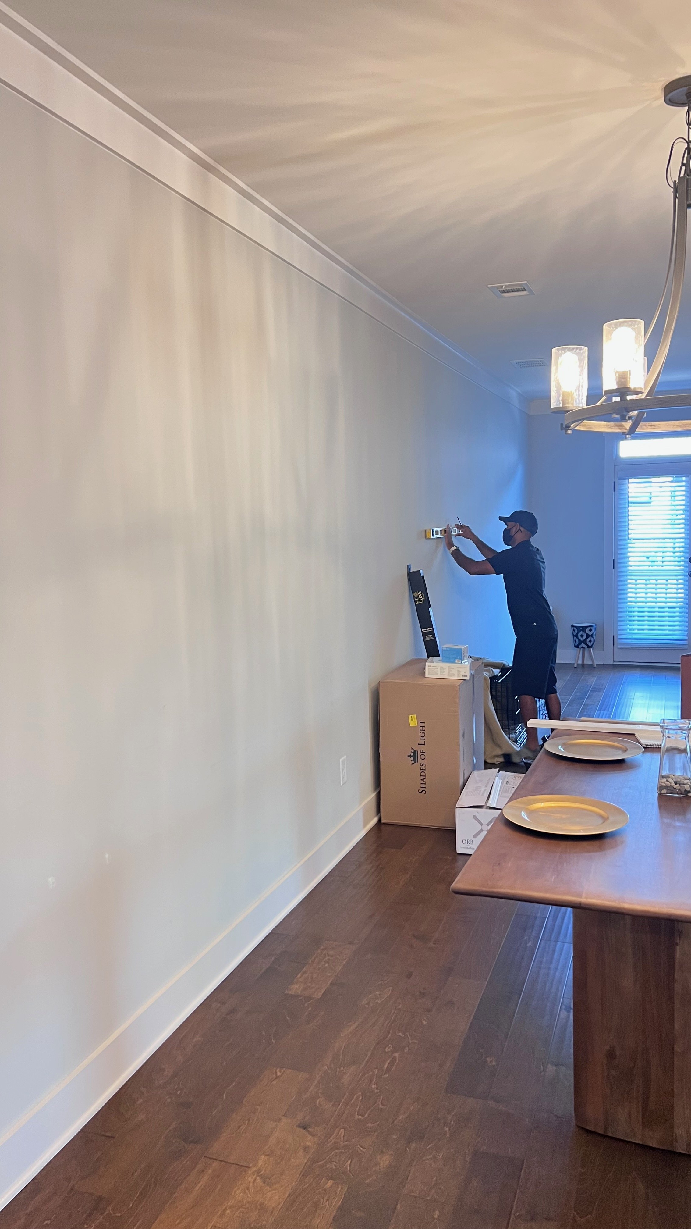
BEFORE
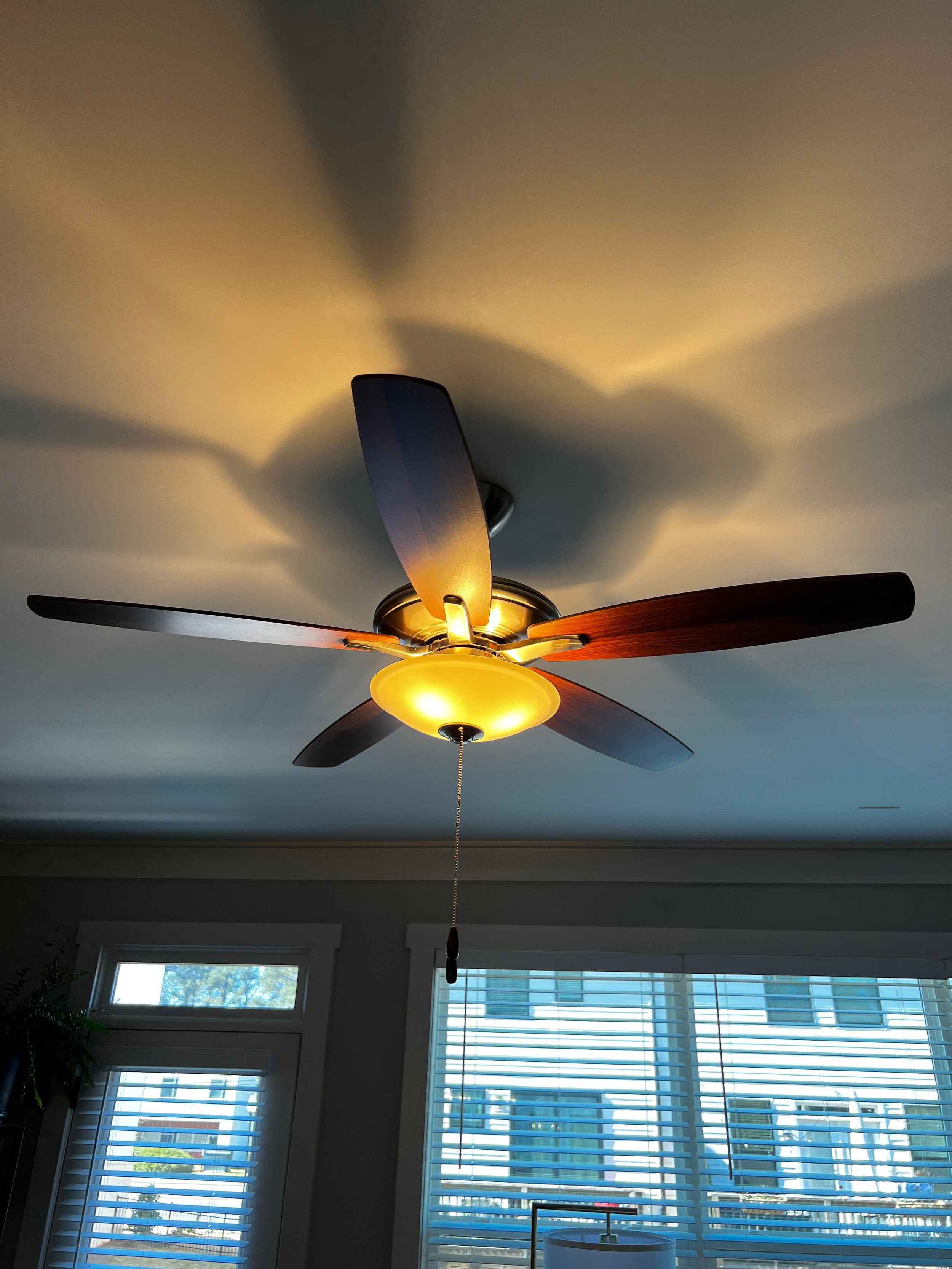
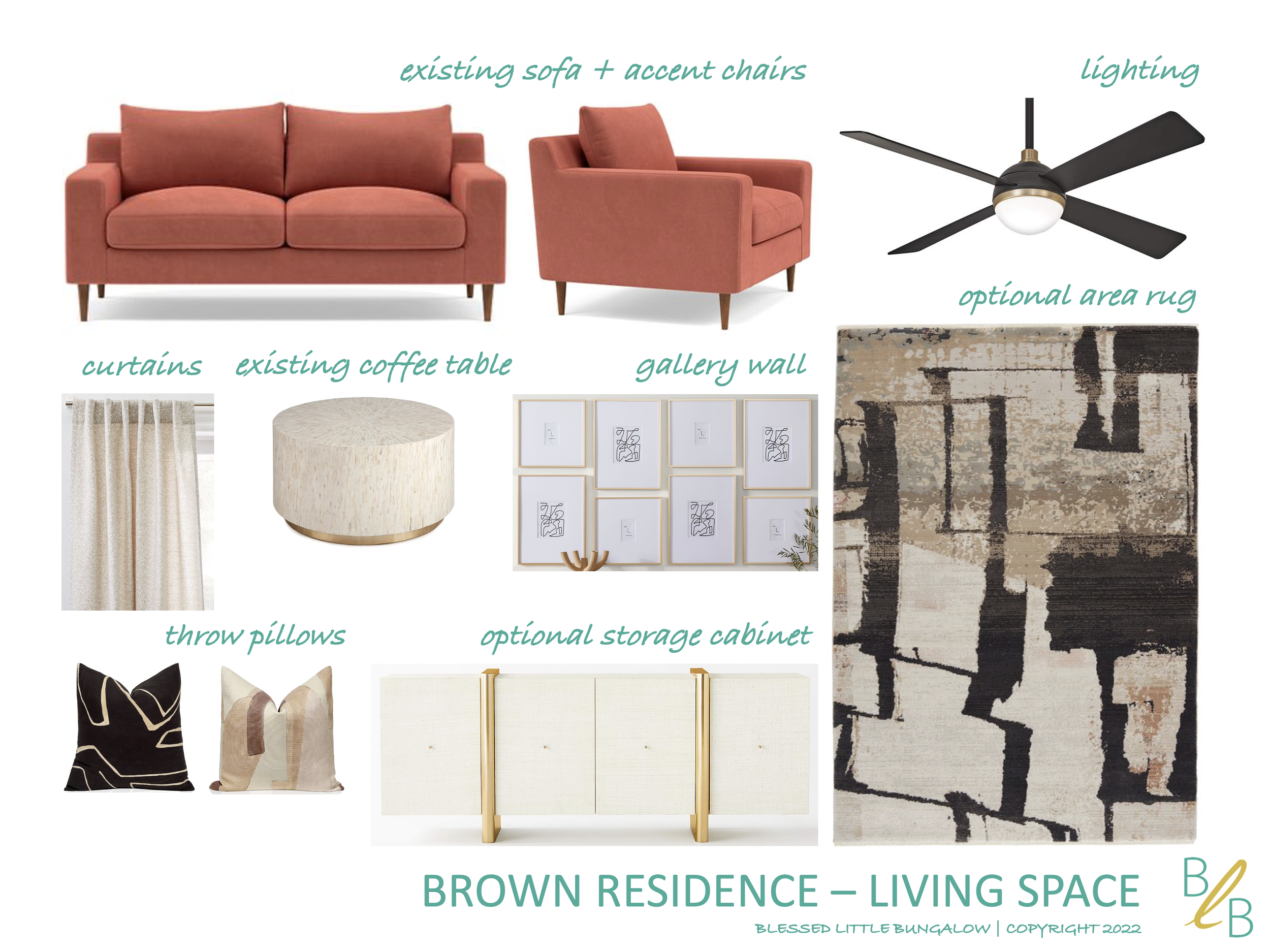
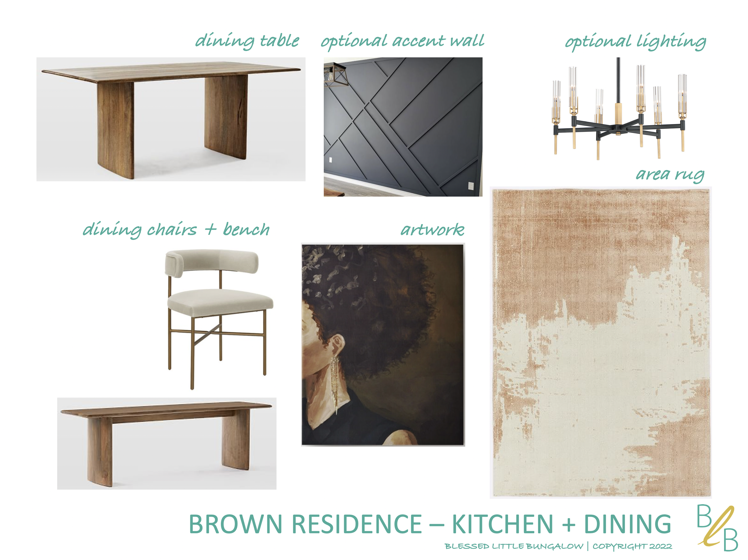
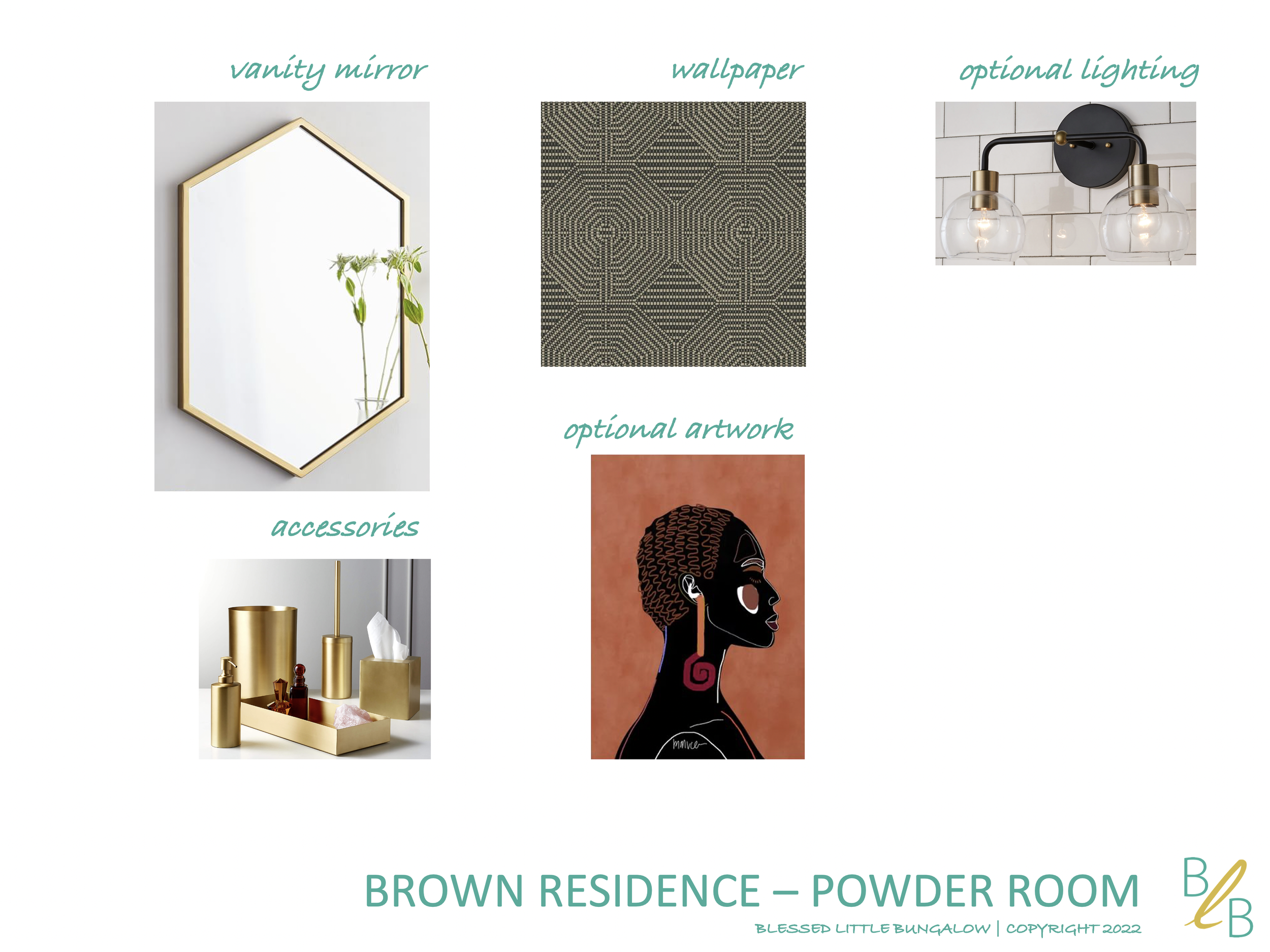
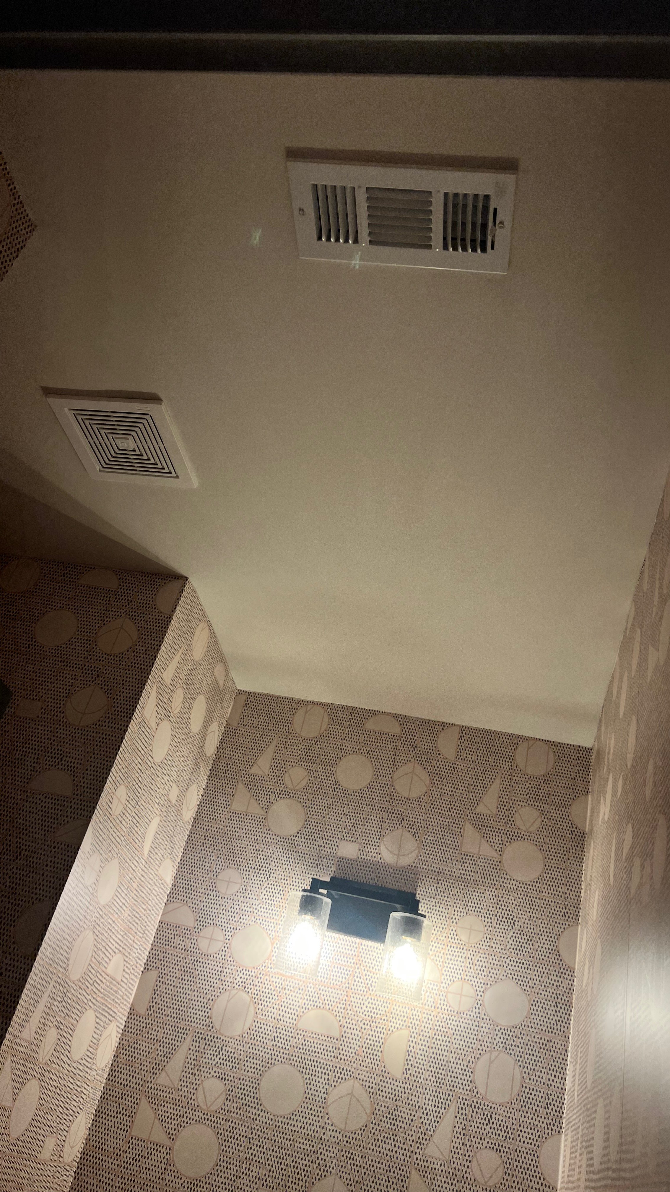
I loved the charcoal and gray paint accents throughout the house and with the furniture she already had and ordered, we were off to a good start. However, there was still a long list of furniture needs for the dining room, and the lighting in the living and dining space, as well as the adjacent powder room were in need of some serious upgrades. There was also that long, blank wall connecting the dining and living room spaces that needed a change. I put a few options together keeping the spaces’ neutral foundation, while layering on some warm tones, texture, and mixed patterns.
MOOD BOARDS
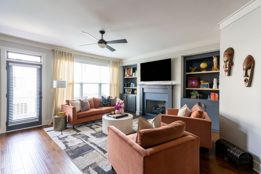
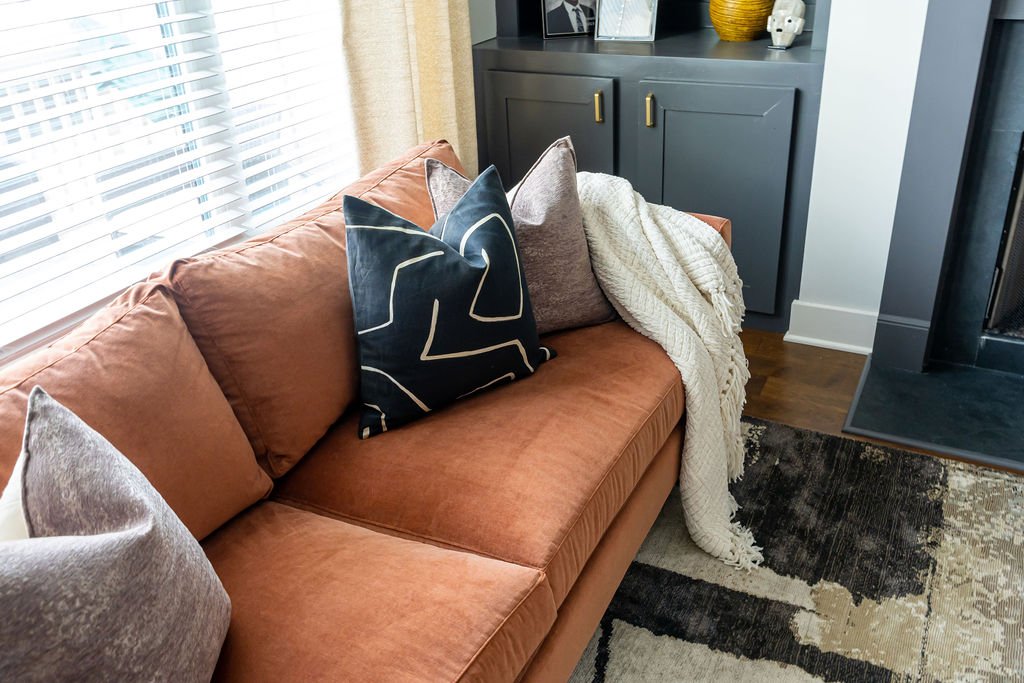
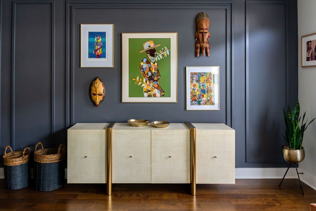
Once the designs were approved, we got right to work on ordering new furniture and lighting. Charlene needed a dining table and new chairs (the ones she had were a bit to traditional and farmhouse-ish), new area rugs, more storage, and complementary décor. We rearranged the existing furniture and added in the new coffee table Charlene already ordered. The back of the living space needed some grounding, so we added a beautiful casegood to give her some additional storage and planned to add a gallery wall above it for a bit of visual interest.
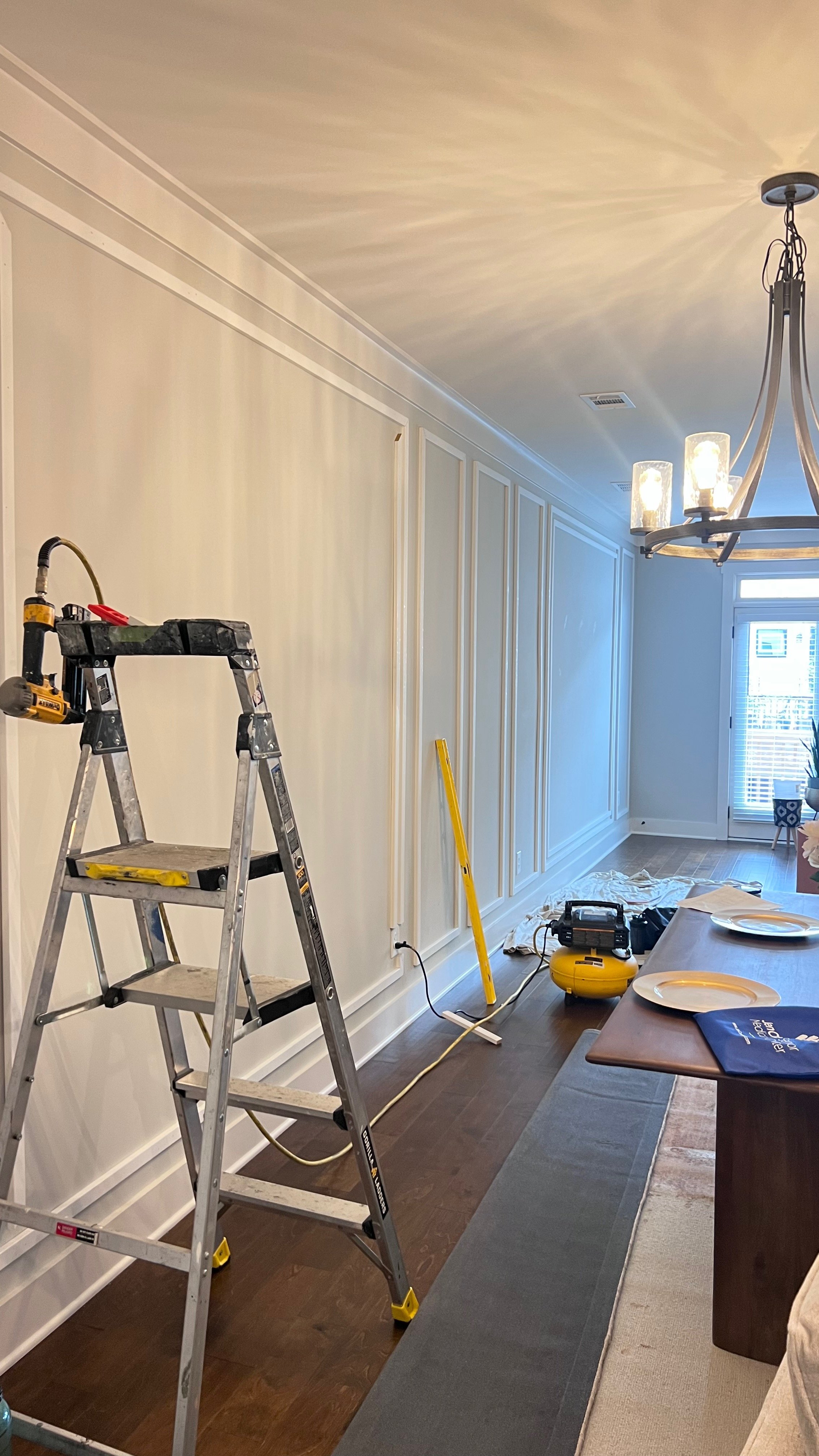
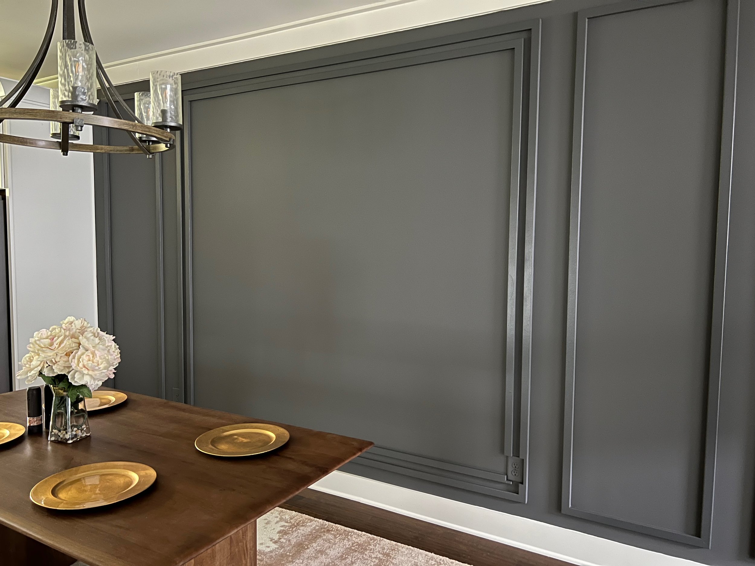
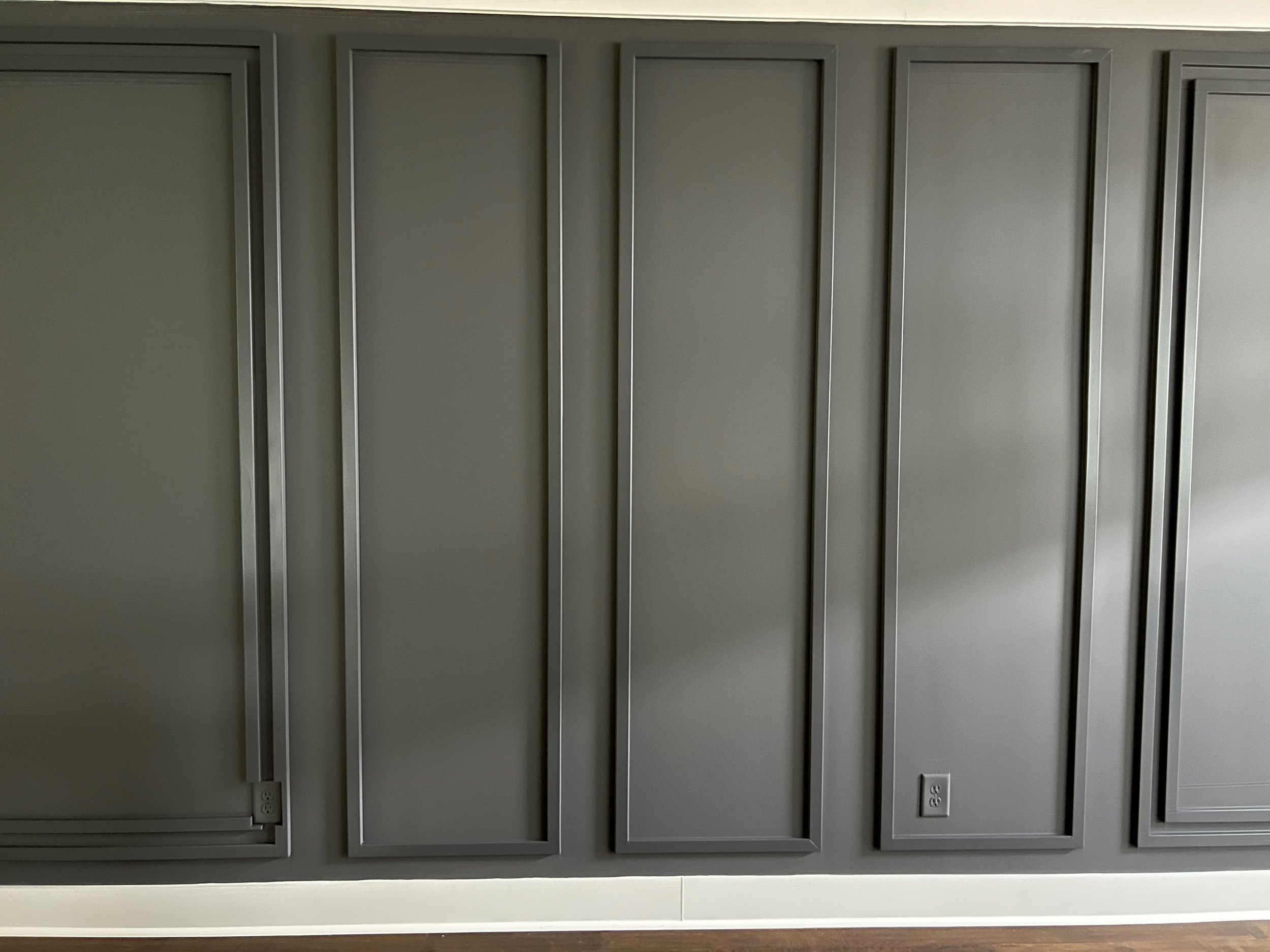
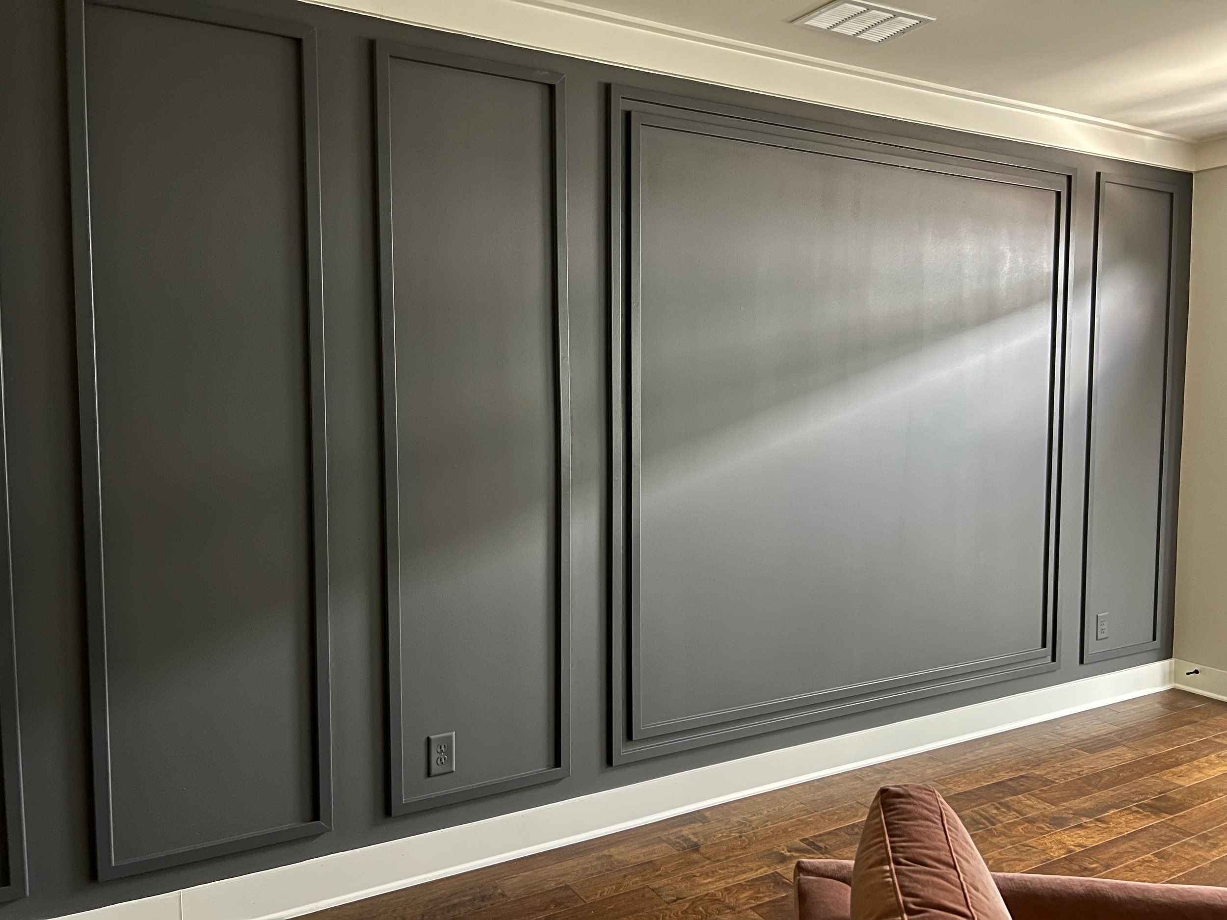
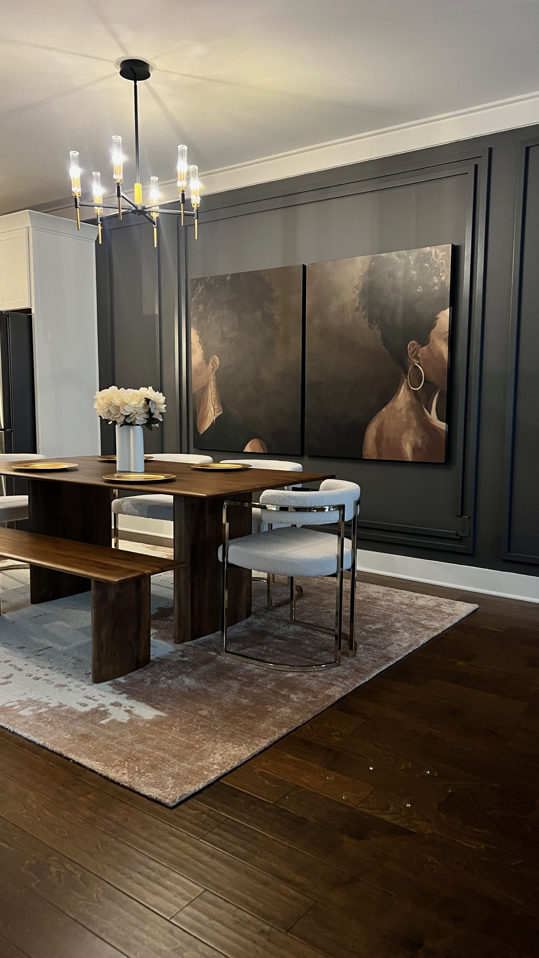
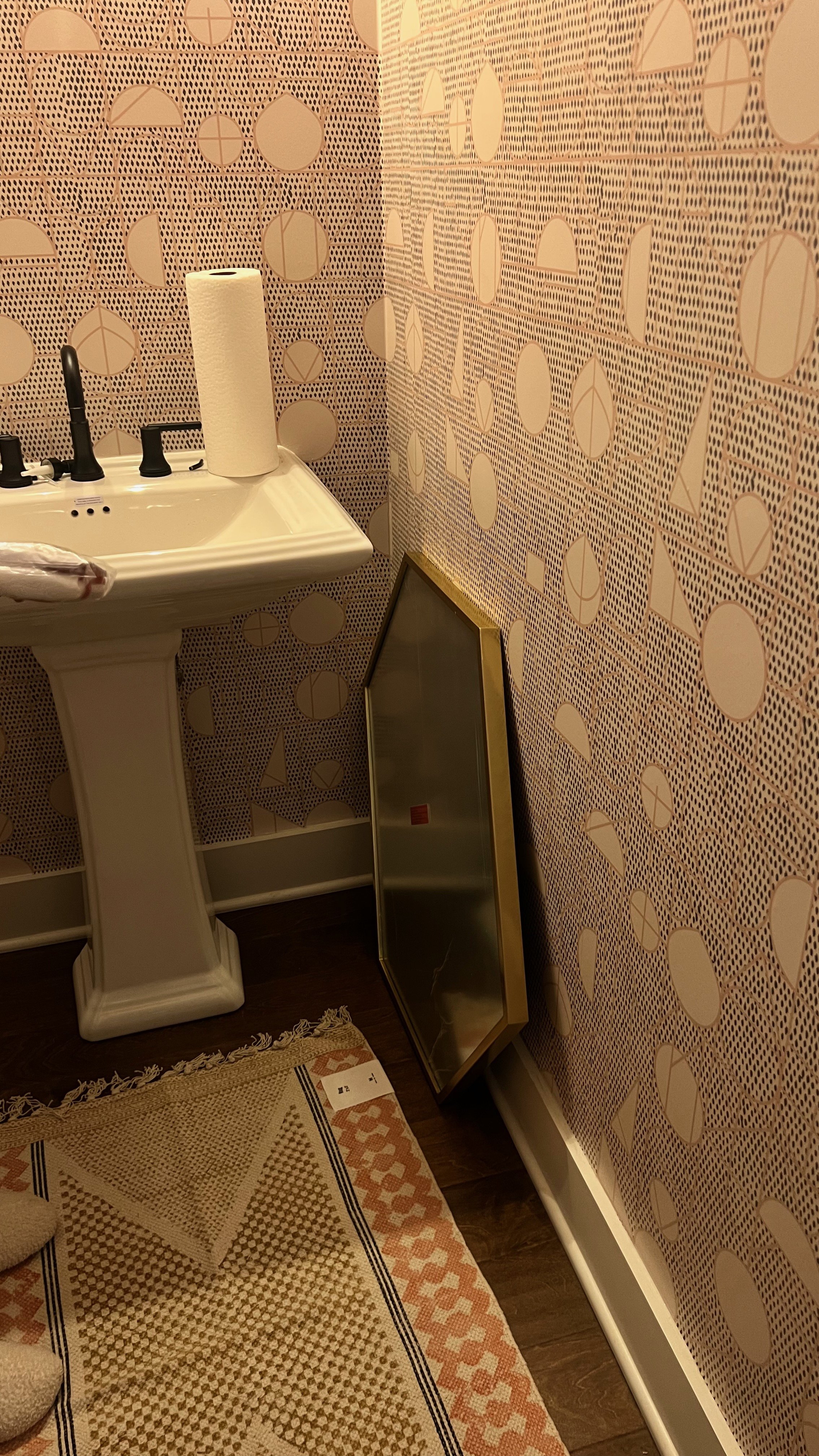
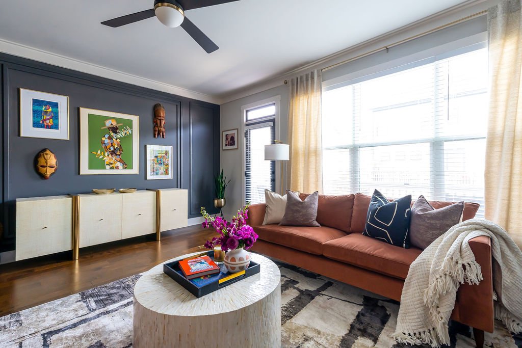
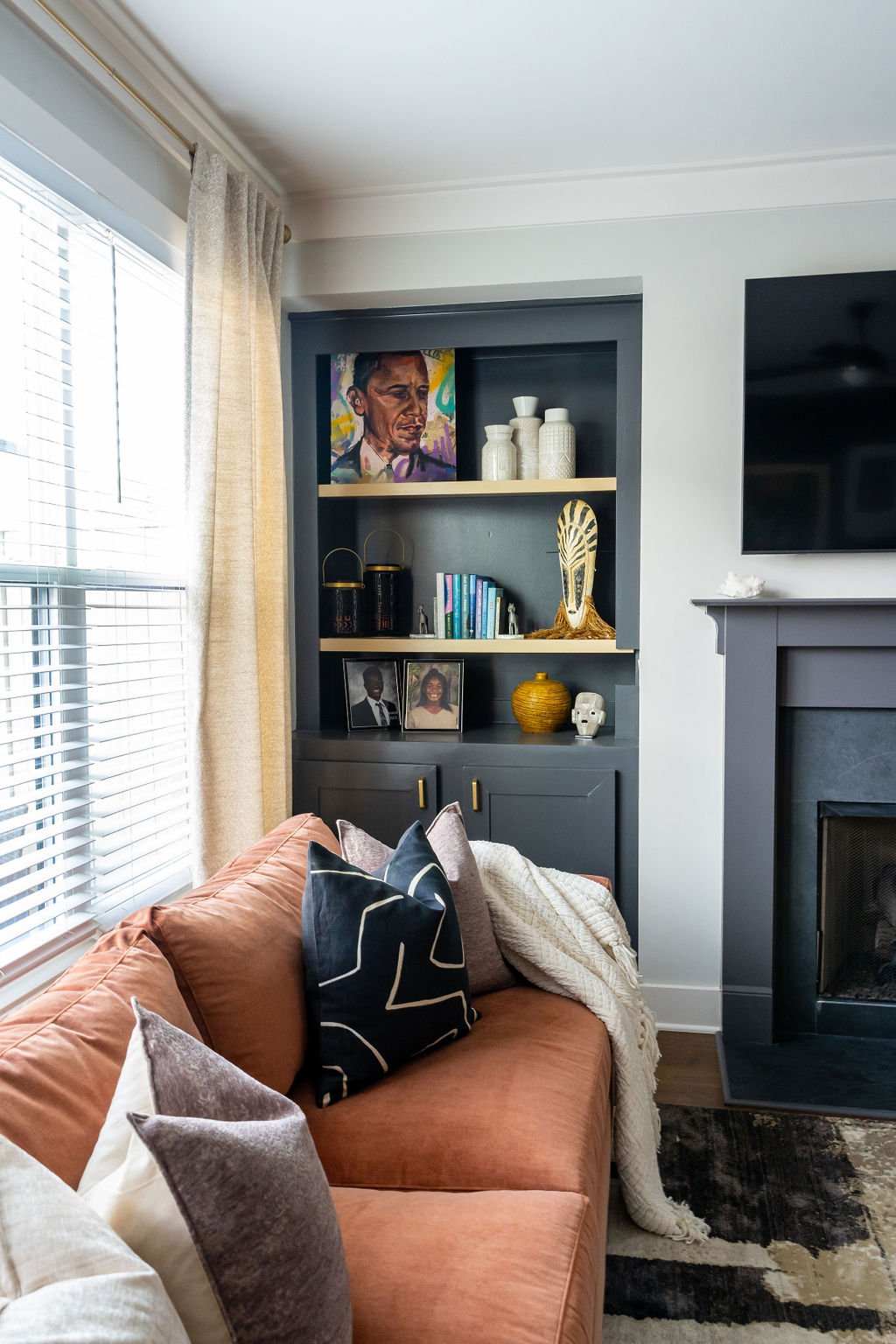
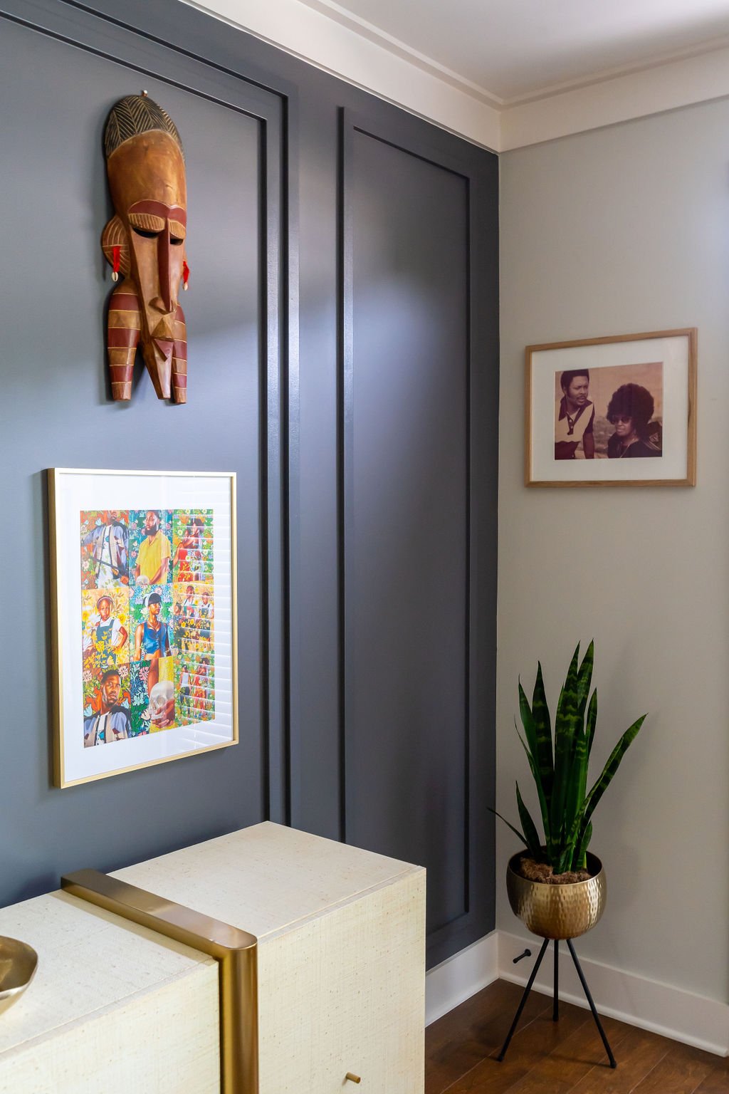
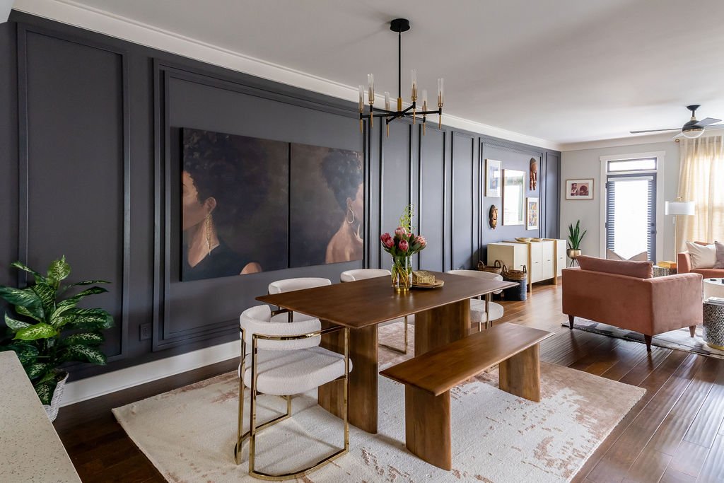
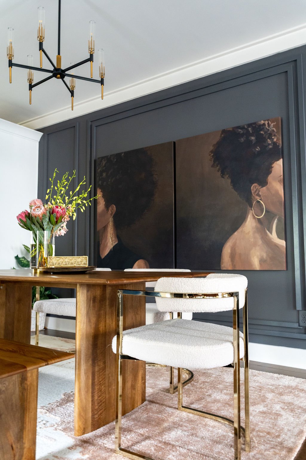
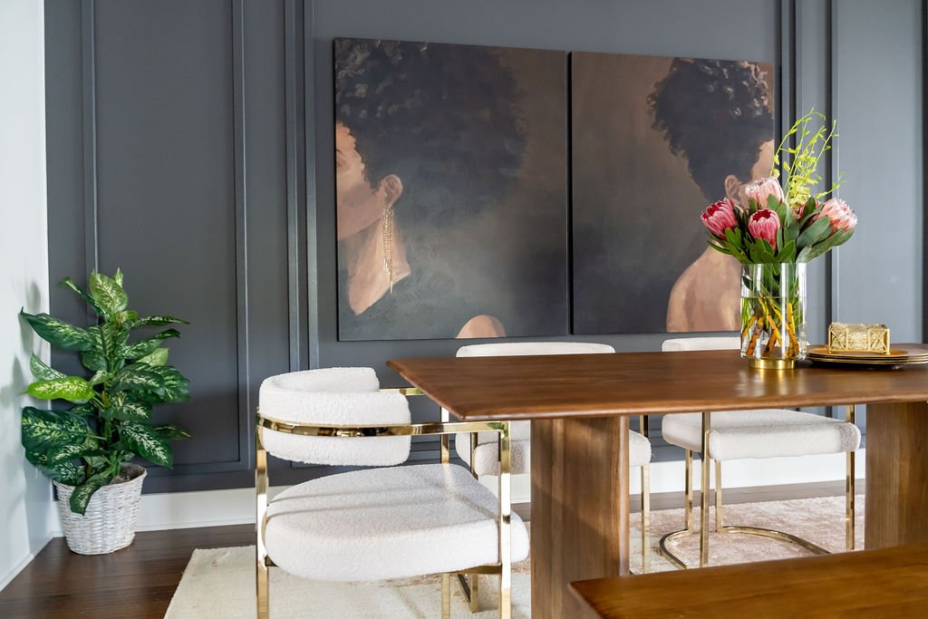
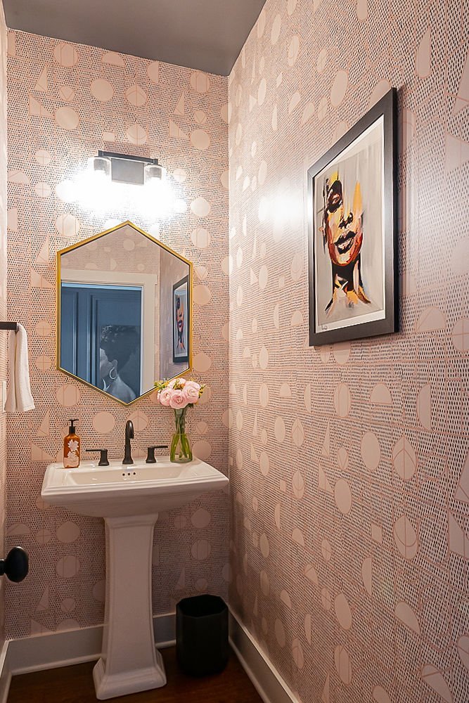
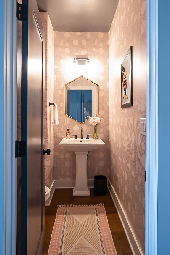
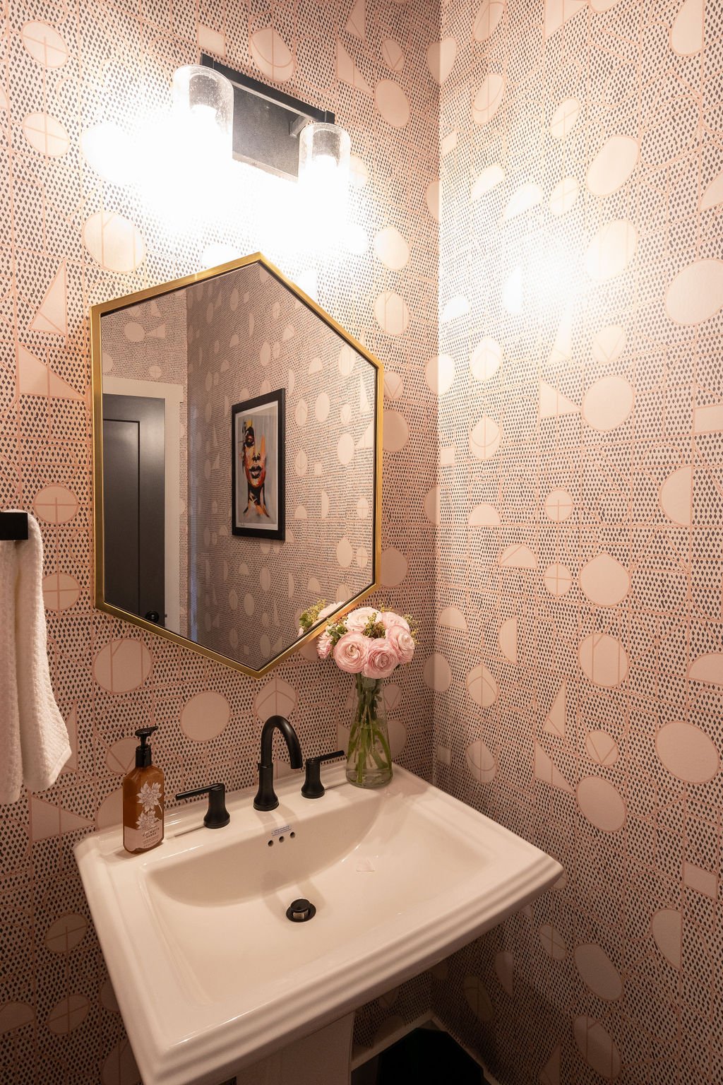
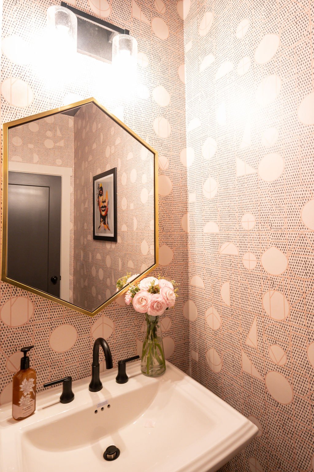
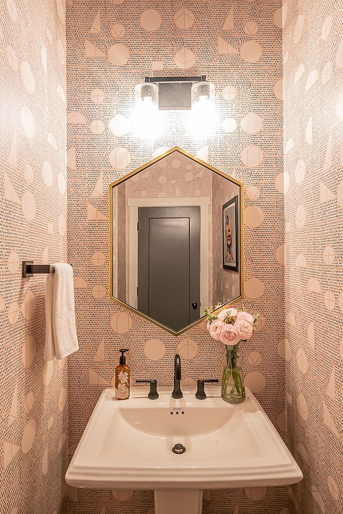
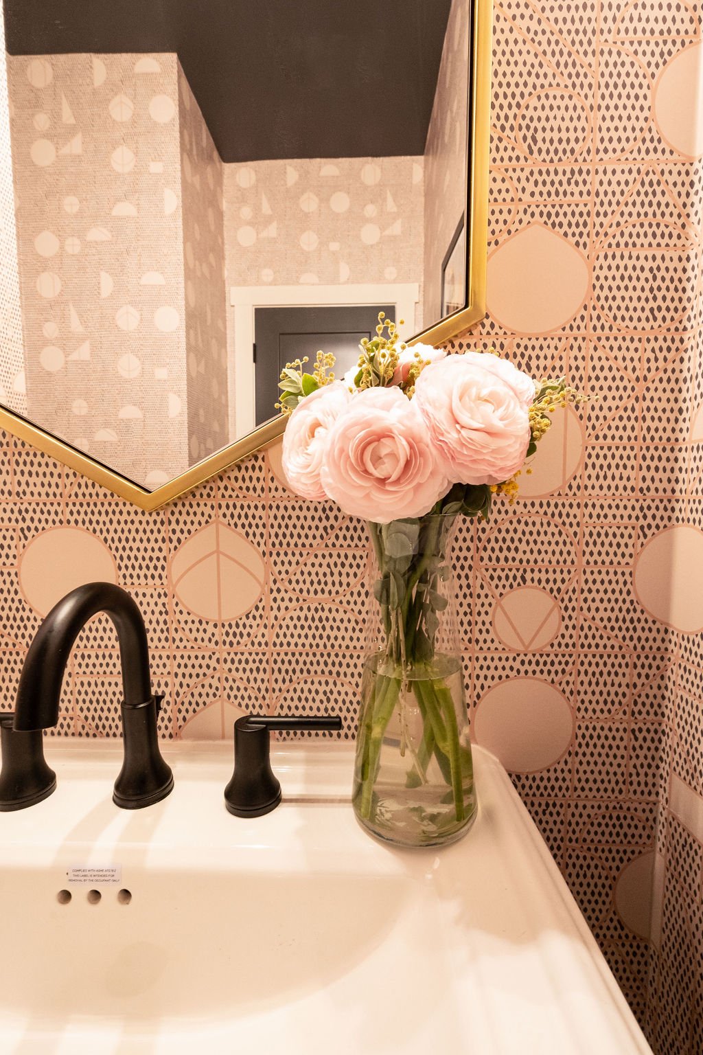
Once the new furniture was purchased, we brought in my friends at The Board Room Accent Walls to figure out the best way add character to the space. The long wall connecting the living and dining space seemed difficult to decorate in the open-concept floor plan, but by adding paneling/wainscotting to it and painting it Peppercorn to mirror the existing living room built-ins and doors, it would look like it was custom created and there the entire time. The wall design was classic with a modern twist, and we continued the geometric theme in the powder room across from it with new wallpaper and a hexagon vanity mirror.
DURING
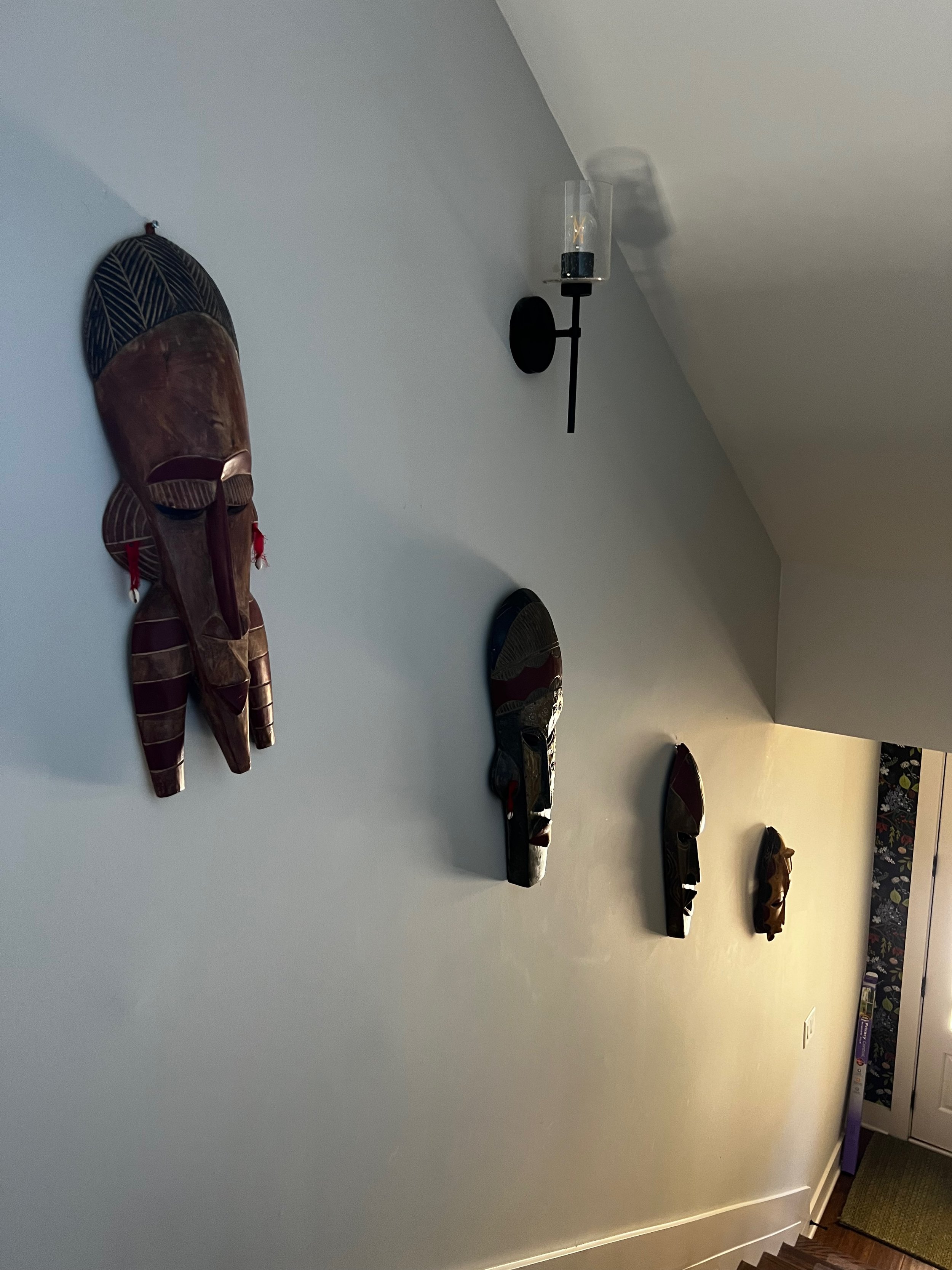
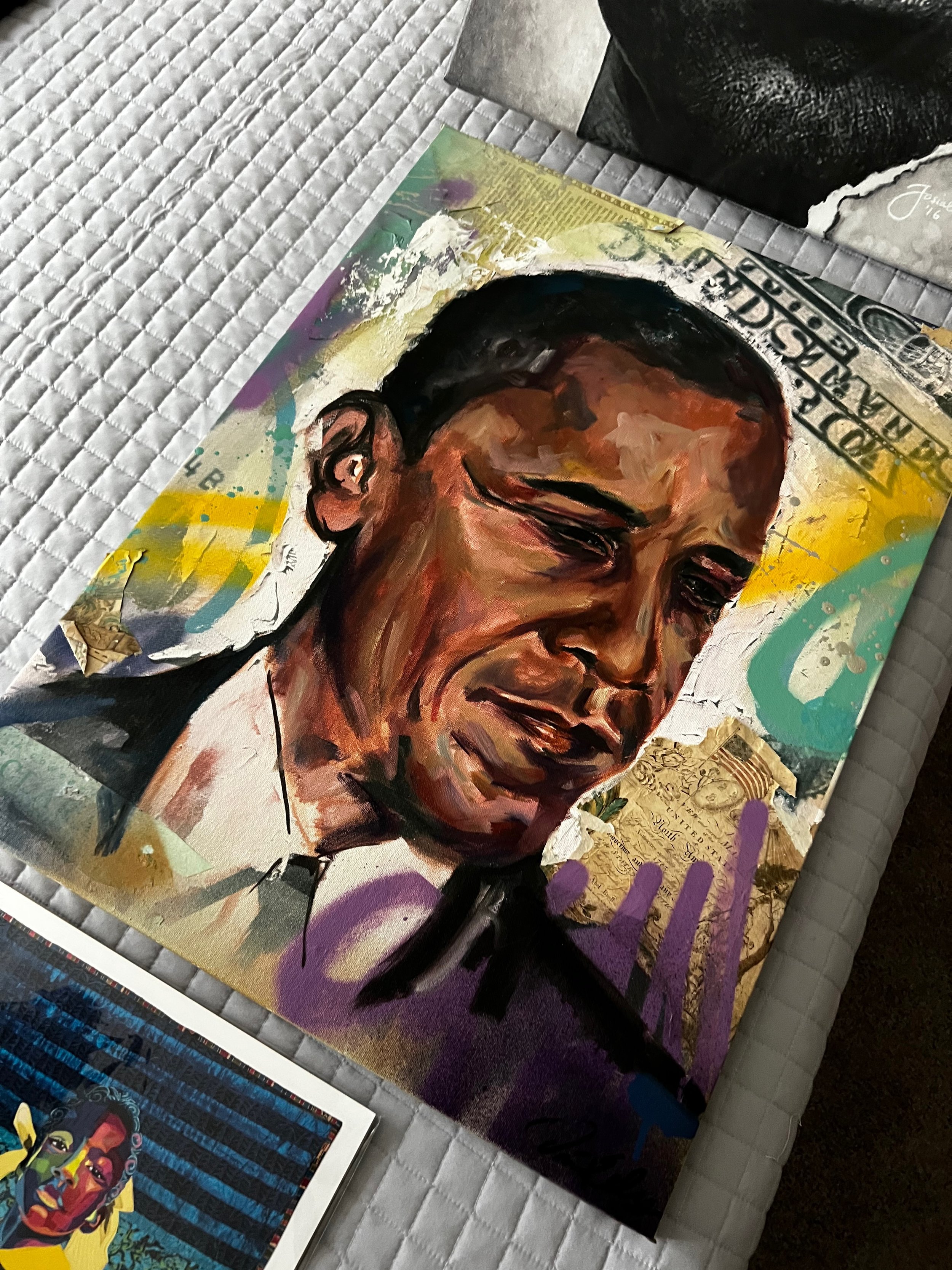
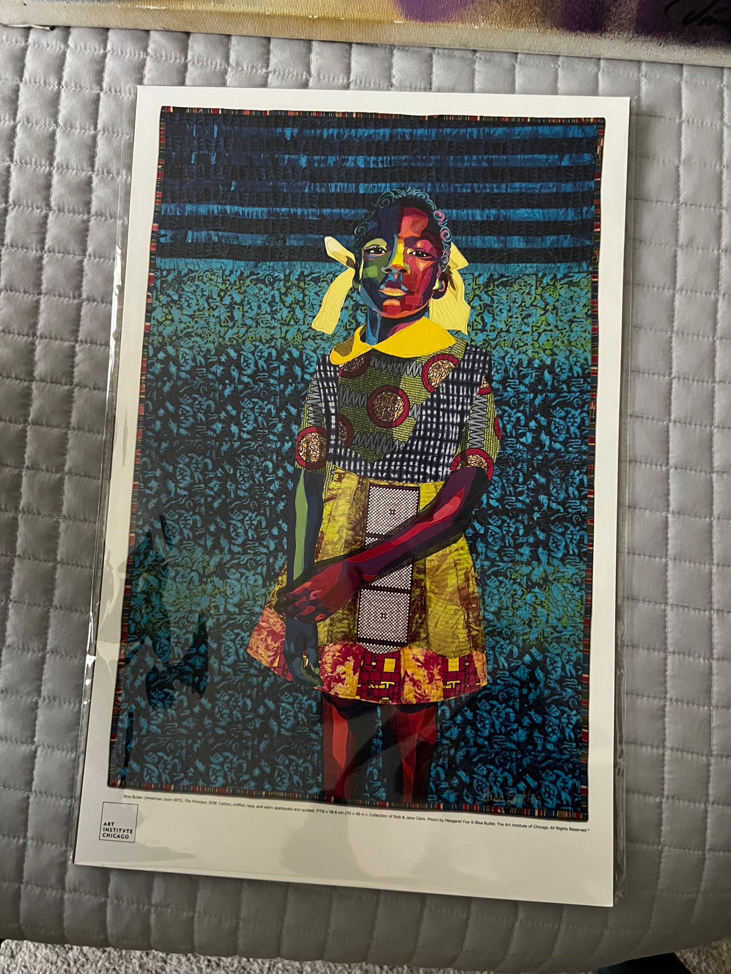
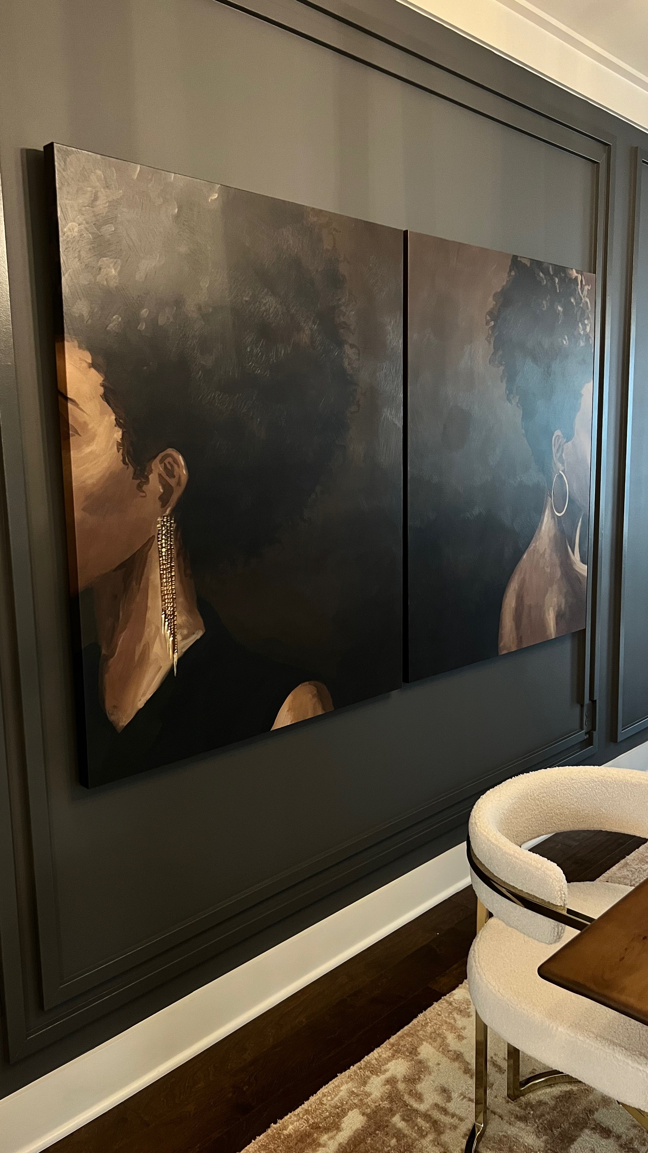
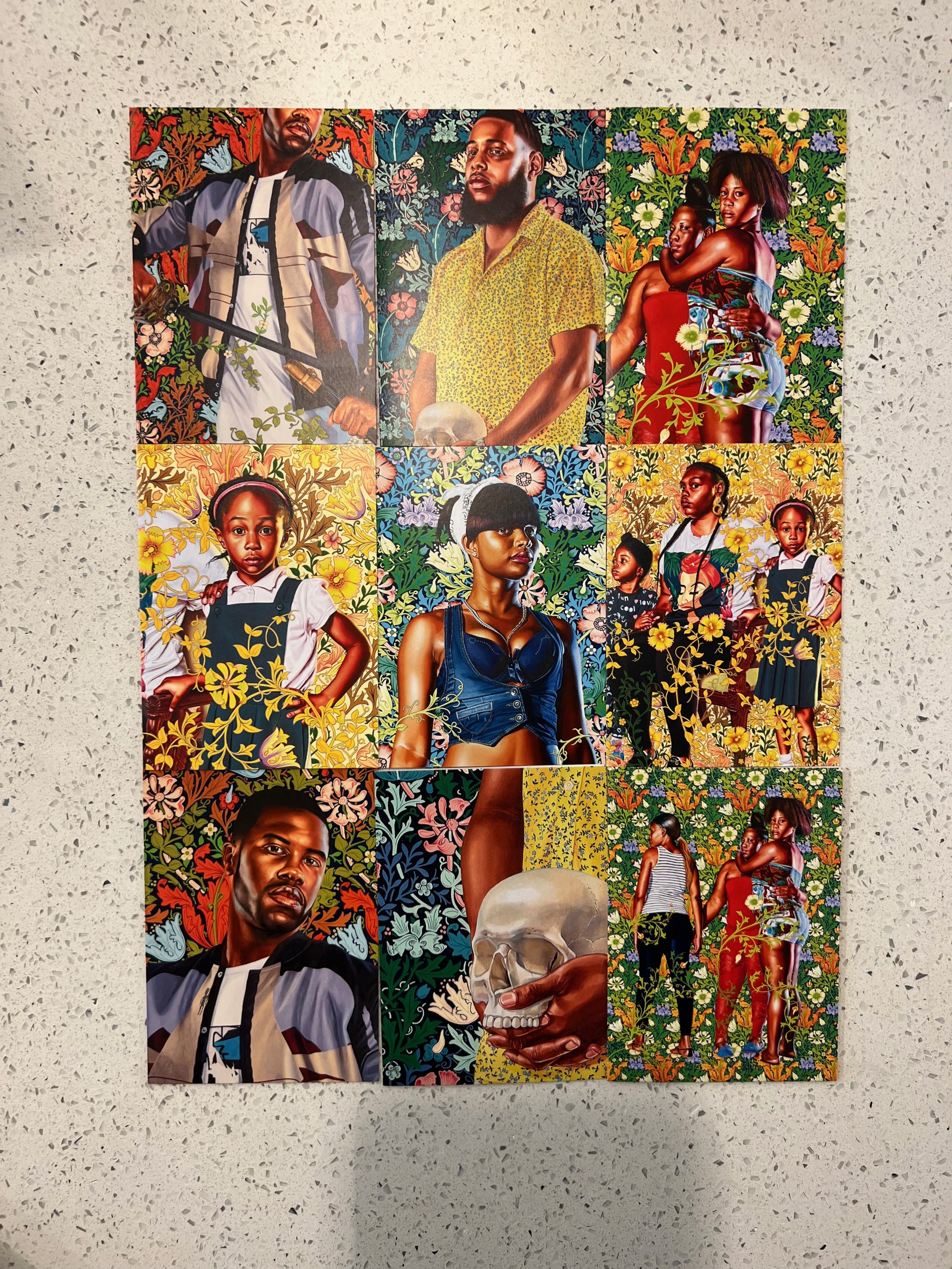
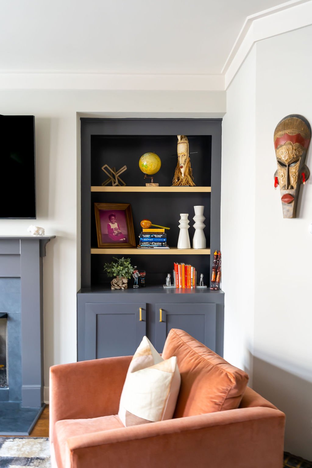
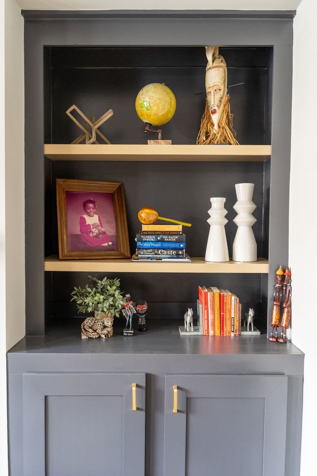
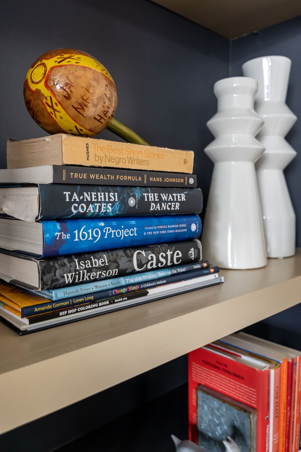
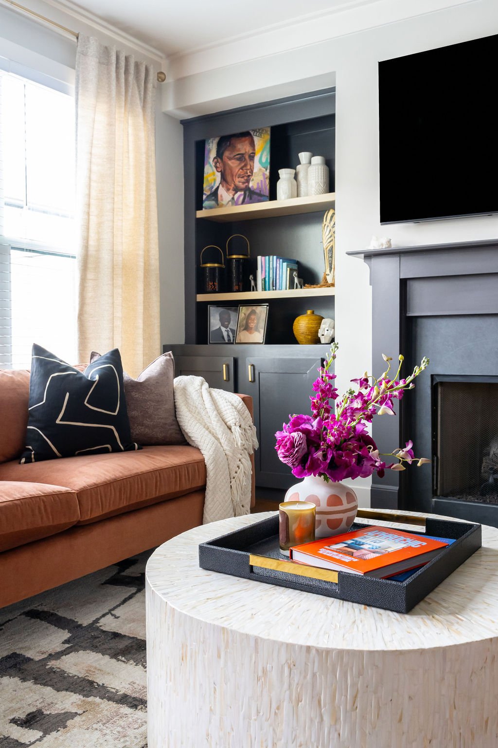
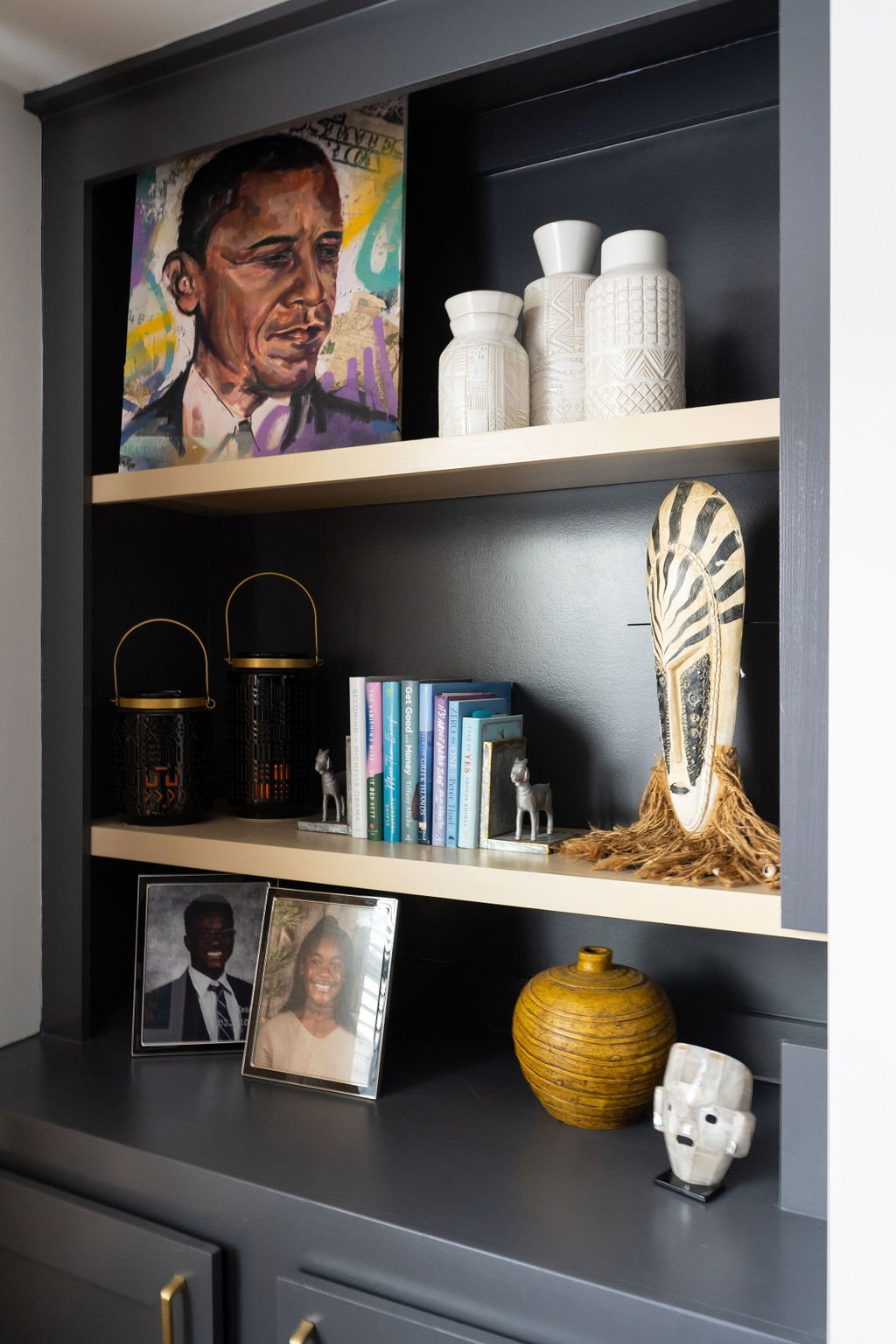
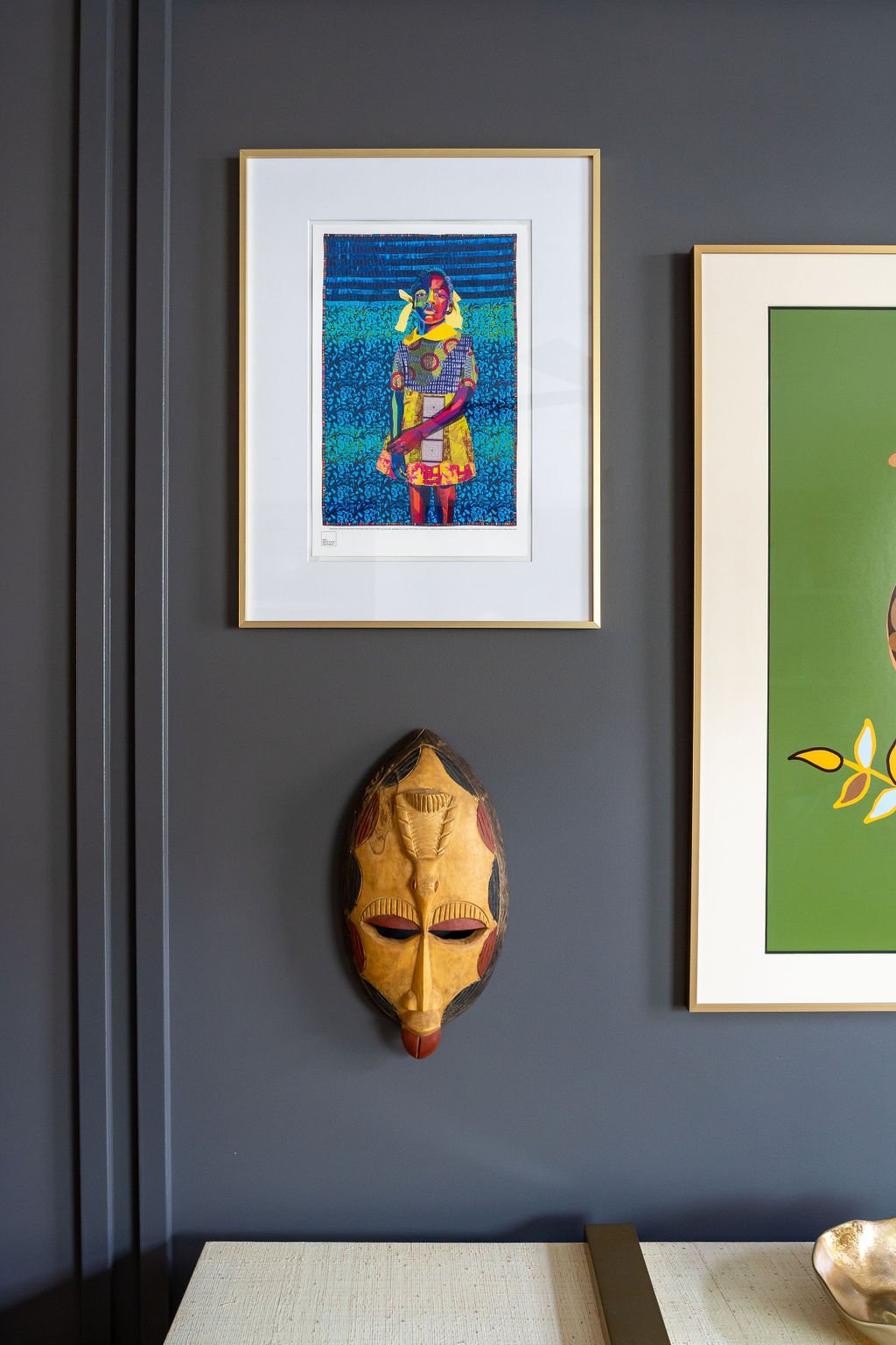
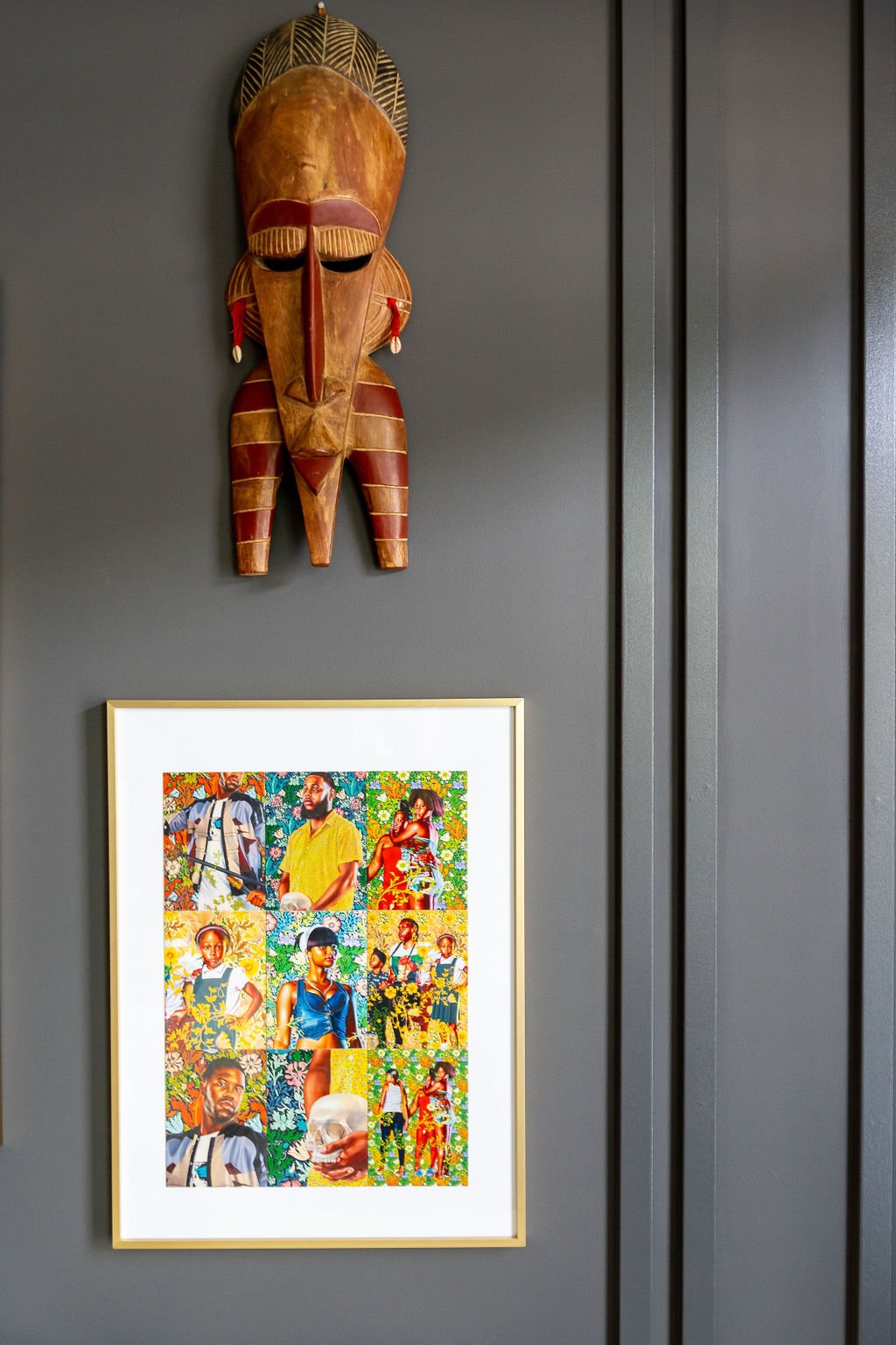
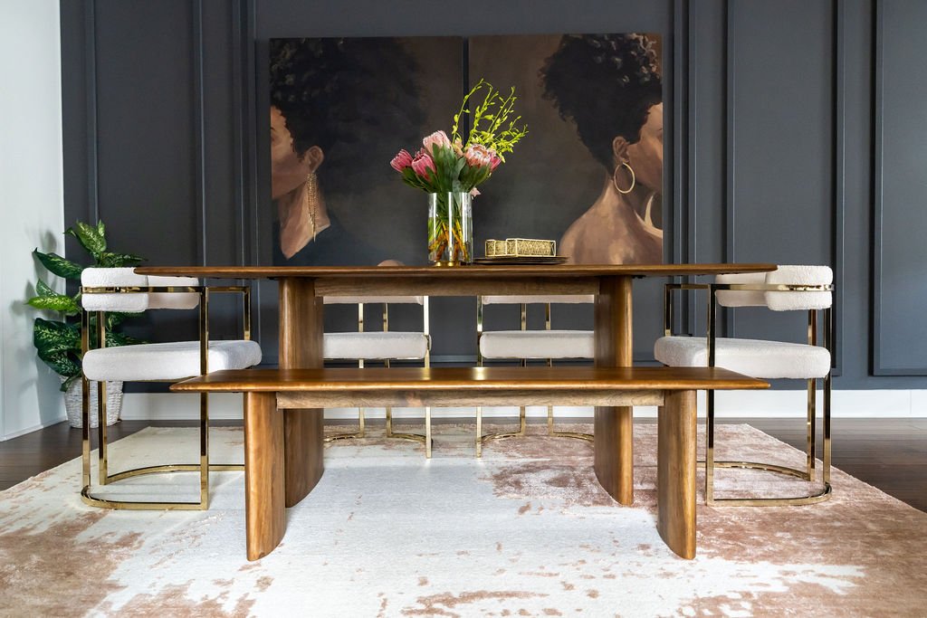
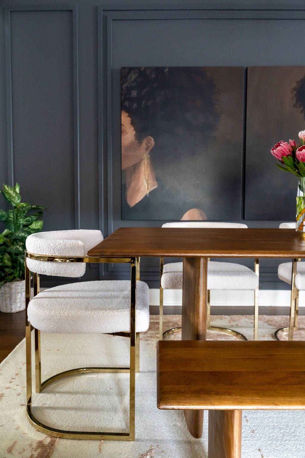
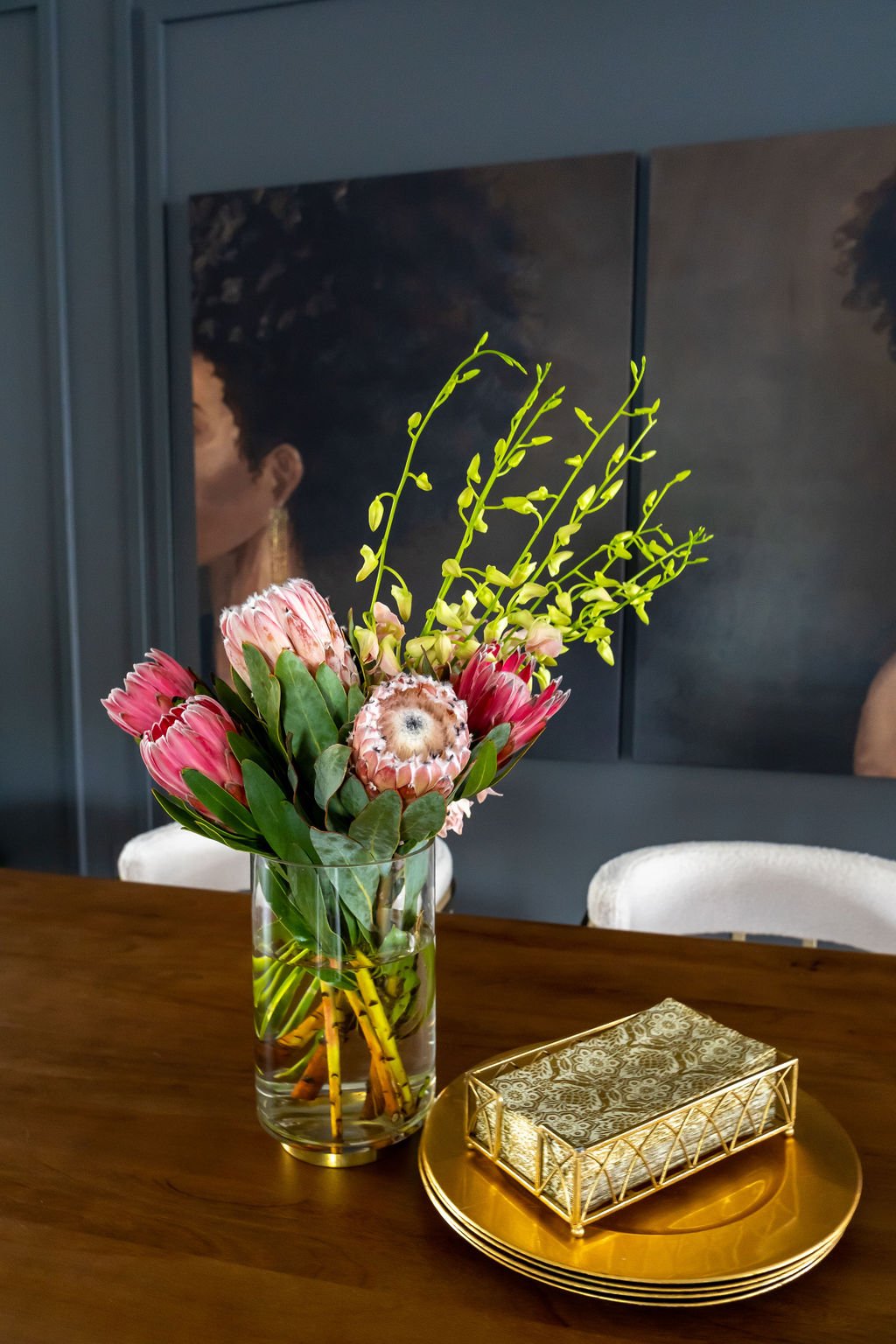
Because of Charlene’s love for travel and Black art, the final touches included covering the walls and styling the surfaces with black and brown faces, family photos, and books, and a few new items we picked out together. The best part of the design is all of the artwork. We combined new and existing pieces seamlessly and made her home feel like its own museum of art. It gives anyone who enters something to talk about. My favorite additions are the two oversized portraits we positioned in the dining space. When you walk up the stairs to the main floor, it’s the first thing you see. They are so striking and the perfect introduction to the vibe we were creating in her home.
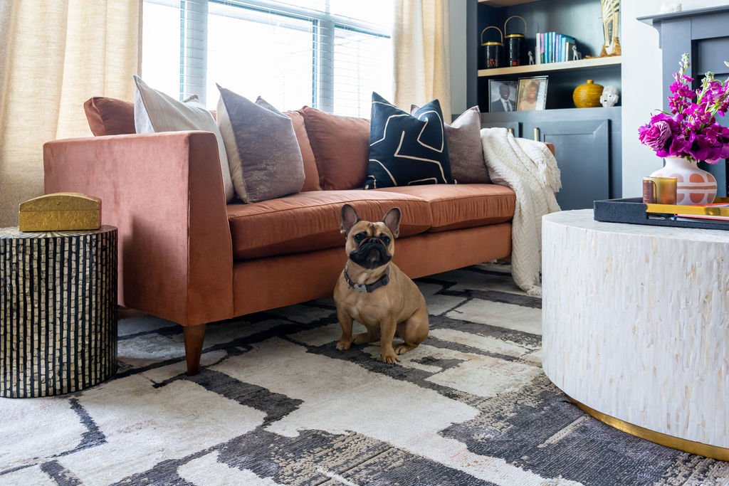
I love the celebration of Blackness, womanhood, and serenity we were able to create in Charlene’s home. Take a look at the finished product!
AFTER
I’m so grateful to Charlene for welcoming me into her home during the pandemic and trusting me to design a timeless, moody, and beautiful space she can be proud of, relax in, and enjoy for years to come. I hope to be back to complete her primary suite and spaces on the other floors when she’s ready, but for now, I’ll just drool over these images and the magic we created together!
For more photos of Charlene’s home, check out my Portfolio and #ProjectBlackRenaissance on Instagram.
Be Blessed,
ACG
Design Deets:
Living Room
Wall and Built-ins Paint – Sherwin-Williams’ Peppercorn
Accent Wall - The Board Room Accent Walls
Sofa and Chairs – Macy’s
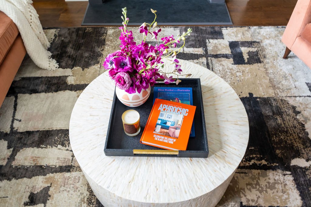
Coffee Table – Z Gallerie
Rug – Nikki Chu for Jaipur Living
Art – Desiree Kelly, Bisa Butler, Kehinde Wiley, Ruth Njenga
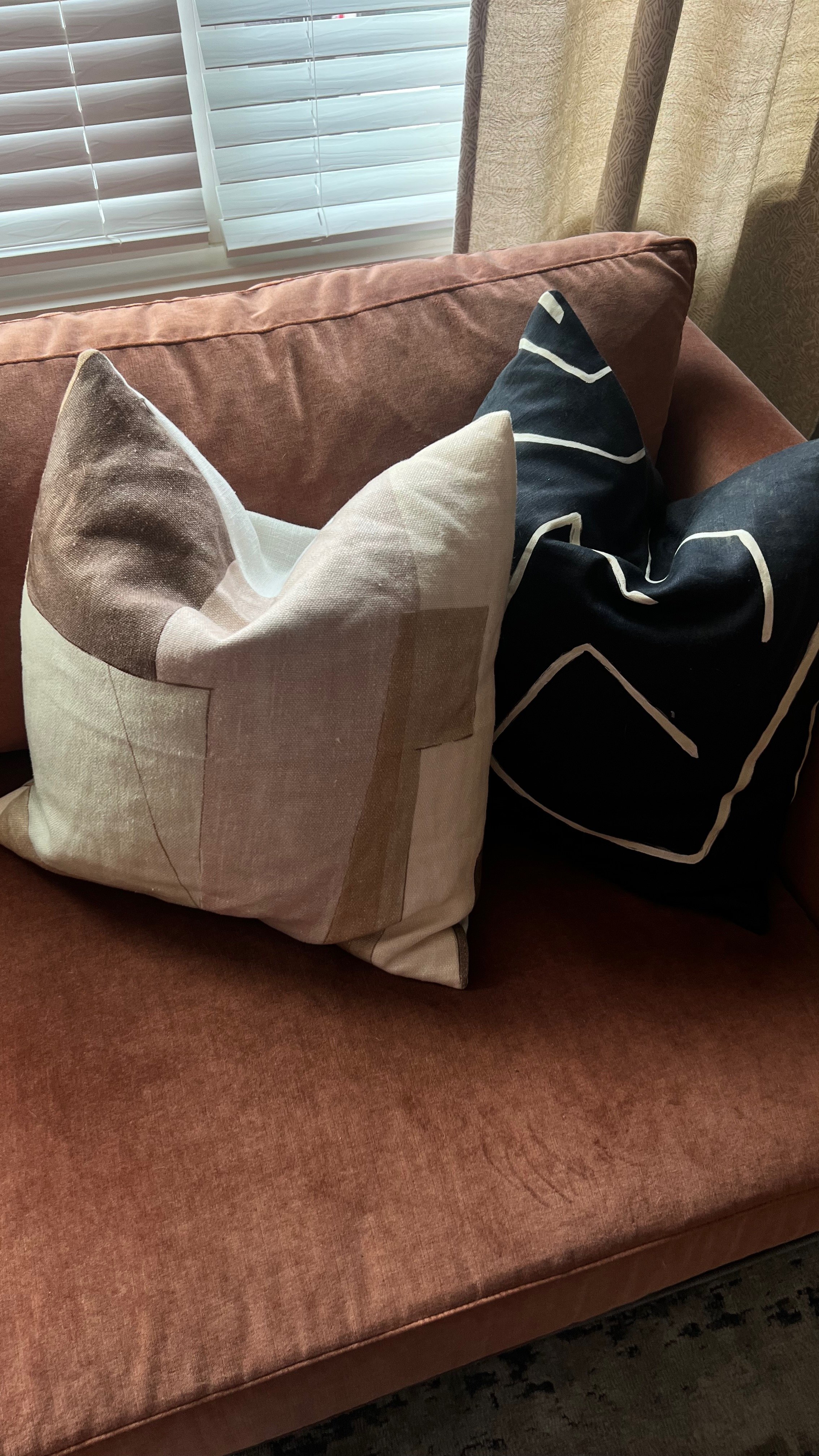
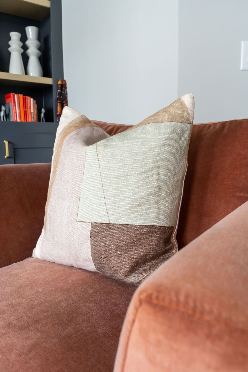
Pillows – Kelly Wearstler, Etsy, Home Goods
Tray - Home Goods
Vases – Home Goods
Accessories - Home Goods
Curtains – West Elm
Throw - Home Goods
Baskets - Home Goods
Casegood/Cabinet – CB2
Picture Frames - West Elm
Dining Room
Wall and Built-ins Paint – Sherwin-Williams’ Peppercorn
Chandelier - Shades of Light
Dining Table and Bench – West Elm
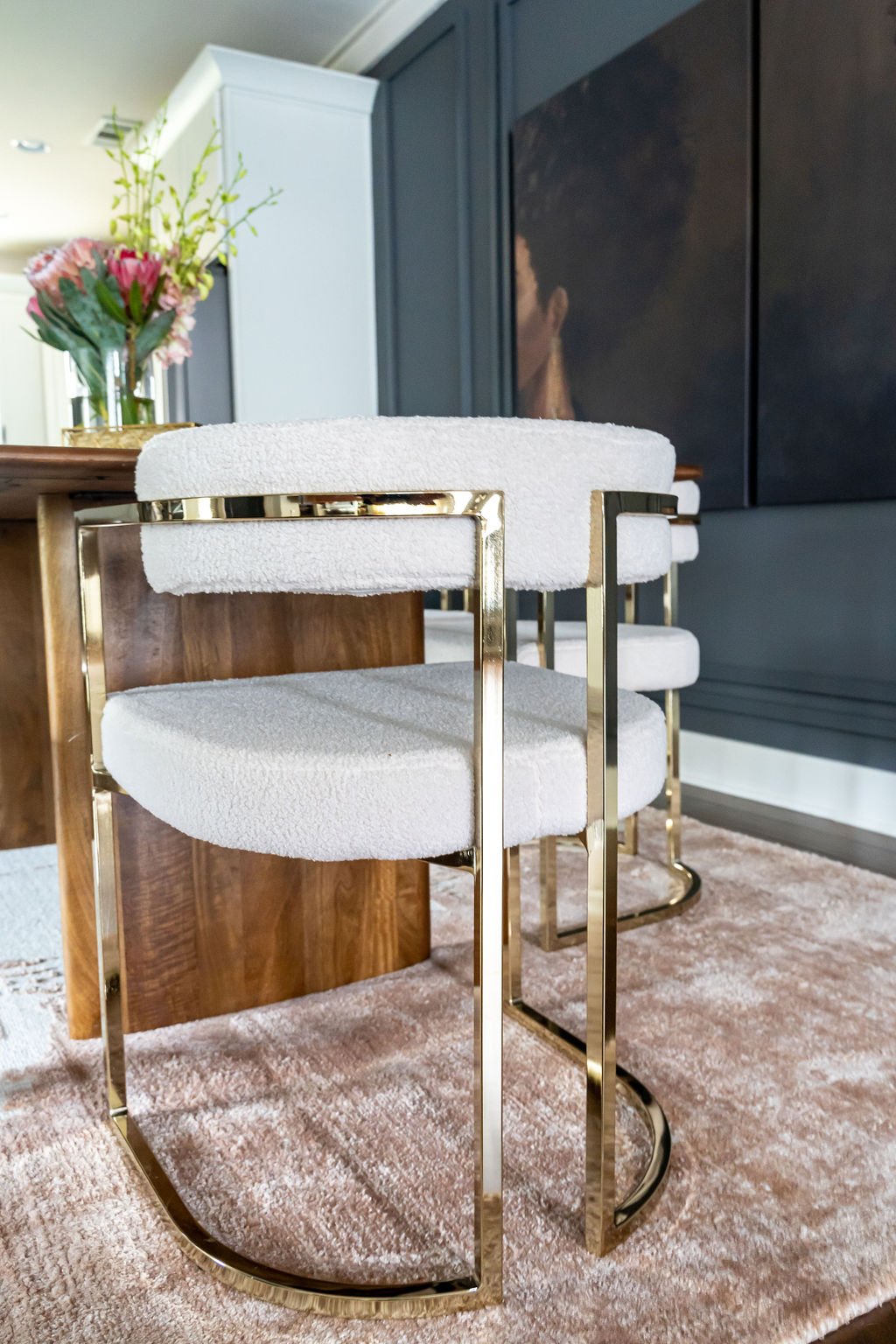
Dining Chairs - Home Goods
Rug – West Elm
Art – Nia and Iman of Michel Smith Boyd for Z Gallerie
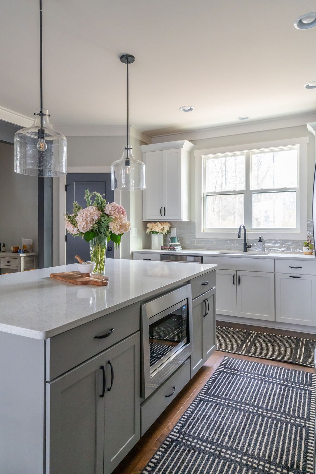
Kitchen Runners - Overstock
Powder Room
Ceiling Paint – Sherwin-Williams’ Peppercorn
Wallpaper – Forbes Masters for Mitchell Black
Mirror – West Elm
Lighting - Shades of Light
Art – Mr. Andre S. Art
Vases – Home Goods
Trash Can – Home Goods
Professional Photography – Brittany Bah Photography
